
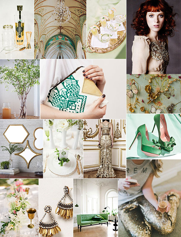
While I’ve got to admit that I’m not the world’s biggest St. Patty’s Day fan, I am completely, 100% onboard with any excuse to use liberal doses of the color green… especially when paired with gold for (in my opinion) the world’s prettiest color combination. An emerald and gold palette inspired our new studio’s design — we shared a sneak peek here — and I love the way it feels at once luxe and organic. I’m that person who’s always getting pinched for forgetting to wear green, so this year I’m intentionally going straight for the pot of gold at the end of the rainbow by adding a few gilded touches to my ensemble; a subtle and decidedly more glam way to embrace the spirit of St. Patrick’s Day, don’t you think?
*images: {row 1} white loft studio via snippet & ink, english snow, katie stoops for southern weddings, karen elson for marie claire {row 2} karen mordechai via a cup of jo, coriumi’s etsy store, bhldn {row 3} monte mirrors at west elm, lilac and grey, givenchy, via this is glamorous {row 4} jessica claire via style me pretty, anthropologie, via elle blogg, glitter guide.