
We’re always going on and on about paper around here — personalized stationery, greeting cards, thank you notes, we’re obsessed to say the least. And while we love anything letterpress, the process behind letterpress printing (and the machine itself) has always been so intimidating. I’d never actually given thought to learning how to letterpress until I met the lovely Clare Wood of Carriage House Design for a coffee date. She started telling me all about the magic that takes place behind her studio doors, and I immediately had to know more. Clare was sweet enough to invite a few ladies from our team over for an amazing afternoon of bites, bubbly and learning how to letterpress, and in doing so dispelled all my fears. Click through for photos from the day (shot by Kate LeSueur) and for an intro to letterpress…

Clare launched Carriage House Design in the fall of 2011. In her mission statement:
“In a time where everything is mass-produced, there is something to be said for creating and supporting things that are handmade and authentic. And where most communication occurs through keyboard and touch screens, the act of writing becomes all the more meaningful.”

Clare works out of a studio space in Austin’s charming Hyde Park neighborhood. It’s pale yellow exterior with lavender trim is positively adorable, while the small interior is a zen, creative haven. Oh, and that gorgeous floral garland hanging above the doorway was arranged by Bricolage, and though it’s not always there, it sure made our time with Clare feel extra special.

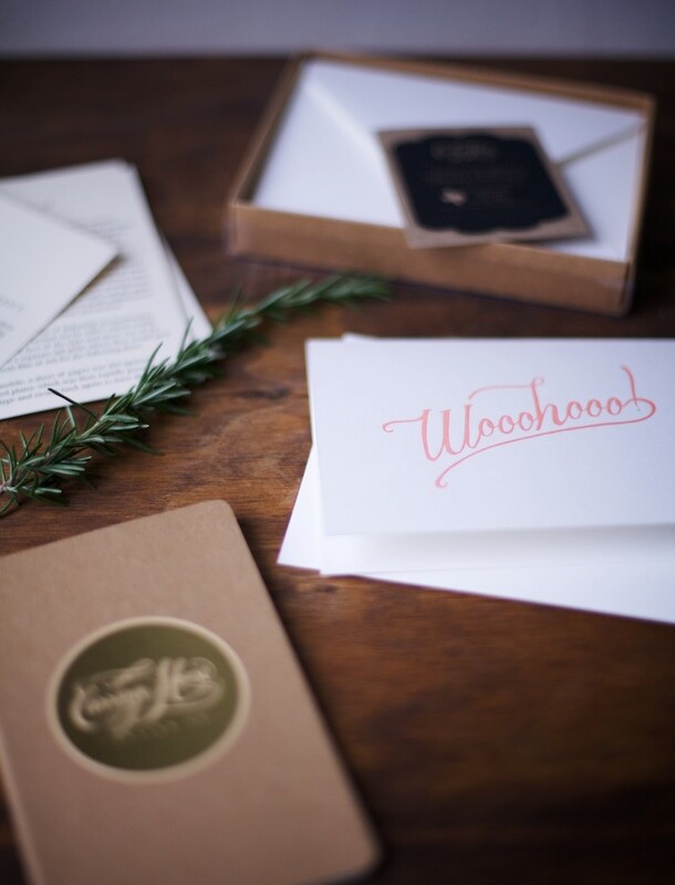
Clare gifted us each with a sweet favor box which included a handy letterpress handout, a small moleskin notebook, and envelopes to package the cards we’d be making.

From Clare…
“As a graphic designer, I was always intrigued by letterpress as a means of being part of the design process all the way through.”
After spending time to find her own voice as a designer, Clare discovered that her style was minimal, simple, and all about the message.

Bubbly helped get our creative juices flowing…

We chatted about the role of paper transitioning from trash to a luxury. Where it was once disposable and mundane, paper is now a medium for writing and sharing your most important and sentimental messages. And if that stationery is custom designed and hand made, it’s all the more valuable.

Clare designs the message that will be pressed onto paper, and orders the design to be made into a photopolymer plate. Setting the plates into the machine is the most time intensive step of the process, as their alignment has to be completely exact. But Clare loves that she has to work with her hands to achieve perfection, rather than clicking a button.

Decisions, decisions. Mixing ink is an intricate process. Pantones give instructive ratios — the light peach color we chose for our design called for 25% red and 75% white.

Typically, this is where you’d add more of a color to achieve the exact shade you want, but Clare nailed it on the first test roll! A perfect color match.

It takes very little ink to run the press. The key when applying the ink onto the plate is to spread it out. Globs on the plate means globs on paper.
Clare adjusts the speed on the motor, and the ink spreads to a point where it’s barely visible.

Meet Lucy, Clare’s 1934 Chandler & Price 12×18 press. The 12×18 dimensions indicate the size of the metal frame, and the maximum size document that can be printed on the machine.
Clare purchased Lucy (2,000 pounds of pure iron) in November 2012 from a man in Oklahoma. She spent three days learning the ins-and-outs of the machine from him, then brought it back home with her.

Clare’s press requires the press operator to feed paper one sheet at a time by hand, while the motor is running. We each took turns creating our own batch of cards, and though it was quite scary at first (think quickly sticking your hand into an alligators mouth), we eventually got our technique down!

Carriage House Design prints on all Crane Lettra cotton rag papers and typically thicker cotton stock.
“The classic feel and finish of letterpress papers takes printing back to an era of quality and craftsmanship that is not often found in most modern printing methods. Even the smell of the ink, more apparent on a letterpress-printed page, often is what people love about the handmade quality of letterpress.”

Isn’t it gorgeous? Special thanks to Carriage House Design for having us over and gifting us with beautiful stationery, and Kate LeSueur for capturing it all so perfectly, as always!