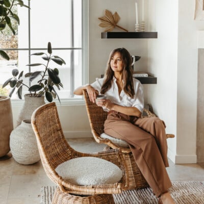

When I decided to make over an accent wall in my downtown loft, I learned quickly that choosing the right paint color can truly make a space. Getting to the finished product wasn’t easy though; it took hours of staring at swatches of neutral paints, asking for opinions, and changing my mind repeatedly before I settled on a shade of gray I was sure about. At the time, I wished I’d had a professional on-hand to guide me. Surely there had to be a science to choosing paint color?!
I realize now that I should have called on Paloma Contreras. With a knack for using neutral paint colors that aren’t white (thank goodness!), the Houston-based interior designer and blogger creates some of the most beautiful interior spaces. For those of you looking to update your home with a color that’s both subtle yet unexpected, Paloma joins us today to share the very best gray and brown paints, plus how to pull them off. Take it away, Paloma!
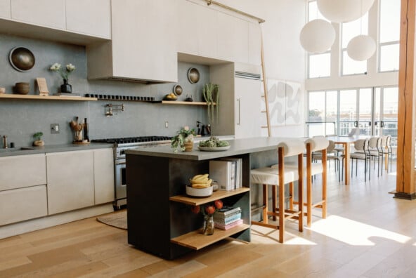
 photo by Lesley Unruh
Get This Look
Paint: Benjamin Moore Plymouth Rock
Finish: Flat
How to make it work: Grey paint colors can be tricky. Oftentimes, the undertones can read too blue, too pink, or even too purple, which is why it is so important to test out a few paint color options on your walls prior to committing to a winner. Paint swatches on a wall in the space, observe it as the light changes throughout the day, and you’ll be able to edit down your choices fairly quickly. This particular hue has a hint of pink in it and is a warmer shade of gray, which makes it both soothing and very flattering.
 photo by Lesley Unruh
Get This Look
Paint: Behr Aging Barrel
Finish: Flat
How to make it work: This is my favorite shade of brown. I love it so much that I used it in a couple of rooms in my old house, including my breakfast room, pictured here. It is the perfect, rich mocha hue. In spite of being a saturated, bold color, it truly acts as a neutral. I kept everything else in this space light for contrast against the chocolate walls.
 photo by Lesley Unruh
Get This Look
Paint: Behr Aging Barrel
Finish: Flat
How to make it work: If your space lacks architectural details such as millwork and moldings, a great way to create architectural interest is by using paint creatively. This rich, chocolate hue adds dimension to this space. The fact that we painted the walls and not the columns adds interest and contrast, while the art and mirrors pop against the dark paint.
 photo by Max Burkhalter
Get This Look
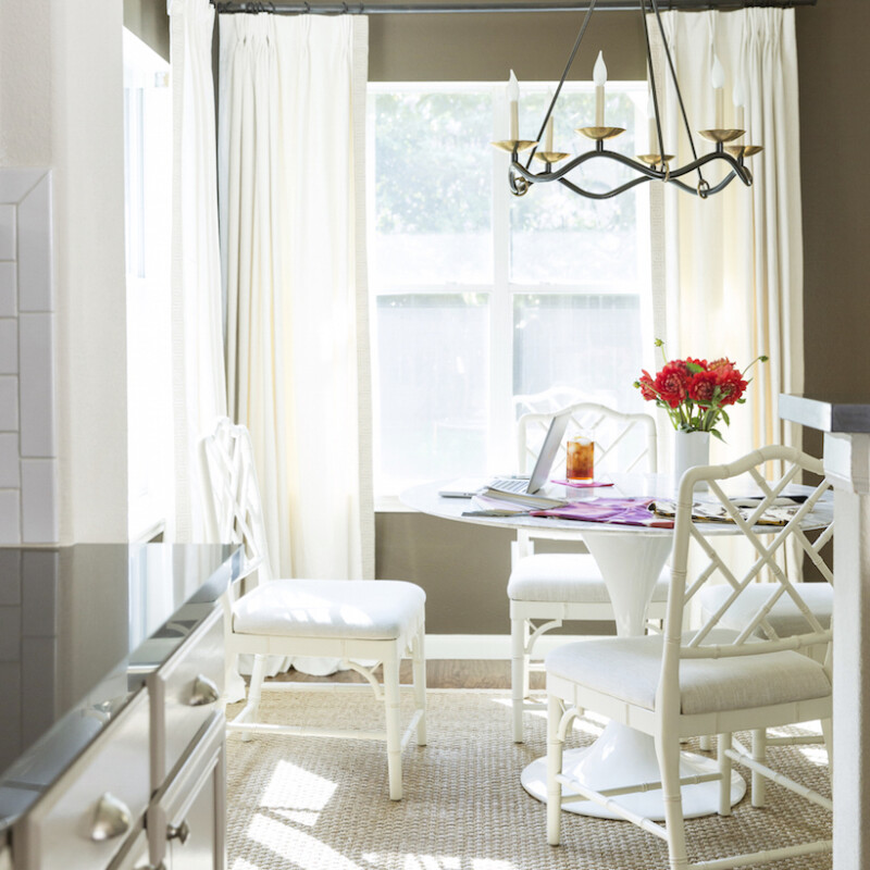
Paint: Benjamin Moore Revere Pewter
Finish: Flat
How to make it work: As I mentioned before, greys are just as tricky as finding the right shade of white. Benjamin Moore’s Revere Pewter is my go- to shade of grey, because it works nearly everywhere and with just about everything! It is so versatile and has the perfect amount of warmth. I’ve used it in both traditional and modern interiors and each time, it has looked fantastic. If you’re looking for a great neutral color, this is it!
 photo by Max Burkhalter
Get This Look
Paint: Benjamin Moore Revere Pewter
Finish: Flat
How to make it work: Selecting a shade of gray with a hint of warmth is important because it gives the space a bit more dimension and doesn’t read quite as flat. In addition, everything looks better with a hint of warmth. For instance, you’d probably agree that standing in a room lit by warm, incandescent bulbs is much more flattering than being in a space that is illuminated by super white LED bulbs. The same goes for grey paint colors– cool shades of gray with blue undertones are not flattering on anyone! Ultimately, you want the room itself to look great, and if you and your guests can look good in it as well, then all the better!
 photo by Brittany Ambridge
Get This Look
Paint: Custom Silk Wallpaper with Hand-Painted White Gold and Aluminum Accents by deGournay; Pratt & Lambert Designer White on Baseboards and Millwork
Finish: High Gloss
How to make it work: The ground, or base color in this custom silk wallpaper is a warm, neutral taupe. I find that colors in this realm are very versatile and serve as a great foundation for many color palettes. I like for the moldings and millwork in a space to provide a nice amount of contrast, so in this case, we painted all of the woodwork, including the baseboards in this room a crisp, high gloss white for a classic look.