

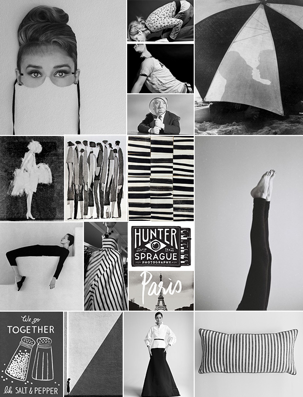

When we hear the word “neutral” most of us tend to think about solid colors — usually white or some variation of beige. Jenn here, happy to share with you my latest discovery: most black and white prints can serve as neutrals, too! Lately I’ve been pairing my favorite black and white striped tee with everything from bright red flats to a pleated mustard skirt. And there’s something about those softer shades of black and white that really just seem right to me for October. Like the colors of an old newspaper, or maybe even an Alfred Hitchock creation, faded salt and pepper hues are both classic and modern at once. Lately I’m craving a set of these black Ted Muehling candlesticks with slender white taper candles for my dining room table. And I’ve even been thinking about a zebra rug for my bedroom! Do you use black and white prints in your home decor? Let us know in the comments!
{row 1: found via amanda jane jones pinterest board, via bleubird vintage, found via gahetNA National Archives}{row 2: alfred hitchcock photographed by otto ludwig bettman}{row 3: aurore de la morinerie, tetsuo aoki, ellsworth kelly, found via henrik.lou} {row 4: source unknown, oscar de la renta, simon walker} {row 5: eiffel tower, source unknown} {row 6: rifle paper company, fan ho via modernbook gallery, carolina herrera via neiman marcus, heidi merrick}