
I’ve always loved the look of a dark interior (I have an entire Pinterest board dedicated to spaces and images that evoke that moody, intimate feeling), but when we moved into our loft two and a half years ago, I did what everyone does: painted every square inch white. At the time, it was an obvious step up from the glossy dark taupe that coated the walls from the previous tenant, but was it creative? Not so much.
Our apartment is completely open (think of your classic studio floorplan) with one curved wall that goes down the center and wraps around the corner to create our “bedroom” space. That wall also serves as our little home office, and I’ve always wanted to carve out that space somehow and make it feel like a room of its own. I thought it could be really fun to apply some kind of wallpaper or dark paint color to it, but when it came down to pulling the trigger, I chickened out every time… except for this time. When Pratt & Lambert invited someone from our team to put their paints to the test, I stepped up the the plate, and the finished product is more gorgeous than I could have ever imagined. Scroll down for the miraculous before-and-after…
*before photos by Laura Alexandra, after photos by Molly Winters

Ah yes, the “before” photo…
Our two-tone striped wood desk is a family heirloom, and though we love how unusual it is, it’s always presented a major design challenge. I think my big mistake was always assuming that “if you just pair it with a lot of white, it’ll look fine,” instead of really thinking about what would complement the piece.

Before we got our iMac, the grid of four framed photos above the desk made sense. But when we got the computer, it blocked half of the artwork, making the entire setup imbalanced. I knew it didn’t look right, but never got around to fixing it.

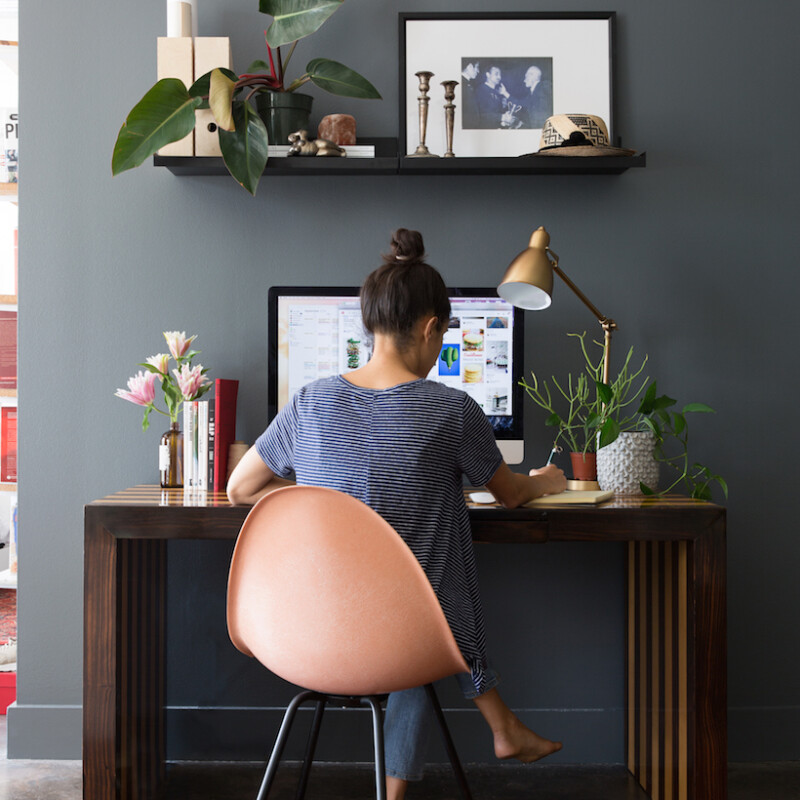
Behold, the “after!”
There are so many things about this new design that make the space work, but I think the real-game changer is this paint color — Stone’s Throw 28-18 by Pratt & Lambert.
I’d originally chosen a true black for this wall, but I’m so glad I made the last minute switch to this gorgeous dark gray shade. I love to observe the color changing throughout the day, and painting the baseboard helped keep the wall looking modern and clean.

I used Pratt & Lambert’s Accolade Interior Premium Paint & Primer. The paint went on so easily with only one coat and provided a luxurious finish that really adds to the space.

The rest of the walls in our studio-style space are still white. Having this wall a darker color instantly created an area that felt truly like a room of its own — something I hadn’t managed to achieve before, no matter how many different furniture arrangements I tried.

This Industrial Task Table Lamp in antique brass ended up being a much better fit than the polished nickel floor lamp we had before.

These floating shelves frame the space out perfectly, and now I can always swap out artwork and decor whenever I’m feeling bored of an existing arrangement.

I was also able to move our magazine holders up onto the floating shelves, which freed up desk space for pretty books and fresh flowers.

Some favorite plants and travel souvenirs on display.

And my favorite detail of all: this mid-century modern peach-colored chair. I scored it at the City Wide Garage Sale in Austin a month ago for only $50, and it serves as the perfect pop of color to tie the whole design together.