How do you feel when you’re handed a blank canvas? Does it light your creative soul on fire or does it evoke a knot-like feeling of dread in the pit of your stomach? I feel both equally—but here’s why I’ve learned to embrace them. I first dipped my toes into the design world with great trepidation and self-sabotaging thoughts. I’m not a designer; who do I think I am? However, after years as a design editor and decorating my own apartment twice (see my first attempt), I’ve amassed plenty of small apartment decorating ideas along the way.
I’ve honed my eye and developed confidence around what I like—and just as importantly, what I don’t. I’m very instinctive now. I know immediately whether something will work in a space or not. This self-assuredness in my design decisions didn’t happen overnight. I’m still—and always—learning. Today, I’m sharing some of the tips and small apartment decorating ideas I learned through my most recent makeover to help you in yours.
Photography by Jenna Peffley for Bedthreads.
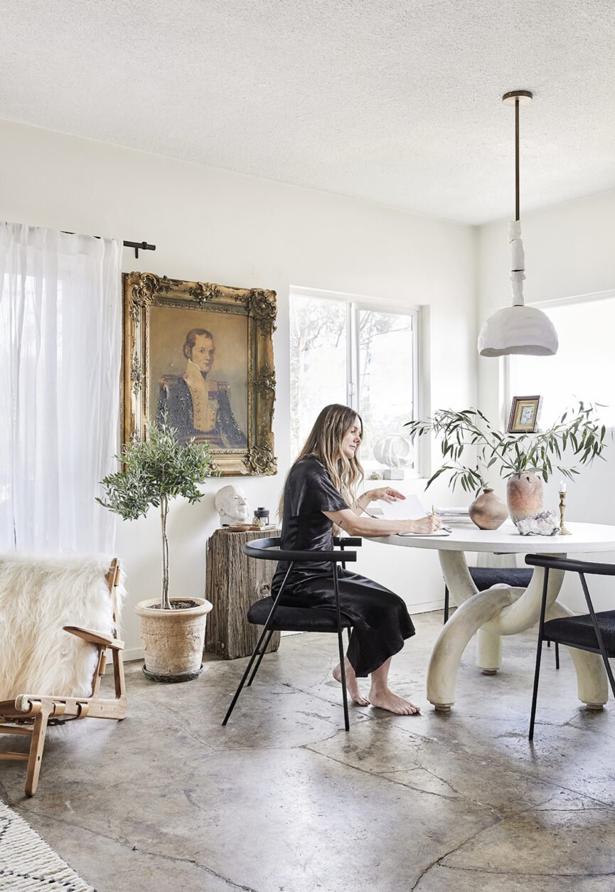
7 Small Apartment Decorating Ideas to Transform Your Space
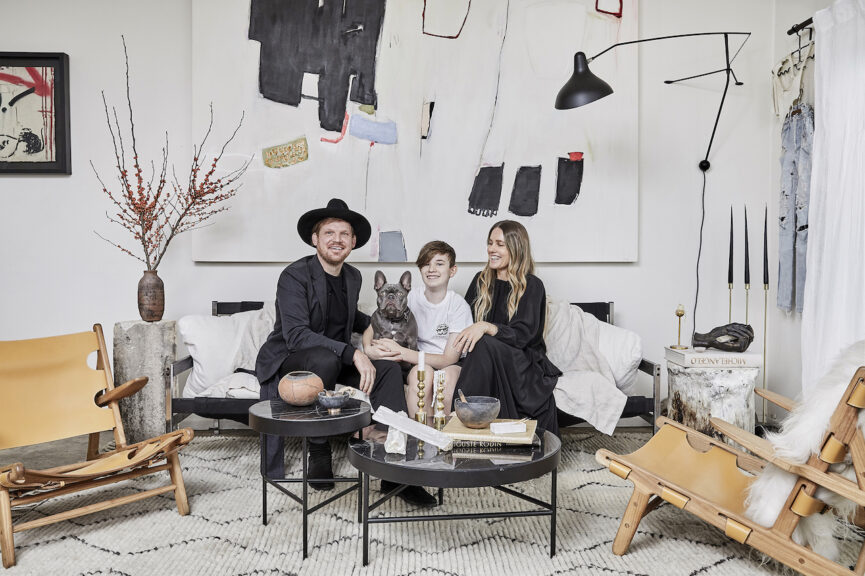
First of all, let me give you a quick background. Our little family—my husband, Troy, son, Neon, Frenchie, Cosmo, and I—relocated from Australia to the hip Silver Lake neighborhood of Los Angeles around six years ago. We’ve been in this apartment ever since. As soon as we laid eyes on the modern rental we knew it was meant to be.
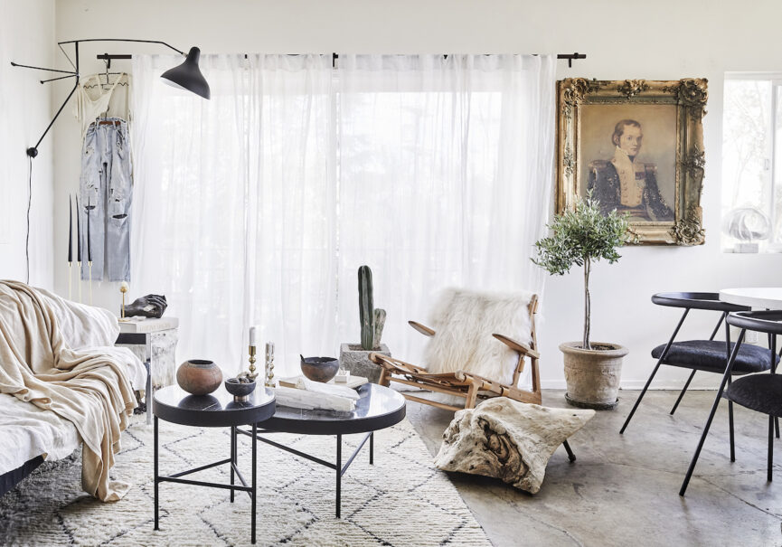
It was the perfect stage to flex my budding designer skills—white walls, concrete floors, and loads of natural light. The living/dining area amalgamates into one open-plan space with the kitchen measuring up to about 350 square feet. The small space presented a challenge, but I love to work within constraints. It pushes you to think outside the box!
Keep reading to learn more about the design process along with some small apartment decorating ideas to help you create the home of your dreams.
Set a Budget
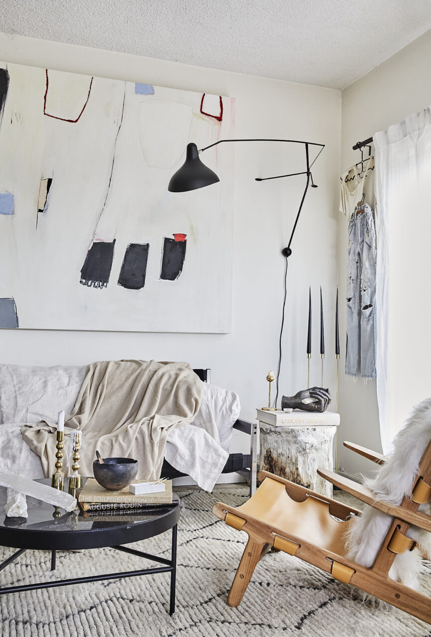
First things first, we had to set a budget. Of course, this is never the fun part of any project. However, outlining the maximum dollar amount you’re willing to spend decorating the space is critical. Thankfully, we already had most of the foundational pieces from our first makeover—dining table and chairs, sofa, rug, accent chairs, coffee tables—so this time we searched for decorative objects, artwork, vintage vessels and vases, and sculptures that would add warmth, depth, and texture while also tapping into that European old-world style we were hoping to achieve.
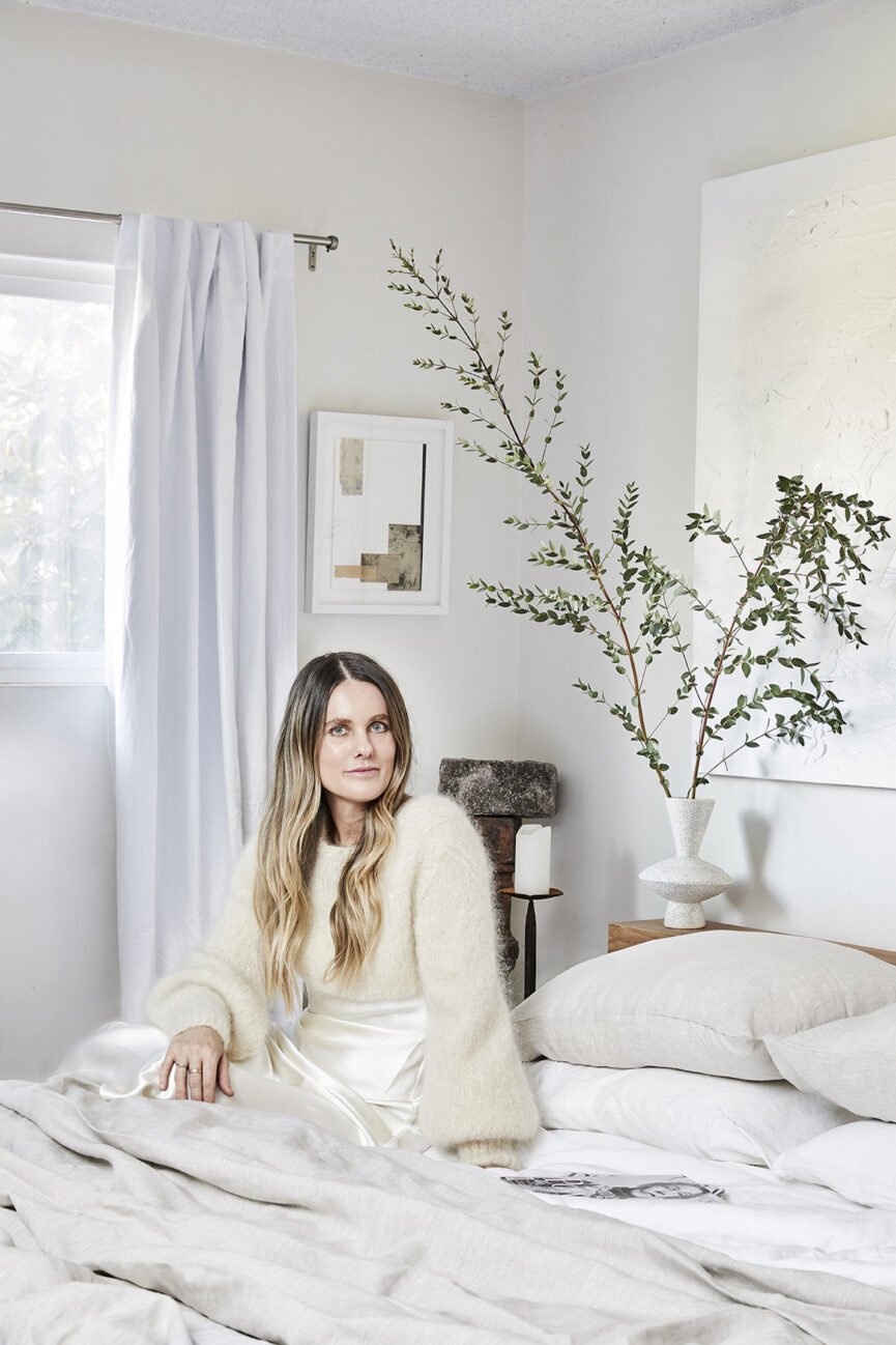
Our biggest budget allocation went to our master bedroom. This space had been left untouched since we moved in and was in desperate need of an overhaul. We knew we wanted a custom bed with luxury linen sheets (thanks, Bed Threads) and eventually decided on a custom bookshelf after not being able to find one we liked.
The custom items ended up pushing us way over our budget, but we knew these investment pieces would last forever. So while the initial outlay stings, its value will continue to increase over time.
Create a Design Dialogue
One of the many lessons I’ve learned from the incredible Athena Calderone of EyeSwoon is to create a design dialogue within your home. You want each piece to have a voice so that when they’re all styled together, they sing. (Or, at the very least, hold an interesting conversation.) As an editor, I’m in the business of making stories come to life. Storytelling is at the heart of everything I do—whether it’s in the literal sense of putting words down on a page or it’s in the physical realm telling stories through design. So, it makes sense that I would want every piece in this space to weave a narrative about our lives and who we are as people, and as a family right now.
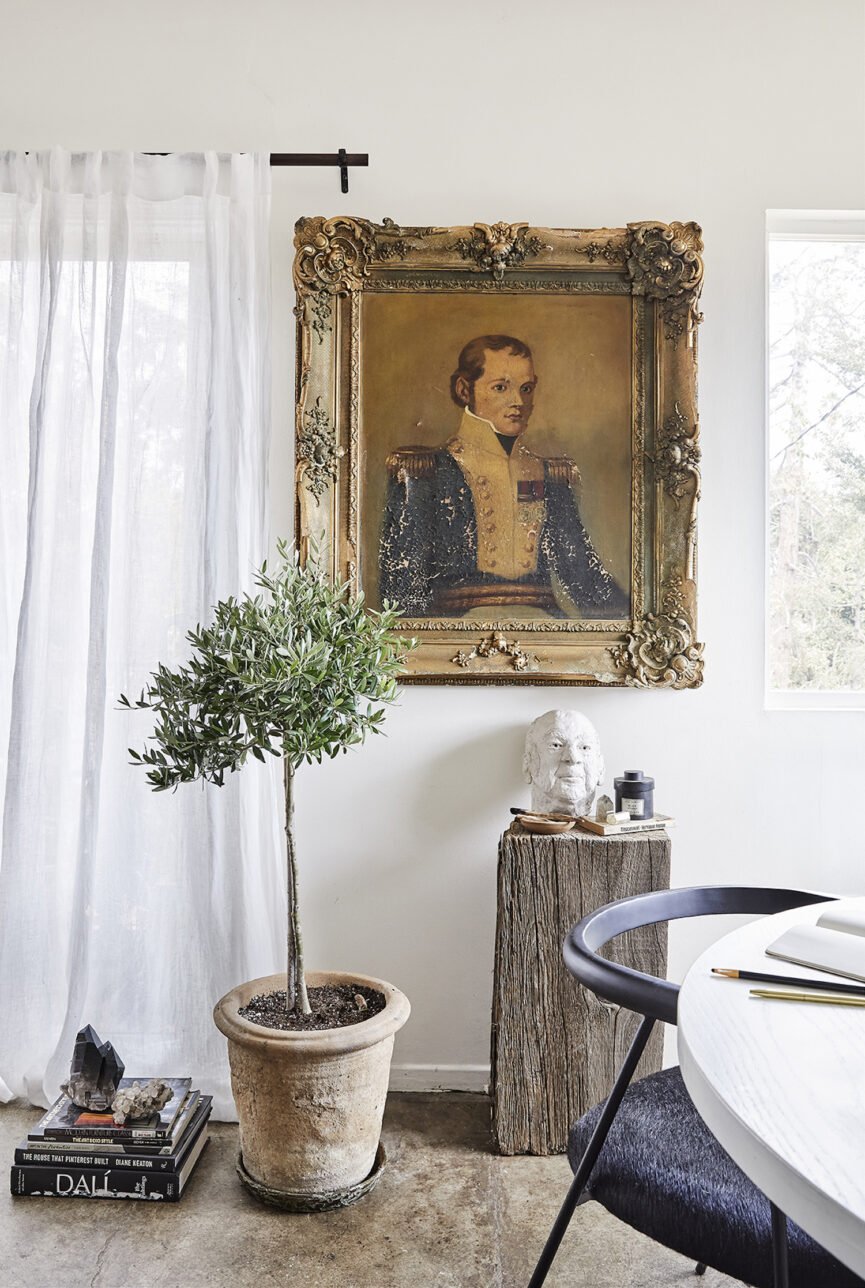
On one of our many sourcing trips, we stumbled upon an antique store that was crammed with trinkets (both good and bad). My husband and I were immediately drawn to this incredible painting. It had flaking paint from age, a tiny hole, and the gilded ornate frame had seen better days with cracks and chips. But we both took one look at it and agreed that it had to come home with us. When we hung it in the dining room it changed everything about the space. It was truly transformative. I felt like it was the missing piece that tied all of the others together. The room was singing!
Make It Personal
As I mentioned earlier, my husband and I are travelers at heart. After meeting in the romantic city of Nice and later falling in love in Venice, we wanted to bring that European sentiment to the space. My husband is also really big on bringing in pieces that have meaning or add context to the space based on travel or emotional connections. They have to have a reason for being there and marry with the existing décor.
You want to design a space that feels instinctively you so that when someone walks into the room, they immediately get a sense of who you are, what you love, and what you stand for. Of course, when you love as many styles, eras, and designers as I do, narrowing down and editing your space can be challenging. I like to create mood boards on Pinterest along with saved folders on Instagram and collect as many images as possible. This helped me get clear on my direction because I could see patterns emerge around textures, tones, eras, and moods.
Scour Resale Sites
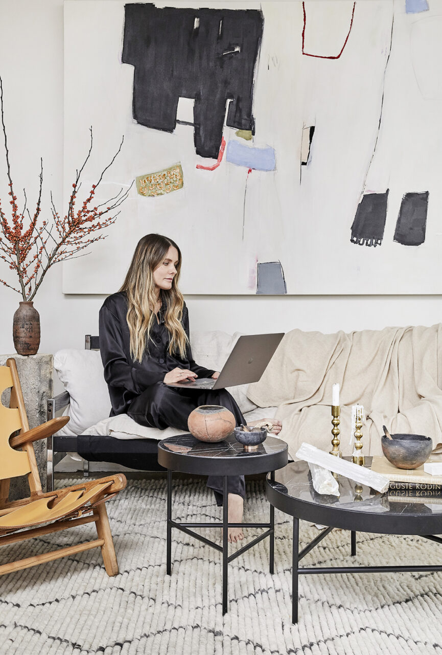
A big part of making it personal is finding pieces that tell your story. That’s why I love vintage so much. From furniture to décor and even clothing, I love nothing more than diving down the rabbit hole of resale sites to find those one-of-a-kind pieces. In fact, Facebook Marketplace has become one of my favorite places to search for unique finds. You have to be willing to dig around and use multiple keyword variations to find the treasure.
After reading Athena Calderone’s tips on keywords, I have developed a mild obsession with sourcing clay, pottery, and terracotta vessels. The vintage vases on our table and beside our sofa are a $25 score from eBay. There’s nothing like the thrill of finding that perfect piece for a bargain.
Consider Custom
Since we’re renting, I couldn’t make any major changes, although I’d love nothing more than to gut the kitchen and bathrooms. Instead, we focused on the decorative aspects and collaborated with local makers to create personal and unique touches. This timber bed it became the inspiration behind the design of our master bedroom. We commissioned our friend Omar to make a beautiful birch timber bedroom suite, including a bed frame and bookshelf. It was an investment, but we’re so happy we did

Take It Slow
Good design takes time. Resist the urge to rush, create your mood board, sit with the images and pieces you’ve collected, and consider what moves you emotionally. This is especially crucial before making big investments. Every day we are bombarded with inspirational images on social media that can overwhelm our senses and cause confusion around what you love. Ask yourself a few questions beforehand:
- Will I still love this in five or 10 years?
- Does this beautiful piece serve my practical needs?
- Am I drawn to this because it’s trendy, or does it resonate with my innate design sense?
When you get clear on these things, you can move forward with confidence and create a space that is truly your own.
Take Risks
Don’t be afraid to dive into the unknown and explore the unfamiliar. It’s in those moments, when you feel uncomfortable, that you are pushed to explore something new. It’s not always easy but inevitably you’ll tap into the magic and stumble upon something unexpected. I love those moments—that creative chasm is where everything happens. A well-designed room should have effortless ease and comfortability with a hint of tension and juxtaposition to keep things interesting. But above all, have fun!

Love your home so much, Sacha! Just gorgeous. Every bit of it.
Ahhh thank you so much Anne! You’re truly a delight. Xx
Loved it! Such a b’full house!
Thanks
Appellointerior
https://appellointeriors.com/