When utility and beauty intersect, there’s bliss. A chair that ergonomically supports and aesthetically pleases. A plant that clears the air and lends a verdant note. Or in the case of this beautiful and functional kitchen, a room that rises to meet your needs while wrapping you in elegance.
Designer Meredith Lamme considered every corner when conceptualizing this kitchen, which she describes as “the heart of the home” that she shares with her husband, Edward, their five teenage children, and their dog. The room sees all the action: Kids running in and out. Dinners for friends. Early breakfasts at the counter. It’s multi-purpose in every sense. As Lamme says, the goal was for the space “to be durable, functional, comfortable—but also beautiful.”
And that is the operative word: beauty. Lamme, who is the design consultant for Tribe Design Group, the Austin-based design firm she co-founded with Brooke Wilbratte, employed materials and features, from hearty concrete and brass to open shelving, that exudes grace while working overtime to serve.
After poring over every crevice of this kitchen, we caught up with Lamme to ask about the smartest design decisions she and Wilbratte made that resulted in this stunning and smart kitchen.
Keep reading to discover this beautiful and functional kitchen—a true minimalist’s dream.
Let’s start with the function and flow of your kitchen. How did you create such ease?
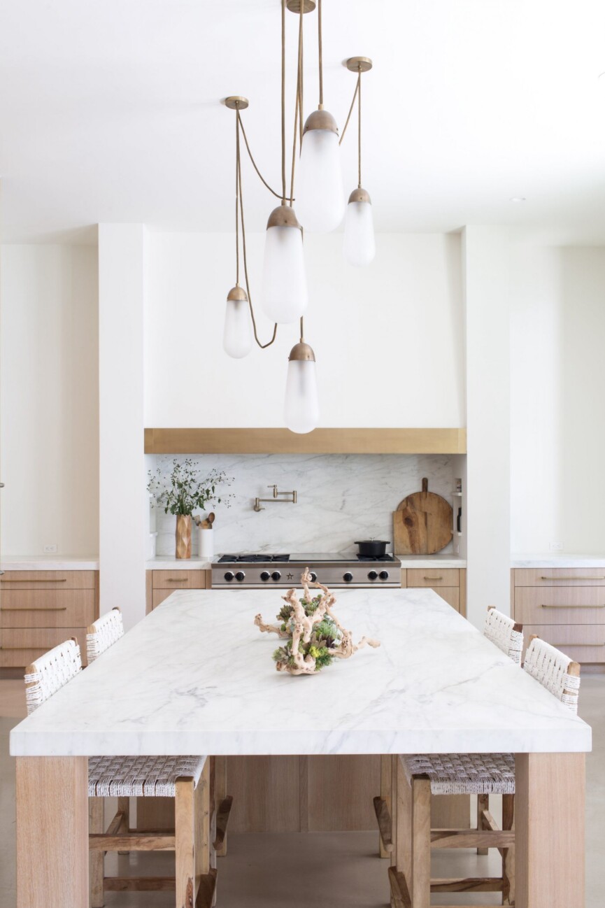
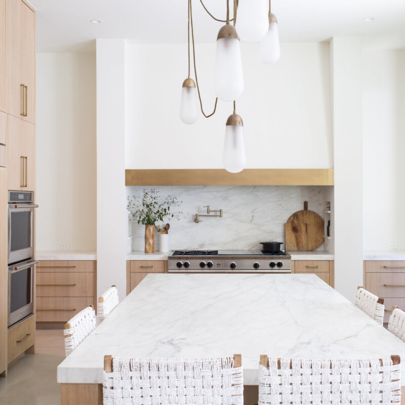
We wanted a giant island to seat our entire family or a group of kids when they are here. We knew we wanted a large island as the center of the kitchen, so we designed the island first and worked the rest of the kitchen around it. But functionality is extremely important. We added the refrigerator, ovens, range, and sink all in convenient locations from one another.
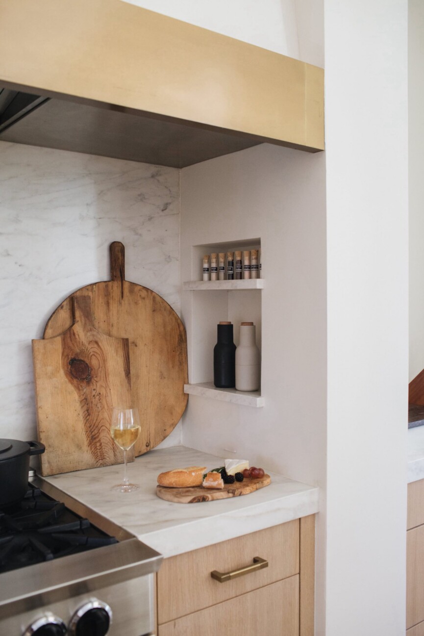
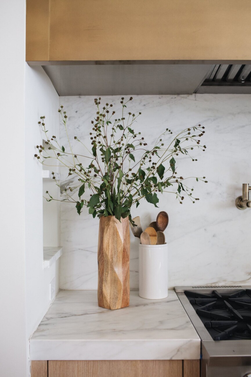
Various design elements, such as the built-in cubbies, make this kitchen functional and smart. Walk us through those, as well as the hardworking materials you included.
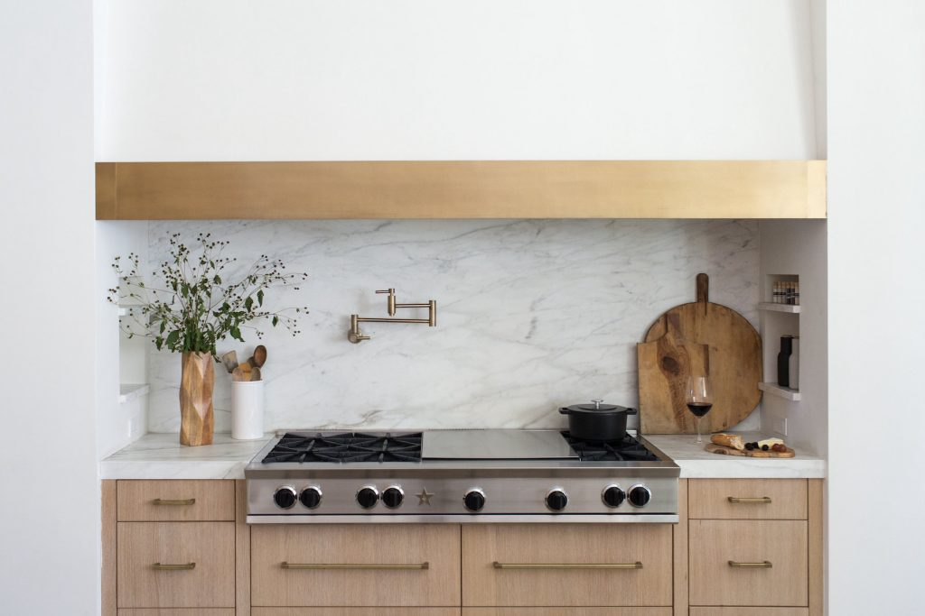
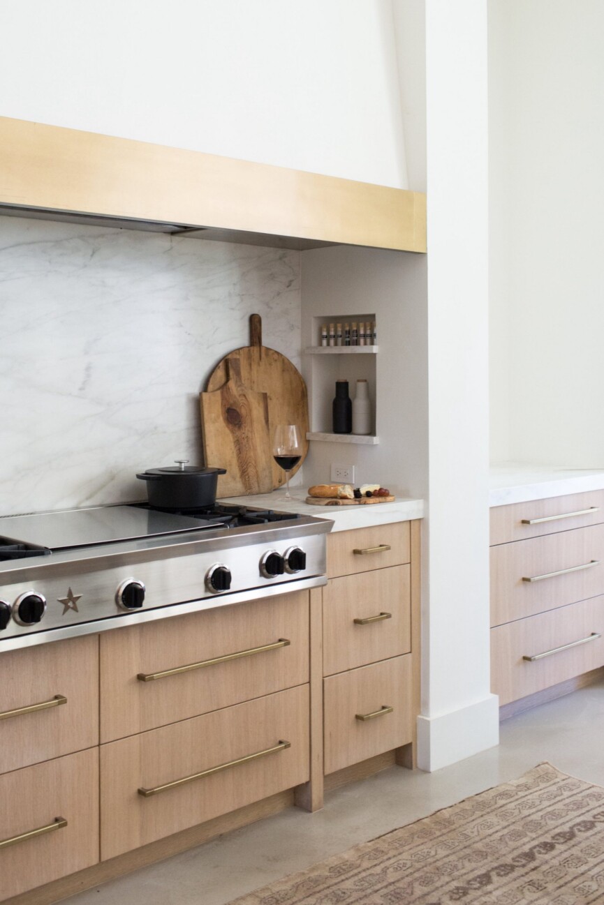
My husband loves to cook. When cooking on the stovetop we designed cubbies on either side so we could keep our favorite oils, spices, and condiments handy. We installed the pot filler for functionality so we wouldn’t have to carry around our big pot across the kitchen to the sink.
As for the materials, the cabinets are white oak. I love an honest material like white oak. The cut makes a difference. These are all rift-sewn with a vertical grain. It makes the cabinet feel modern and not rustic, while still giving you that organic feel. The stain is also important because a white oak can turn yellow quickly.
The floors are concrete. Our family lives hard in our home and I wanted to use a material for the floor that would be super durable. Spills are easy to clean up, and the kids can come in and out of the pool dripping wet without any worries. Our dog can track in mud, and we don’t sweat it.
The countertops are Calacatta marble. A lot of people can’t deal with marble in a kitchen, but I love the way it ages. We just decided to live and cook freely in it and let the stress of the etching go. I’m the girl who can spend hours at the slab showroom. I’m obsessed with all different types of gorgeous slabs that Mother Nature creates. It feels authentic to have a natural slab in my home.
The fixtures and lighting are burnished brass. While our business is moving away from burnished brass and toward gunmetal finishes, I still love burnished or unlacquered brass. An unlacquered brass ages over time and brings a space extra character.
How did you approach the lighting? Any kitchen lighting tips to share?
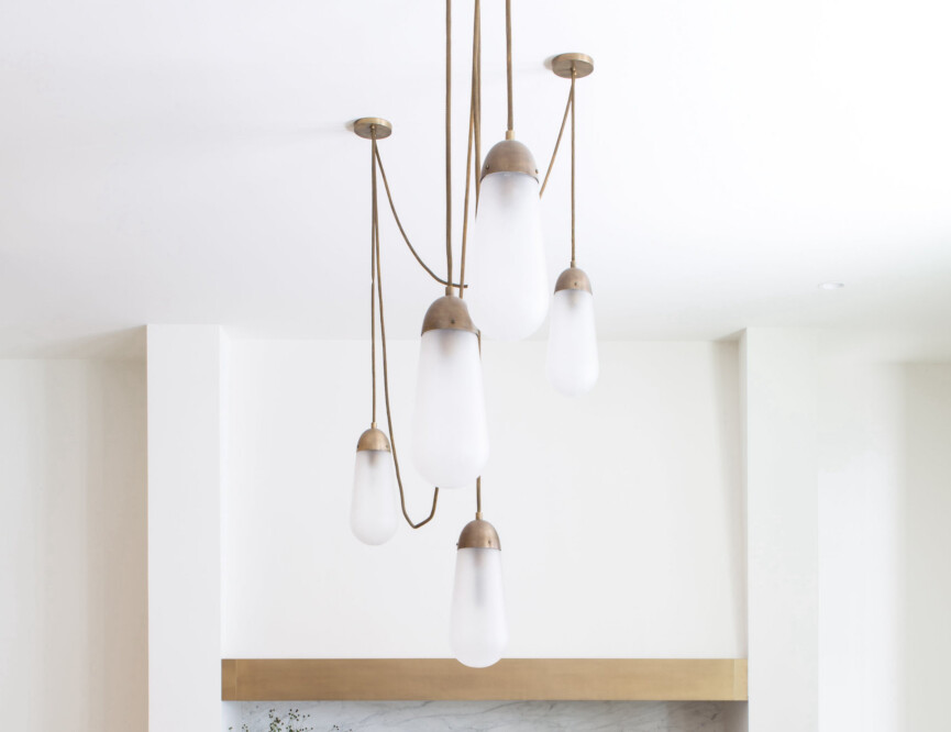
Our ceilings are twelve feet high and the island is twelve feet long, so the typical two to three pendants above an island wasn’t the right choice. We designed a custom light fixture with Apparatus Studio so it would fit the island, take up that vast space and give the kitchen a wow factor.
Lighting should be the crown jewel of the kitchen. Don’t be afraid to go big and bold.
Keep the rest of the kitchen clean and minimal, but go bold on your lighting. Have some fun with it. It’s the one room of the house that gets the most use by your family and friends.
What role does color play in this room?
We live a very active lifestyle. Our family is constantly on the go, so when we come home we don’t like to be overstimulated with a bunch of colors or patterns. At heart, I’m a pretty simple person and I feel like the neutral palette reflects who I am. We used Benjamin Moore Swiss Coffee—a go-to color.
Kitchens can be ground zero for clutter, but yours has a streamlined, minimalistic look. What’s the secret?
We aren’t fans of upper cabinets. If you can, remove the upper cabinets and put in open shelving. If you can’t stand to live without your uppers, make sure they go all the way to the top of the ceiling. We prefer smart storage to conceal as much as possible. In our kitchen, we used floor-to-ceiling cabinet doors with pull-out shelves to conceal blenders, toasters, juicers, and other everyday items already plugged in and ready to use.
For easy access, we store plates and utensils in the island drawers close to the refrigerator. We added an adjacent pantry and a storage wall to make up for lost storage space. We keep entertaining essentials like platters, utensils, tablecloths, and glassware in the butler’s pantry. The butler’s pantry off the kitchen is one of my favorite spots in the house. We use it as a place to prep for parties.
What do you love most about your kitchen?
My favorite thing about our kitchen is the amount of time I spend in there connecting with my family and friends. From doing homework on the island to hosting parties, or nightly dinners, we truly live in this space. It’s not necessarily the things in the kitchen that I’m attached to but the memories the kitchen affords me to make. It is the heart of our home, and I’m grateful for all of the meals, wine, and conversations that happen here.

Stunning! May I ask what stain you used for the white oak? We are considering using white oak as well for our kitchen cabinets but are indecisive about the stain. Appreciate if you can share.
I love your kitchen. Can you please tell me more about the side that includes the oven and where is the refrigerator? Thanks
.
We started with an excellent view of our backyard. Nice big windows and good airflow that helps keep the kitchen cool. A four burner gas stovetop is exactly what we need in a small kitchen. Finally, self-closing drawers for cutlery is very handy.
This sounds so dreamy! Taking notes—thanks for sharing.
Your articles are so very Inspiring and Creative. Thank you.