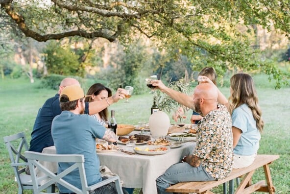

Happy June, friends! It feels like the sneaky transition from spring to summer happened in the blink of an eye this year. It disguised itself as a solid month-and-a-half of nonstop rain here in Texas, leaving many of us to wonder if summer would ever arrive at all. Well this week it finally has, and thanks to those storms it’s a greener and more floral one than I can ever remember. It truly feels like the first few days of spring all over again.
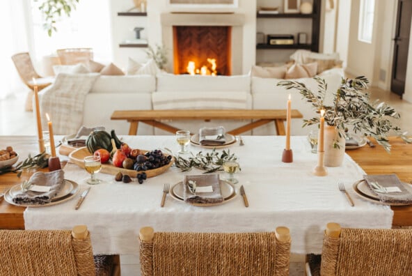
We couldn’t think of a better way to pay tribute to the seasons than with this jaw-dropping table from Lauren Field Design. Inspired by the earthy textures and tones found in nature, Lauren’s table evokes a sense of warm weather adventure: old-world charm with modern details, warm vibes with cool colors. Click through the serene photos by Moondance Photography for all the stunning details…

What inspired this gorgeous table design?
This table is about emulating the fresh romantic spirit of something anew that brings a sense of hope and adventure. We wanted to capture the energizing and serene nature of the atmosphere of spring and summer. The remarkable magic it awakens across the land, sea, and sky is celebrated around the world.
*sources: table from Anew Nature Furniture

Do you have any helpful tips to keep in mind when mixing and matching chairs?
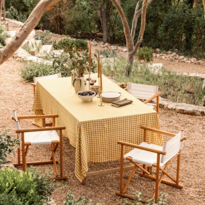
When mixing and matching dining chairs, look for different silhouettes, different materials, or styles from different eras. The most important thing is the balance of soft/hard and dark/light in both material and construction aspects. If you choose patterned chairs, keep it fun but keep it simple .

I love that this centerpiece can be used as decor long after the dinner party is over. Can you tell us a little more about it?
We chose to craft a ship for the centerpiece en lieu of traditional flowers because it reminded us of that crisp “wind-in-your-face” feeling. The structure is vintage, with the sails and mast made by us.

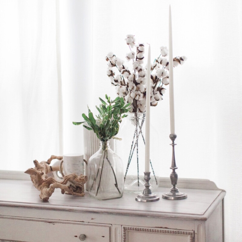
… And how about all that unexpected greenery?
We wanted the foliage to be sculptural and whimsical, yet simple, so we chose dried cotton stalks, variegated boxwood, and real dried moss. The neutral/monochrome palette of the plants allowed the more moody elements to stand out.
*sources: buffet from Anew Nature Furniture; long taper candles from Creative Candles

Do you have any tips for working with moss?
We love the way moss represents new growth, and how it feels so airy and ephemeral to “pillow” it on the table. Also, because moss comes in so many colors and textures it is easy to incorporate into decor year round. Styling moss can be tricky because it can get very messy really quickly, so we recommend stretching/piecing the moss on a large covered surface before use. Mixing mossy textures makes a great soft backdrop to layer other decor (large or small), so put some on, put some under, or have some peeking out!

*sources: Textured Pure Ceramic Vase from West Elm, and Pantone Glasses from Table & Dine

Inspired by the forest and the ocean, we decided on a natural color palette full of texture, mixed with subtle cool hues. We used navigation-inspired napkins, black accents, and moss to enhance the handmade table.
*sources: tumblers with horses from Crate & Barrel; mint green charger plates from CB2

Our dear friend, Dani Jackson made us a special yet simple vintage cake, which was adorned with sprigs of boxwood.
*sources: cabinet from Anew Nature Furniture

We love how you incorporated the poem into your decor. Is this something you do often at your gatherings?
Yes. The written word always finds itself into our gatherings, whether it is for mere inspiration or actually physically integrated. We love using quotes and poetry to add personal touches in a range of scales, from place-cards to oversized welcome signs.
*hand Lettering from Design by Kadie

*source: marble plate from CB2

You did such an amazing job of combining different colors and textures. Any tips to keep in mind for someone trying to do the same?
When using a lot of color, it’s important to introduce the color in varying degrees of transparency/translucency. This helps bright colors mix well with neutrals and pastels without seeming garish.

The brightly colored macarons, petite fours, and signature choux puffs with strawberry meringue by La Patisserie Chouquette were remarkable. They added the perfect touch of whimsy and reminded us just how contagious childlike excitement can be.

We wanted this to be a relaxed gathering that included the children, and decided that giving them their own sweets table was the order of the day.

We adorned the girls in poplin dresses with a leisurely horse print, and the lovely Bridget of Flowers to the People crafted the tiny floral crowns to be soft and weightless with waxflower, gunni eucalyptus, and agonis.

“And the Spring arose on the garden fair,
Like the Spirit of Love felt everywhere;
And each flower and herb on Earth’s dark breast,
Rose from the dreams of its wintry rest.”