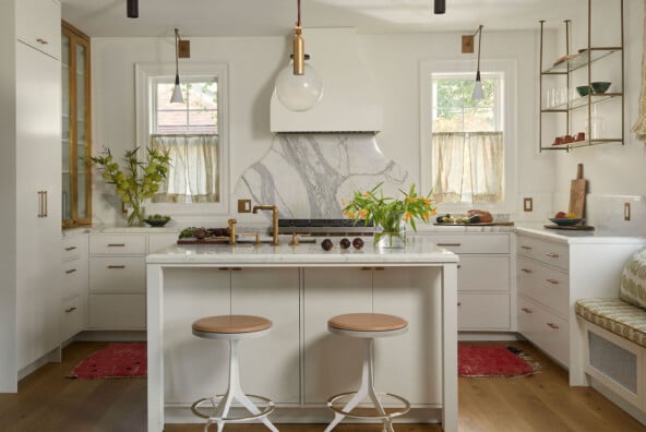
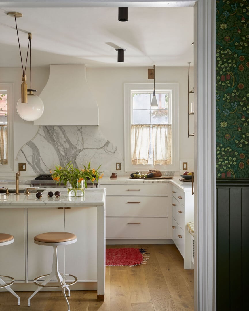
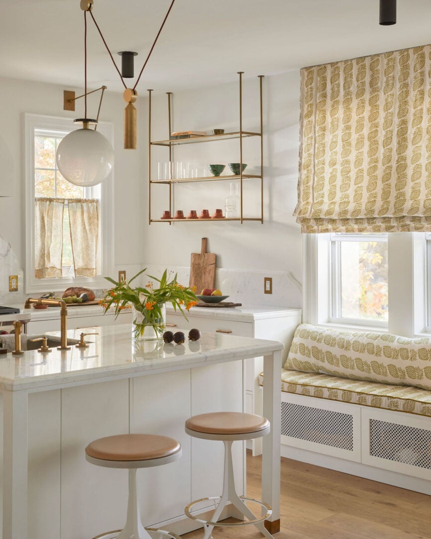
Designing a kitchen that feels open and spacious, yet functions seamlessly for daily life, requires a thoughtful balance of form and function. In this charming 1920s Arts and Crafts home near Toronto’s High Park, designer Sam Sacks achieved just that. The space is a harmonious blend of traditional and modern elements, with every detail thoughtfully considered to create a kitchen that feels both practical and undeniably pretty. From its airy étagerè shelving to its small but inviting island, the kitchen reflects an understanding of how to make the most of a smaller footprint without sacrificing elegance or utility.
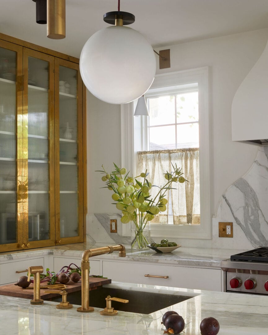
While storage was a priority for this family of four, Sacks opted for open shelving instead of closed cabinets, lending the space a lighter, more ethereal quality. The shelves double as a showcase for curated ceramics and everyday essentials, transforming practical storage into a design feature. Anchored by brass cabinets and a calacatta oro backsplash, the kitchen strikes a delicate balance between timeless craftsmanship and modern simplicity.

Sam Sacks on Creating an Open, Airy Kitchen
Beyond aesthetics, Sacks paid close attention to flow and functionality. A compact island prevents bottlenecks in a busy household while still providing space for connection—whether for a casual meal or a glass of wine with a friend. Clever solutions like a vented bench that covers a radiator offer extra seating while introducing another layer of pattern and charm. Every element is designed with intention, ensuring this kitchen not only looks beautiful but works beautifully, too.
Ready to bring this airy, open vibe into your own home? Ahead, Sacks shares her top tips for creating a kitchen that’s as practical as it is beautiful.
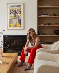
A former magazine editor and consummate storyteller, Sam’s work reflects a deep understanding of her client’s needs, paired with a fundamental knowledge of architectural history, and backed by wild inspiration. A mother of three, Sam gets kids, loves decorating for families and knows how to design around a hairy dog.
1. Embrace a Tone-on-Tone Palette
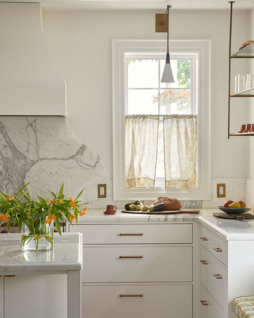
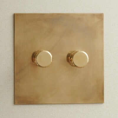
To create a cohesive and calming space, Sacks advises starting with a tone-on-tone color palette as your foundation. “Here, we used a soft white on the cabinets,” she explains, which creates an elegant backdrop that feels timeless and serene. From there, introduce subtle variations in texture and material to keep things interesting. Shimmering brass accents and grey-gold marble surfaces add a sense of depth and sophistication.
2. Add a Splash of Color
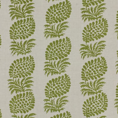
Once you’ve established a neutral base, bring the kitchen to life with a punch of color. In this design, Sacks introduced “verdant pattern on the window and bench,” a vibrant green print that energizes the space without overpowering it. This thoughtful touch adds personality and serves as a natural focal point in the room.

Watermark Designs
Ladies & Gentlemen for Roll & Hill
3. Balance Feminine Touches With Industrial Details
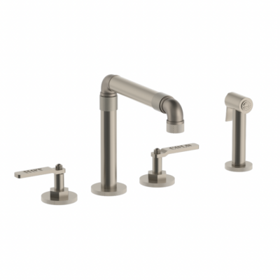
Sacks describes the overall aesthetic as “a nuanced femininity that’s balanced by the bold industrial plumbing fixtures and heavy brass cabinets.” The mix of soft, delicate elements—like the airy palette and curvaceous backsplash—with stronger, weightier features creates a kitchen that feels grounded yet fresh.
4. Let Function and Beauty Coexist
For a family of four, storage and functionality were non-negotiables, but Sacks found ways to combine practicality with beauty. Open étagerè shelving provides storage while maintaining a light, airy look, and the vented bench covering the radiator serves a dual purpose. “It allows for more seating as well as an opportunity to repeat the leafy vine pattern in the roman blind—a tried and true trick of decorating for creating impact in a small space.” By prioritizing smart, multipurpose solutions, Sacks proves that function doesn’t have to sacrifice style.


