 I’ve mentioned here a few times that we’re currently renovating a new space that will become our studio and office in a couple of weeks! There’s nothing more exciting than seeing it all come together — wood floors down, lighting installed and marble for the kitchen arriving this week. I’m so lucky to have been able to work on the project with Claire, our resident interior design expert, so instead of her usual Transformed DIY project this week, I asked her to stop by and share some of the strategies she employed when approaching the studio’s design. At the beginning of the process, we sat down and I shared two main goals I had for the space. (1) I wanted the dining room and kitchen to be light, airy and outfitted for spontaneous photo shoots and cooking demos, and (2) I wanted the team offices and meeting room to be open and encourage collaboration and creativity. Here’s how she approached them:
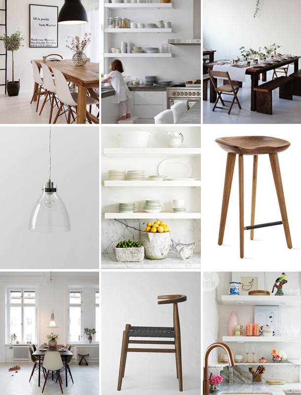
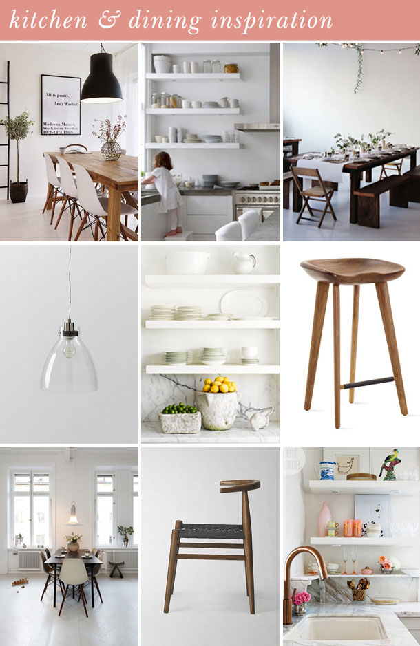
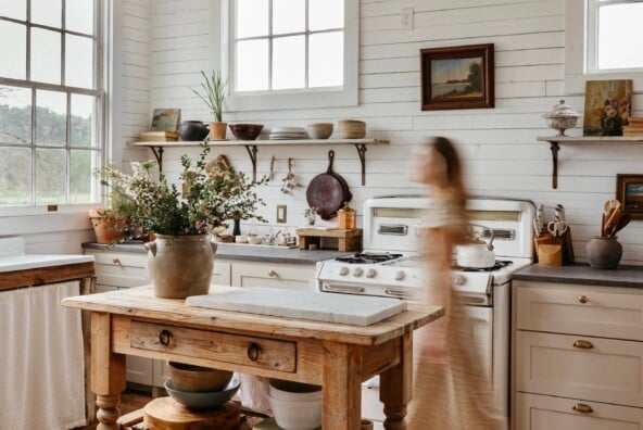
With the connected kitchen and dining space we wanted to create a beautiful backdrop for the frequent photoshoots that will happen here. We decided to keep the existing cabinets, but simplified them by painting them all-white. We also opened up the kitchen by knocking out the cabinets above the stove and adding open shelving behind the island. And to create the most airy vibe throughout, we’re removing the current tile backsplash and granite counter tops to replace with Carrara marble — it always creates such a bright, clean feel! The inspiration for the connecting dining room is similar. A farm table and bench provide the foundation for a flexible space that allows the team to create many different tabletop looks depending on what they’re shooting, and basic wooden chairs can be dressed up or down with any theme. We’re sticking with this simple glass pendant for an elegant but understated overhead light fixture.
image sources {row 1} image found via coco + kelly (original source unknown), open shelf image from colour block designs tumblr (original source unknown), dining table found via pinterest (original source unknown) {row 2} light fixture from west elm, open shelves by jeffrey alan marks, ford bar stool from industry west {row 3} interior space by joanna laven, john vogel chair from west elm, image via planete deco (original source unknown)
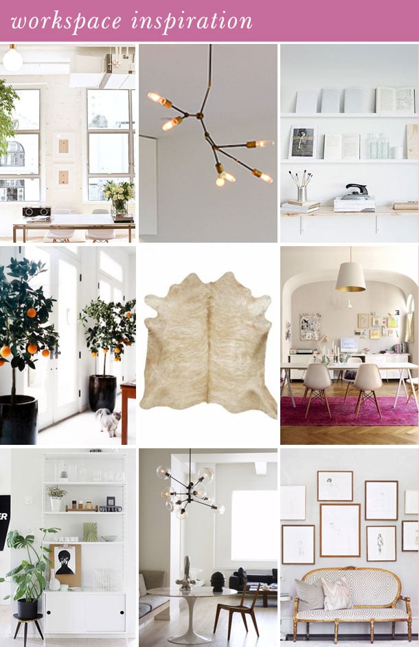
The office spaces are divided into 3 separate areas: the main studio space, Camille’s office, and the team meeting room. First thing’s first: remove all the carpet in the back rooms! We found a beautiful dark wood that complements the existing old wood floors, and since the main studio space doubles as the entry, we wanted something bright, light and punctuated with a pop of color. Using our pinterest board as a jumping-off point, we decided on simple white desks and chairs set against a colorful fun rug with lots of personality. A modern brass chandelier will add a gorgeous finishing touch. For the team meeting room, we’re dreaming of a round marble Saarinen-style table to encourage collaboration, and we’ll tuck a velvet settee and a piece of statement art into the room’s cozy nook. And throughout the work spaces? White shelving, inspiration boards, and plenty of functional storage to keep creative projects organized!
It’s so exciting to see our inspiration boards and design ideas come to life… stay tuned for photos of the finished project in a few weeks!
image sources {row 1} image found via sfgirlbybay (original source unknown), lighting fixture by lindsey adelman, wall display image from rebecca cantren, {row 2} image from pinterest (original source unknown), mead cowhide rug from lulu and george, image via the little room of style (original source unknown) {row 3} interior space from design love space (original source unknown), lighting fixture by lindsey adelman, wall photo by emily followill


i like the inspiration you choose for your studio!!
DIY ON MY BLOG
http://www.stelstyle.com
It’s absolutely gorgeous Camille! Look forward to lots of good things coming from this space. Love your inspiration boards too. Congratulations!
absolutely in love with your inspiration. so excited to see the final result and all the amazing content you and your team cooks up {no pun intended} in your new space 🙂
Molly {Dreams in HD}
http://www.dreamsinhd.blogspot.com
oh my goodness! Can’t wait to see what you all end up doing. Personally I am absolutely in love with exposed shelving and that kitchen seems like the kitchen to do it. Also the windows are ideal! So inspirational! Good luck with it all 🙂 x
Oh my, this is SO exciting! I’m literally jumping up and down on my chair :)) I can’t wait to see the end result, I’m sure it’s going to be beyond fabulous!
xx Ivana
Macarons and Pearls
Can’t WAIT to see the finished product! It’s going to be gorgeous!
I’m so excited for you guys! Congrats, can’t wait to see the finished product 🙂
Everything is absolutely P E R F E C T! Yay Claire and yay everyone who will get to enjoy this gorgeous space!
I really like it 🙂
Ladies – this is going to look AMAZING! I can’t wait to see everything in person next week. You are going to create such a beautiful workspace. I’m so giddy for all of you!
I love the design inspiration for this space, so crisp and bright. Can’t wait to see the final result!
Congrats on your new space! I can’t wait to see the outcome!
xx!
Congratulations Camille! It’s going to be beautiful!
Claire is awesome!!!
It’s going to be gorgeous! Good work, girls.