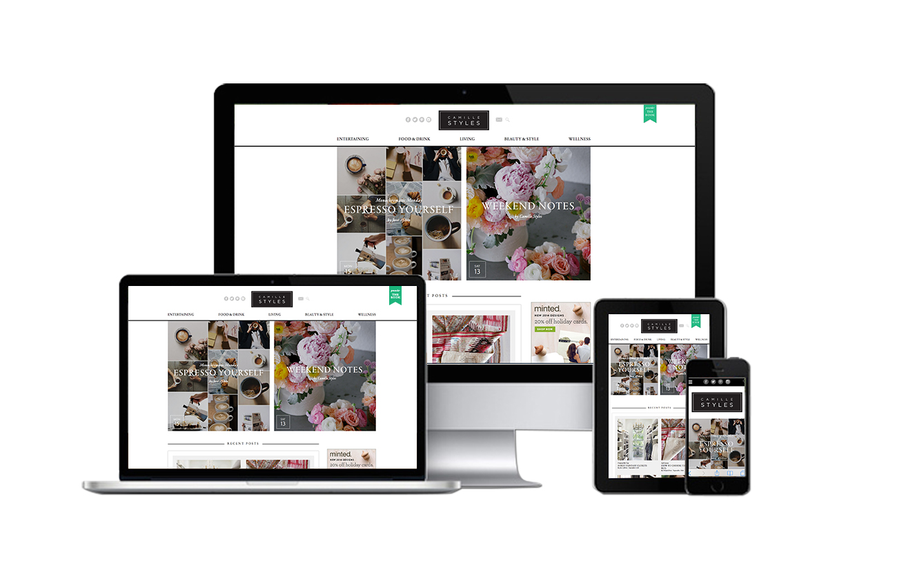
 Yes, we are looking a little different today, and I couldn’t be happier to unveil the all-new site design that we’ve been toiling over for the last several months. Especially in this constantly changing space, I believe that it’s crucial to stay fluid, stay flexible, and keep evolving with technological advances, and my goal with this relaunch is that Camille Styles will be more visually inspiring, easily explorable, and simple to use — especially when you’re on-the-go. The new site brings you way bigger images to satisfy the eye candy cravings that bring many of you to the site each day, but even more importantly, we revamped the entire foundation to make the site more intuitive, uncluttered, and basically, a place where you want to come and hang out everyday. We couldn’t have done it without David, Emily, Andrea and the rest of the SpaceCraft team who developed the site and made it more technically robust than I could have ever dreamed, as well as the spot-on skills of Merry Design Studio who is responsible for our gorgeous new look. (I can’t recommend both of them highly enough, so if you’re on the market, check ’em out.) Here are a few of my favorite game-changing features:
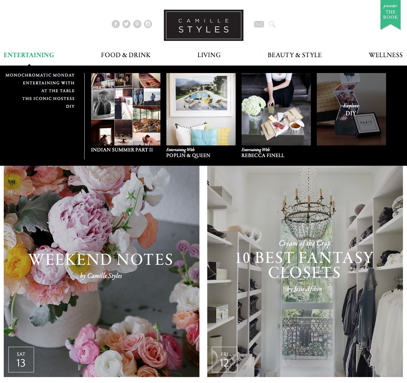 Clean Navigation. Our new drop down navigation clearly displays all of the great series you can choose to explore, as well as shows the most recent posts from each category. It’s there on every page, so you’ll always know how to get exactly where you want to go. And since we’ve broadened our content over the last couple of years to include fashion, beauty, interiors, food, cocktails, and much more, we’ve created a wider set of categories that encompasses everything we do (check out our all-new Wellness section!)
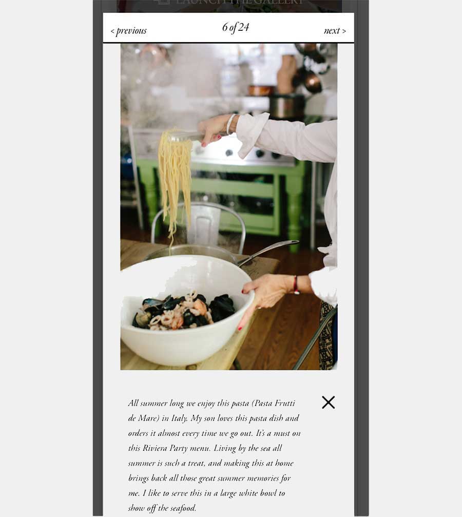
Responsive design. Really just a fancy way of saying that we look great everywhere (thankyouverymuch!) whether you’re on your phone, iPad, laptop or big monitor. Images size to fit whatever device you’re using, and check out that navigation on an iPhone — I’d say it speaks for itself! Our gallery/slideshow layout has been a major priority for me with this redesign: there’s no better way to show off the home tours and food/product roundups that we share every week, but I’ve long wanted to make our slideshows faster and easier with larger images. I couldn’t be more thrilled with this new slideshow layout that displays images in their entirety at the largest size possible, and allows you to click-click-click through them at lightening speed.
 And finally, check out our resource database pages! You can find them under their respective categories in the navigation, or simply click into them from the “Explore” section of the homepage. We divided our Recipe Files, DIY’s, and Beauty Tutorials into addictive categories where you can easily search and find the exact inspiration you’re looking for. Need a delicious recipe for your detox? A Thanksgiving table centerpiece? A new ‘do for your short hair? We’ve got a category for that.
***
I could go on and on, but I’ll leave it to you all to dive in, click around, and explore our new site. Oh, and did we mention that beautiful new comment block that you see below? More than ever, we want to engage with YOU, dear reader, and continue this ongoing conversation as we continue to evolve. So leave us your feedback, let us know what you love and what you don’t, and as always, thank you for making us part of your day. We hope you enjoy the new site!


Great new look! Love the clean look and crisp colors! The small font/text is difficult to read. I don’t know if it’s the font or the contrast but I find myself blinking to focus on it and read the small print (and I”m only 26!). Love it overall – congrats!
Looks absolutely AMAZING. Congratulations!! The SpaceCraft team is fab (they designed my husbands site!). Anyway, great work. The site looks beautiful! xo, Julie
Yeah!! Go SpaceCraft! 🙂
the design alone makes me smile and feel like i want to stick around!
Yay!! Makes me so happy to hear that!
I love the new layout! It’s beautiful and easy to navigate from my iPhone. Great job!
http://www.livinginsteil.com
Thanks Vanessa! So happy to hear that!!
Camille, I was so excited when I visited your site over the weekend and found the new design. First of all, a big congrats on the new look and layout! Also, I love how easy you’ve made it to explore the wide array of DIY projects (and other past features–such as parties) you’ve created and designed over the years. I’m really enjoying this! Thanks, and again, congrats!
So happy to hear that Kate! Thanks for the wonderful feedback, and thrilled to hear that you’re exploring the new DIY database. Can’t believe how many we’ve done over the years! 🙂
It’s a fabulous collection of DIY projects! And on a side note, I really love the emerald green buttons and accents! So chic with the black and white.
Thanks – so glad you noticed, because that is one of my favorite little details! 🙂
Fresh and inviting! Love it! Best wishes for continued success and with your new book! Can’t wait for the book!
Elaine
http://www.OMGlifestyle.com
Absolutely loving the new makeover, I can’t stop clicking!! xoxo-J
The site looks absolutely gorgeous!! So chic! xo
Thanks lady – love hearing from you! xoxo
Hooray Camille! You did it! Well done this is just fabulous, I’m so happy for you the pics look great, the images, the layout… you have done such a great job. You should be so proud! Now I think a glass of bubbly (or two!) is in order to celebrate!
Nat 🙂 xx
Yes please, I’ll take two! Thanks Nat. xoxo 🙂
Perfection! I often wouldn’t read your blog on the go because the layout was a hassle and wasn’t easy to navigate from my phone. This is great…I won’t skip over anymore!!
Music to my ears… that was one of our main goals with this redesign! So happy that you’ll be taking CS.com everywhere with you, now! 🙂
oh, i just love this. it is so clean, easy and pretty to view. congrats and such a beautiful and thoughtful redesign. xx
How exciting this cyber face lift must be! Every detail is fantastic. It’s timeless to boot!
LOVE it! The site is clean and and eye catching. Congrats on the new redesign!
looks beautiful, clean, chic…and I agree cheers with a glass or two! of bubbly.
xo
Diane
Really like your clean drop down navigation alot. Beautiful design – proving less is MORE!
Agreed!! Thank you so much Cindy! 🙂
Congrats Camille! So lovely!
Thanks Alexia! xo
Doesn’t work correctly on i-phone and also when you launch gallery click next the gallery dissapears and only reappears when you click next.
Hi Linz! Thanks for the feedback. Can you please send me a screenshot of what’s happening on your iPhone? My email is [email protected]. Thanks so much!
The i-phone problem seems to be ok now. The launch gallery clicking next problem is on the desktop. Hope this helps 🙂 Otherwise looks good!
Thanks Linz! Glad the iPhone issue is fixed. Do you mind letting me know what type of browser you’re on when you’re having problems clicking “next” in the gallery? It’s working okay on my end using Safari… Thanks so much!
it’s just gorgeous and modern and I just want to click away!
Congrats, it looks beautiful!
Love the redesign! So simple and beautiful! I was wondering if you will be adding a ‘pin it’ button to each photo in your galleries? I just finished reading the post on Jennifer Rose Smith’s stunning home and was unable to pin any of the gorgeous images to my Pinterest!