When we began shopping for a home, we knew that finding a house with revenue-producing potential was a major bonus.
So when we discovered a decaying garage in the backyard of a Central Austin bungalow, rather than seeing red flags, we saw possibility.
After closing, the first call we made was to my good friend and wildly talented architect Scott Parks. This was a job for a professional, and with Scott’s plans and guidance, we were fearless in gutting the 400 square foot structure. Five months later, the project is complete (hallelujah!), and we are the proud hosts of a fully operational, totally gorgeous guest house. Read on for all the details and resources, or better yet, come see it for yourself!

When looking into the best system for the front door of our guest house, I struggled to find hardware that was beautiful but also “smart” enough to allow guests to check themselves in easily. In the end, the Schlage Sense Smart Deadbolt was the winner — it has all the high tech functionality we need and looks great too.

You guys would never believe the “before” photos of this space (here’s one for ya.) It had been used as a recording studio several homeowners ago, but since then, it was totally neglected. When we bought the house, this place was smelly, dark, scary, and raccoon infested! It needed to be dealt with. Halfway through our renovation we made the call to vault the ceilings, which made such an enormous impact, and it’s now virtually unrecognizable — in a really good way.

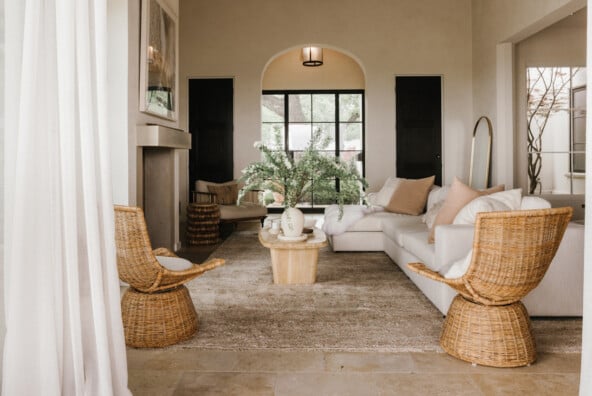
The space was outfitted with a combination of thrifted pieces, items from my old place (remember the rug?), and beautiful new furniture from Room & Board.
Until now, I’ve only ever furnished with Craigslist finds and vintage scores, and supplemented with basics from Ikea. While that kind of decorating certainly inspired some creativity, there’s something to be said for bringing really high quality, handmade furniture into your space. Room & Board’s customer service and delivery process alone were a total game changer, and I know this furniture will stand the test of time — both in style and durability. Pictured above is the Braden Custom Sofa in Destin Grey, the Oskar Lounge Chair and the Reclaimed Fir Timber Stool.
On the other side of those french doors is a stone patio, which is so lovely on a beautiful day. Blindsgalore was another fantastic company we got to partner with, and their custom sheers on rings are light, airy, and just thick enough to offer guests privacy from our shared backyard space.


We wanted this space to be bright and minimalist to always give a sense of cleanliness, but still cozy enough to feel like home for our guests. Lots of natural texture and neutral colors helped warm up the all-white interiors.
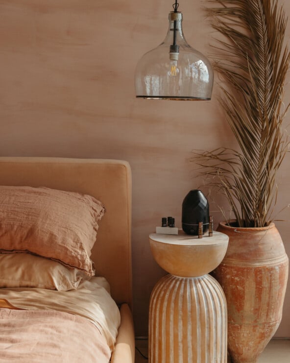
I knew I wanted a really simple, streamlined platform bed for our guest house, and the Core Bed from Room & Board was exactly what I was looking for. Plus it comes in 15 colors! I topped it with the Norwich Blanket in Blush, the Surrey Down Blanket, and pillows from Therapedic which are designed to stay cool all night long.


Pictured above is the Mills Wood Nightstand and Monarch Table Lamp in White. Below, some favorite light reads to better acquaint our guests with Austin — the Austin City Guide by Wildsam, and El Arroyo’s Big Book of Signs.


This door! Out of the entire renovation, this door is totally my pride and joy. Our contractor gave us the dimensions of the door opening, and so we went to the Habitat for Humanity Restore here in Austin in hopes to find something that would fit it. My husband spotted this beauty, which was painted off-white at the time, and it was the perfect size. We had it sanded and stained, and then added a pretty matte black lever from Schlage for the hardware.

Wait, did I say the door was my pride and joy? I meant this bathroom is. Scott designed the most adorable layout for the tiny space — because who doesn’t love a pony wall ledge — and all it took was a few special finish outs, like simple Daltile 2×2 tiles in Arctic White, to take it to the next level.
The vanity was a custom design by Scott, and we topped it with Caesarstone in Intense White. All the beautiful brass faucets and fixtures came from Delta Faucet, and I’m in love with how they look.
Pictured is the Trinsic Lavatory Faucet, the Trinsic Shower Trim, the Trinsic 24″ Towel Bar, and the Foundations Toilet with the Trinsic Tank Lever.
Below, the Saco Soap Tray and the Saco Tumbler (not pictured) are the perfect little bathroom accessories.


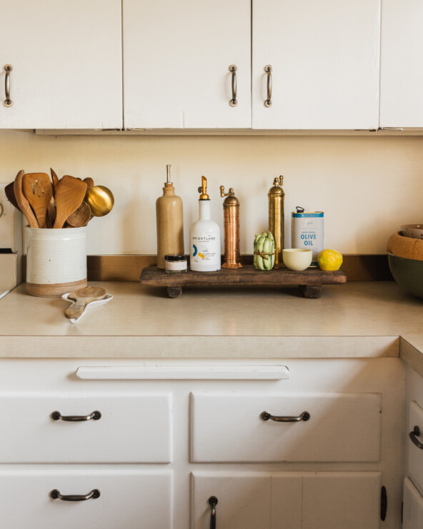
We originally planned to just put a kitchenette in the guest house, but when we realized we had the space, we went ahead and outfitted a complete kitchen.
Scott designed the a-mazing cabinets, and our contractor worked his magic to bring our vision to life. Once again, the Caesarstone in Intense White looks modern and clean, and it has a very cool textured matte finish as well.
Is it just me, or is everyone always on the hunt for woven bamboo-style roman shades? The windows in this space aren’t all standard sizes, so I searched for nearly two weeks before I finally came across this perfect customizable style from Blindsgalore. The team there is so nice, you guys, and the product arrived exactly how I wanted it. Highly recommended.


The Trinsic Pull-Down Kitchen Faucet from Delta Faucets has me feeling some type of way. Seriously, couldn’t be happier with this choice.

I was feeling totally stumped by this large blank wall in the kitchen before I discovered ArtStartArt, which is a new online marketplace where college level artists can sell their work. The collection changes each month, which is why I was glad I could get my hands on this piece by Miranda Terry before it was gone. It’s such a great way to both support young artists and get your hands on original work at affordable prices — I can’t wait to frame this beauty.


