Our homes play a paradoxical, dual role of being both a haven and an escape. A house is a refuge from the layered chaos outside its walls and a place to evade the mundane. Designers are tasked with this complex goal, looking for opportunities to weave aesthetic character and efficiency into every element and choice. While some manipulate the existing structure, others respond to it. The latter approach honors the past while celebrating all future possibilities. And it’s exactly the strategy Tess Twiehaus applied to this upstate New York overhaul.
As the owner of Tess Interiors, an LA-based design studio, Twiehaus and her team seek to understand every property not solely through its functional purpose, but by how the clients inhabit it. Because of this, she’s able to create beauty in its fullest sense: incorporating a sentimentality that extends beyond the visual. And when the final result is revealed, that intricate allure is felt throughout the space.
The designer herself remarks that this “evolution” is one of her favorite parts of what she does—and a key player in how she brought this upstate New York barn renovation from start to finish. Ahead, we dive into the project, and Twiehaus reflects on the challenges, decisions, and learnings the process brought. Read on to inspire your wildest interior imaginings. My Pinterest board is ready.

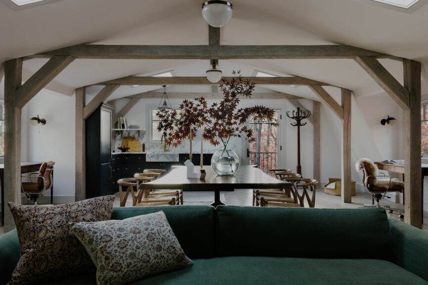
Tess Interiors Upstate New York Barn Renovation
When Twiehaus initially took on the project, the intention was to renovate the space into an exterior apartment where the owners could host guests on the grounds. But as the renovation got underway, the barn’s purpose shifted, with the client wanting a home office instead. Nimble and ready to pivot, Twiehaus and her team took on the shift with excitement, prepared to explore the extent of what the space could offer.
The final project yielded an interior that extends beyond what an office traditionally boasts—and an exterior that melds seamlessly with the surrounding environment. But as we discuss in the interview ahead, it’s that multidimensional exploration of a project that Twiehaus loves, and that energizes her approach. Discover the details ahead.

What initially drew you to this property and inspired the project?
Right off the bat, I was captivated by the property. You get off the train, drive a few minutes up a winding road, and then these iron gates welcome you to almost five acres of trees and rock gardens. It was unbelievable. Coming from Southern California, I was blown away by how lush everything was. Then as soon as I stepped foot inside the space I realized how much history it held. There was so much character and potential. I just wanted the space to look the way it made me feel.
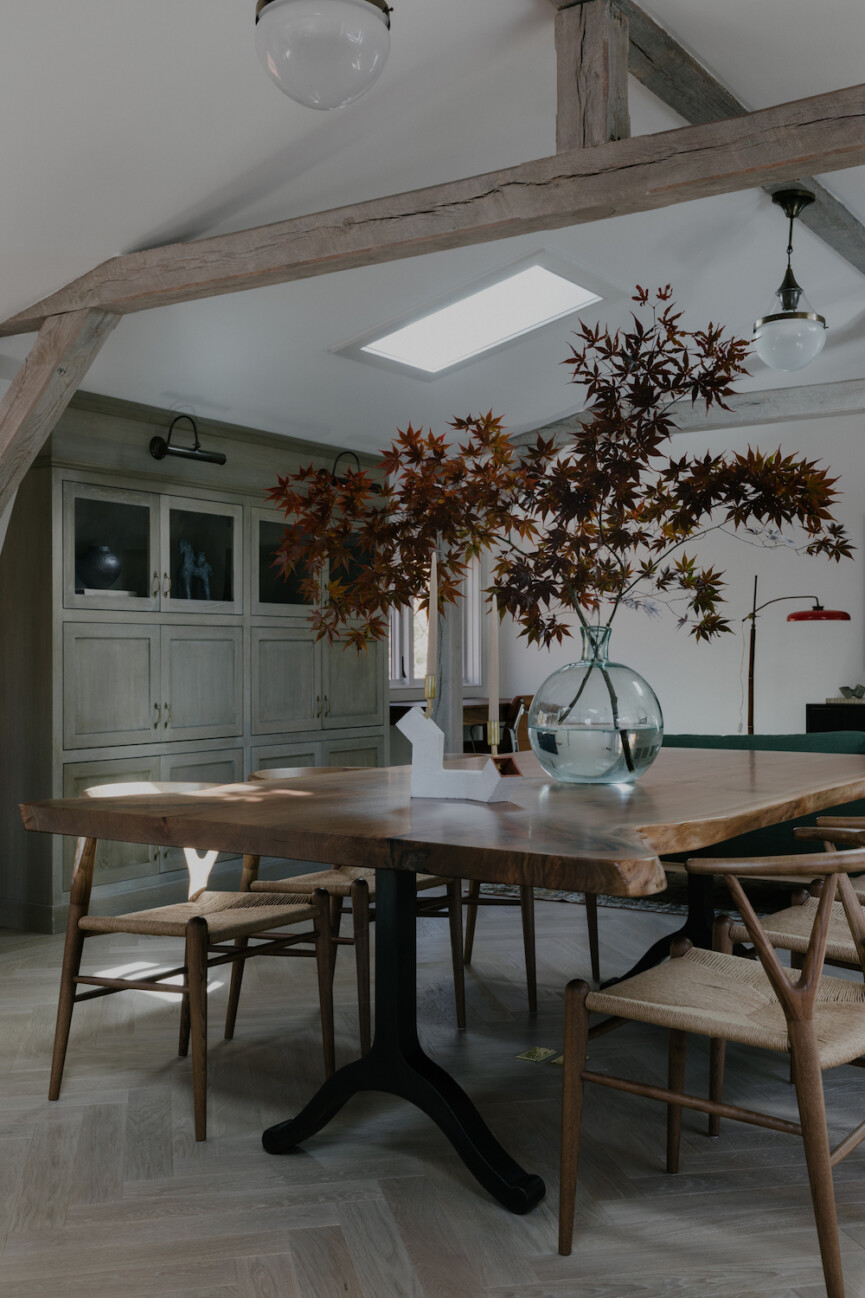
Maintaining the bones of the barn was a must. We knew the shell had to remain the same so we wanted the structural components supporting it to remain as well. We didn’t remove the beams, we just refinished them, and we didn’t relocate the windows, we just upgraded them. We didn’t even change the location of the kitchen. Instead, just reconfiguring the layout.
A true juxtaposition of old and new.
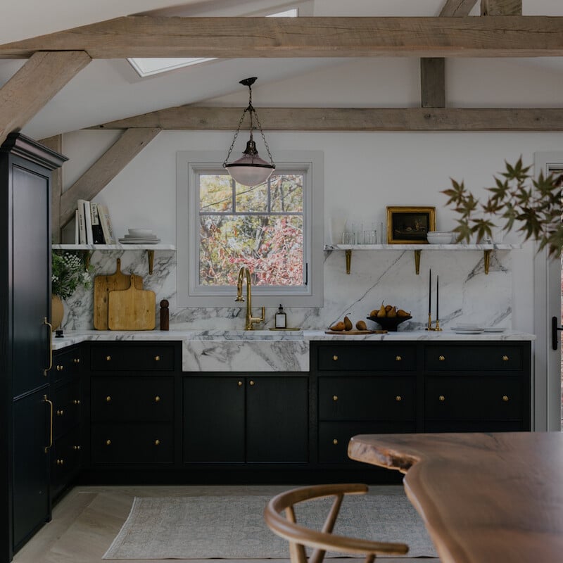
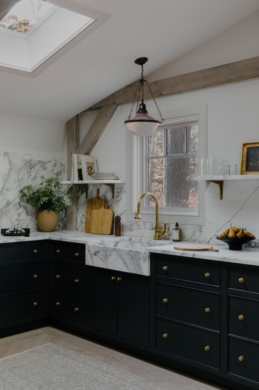
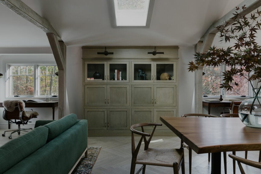
Adjusting the layout for the bathroom and demolishing the center partition gave us so much room to play. From there, it was mostly about layering in the right materials and fixtures. Our main objective when sourcing was to curate items that look like they could be original at first glance, but are actually quite modern when you study them further. The custom rift white oak flooring with the framed herringbone layout, the inset cabinetry, the intricate details on the decorative pendants, the aged brass hardware—they’re all a true juxtaposition of old and new.

You gave the home a modern feel while still maintaining the integrity of the original architecture. Can you talk us through some of those choices? In gutting the property, how did you decide what to keep?
This probably sounds crazy, but whenever I’m tasked with remodeling an old home, I like to pretend I’m a designer from the era it was built. I imagine that I’m collaborating with the original architect. As with any collaboration, you want to keep an open mind, respect the other person’s ideas, and hopefully come out on the other side with a cohesive vision that’s a true melding of the minds.

You chose to paint the exterior black and incorporated moodier elements in the interior. And yet, the home illuminates such an incredible light. How were you able to capture that and reflect it through the space?
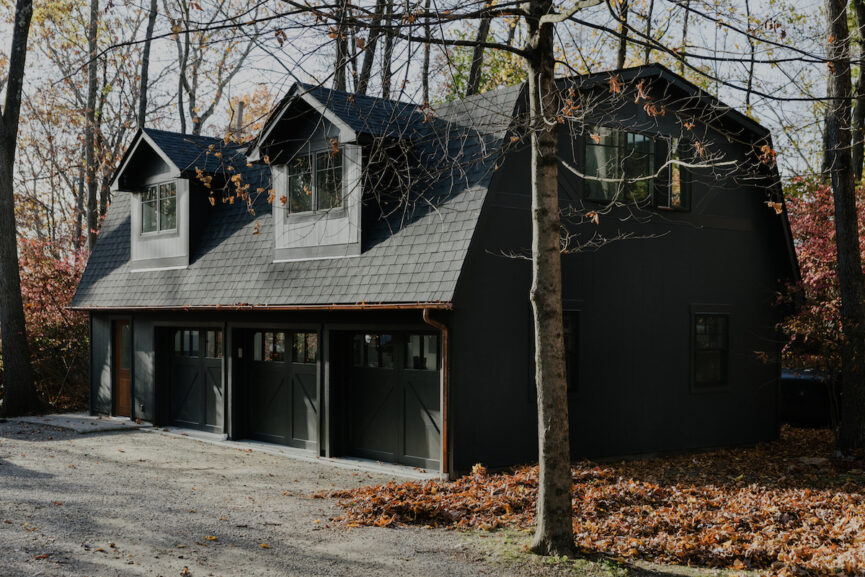
Painting the exterior black was the plan pretty much from the start. The foliage surrounding the barn is gorgeous and we wanted the barn to act as its backdrop. Also, there’s a sort of yin and yang effect we wanted to create with the main house. While the main house is white on the outside with lots of color and pattern on the inside, the barn is black on the outside with lots of natural materials and neutral tones on the inside.
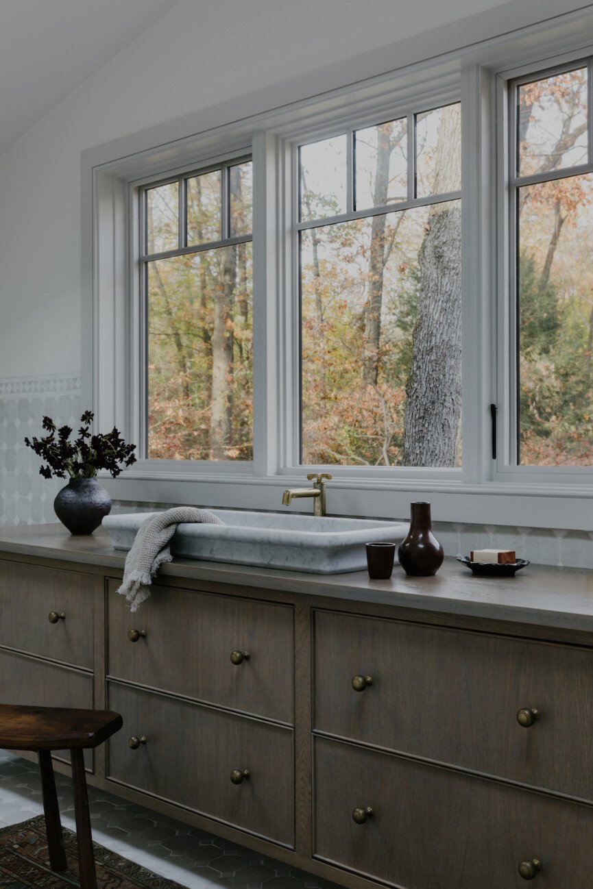
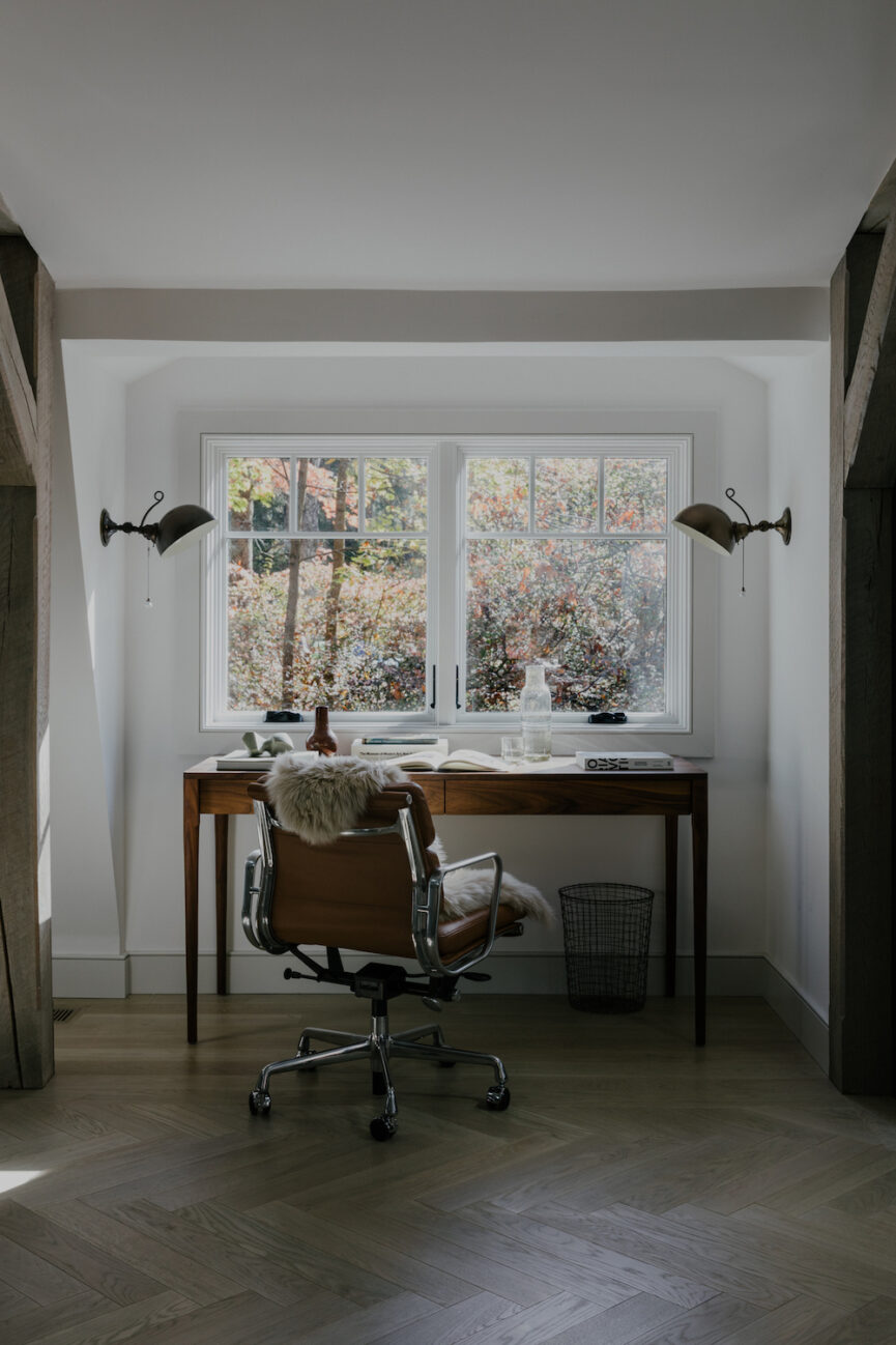
As far as the bright interior of the barn, that’s in large part due to the windows and skylights we put in. We also took down a wall that was cutting the space in half, which allowed all of the windows to work in unison and flood light throughout the space. The moodier elements are a result of the many wood tones we layered together.
I love using natural materials to create a moody effect because it never feels dreary or overly dramatic. It just feels earthy and balanced.

When approaching a project, are you able to envision the final result from the beginning?
Not exactly! I always know how I want the space to feel and I do see clear opportunities for specific design details when I’m doing the initial walkthrough, but the evolution is one of my favorite parts of my job. I truly enjoy the surprises that the demo phase brings and the client opinions we learn as we go. Those unexpected “problems” always result in the most interesting solutions, and they often end up being my favorite details at the end of a project.
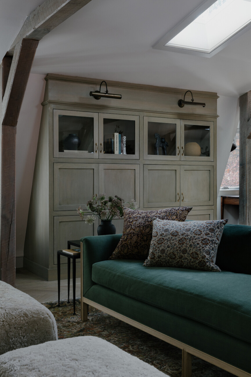
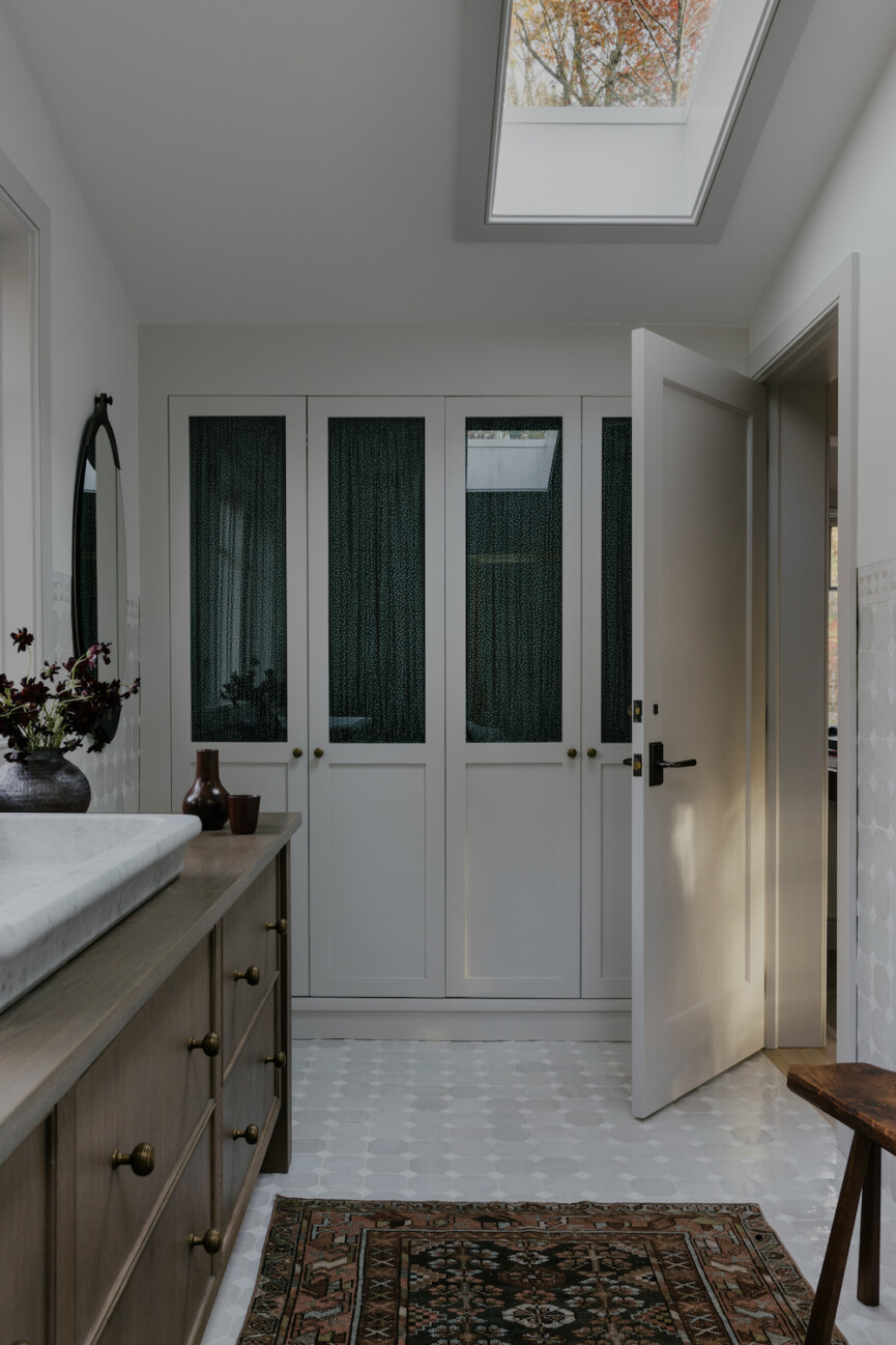
For instance, the barn has a classic gambrel roof. This means that we had to deal with all sorts of fun angles on the inside. Since the client wanted to use the barn as an office for their employees, and I wanted each employee to sit in front of a window, there were only so many places to build the storage an office requires. The storage cabinets in between the desks are deepest on the bottom and shallowest at the top due to the angle of the roof. We decided to put glass inserts at the top cabinets where the roof slopes and treat them as the display area, whereas the bottom houses the necessary paperwork/supplies. I certainly didn’t have that solution from the start, but I’m so happy with where it ended up.

What major changes did you focus on in the renovation?
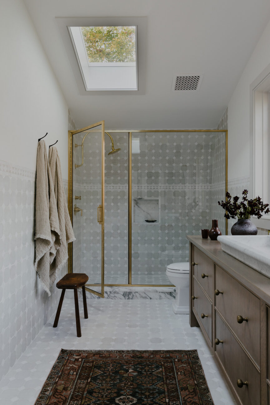
The primary objective was to make the kitchen and baths functional and beautiful. That bathroom layout was the biggest change. Originally, it was shoved into a corner. We created a bathroom suite by relocating it to the end of the barn and allowing it to take up the entire width of the space.

Exposed beams, oak floors and cabinetry, and marble countertops dominate the space. How did these elements and this aesthetic come into play in your design process?
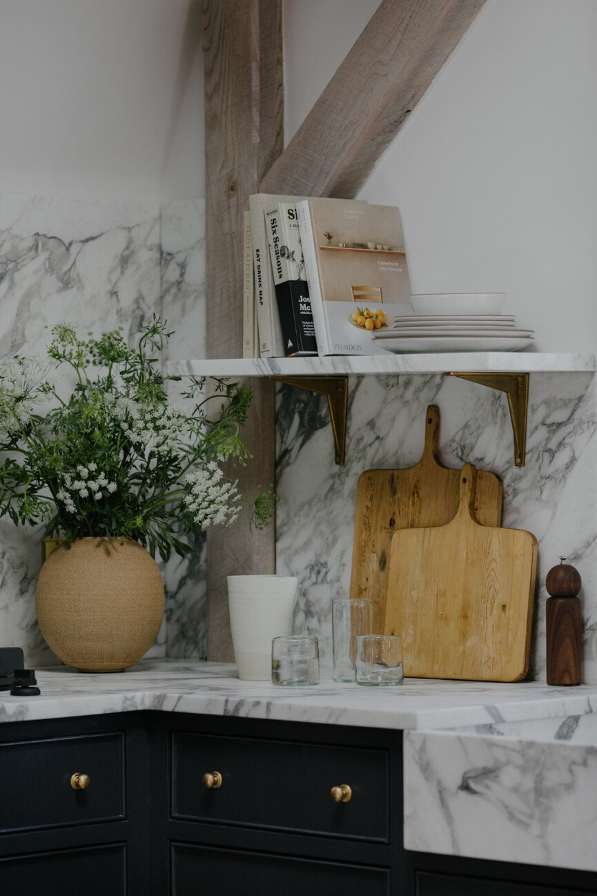
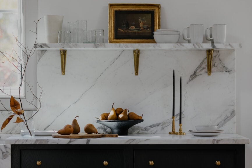
Again, I go back to the property. The nature surrounding the barn is so beautiful, and we simply wanted to bring that outside beauty in. It was important to me and to the clients that we use materials found in nature. Real hardwood floors, genuine calacatta stone, unlacquered brass, and walnut furnishings.
What all of these have in common is that they are from the earth. They will age over time and we will appreciate their beauty then as much as we did when they were first installed.


