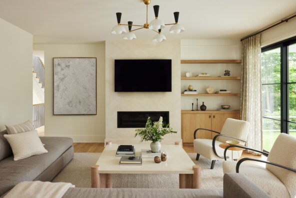
When I first heard that creative Lauren Cunningham was renovating her Northwest Austin home, the first thought that entered my mind was, “Why?”
Her mid-century home was already bursting with history, character, and amazing design, and what’s better than that?
As it turns out, Lauren knew what she was doing. And why did I ever doubt her? The mother-of-two has been flexing her eye for design for years through various creative projects — most recently it’s a creative co-working space in Austin that’s just what this town needs — so it’s no wonder that when it came to her own home, Lauren took extra care to make sure every detail was thoughtful and executed perfectly. She partnered with Alterstudio and Claire Zinnecker to bring the transformation to life, and the result is a home that’s rooted in the mid-century, but fully transitioned into the 21st.
We have a lot of ground to cover, so let’s begin: tell us about your home.
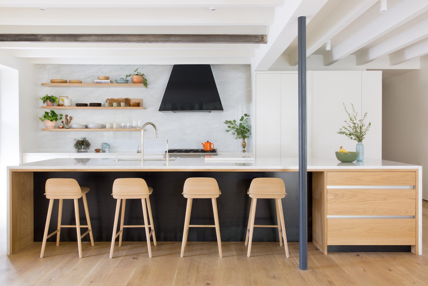
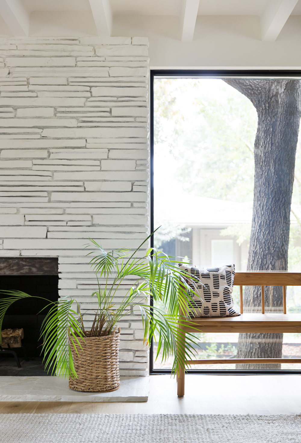
We fell in love with and bought our ranch-style home back in 2009. It’s tucked in a neighborhood not far from downtown called Highland Park West that a lot of locals don’t even know about, with oversized lots and massive trees. The house had just undergone a thorough remodel by the previous, second owners (we’re only the third owners — pretty crazy for a 70 year old house!) but maintained a lot of its mid-century charm. It’s a truly unique structure built completely of concrete and stone by an engineer who was terrified of fire, so it feels very solid and we love the exposed ceiling beams. (Our neighbors tell us there actually was a fire in the 70s but the structure was well preserved because there was no wood.)
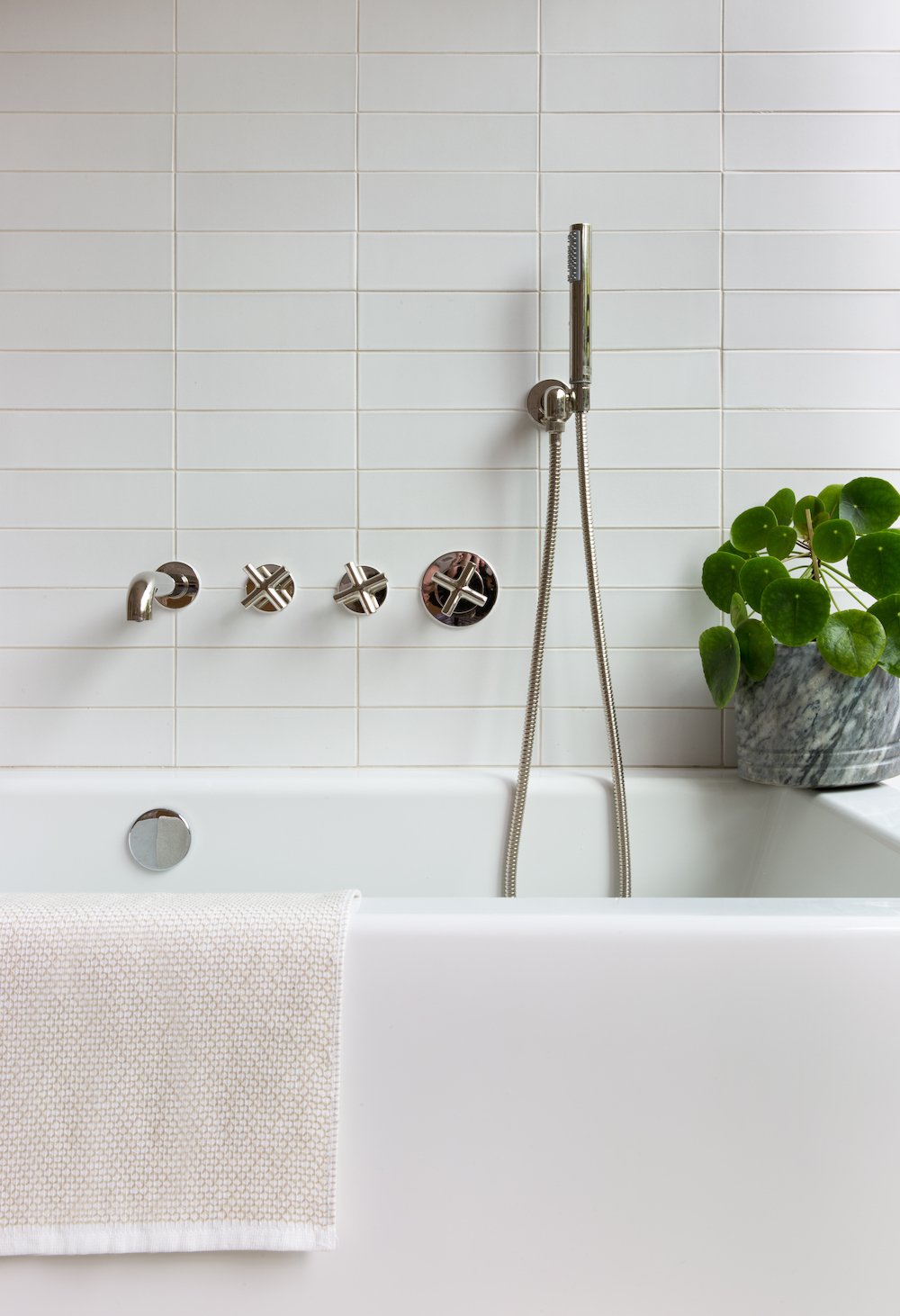
The house served us well for the first few years, but the dark floors and tree-filled yard had me craving sunlight, we needed a tub in our master bathroom and the layout needed improvement. When we left the country for a 2-year stint in Asia and started having kids, we decided it was the perfect opportunity to make it our ideal home before re-planting ourselves there with our growing family.
We loved your home pre-renovation, but this updated version is next level stunning. Tell us about the construction process.
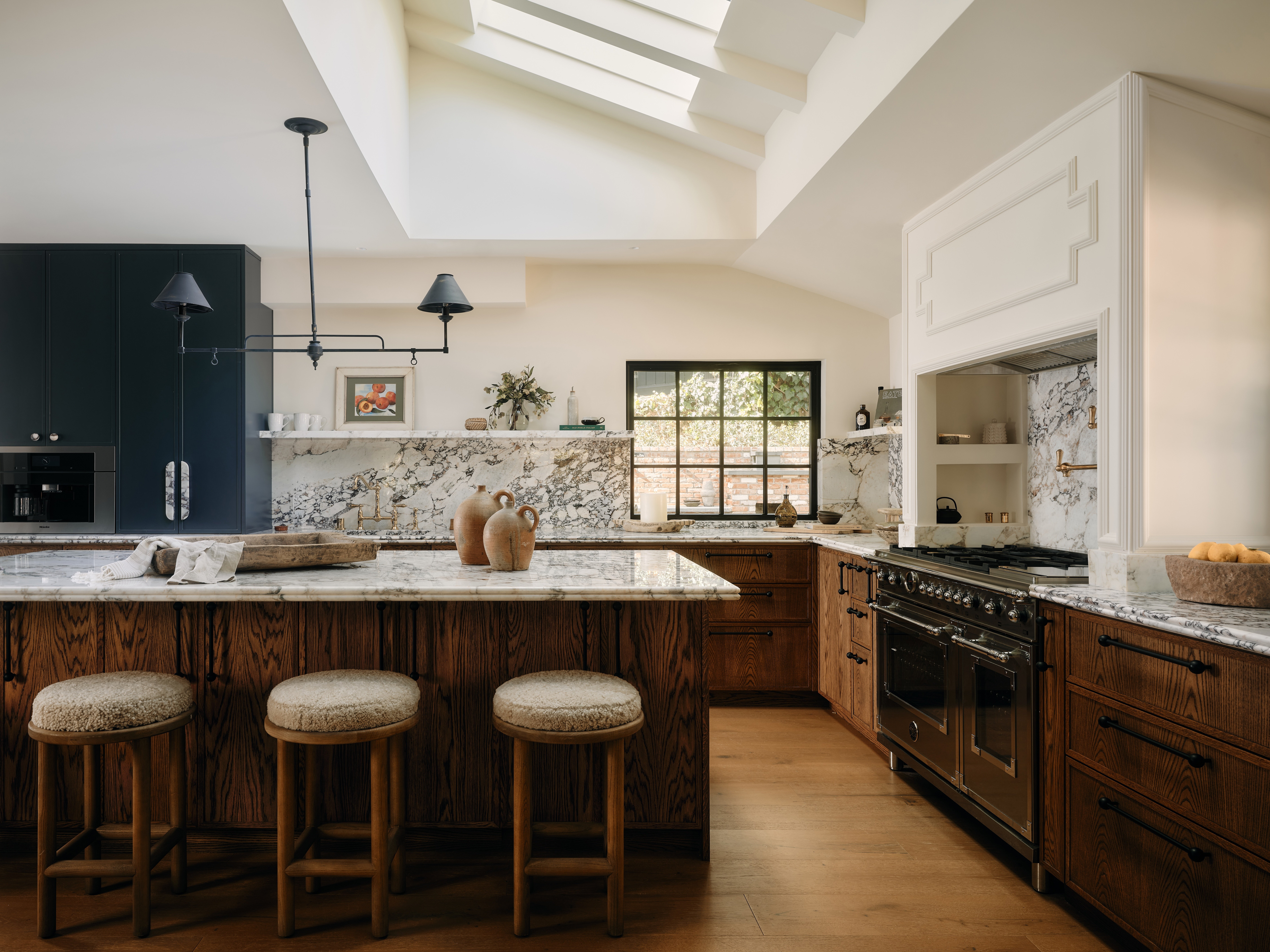
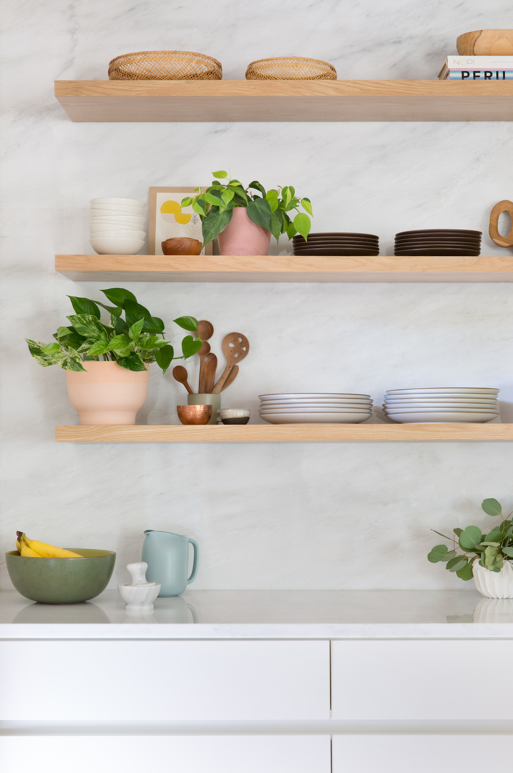
We hired our architect, Alterstudio and then-acquaintance (now good friend) Claire Zinnecker while we were still living in China, and the architect’s drawings were pretty much complete before we even moved back. Claire actually flew out to meet me in China to source the marble for our kitchen because I’d discovered we could save thousands by buying it there directly from the quarry, and we were going to need a lot of it. Plus, when else do you get to do that?!
Your favorite spot in the house – go!
The kitchen.
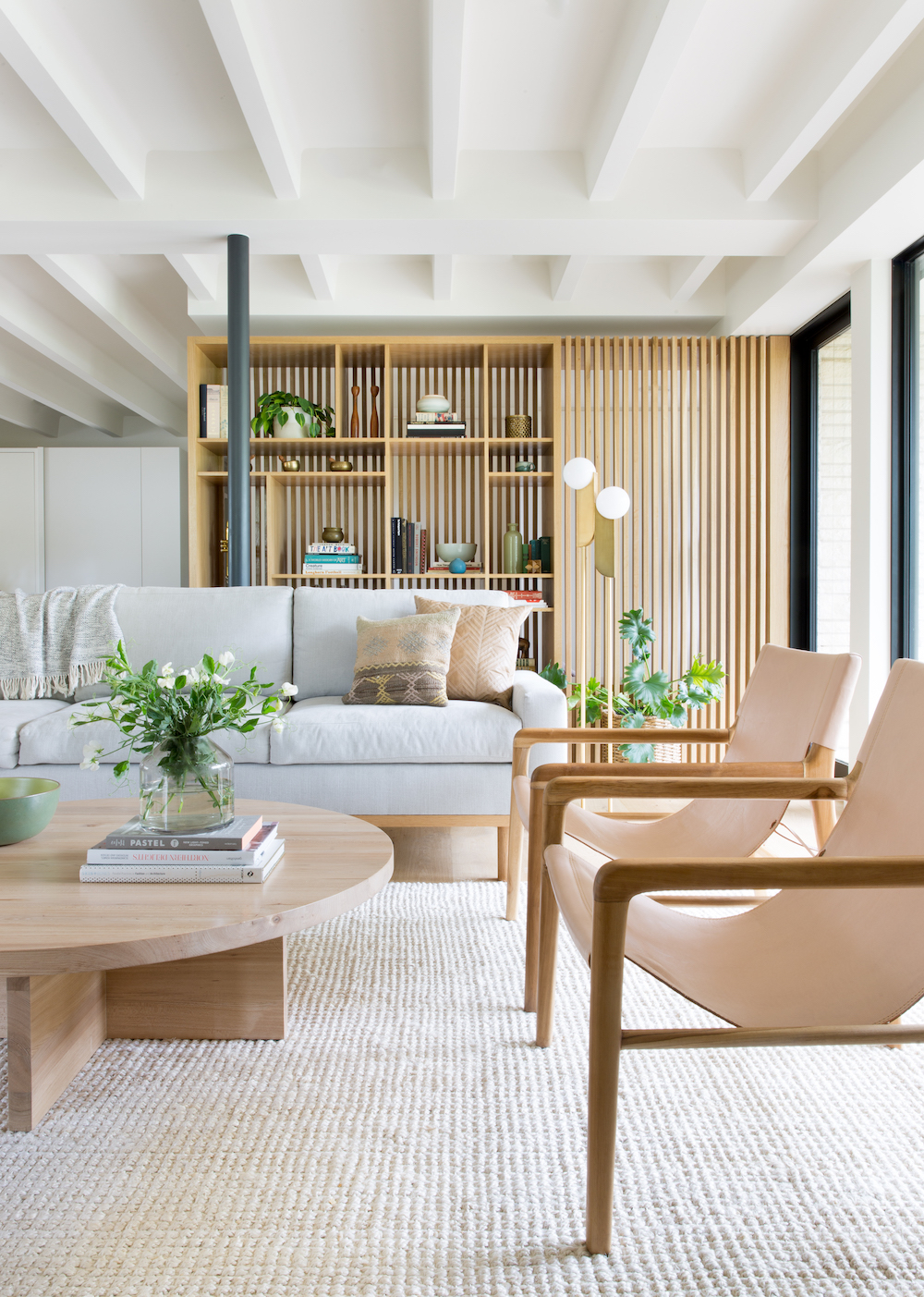
Describe your home in 5 words or less:
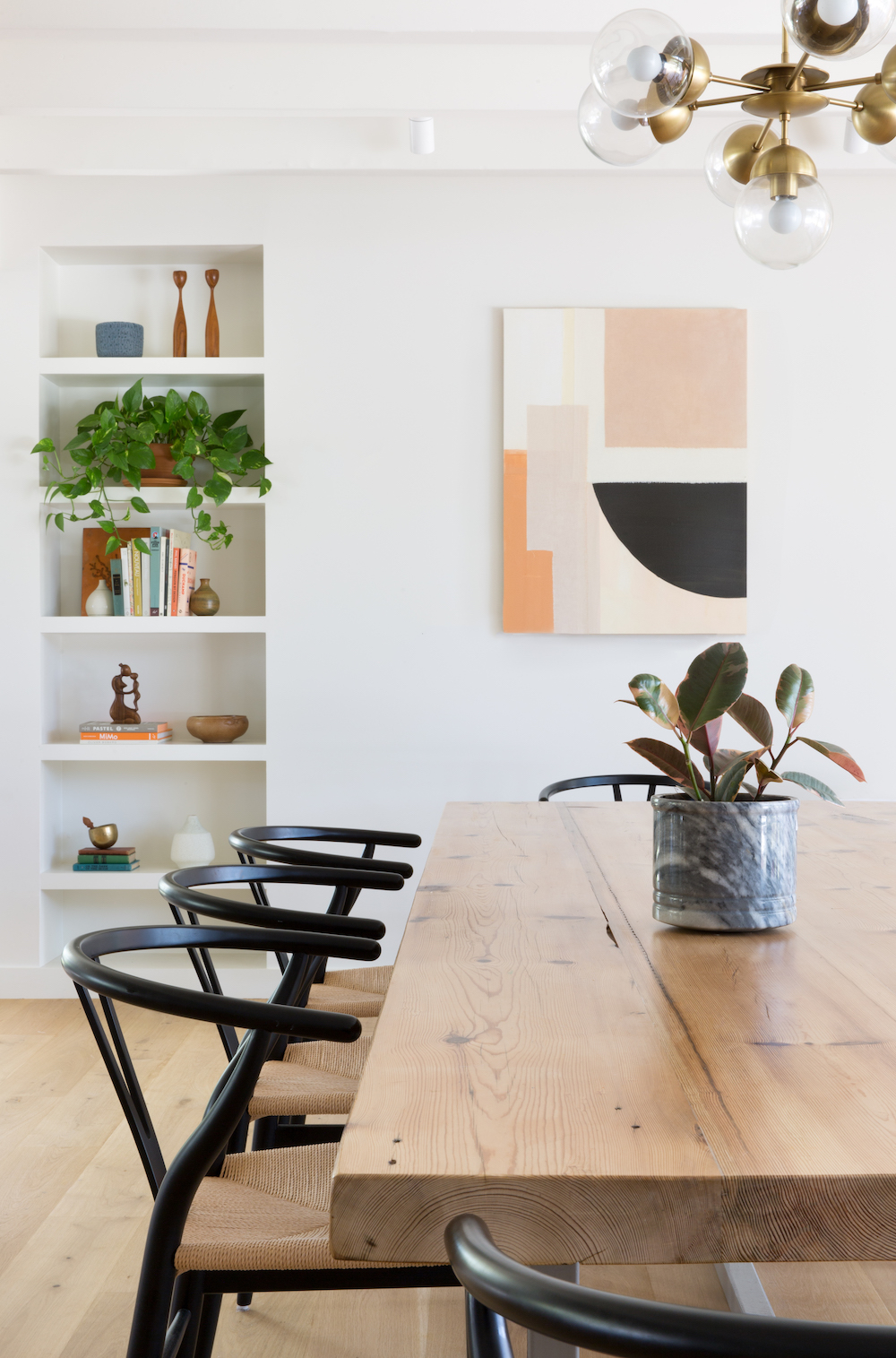
Warm modern oasis (people often comment that it feels like they’re at a spa, and with two crazy young boys that was definitely intentional!)
We love all your laid-back, modern furniture and decor pieces. What are some of your favorite places to shop for your home?
I’ve bought quite a bit from Australia in the past few years, from tile to furniture, because the design there is just so good and the US dollar is stronger than the Australian dollar so even with shipping you can end up spending about the same as you would in the states. Two of my favorites are Designstuff and Barnaby Lane. Muuto and The Citizenry are awesome for furniture and accessories. Some of my Austin faves are Nannie Inez, Flourish (don’t forget the plants!) and Miguel’s for affordable pots.
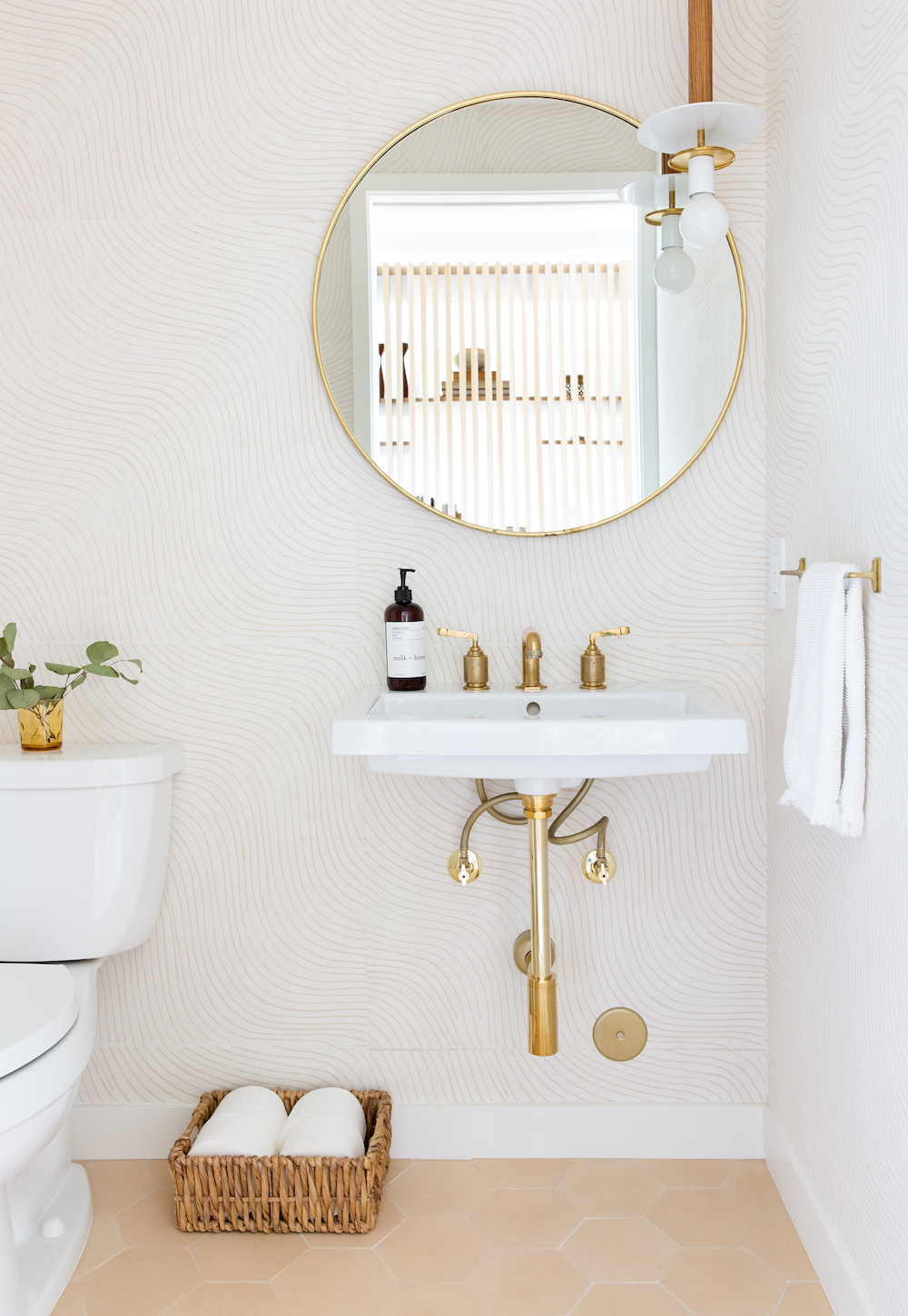
This was no small feat. What advice would you give someone embarking on a similar renovation project?
Be prepared for it to be overwhelming, especially if it’s a large project. With a renovation there are always surprises. Always! Make sure you build in a contingency of at least 10-20% because you 100% will end up having to spend that.
And hire wisely. You’re going to be spending a lot of time with these people, so you need to get along with and trust them. Character and experience are just as important as price in choosing a builder, architect, designer, etc. After three renovations (two residential and one commercial), I still love most of the people I’ve worked with, but that’s not always the case.
Do you have one interior design tip you always come back to?
Steer away from anything too trendy in your materials (flooring, tile, etc) or you’re bound to be over it in a few years.
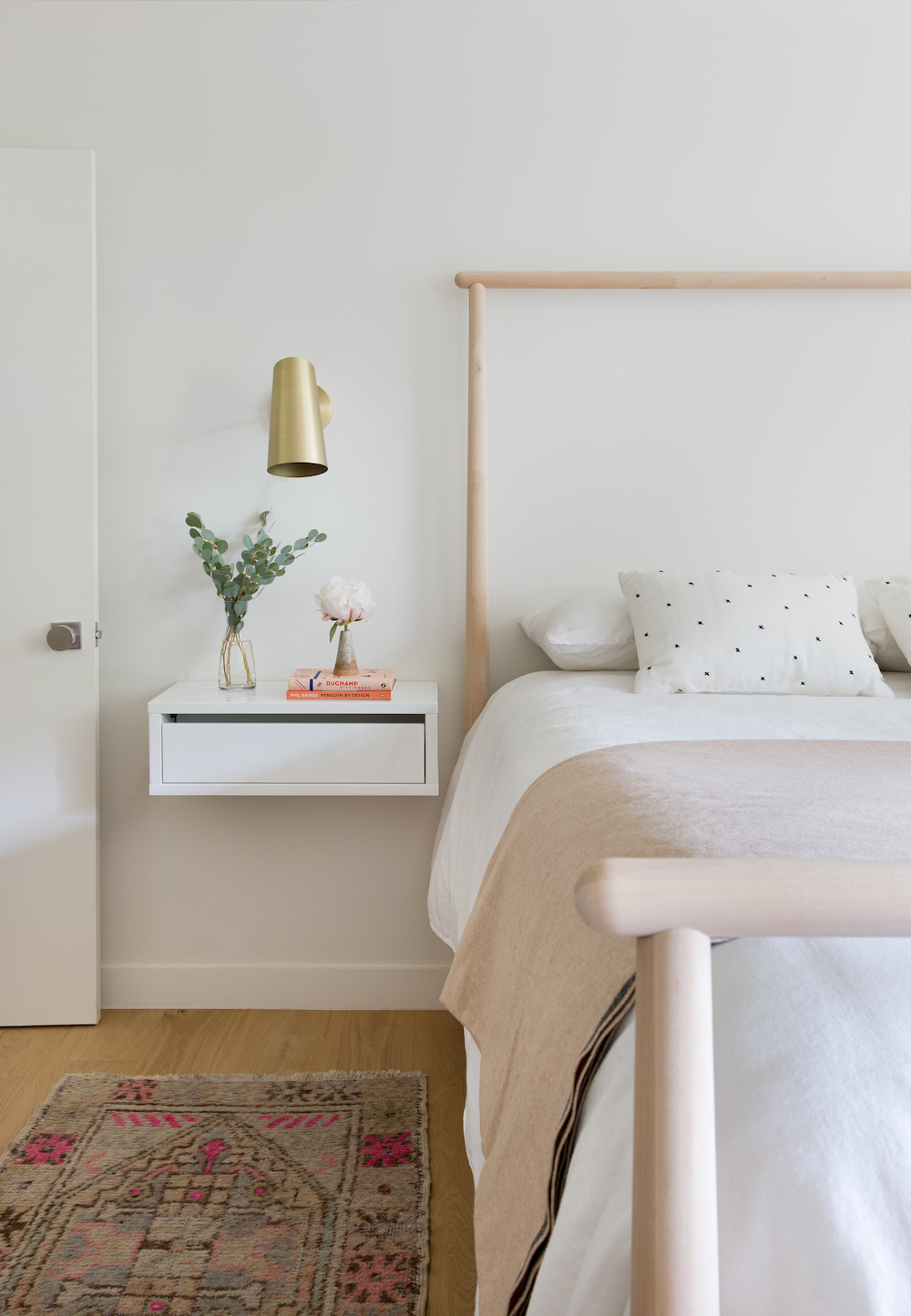
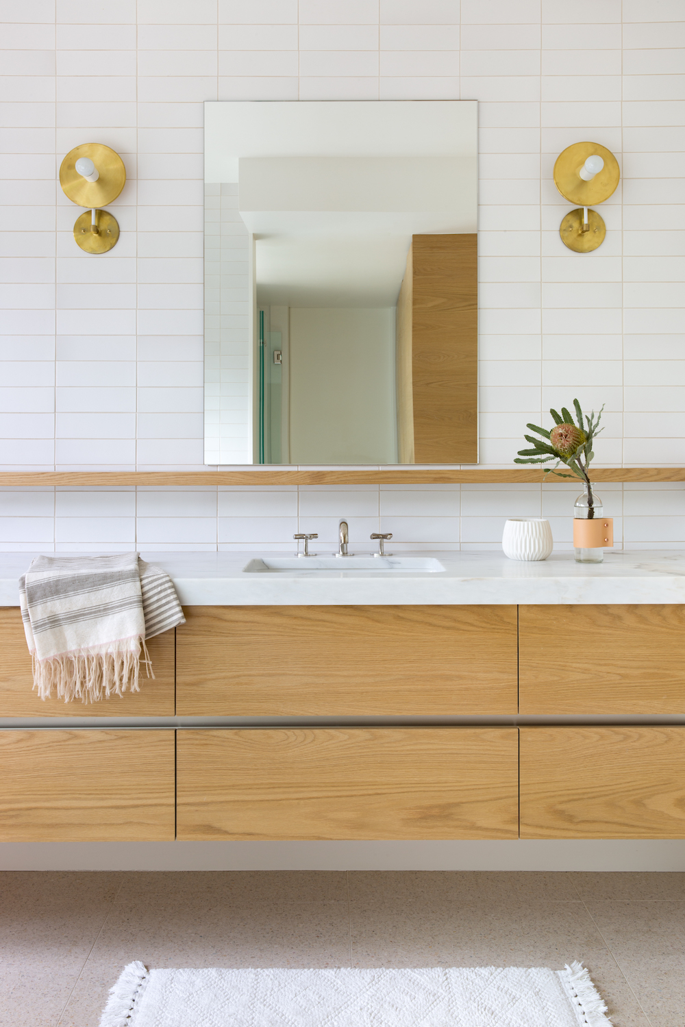
Tell us about what inspired the design for the house.
We pulled a lot of influence from Scandinavian design, and some of the materials (terrazzo in the master bath, the white oak) were inspired by places I loved in Asia.
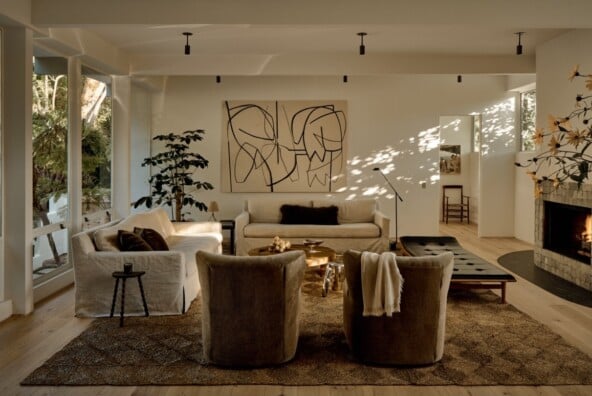
My style definitely took a sharp turn with our remodel, as I found myself gravitating toward warm, neutral tones over the bright mid-century colors in our home’s first iteration. I like that it’s really a blank slate so I can add or remove color with pillows and accessories. On most days though we get enough color from the clutter of kids’ toys and art!
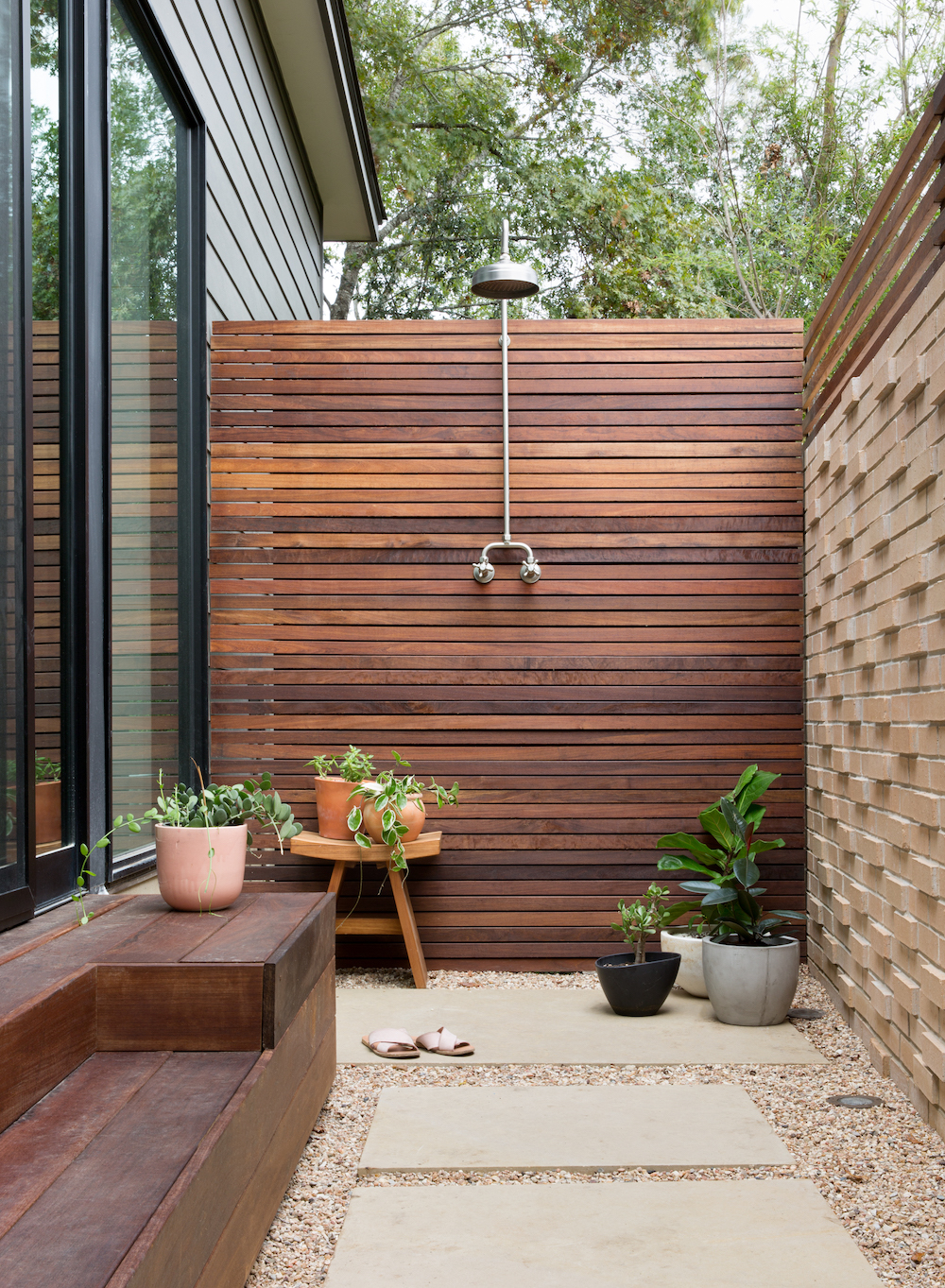
You have an outdoor shower! Wow, goals. What’s the story there?
This was the only request my husband had! Our hotel room where we got engaged in Carneros had an outdoor shower and he’s wanted one ever since. He actually uses it quite a bit, and our kids love it too and often just play in it. We joke that it’s kind of like having a pool, but way cheaper!
Did you face any big design challenges with the space?
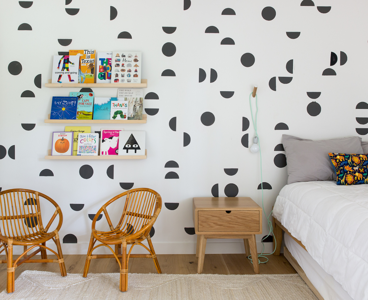
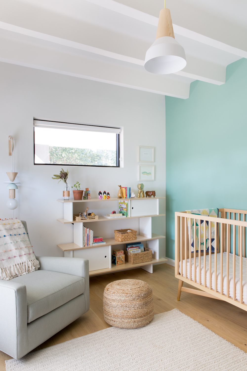
I was determined to make both of our boys’ rooms larger, but because the house is concrete and supported by metal columns, pushing the walls out was going to cost as much as $100k and just not worth it. We found a way to make one room larger by moving an interior wall but my younger son’s room is still pretty tiny. With remodels there’s often a lot of compromise.
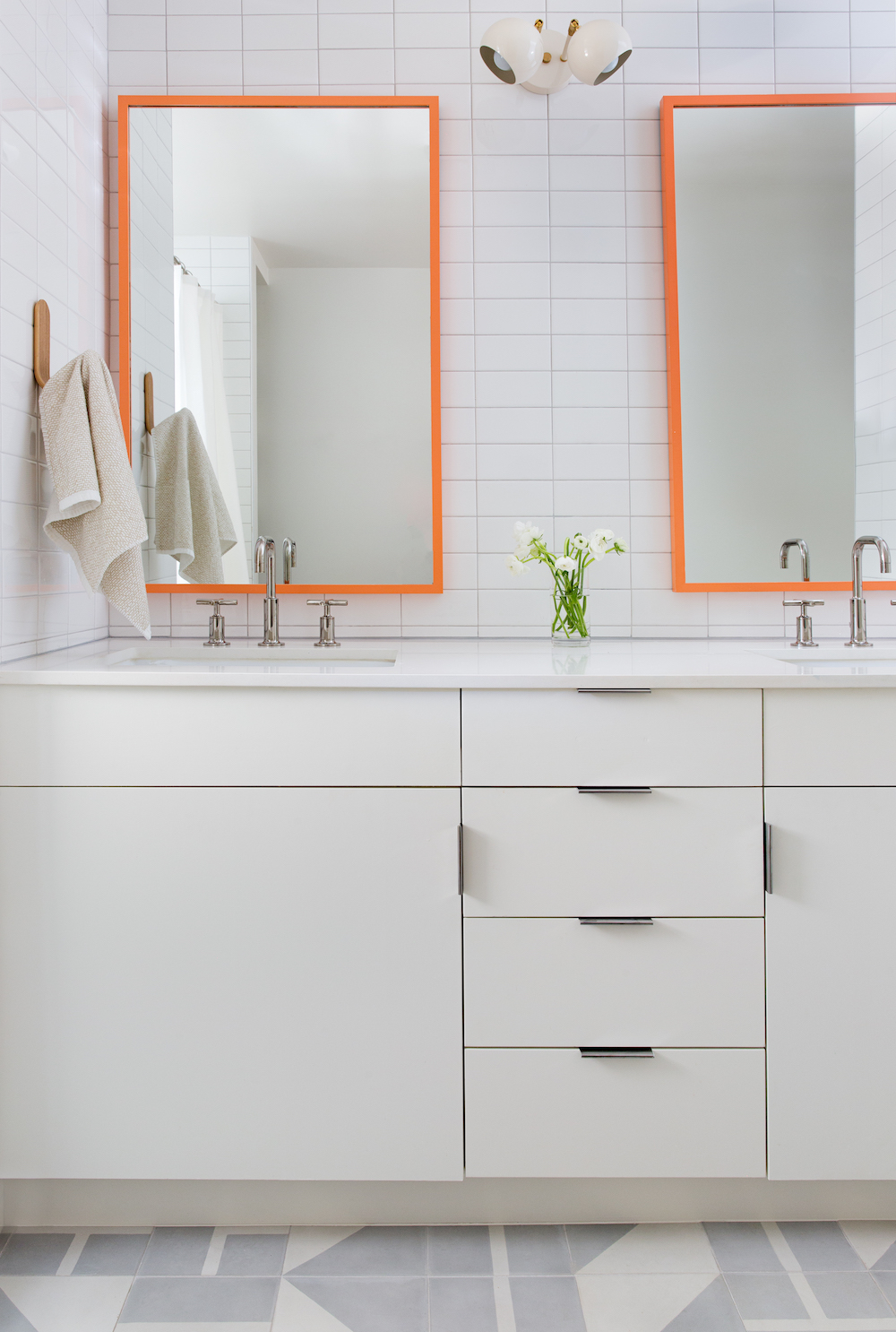
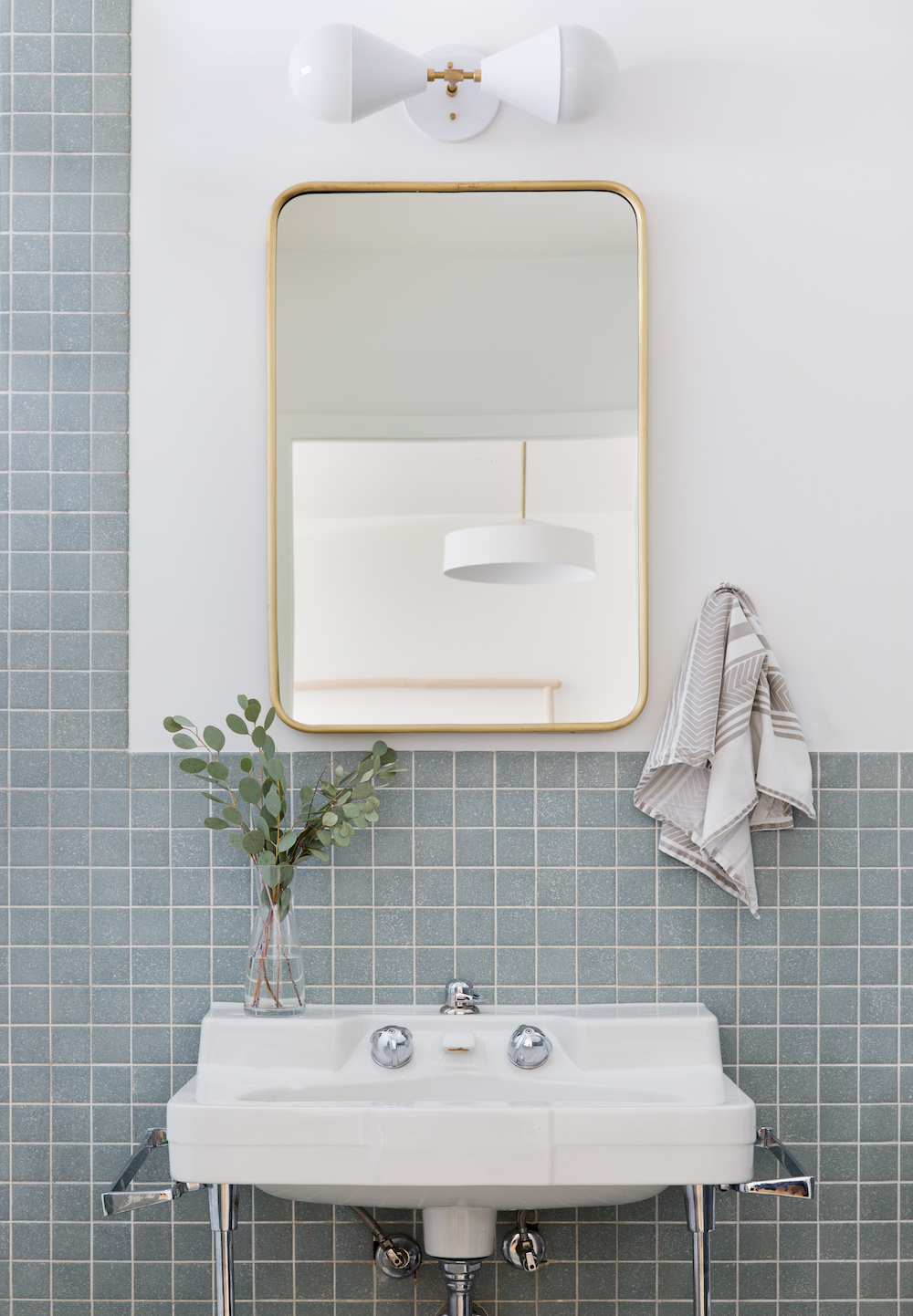
The light fixtures! The hardware! The storage! So many special details in each space. Any tips for sourcing these small touches?
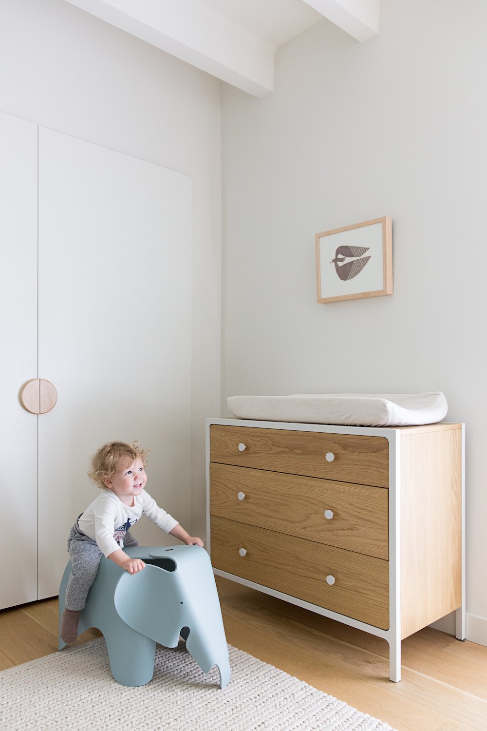
Etsy is amazing for anything custom. I knew exactly what I wanted the pulls for our playroom cabinets and boys’ closets to look like, and I found a woodworker on Etsy who made me exactly what I wanted. You can also find some really great light fixtures and unique hooks on Etsy. Triple Seven Home also has some amazing affordable lighting… I have at least 8 of their lights!
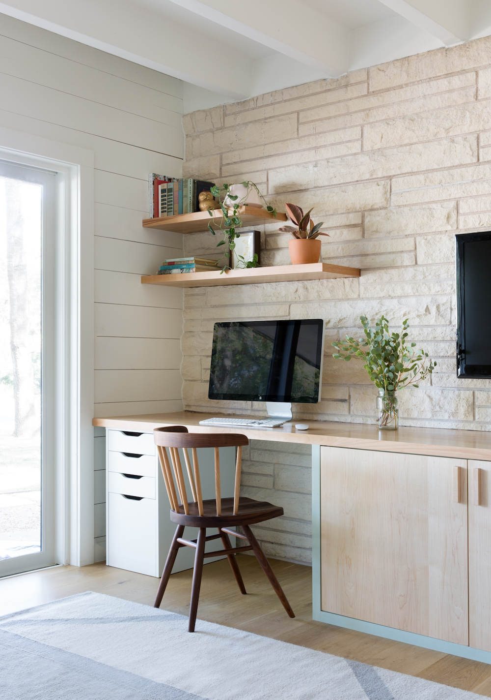
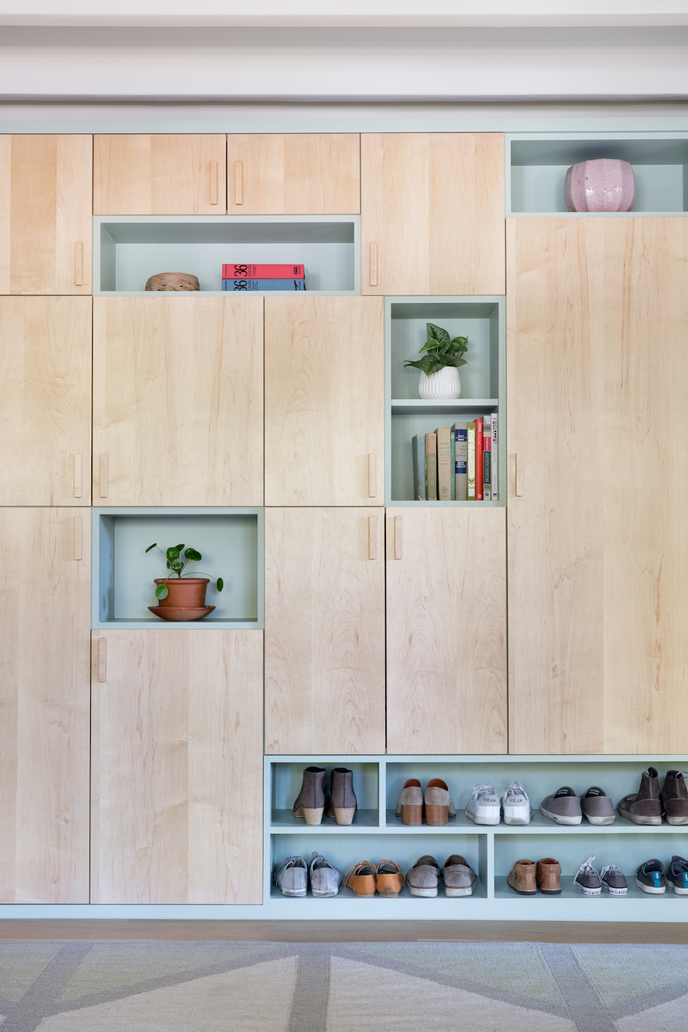
This workspace is one of our favorite corners, with its unexpected mix of modern and natural details. Tell us about all the interesting modular storage and custom woodwork in your home.
One of our goals was to add as much storage as we could because that’s one place we were lacking (we don’t even have a garage, so there’s really no where to put junk!) Our second living room serves as the playroom, and since it connects to the carport it’s the entrance we use most often, so hiding all of the games and toys was essential. We put drawers or shelves everywhere we could, and not an inch of storage goes unused.
What’s your favorite way to spend time at home?
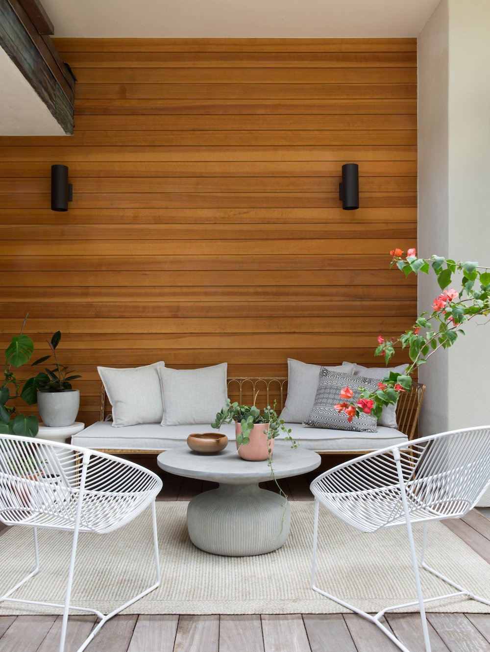
Sitting out back on the deck with my husband while the kids play in the yard…when it’s not 100 degrees outside!
Fill in the blank: A well-designed home should ____
make you not want to leave.
