Not gonna lie: when I first found out I was expecting, I kind of rolled my eyes at the thought of designing a nursery. I thought, “Babies don’t care what their rooms looks like. This feels like just another way that the crazy baby industry is getting moms to spend money on things they don’t really need.” Fast forward just a few months into my pregnancy, and inspiration struck when I discovered the sweetest print — this stargazing dog by Chelsea Textiles. Just like that, I was singing a different tune — scouting out paint colors, hunting for a deal on window treatments, and imagining the perfect baby-friendly space.
Sure, our little guy might not appreciate it (yet,) but it sure does bring me joy when I look around at this beautiful nursery, and happy mom = happy baby.
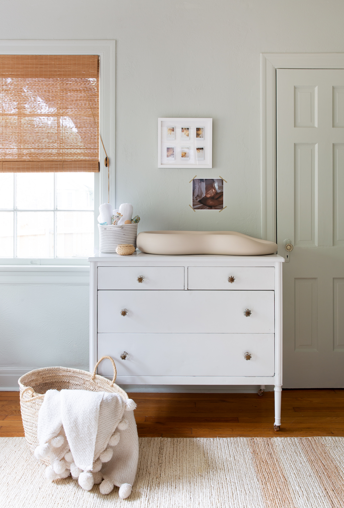
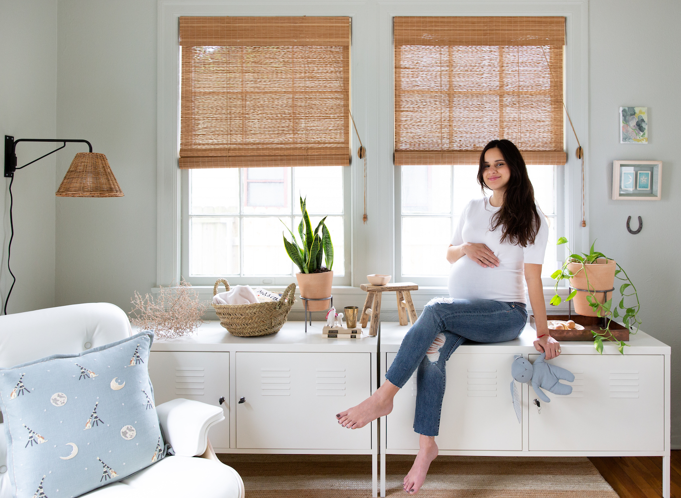
That said, I am proud of all the ways we didn’t spend money on this space by repurposing furniture and decor we already owned, and even inheriting a crib from a cousin (thanks Liba!) The metal storage lockers came from the guest room, the dresser came from our bedroom, and the art pieces were filed away just waiting for the perfect home. I’m in love with the way it all came together. Keep reading to see it for yourself!
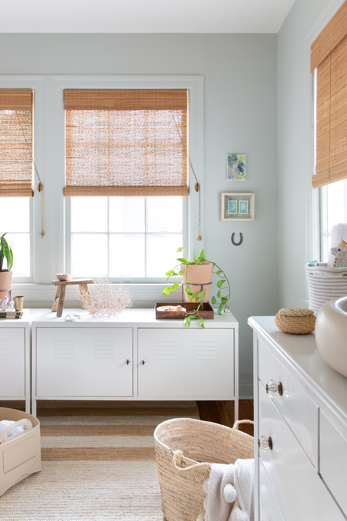
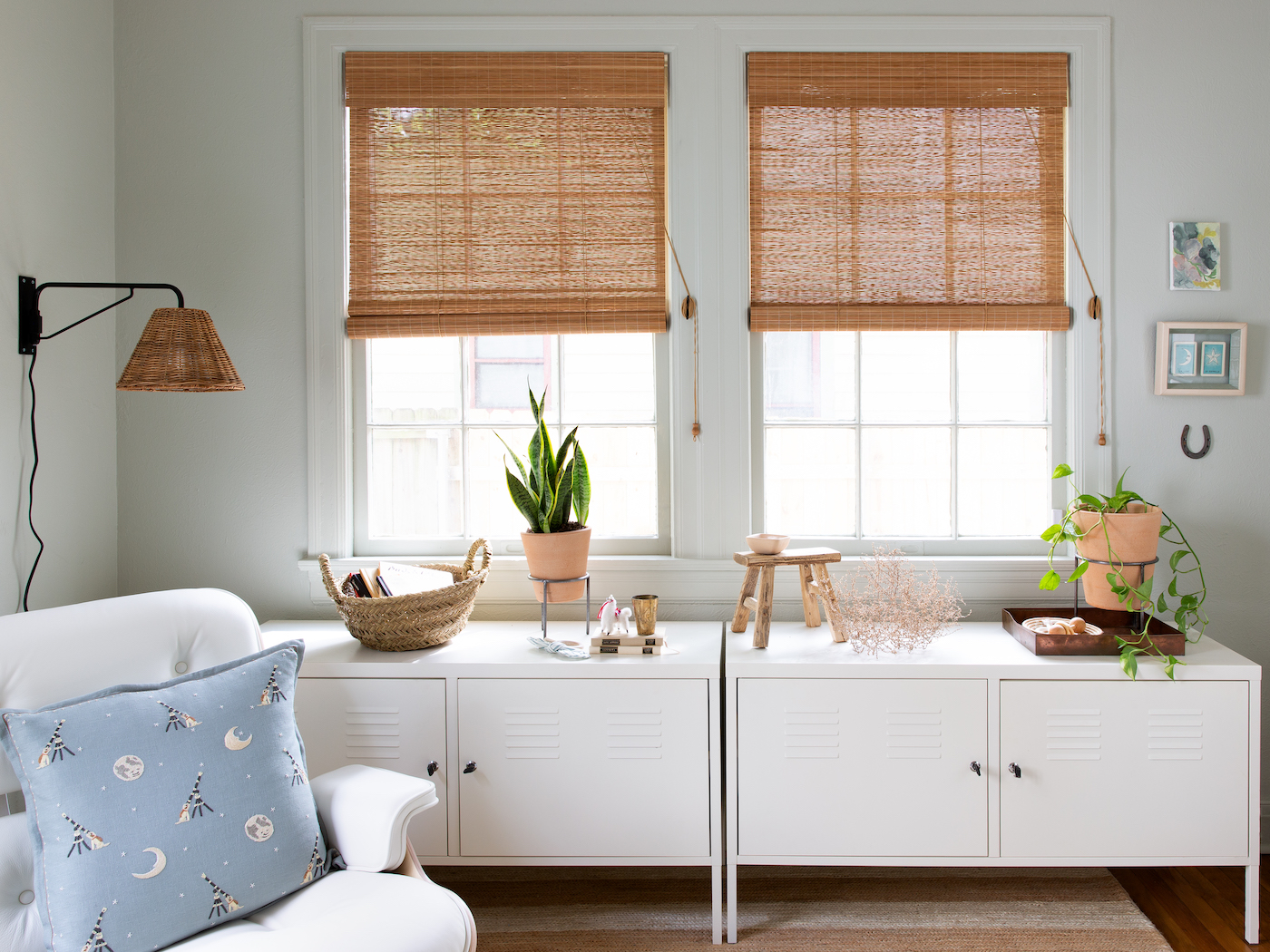
How perfect is this rug? It’s the Ipswich Natural Woven Jute Rug from the Mark D. Sikes x Annie Selke collection, and I thought it was just the right blend of classic, but a little bit unexpected and youthful for this space. It adds earthiness and balances the bamboo roller shades we put in the windows.
A classic Eames Lounge Chair has been on my bucket list for years, and leading up to baby’s arrival, we felt there was no time like the present to treat ourselves. It’s classic yet modern, and totally durable — well, at least while baby boy isn’t mobile! At that point it’ll likely be making its way to our bedroom.
And while we’re on the topic of things-that-wont-last-in-here, these gorgeous ceramic planters from Bloomist are another favorite. While they’re still out of reach, they’re the perfect vessels for displaying low maintenance plants.
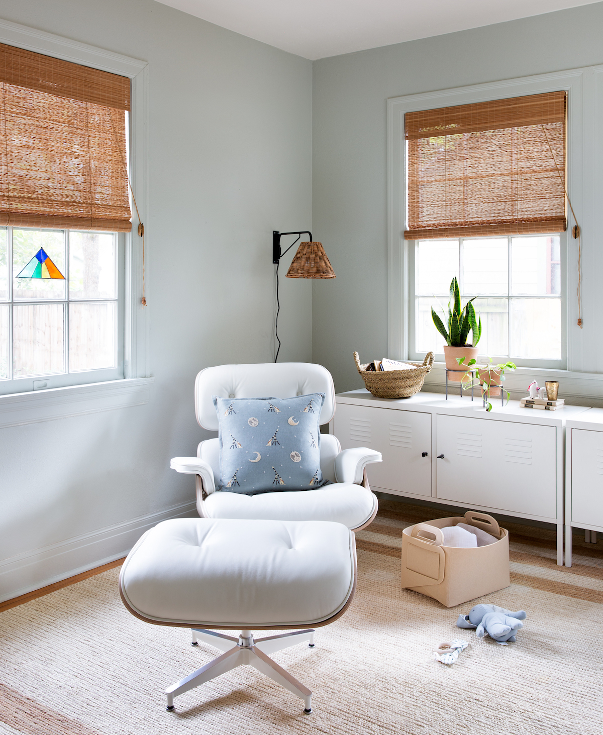
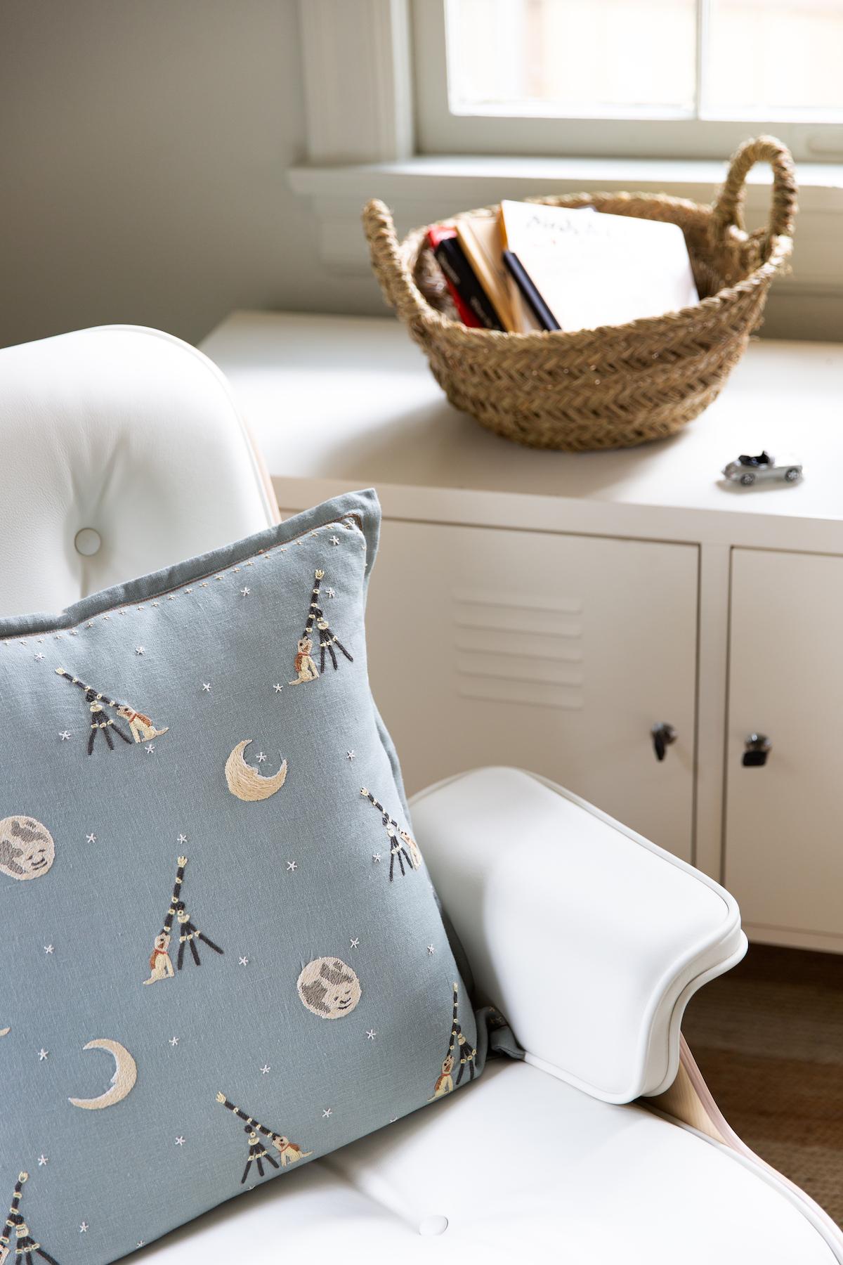
I’m not sure what we’re calling the theme of this nursery — it’s a little bit country, and a little bit outer space. Space cowboy, maybe? Anyway, my advice is: there’s no reason to feel confined to a theme, especially when designing a child’s room, which is meant to be fun and whimsical. Sure, that stargazing pillow kicked off the vision, but this cowboy artwork by Minta Maria was practically made for a little boys’ room too, so onto the wall it went!
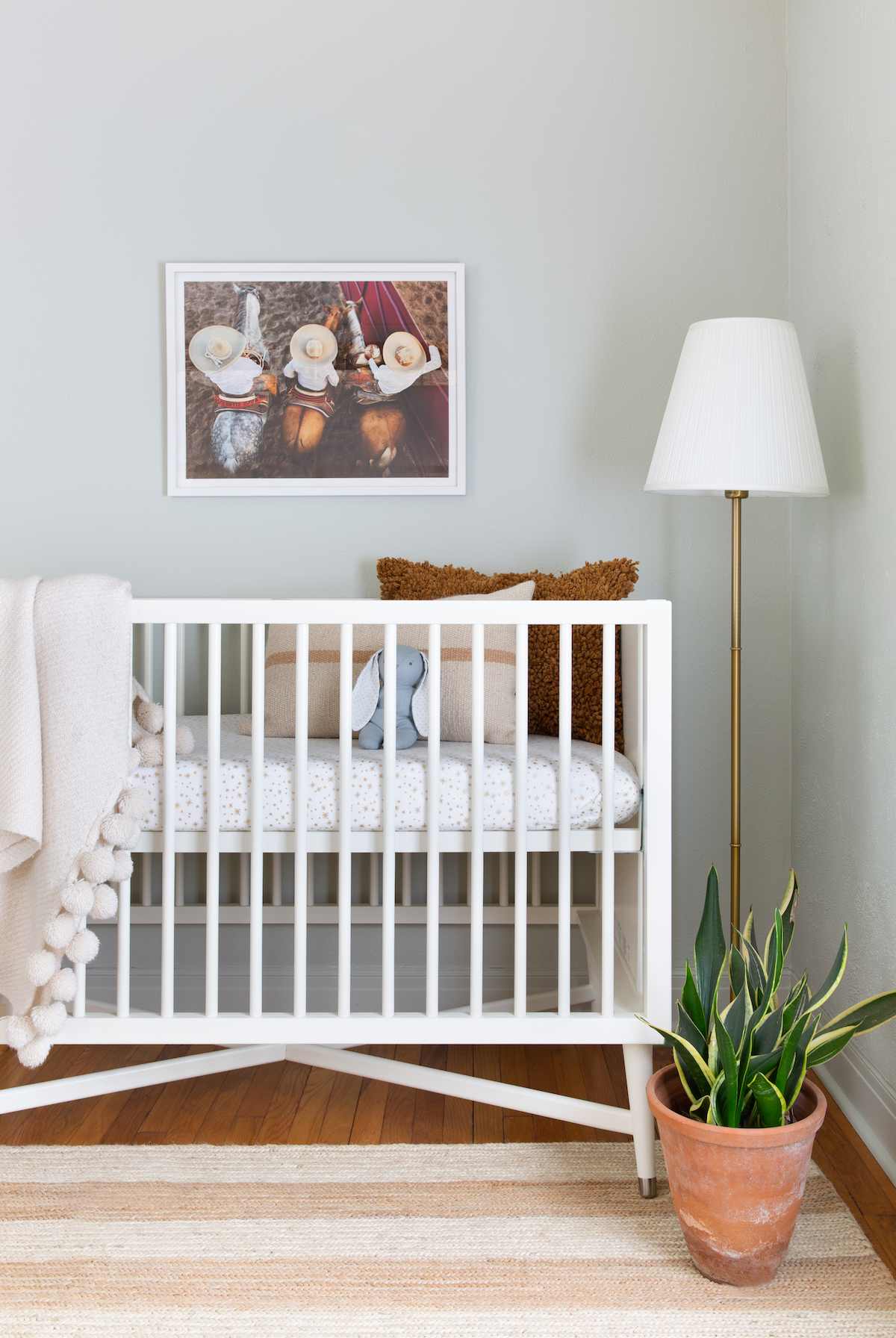
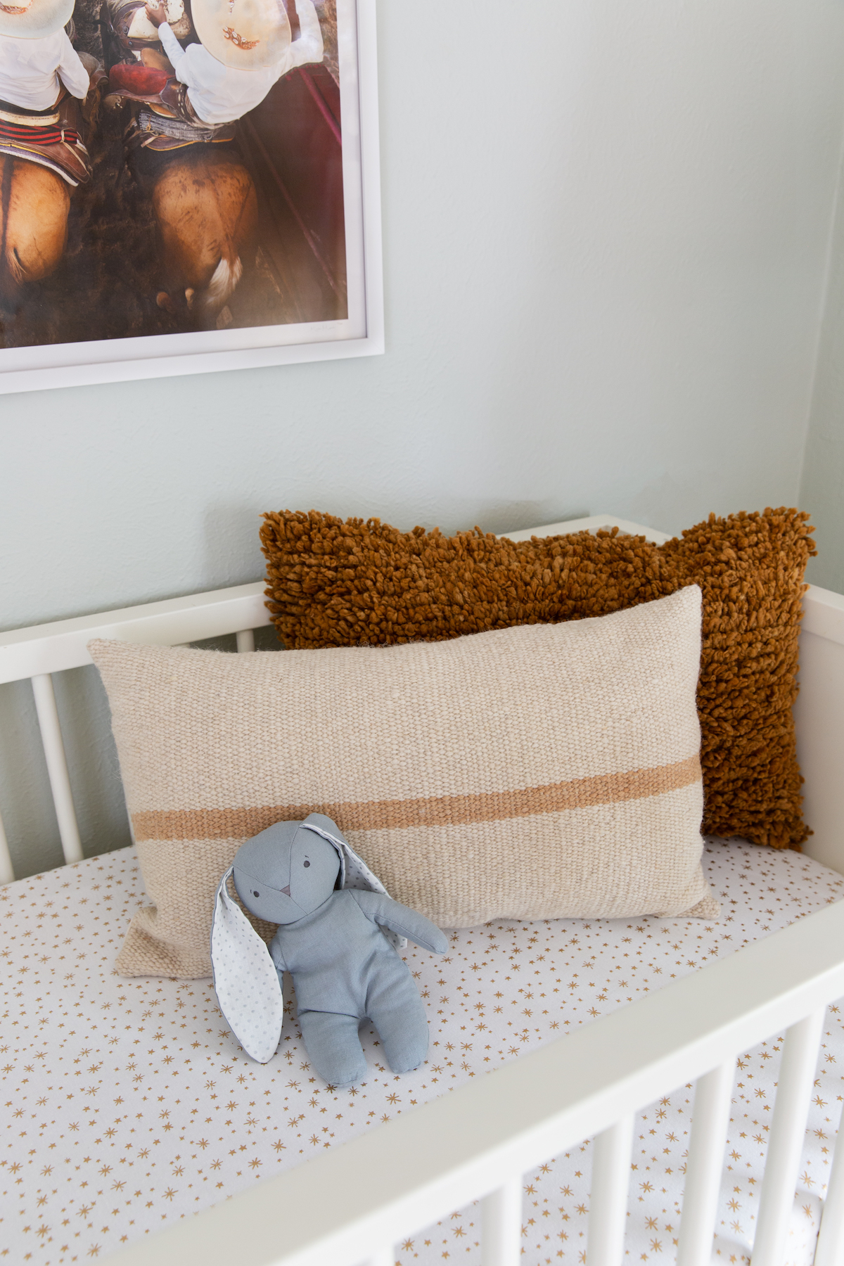
This bedding is from Pottery Barn Kids (one of a few different patterned crib sheets we have on rotation,) and the pillows are from one of my all time favorite shops, Bloomist. The crib is by Dwellstudio — modern yet timeless in every way!
We painted the walls, trim, and doors in Cromarty by Farrow and Ball. The hard to describe blue-green-gray is so serene and interesting, and still feels like a neutral to me.
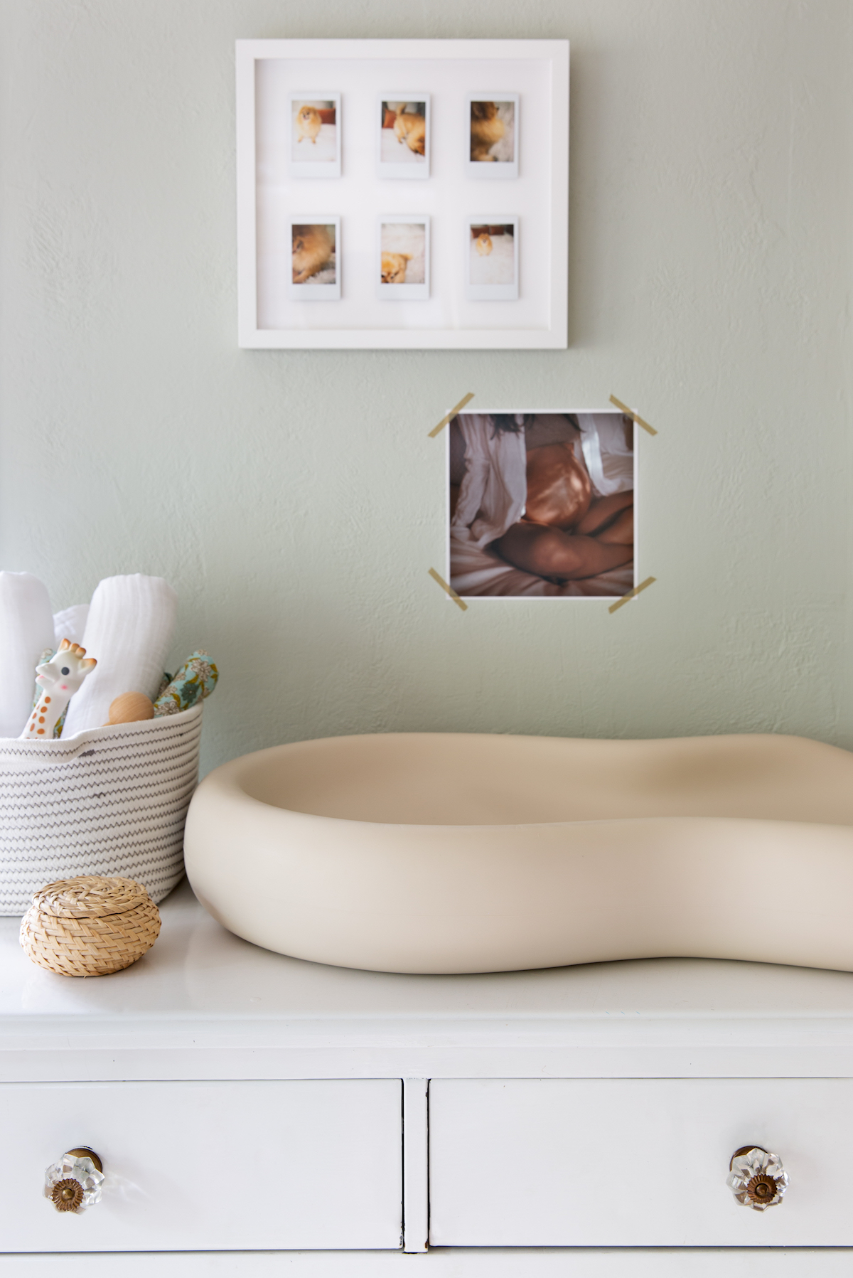
Above the changing table I hung some sweet polaroids of our dog, and a photo of my pregnant belly taken by talented photographer friend Kate Zimmerman Turpin. Baby boy is already infatuated with staring at these while I change him!
