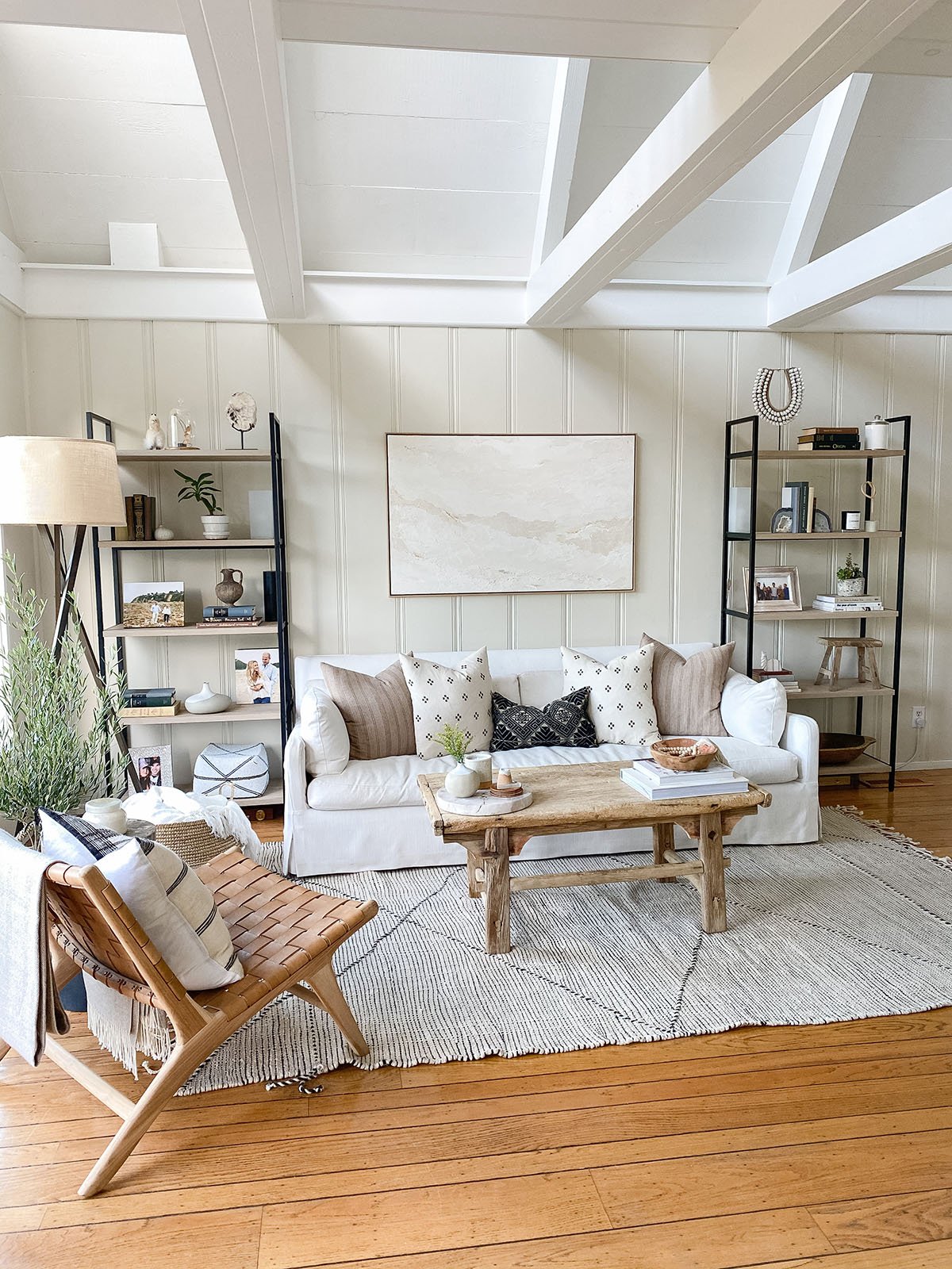
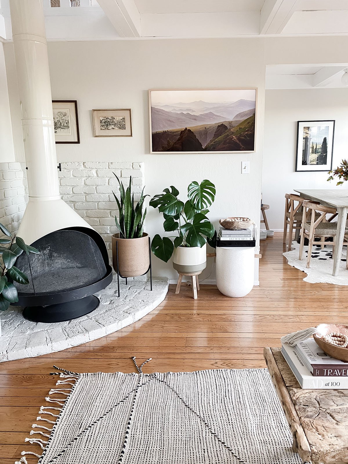
There is something almost magical about finding the perfect home. Whether it’s your first mortgage or a rental, you instinctively know as soon as you step one foot through the door, or in Johanna Vente Anderson (co-founder behind the artisan home goods shop, Saffron + Poe) and Carl Anderson’s case, when you spy the listing on Zillow. The couple “immediately fell in love” with the 1400-square-foot mid-century beauty in California’s Mill Valley. From the A-frame architecture to the double high ceilings, original 60s Malm fireplace, and stunning views of Mill Valley and Mount Tamalpais, it’s safe to say this 1960s home had all the charm and character they could dream of. So you can imagine our excitement when they asked us to reveal this stunning Saffron + Poe home tour.
This stylish couple’s approach to decorating is very similar to our own design M.O: a home should always evoke one’s personal style but also tell the story of the people who live there.
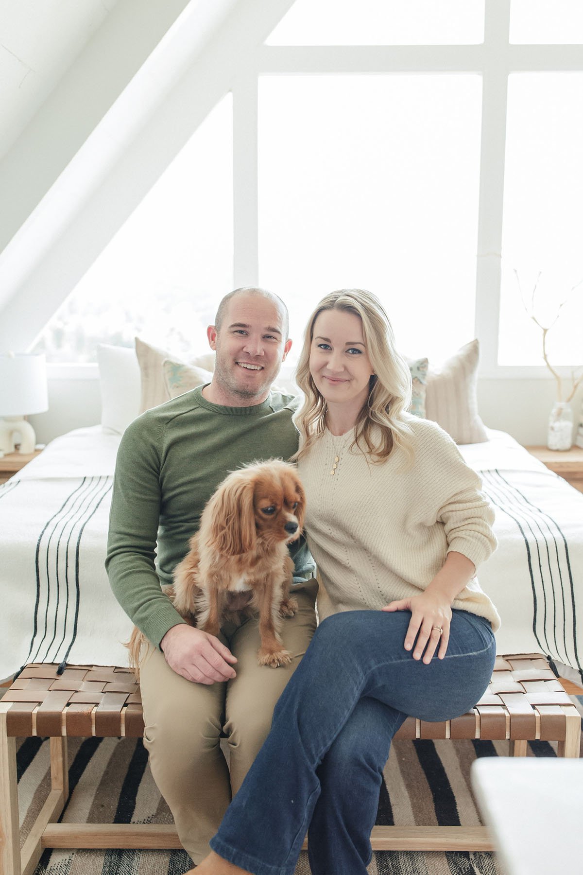
So when they started the decorating process, it was important to them that they honor the classic mid-century California architecture while also maximizing the home’s abundance of natural light. “I love a house that already has some charm and character that I can use as design inspiration,” notes Johanna. Ahead, we share the stunning home tour along with details on their design journey and links to shop the look.
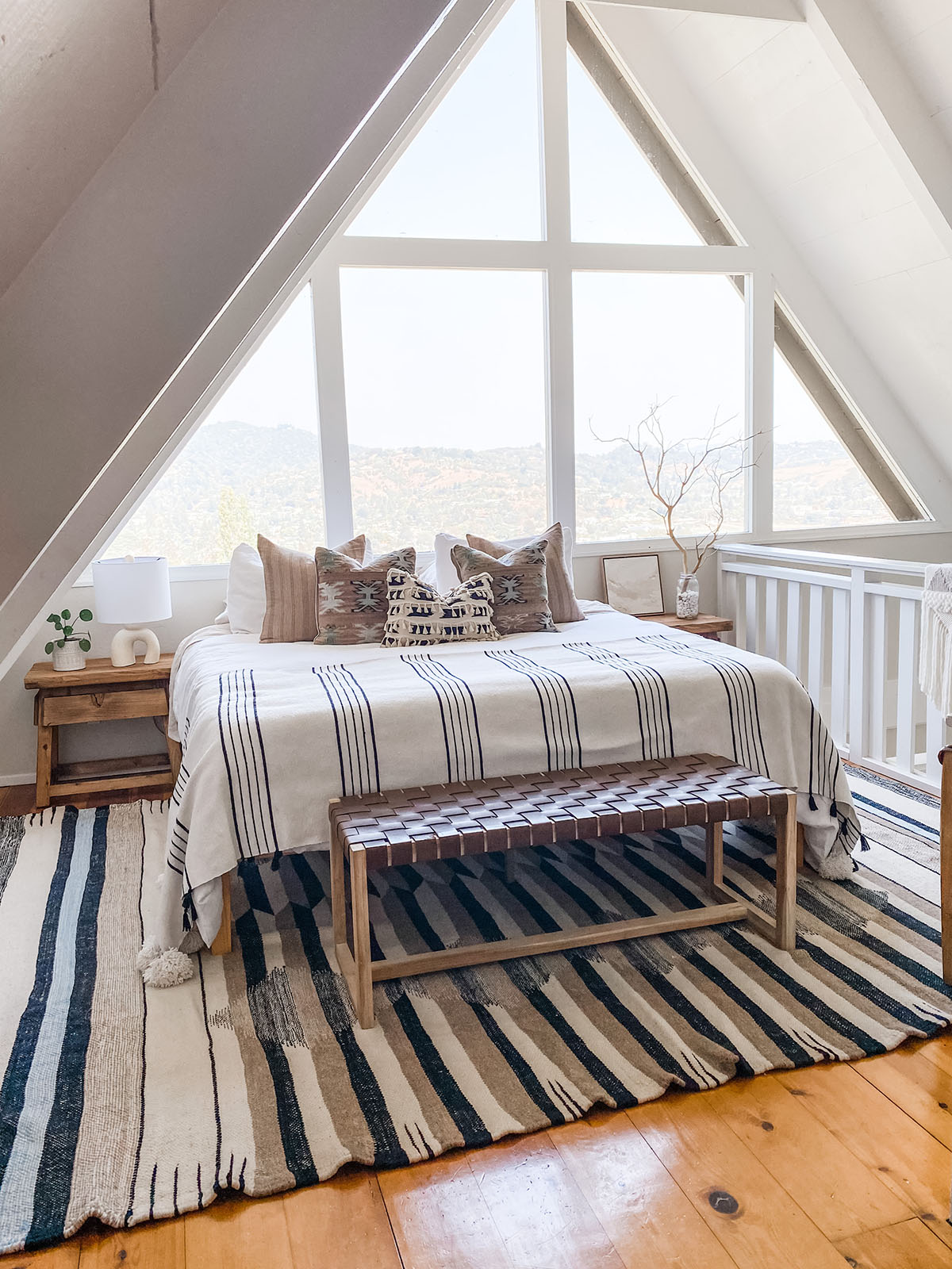
Let your travels be your guide…
Johanna’s primary source of inspiration for this space was her travels—something we all miss since quarantine. “I’ve been lucky to have traveled a lot in my life and it’s a big part of what motivated me to start our global sourcing and design business,” she explains. “We love taking the magic of those places home with us where it can be enjoyed in everyday living.” Pro Tip: Sprinkle decorative items—shells, rugs, throws, art—you bought on vacation around your home to bring sentiment and soul to your space. “I’m a nature and travel lover so I’m always trying to bring the outdoors in and collect treasures that tell a story,” she continues.
Her favorite piece is their Saffron + Poe leather strap lounge chair in the living room which they found on their very first sourcing trip to Bali. “It’s a nice little sentimental reminder of that incredible adventure all those years ago right in the middle of our living space,” she recalls.
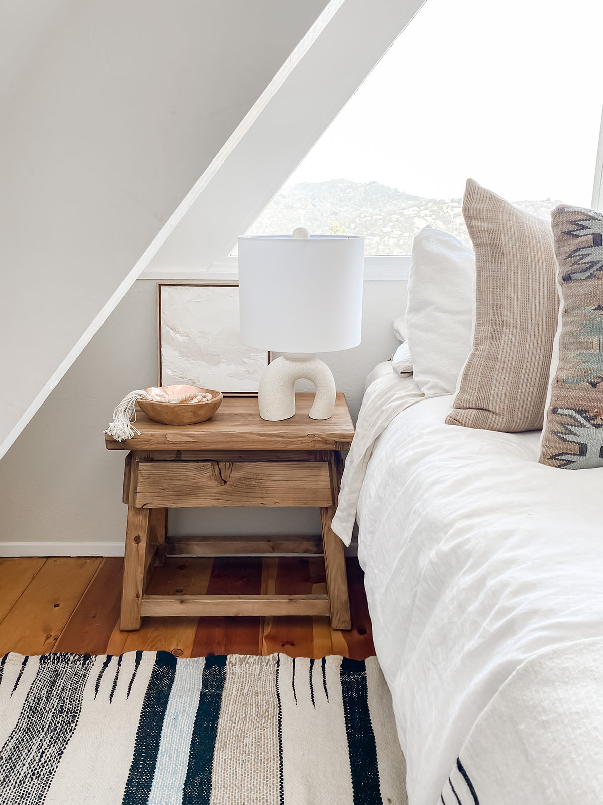
Layer your neutrals…
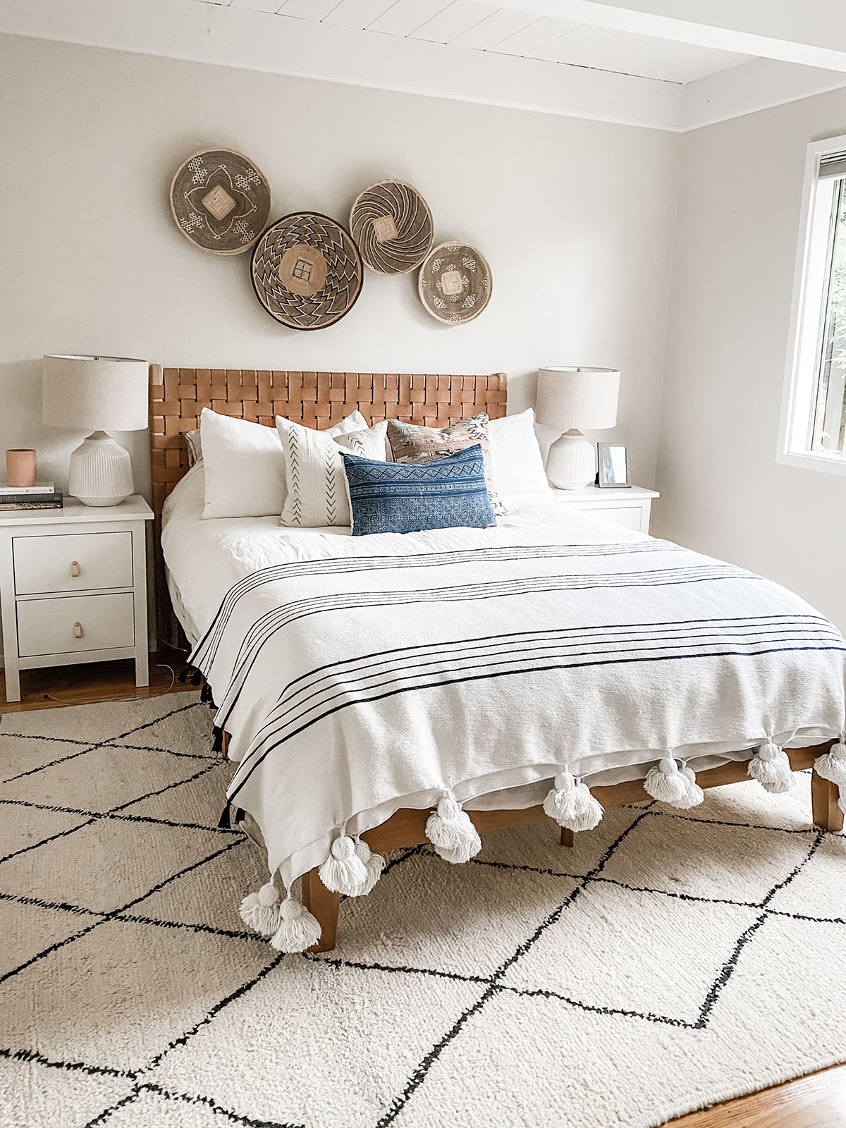
No matter the space, Johanna is a “neutral palette gal” for life. “The color scheme for me is always going to be soft-toned textiles, light natural wood, and tonal white walls,” she explains. If this sounds like you too, but you’re afraid it’ll look boring or bland, then follow Vente’s advice and add natural pops of color via art or throw pillows, and by incorporating plants into your design.
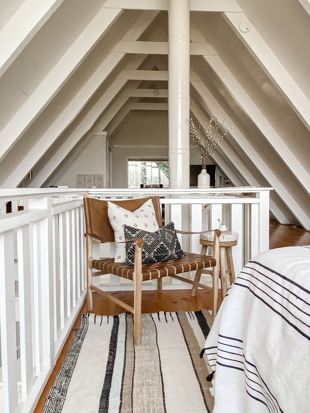
Find creative solutions to architectural problems…
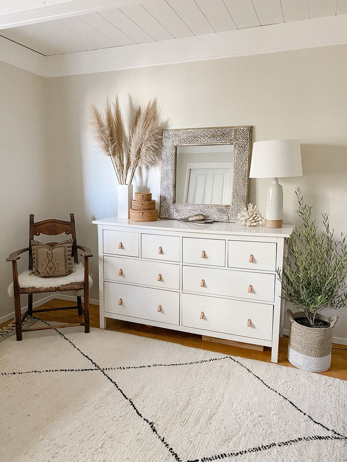
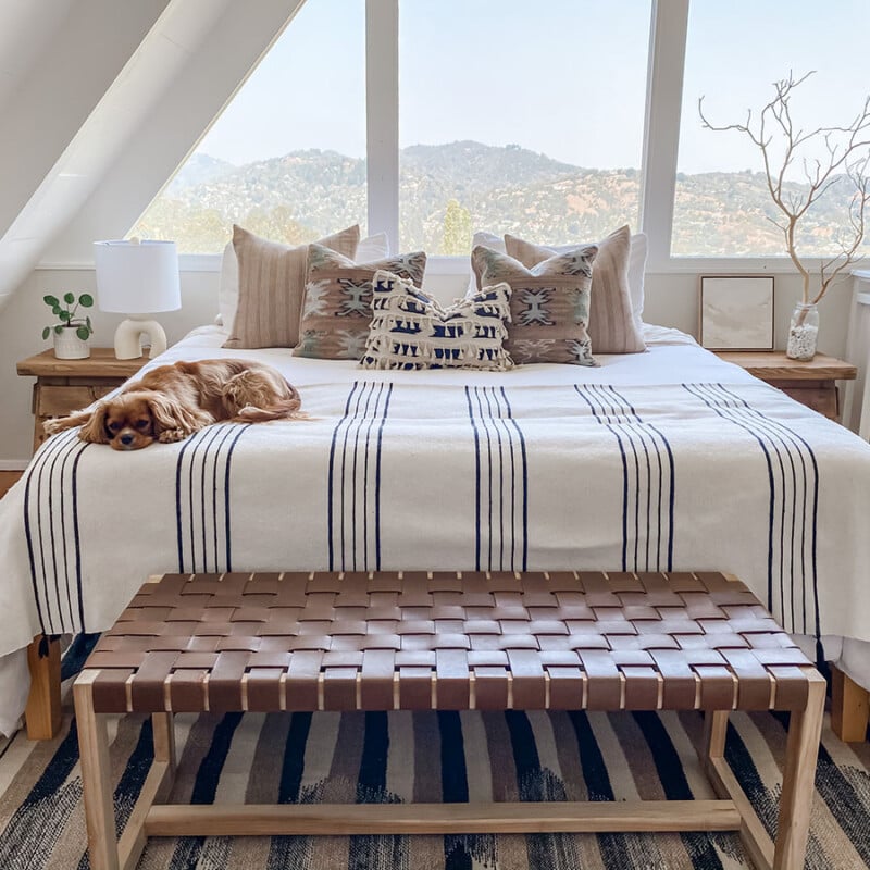
While the airy and bright vibe of the house matched Johanna’s go-to style, the classic 60s A-Frame with slanted walls proved a unique challenge when designing the space. But that therein lies the beauty of design and an opportunity to think outside the box. Without the ability to hang art or wall décor, Johanna was forced to get creative when adding visual interest to the space. This looks like statement chairs in empty corners with stools repurposed as side tables topped with decorative objects and accents. Now, the master bedroom is her “absolute favorite part of our home.” She adds: “The towering triangle windows above our bed provide gorgeous views of the tree-covered Mill Valley hills and Mount Tamalpais. It’s honestly the dreamiest place to wake up every morning.”
Make it stylish but liveable…
While we don’t pay attention to design rules at Camille Styles HQ, there is one that Johanna mentioned we agree upon: living spaces need to be livable. “Look for pieces that provide form and function, style and comfort,” she explains. “No sacrificing comfort for beauty—save that for your skinny jeans and best pair of heels.”
Mix high and low…
One of our favorite things about this space is its nuanced, neutral approach throughout but how do you maintain a balance between timeless and trendy? Through mixing found treasures, vintage, and antiques with contemporary pieces, you keep things current yet timeless, always.
Don’t stop decorating…
While the basics like paint color and key furniture pieces come together quickly, as Johanna says “a designer’s home is never done!”—and we couldn’t agree more. “I’m always reimagining every little detail and finding new treasures that need to find their way into my design,” she points out. “Given the constraints of the cozy size and specific architecture of an A-frame, I’m not making big changes to the space (yet!) but I do switch up the art, lighting, rugs, etc.”
So take your time, decorate slowly, and see your space as an evolution—there really is no end date. Pro Tip: Apply the “one-in, one-out rule” to maintain balance and avoid clutter. “I’m always editing as I add, maintaining the balance as I go versus a big edit every once and a while,” she says. “If I add something new, another element may get tucked away or passed on to a friend.”
The devil is in the details…
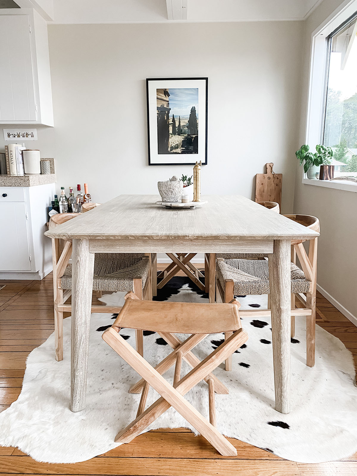
If there’s one thing Johanna stressed to us during our interview it’s the power of textiles to create a home that’s minimal and modern yet still warm and inviting. Think pillows, throws, and rugs to add warmth and texture to a space while allowing you to keep things minimal and chic. Always pay attention to these smaller details because they really make a big difference to the overall mood and energy of your space.
Mix practical with pretty…
Since spending so much time at home, we’ve all gotten a little stir crazy, but it’s only made Johanna even more grateful for the space she has. “I genuinely love this house which is a really amazing feeling when it’s where you spend all your time,” she says. That said, they had to get creative to ensure their home was a functional yet aesthetically pleasing co-working space now that her husband was working from home too. “We’ve just added a narrow console that we use as a laptop desk to our guest room in front of a sunny window to provide a more private workspace for meetings,” she shares. “I never planned to make that room an office and guest space as we have other office nooks in the house but it has added more flexibility to our work-from-home dynamics and it really just works for the space.”
What is your favorite thing about this home? Share it with us below along with your top design tips.
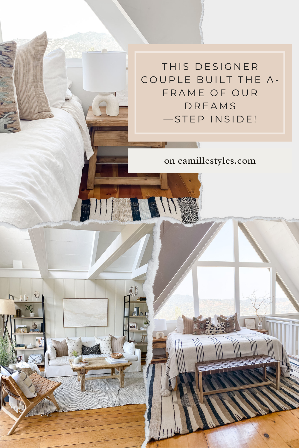
Loved this post? Pin this graphic to come back to it later.


I love the chair and throw pillow on it, both to the left of your dresser. Can you let me know where you got them?
Congratulations of the very charming and warm space you’ve created!
Kind regards
Great house!
I hate to be “that” person, but I thought you might want to know that the tag line should actually be “Our pupils are fully dialated.”