One of the easiest and most transformative ways to completely change the look of your home (without investing a ton of money in new furniture) is to paint it. Talk about an instant upgrade, paint can make any room look and feel fresh (and it also happens to be a great weekend home improvement DIY, too). The hardest part is choosing the right color. Now that life is picking up a bit and we’re all venturing outside more often, we think paint trends will start to zen out with ultra-soothing and calming color palettes.
It’s all about creating a relaxing space to come home to because the color palette of a room plays a huge part in the overall vibe and emotional tone that it sets. Chaotic patterns and bold colors, however fun and funky they may be, do not necessarily lend themselves to a calming environment (some may beg to differ, and that’s fine too!). So if peace, quiet, and gentle bliss are what you are looking for, then strive for calming color palettes that soothe the soul.
That said, you don’t necessarily need to transform your home into an oasis of pale grays, light blues, and stark whites. The combination of warm and cool tones is what gives a room an overall calming color palette, with varying degrees of brightness. We asked designers Max Humphrey and Julie Daele for their expert insight.
Check out our experts’ favorite calming color palettes ahead!
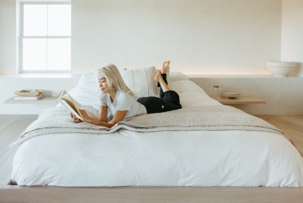
Bedroom
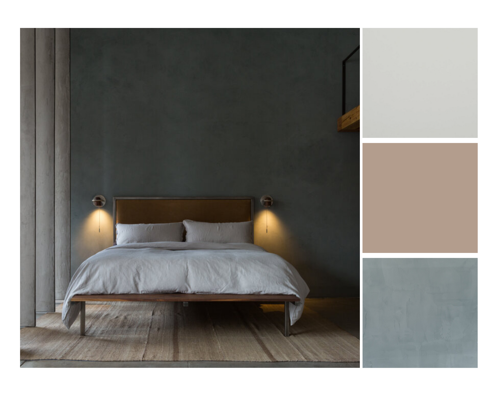
Photo by Amy Bartlam, courtesy of Well Received
Daele emphasized that you don’t always have to use warm beiges and light colors for a room to be calm and serene. Here, Portola Paint in Salem sets the scene for a truly zen environment.
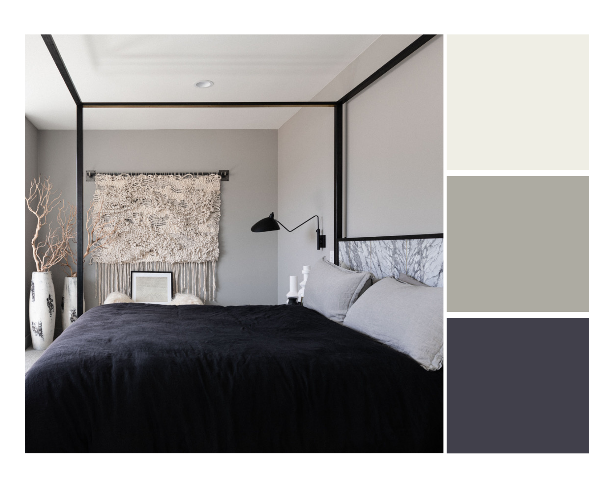 Photo courtesy of Well Received
A big fan of moody, yet peaceful, bedrooms, Daele loves shades that are reminiscent of Japanese design and her travels to Kyoto—like the classic greys found in Benjamin Moore Cape May Cobblestone.
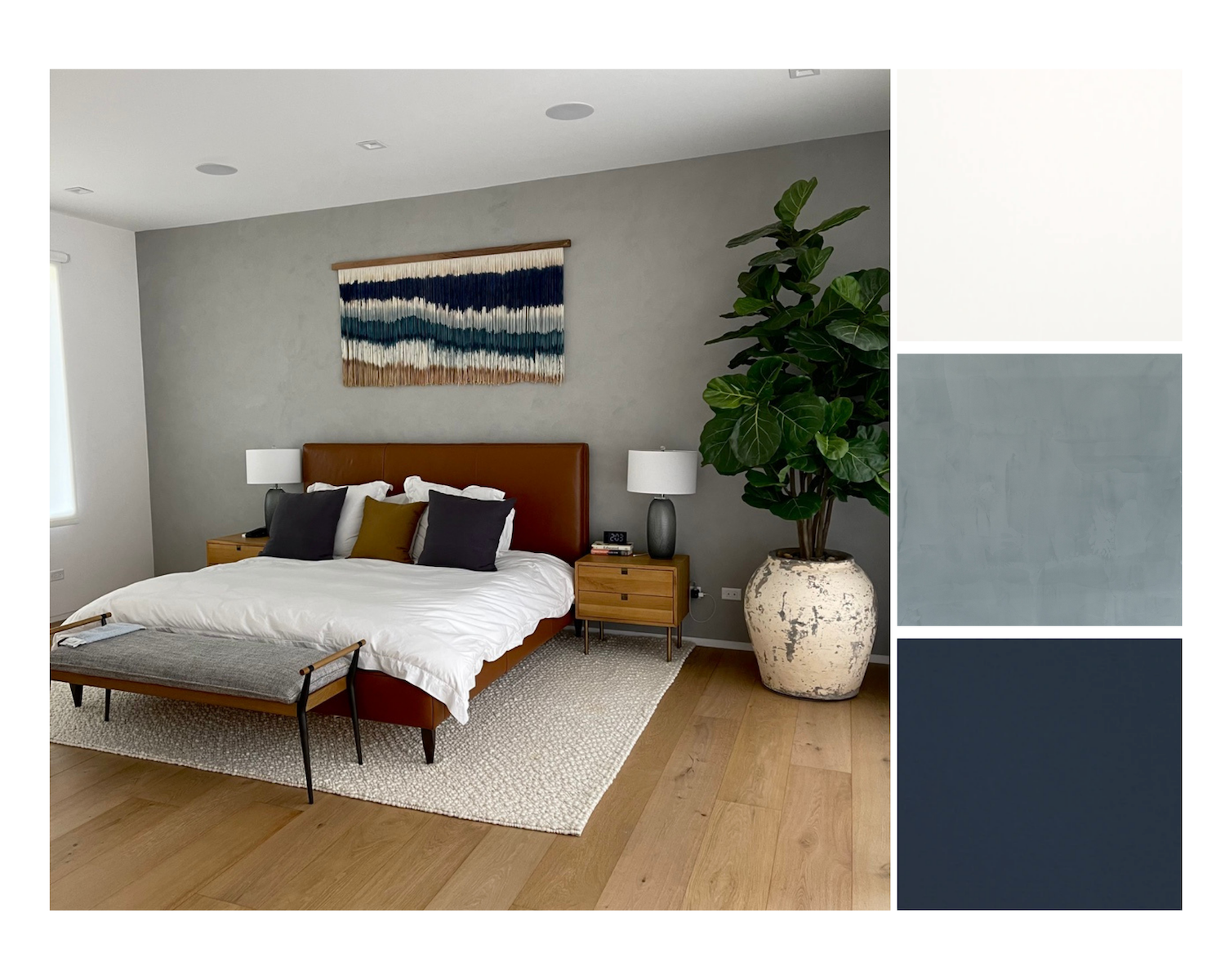
Photo courtesy of Well Received
How chic is this warm, yet muted bedroom? It’s proof that calming and serene doesn’t always equal pastel colors. This is another room that features Portola Paint in Salem, showing you just how versatile a single paint shade can be.
Kid’s Room
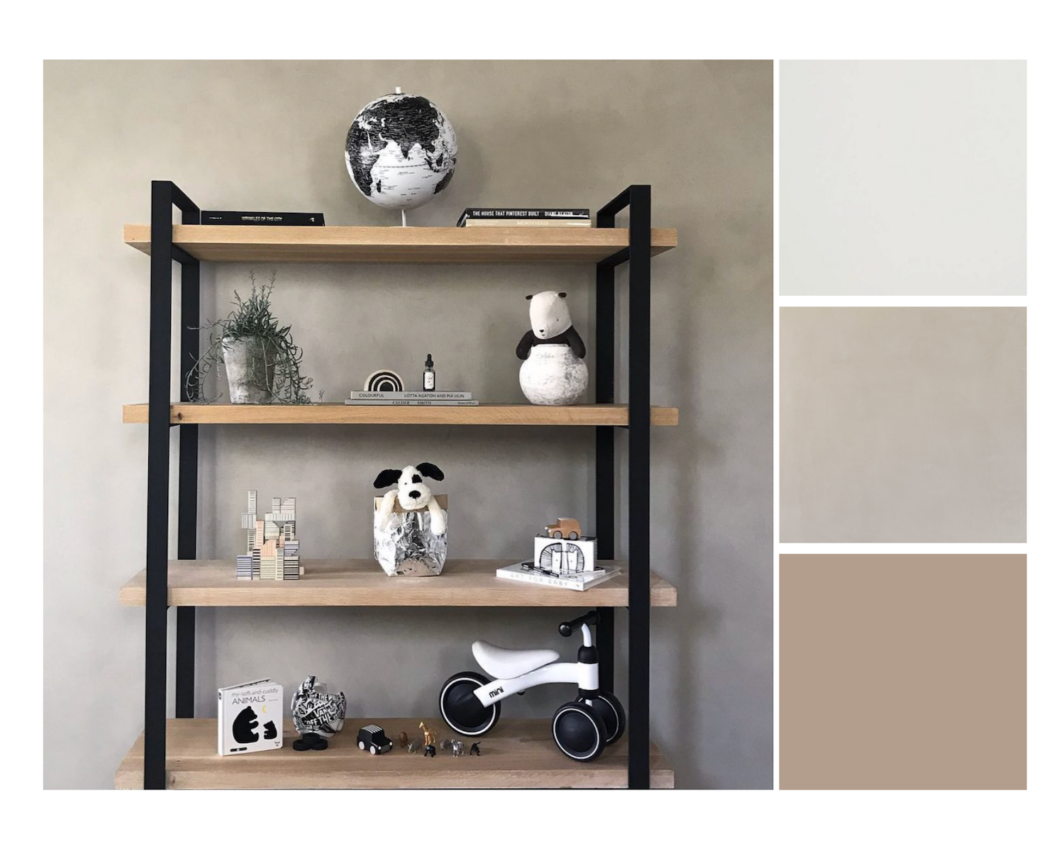
Photo courtesy of Well Received
When it comes to children’s rooms, Daele prefers neutral colors that allow the room to mature as the child grows. She also reminds us that the days of having to create the room around the sex of the baby are gone! Portola Paint’s Roman Clay in Charleston rules the palette above.
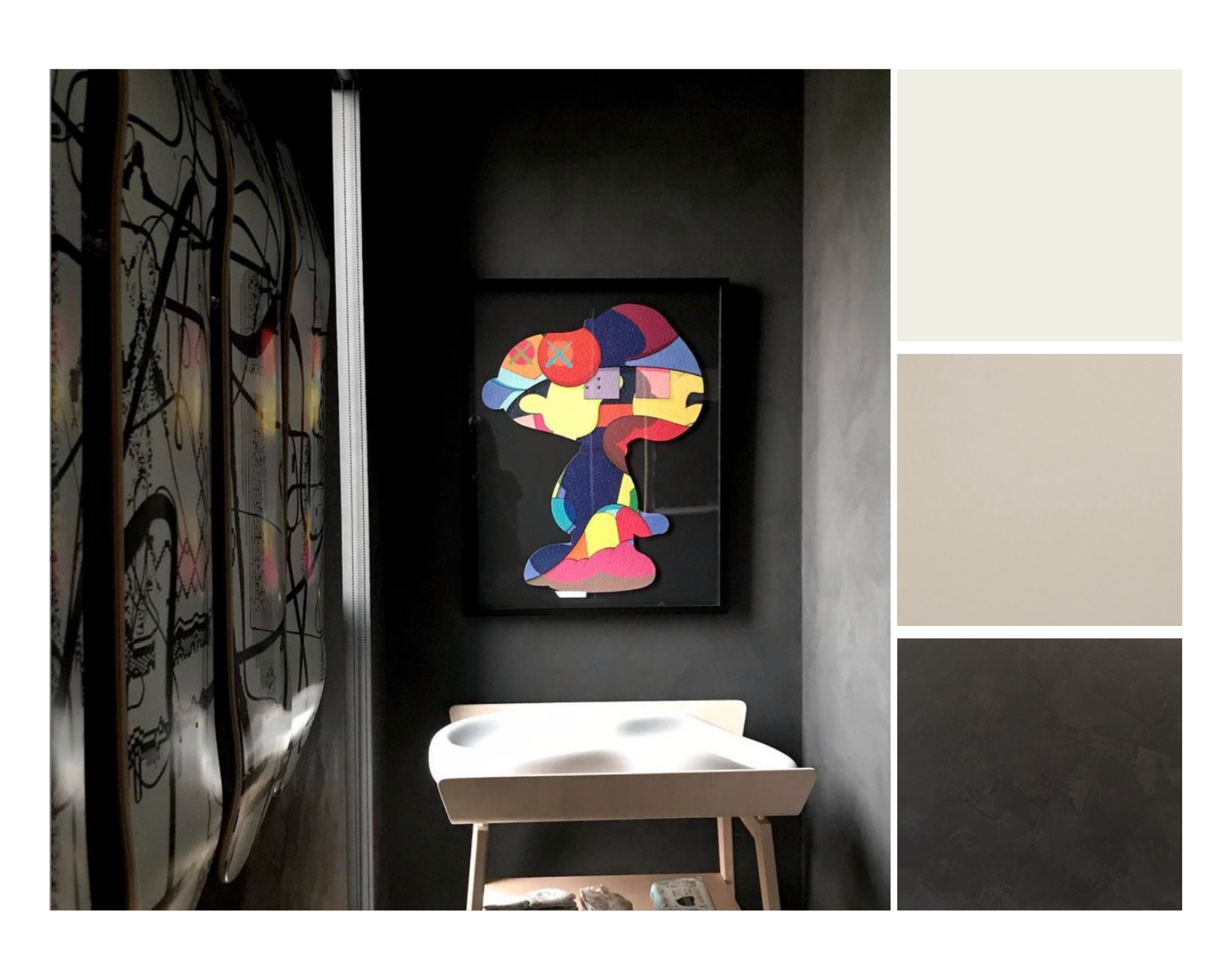
Photo courtesy of Well Received
For the above young boy’s room project, Daele chose to go a bit moody, using Portola Paint’s Roman Clay “Fade To Black” along with colorful pops of artwork. It might not be for everyone, but she loves the juxtaposition of the art with the dark walls.
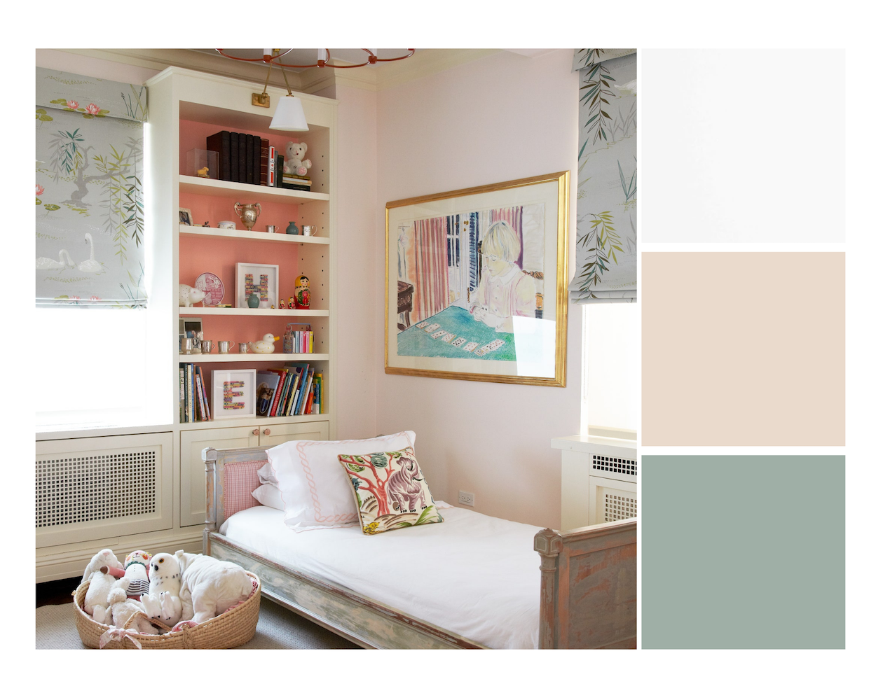
Photo by Pappas Miron Design
Humphrey is all about a super soft and muted sandy pink like Benjamin Moore’s Bashful. It can be a sweet addition to a child’s room and set the stage for a light and bright palette without being overtly gendered.
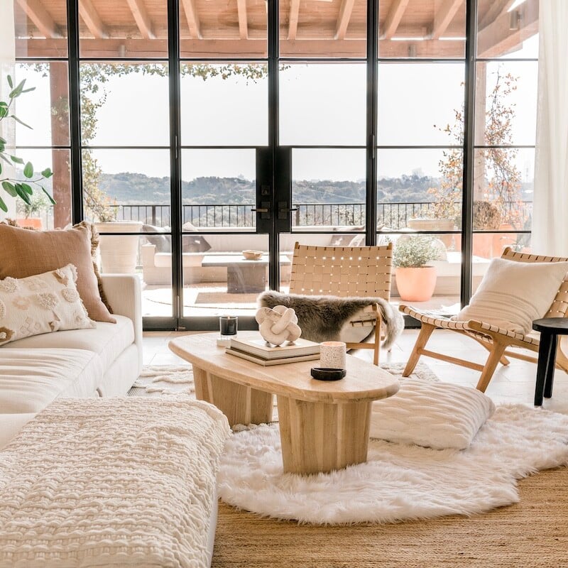
Living Room
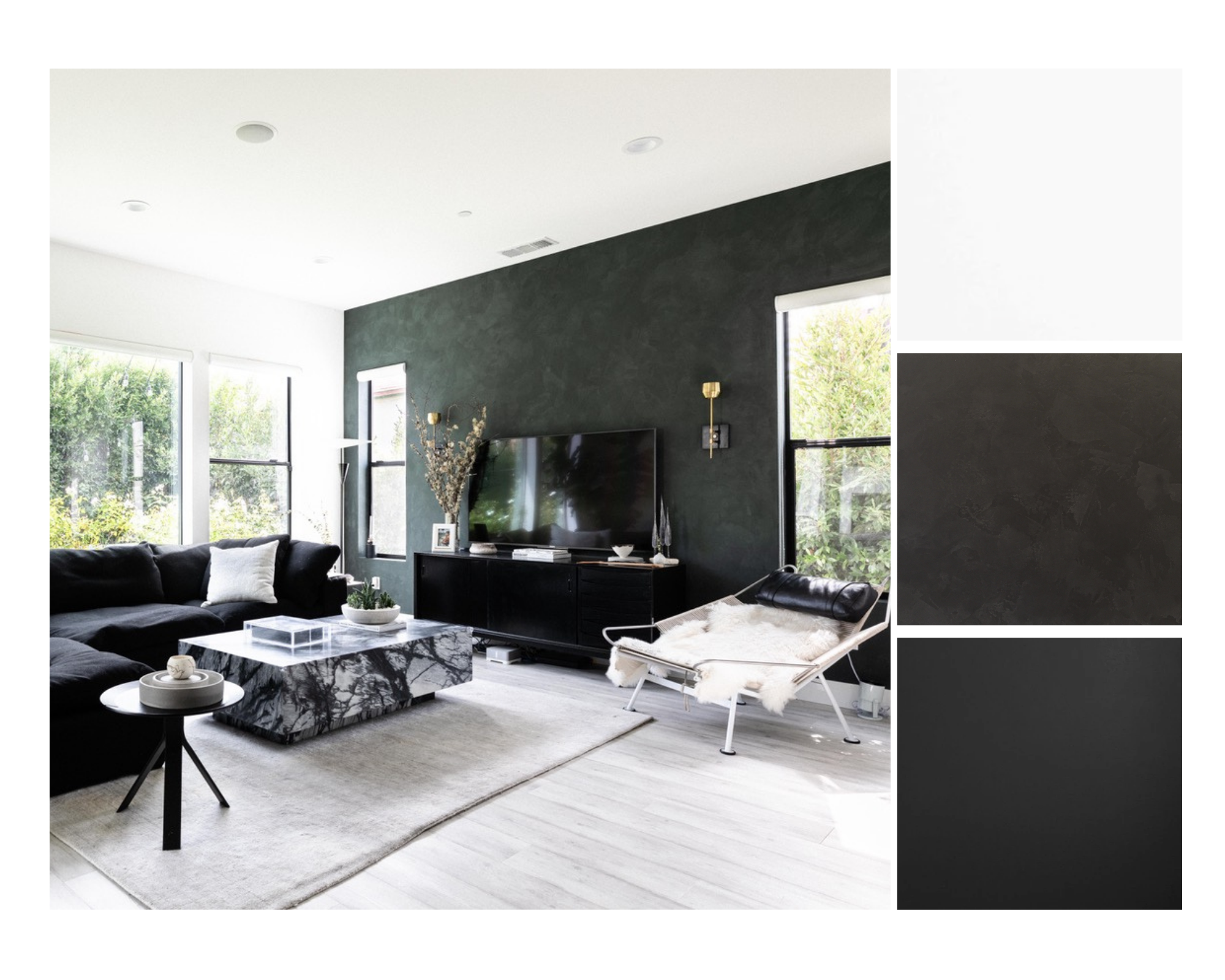
Photo by Stephen Paul, courtesy of Well Received
According to Daele, more people are steering away from the all-white walls, wanting to mix white with an accent wall of color and/or texture. Portola paint in Lone Park is the star of Daele’s stunning living room above.
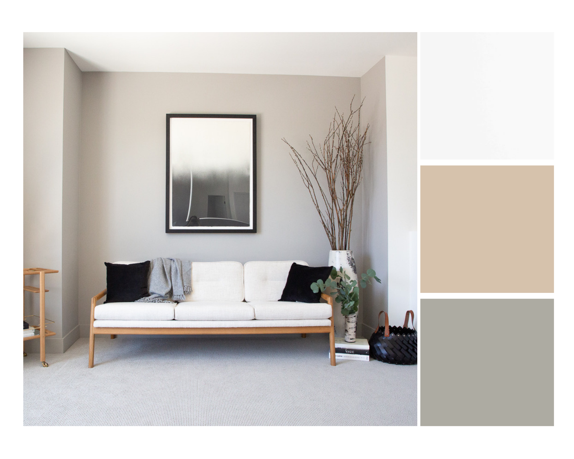
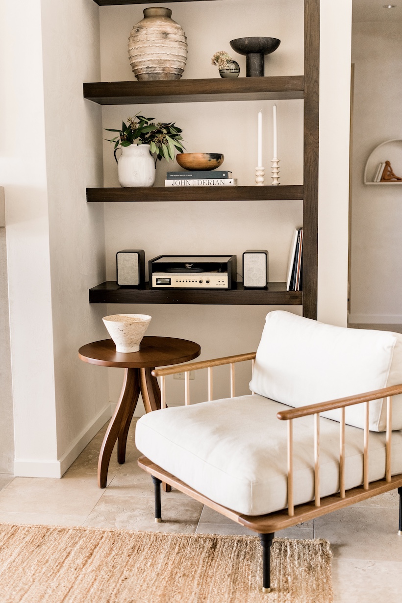
Photo courtesy of Well Received
Daele also enjoys mixing two neutral colors (i.e. greys and browns) to create texture and contrast in the room. Classic go-to shade Cape May Cobblestone by Benjamin Moore sets the stage in the photo above.
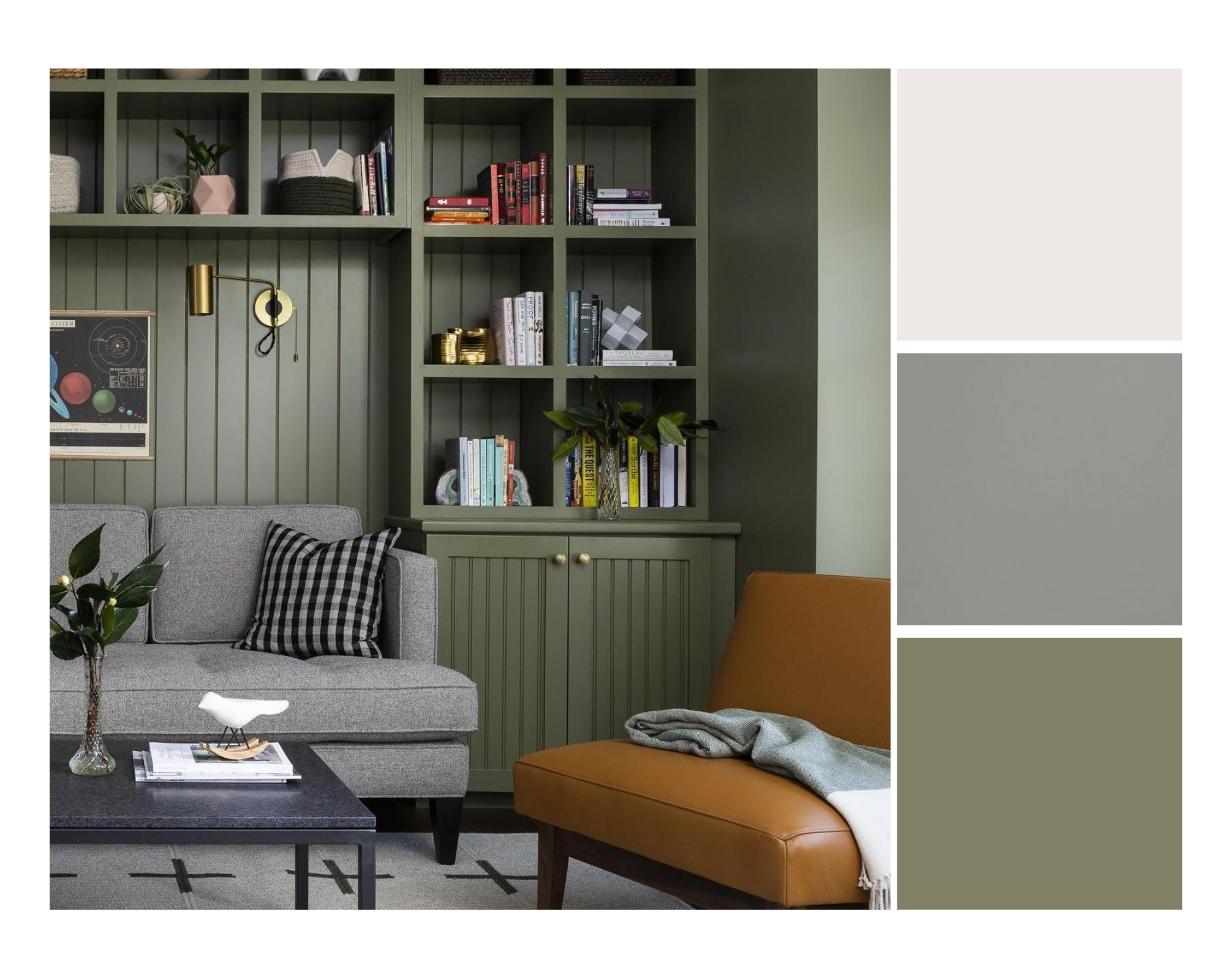
Photo courtesy of Max Humphrey
Humphrey is all about using olive as a neutral, and Benjamin Moore’s Tate Olive is the perfect shade for a room that is ultra chill without being boring.
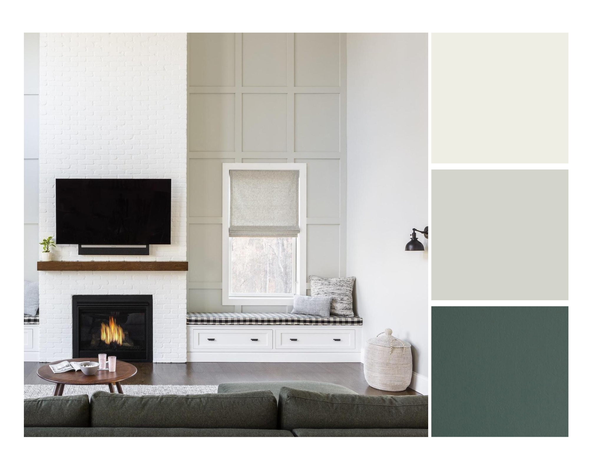
Photo courtesy of Max Humphrey
Humphrey doesn’t find white paint to be calming at all, it’s a bit too sterile for his taste, which is why he’ll often turn to a soft gray like Benjamin Moore Gray Owl when designing neutral spaces.
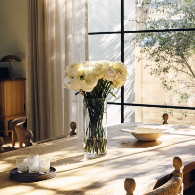
Dining Room
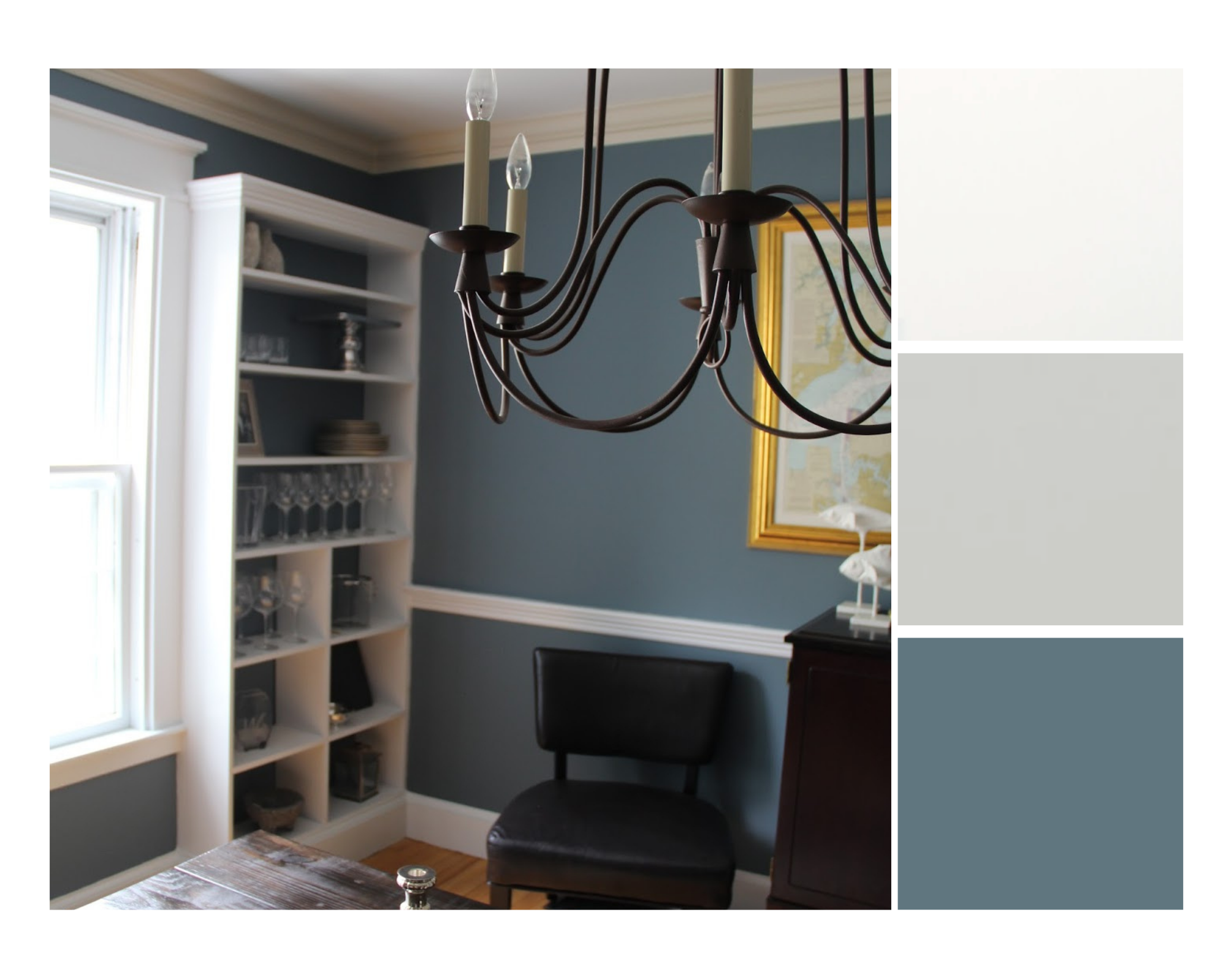
Photo by Olive and Tate
Color is instinctual for Humphrey, he usually wants to reference nature in some way—blue and pink sky, green grass, etc. Benjamin Moore’s Hamilton Blue does just that. Doesn’t it remind you of a stormy sea?
What’s your favorite calming color palette? Share it with us below.