
After over a year of mostly staying home, it’s impossible not to notice those little details of our homes that could use some extra love. The tiny corner of your bathroom that could use a touch of spackle, the ding on your dresser or the bits of flaky paint on the living room wall all seem magnified after months of staring at the same four walls. So, the next time you’re gazing off into the middle-distance while trying to figure out how to freshen up your home, consider one of these 13 paint color trends for 2021.
Even if you’re not one to hop on a bandwagon, there are exciting and unexpected paint trends cropping up for every aesthetic. People are paying close attention and care to their homes this year, and a new coat of paint is the perfect way to completely change the vibe and bring in some much-needed joy. After years of all-white-everything, the most exciting paint color trends of 2021 include bold statement hues that inject happiness into any space.
When we asked interior designers what paint colors were trending in 2021, we were pleasantly surprised at what they had to share. One thing is for sure, a wide array of color trends are on the horizon but ultimately, picking a paint color based on your personal aesthetic is key. As Portland, OR-based designer Max Humphrey reminds us, “The good thing with paint is if you get sick of it in a few years you can just paint over it—so I like to push myself and my clients to go for the bolder paint color options. It’s just paint!”
Still can’t bring yourself to go bold? Designer Julie Van Daele has your back. Her recommendation is to, “stick with a more classic and versatile color but pump up the volume with texture! It’ll be way more timeless.” Great idea!
It doesn’t get much better than these 13 paint color trends for 2021.
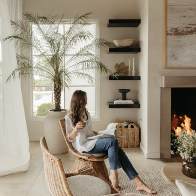
Image by Sean Litchfield for Tali Roth Designs.
Hannah Banana from Benjamin Moore
Designer Tali Roth is finding herself drawn to rich yellow tones like this cheerful banana cream pie hue. She reiterated a piece of advice from Kelly Wearstler about “going to your wardrobe, draping those colors around your house and seeing how it makes you feel.” Chances are if you like a pop of yellow in your clothing, you’ll love it on your walls.
Dead Salmon from Farrow & Ball
According to Roth, paint color trends for 2021 are all about a throwback to the 1980s. Earthy palettes like browns, mushrooms, and muddy colors are finding their way indoors. The trick is to find a perfect shade, like Dead Salmon, which features hints of pink to avoid a dowdy feel.
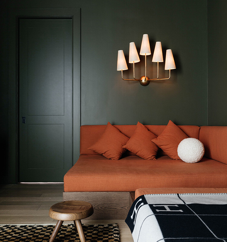
Image via Max Humphrey.
Dirty Martini from Clare
Humphrey is all about using olive green paint instead of a more traditional navy blue. He points out that “it looks great on a bedroom wall and really great as a cabinet or dresser color, especially when a slight sheen like satin or semi-gloss is used.” This cloudy olive green hue from Clare is soft while still making a chic statement.
Ghost Ranch from Backdrop
In a similar realm to the earth-driven browns previously mentioned, Roth emphasizes that rich earth tones like terracotta, dark reds, and mustards are also going strong. Ghost Ranch splits the difference between a classic brown and deep red—it’s the perfect warm terracotta.
Roman Clay from Portola Paints
Van Daele can’t get enough of textured walls, it’s the perfect way to turn an ordinary paint job into a big statement. She says, “Try to add texture to your wall, not just a flat color. Your walls can be a statement in texture, but not necessarily color. I love Portola Paints’ Roman Clay!”
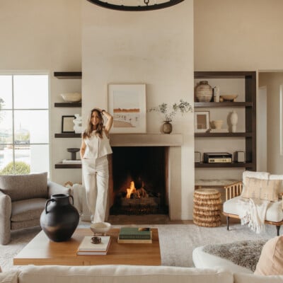
Image via Tali Roth Designs.
Calke Green from Farrow & Ball
This classic deep sage green is absolutely gorgeous—no wonder it’s one of the biggest paint color trends for 2021. This elegant, traditional shade is practically a neutral color and it is incredibly versatile. It would look stunning in a smaller room, office, or home library.
Good as Gold from Clare
Pretty much all the designers we spoke to emphasized the resurgence of mustard tones in paints. This softly sunny shade from Clare is rich and joyful without being overly bright. Use it to brighten up a kitchen corner, bathroom, or small bedroom. There’s something special about this warm gold hue.
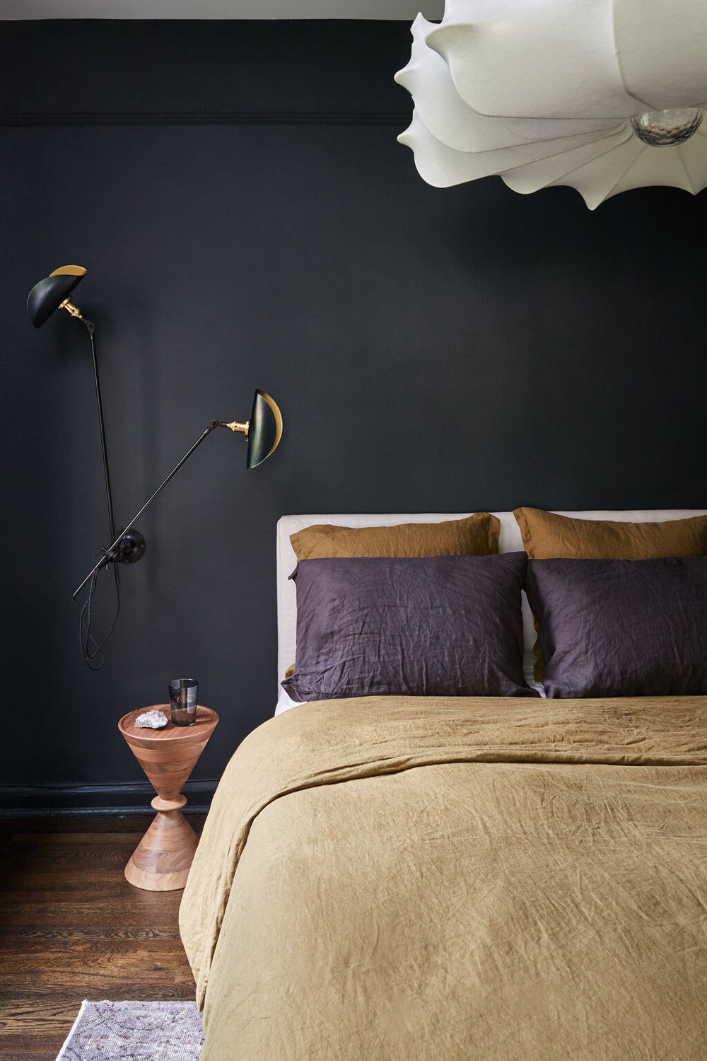
After Hours from Backdrop
Romantic and moody, After Hours from Backdrop is the ideal soft charcoal black for a sexy bedroom or a candlelit bathroom. While dark paint colors have been gaining popularity in recent years, the need for a retreat within one’s home has helped to really boost this shade’s prominence. It’s the perfect hue for a quiet, zen little hideaway within your own home.
Rust from Benjamin Moore
Both Roth and Van Daele mentioned the prevalence of rust as one of the biggest paint color trends for 2021. No longer limited to being an outdoor color, this super-saturated true rust would look incredible in an office, dining room, reading nook, or bathroom.
Aegean Teal from Benjamin Moore
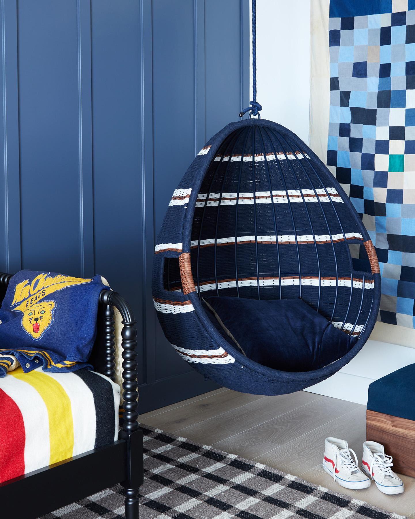
Hyperlink from Clare
Jewel tone paint shades are gaining prominence this year with everything from eggplant to ruby reds dominating the scene. This cheerful, aptly-named bright blue shade has enough white undertones to use in a bedroom without starting to feel like the walls are going to close in on you.
36 Hours in Marrakesh from Backdrop
Earthy paint shades abound in 2021 and this deep, warm pink would look just as beautiful in a kitchen as it would in a bedroom or small living space. It’s pink without being overtly feminine and grounded without feeling too brown. A true neutral pink for those hesitant to dive into something brighter.
Gray Cashmere from Benjamin Moore
Once you start to think outside the box, you might just find that a more neutral shade with undertones of a certain color is the right way to dip your toes into the bold paint world. After all, it’s not easy to go from years of neutral walls to a bold shade! “If you like the idea of incorporating green into your home via paint, maybe find a beautiful brown or grey that has hints of green in it,” Van Dael recommends. Gray Cashmere perfectly fits that bill.
Loved this post? Pin this graphic to come back to it later.
Nothing from Behr the highest quality paint in the industry!!!