Paint has an incredible ability to enliven a space, imbuing a sense of ease and character into each room. For our family, the aesthetic power of paint played a major role in our design process, so we leaned on the integral quality of Benjamin Moore in the renovation of our 1950s Malibu beach house. We spend so much time within the walls of our home, so it’s an area where quality reigns supreme. I love how a simple, fresh coat of paint can bring out the beauty of a room. It’s something you can’t always put your finger on but makes a huge difference in the overall feeling.
When it comes to Benjamin Moore, the iconic paint company offers incredibly durable colors that stand up to years of wear and tear. This means that my walls always have the color vibrancy and smoothness that give it that clean slate feeling.
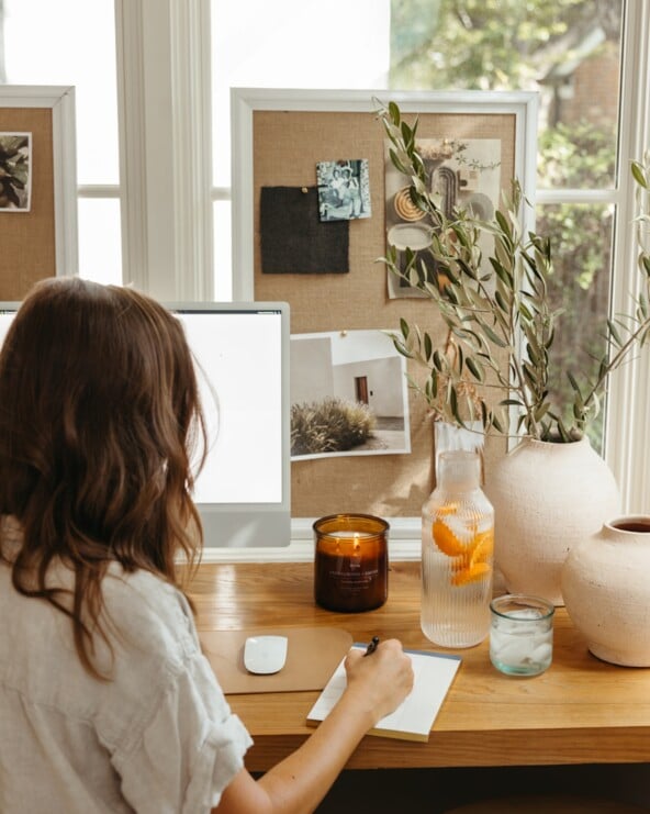
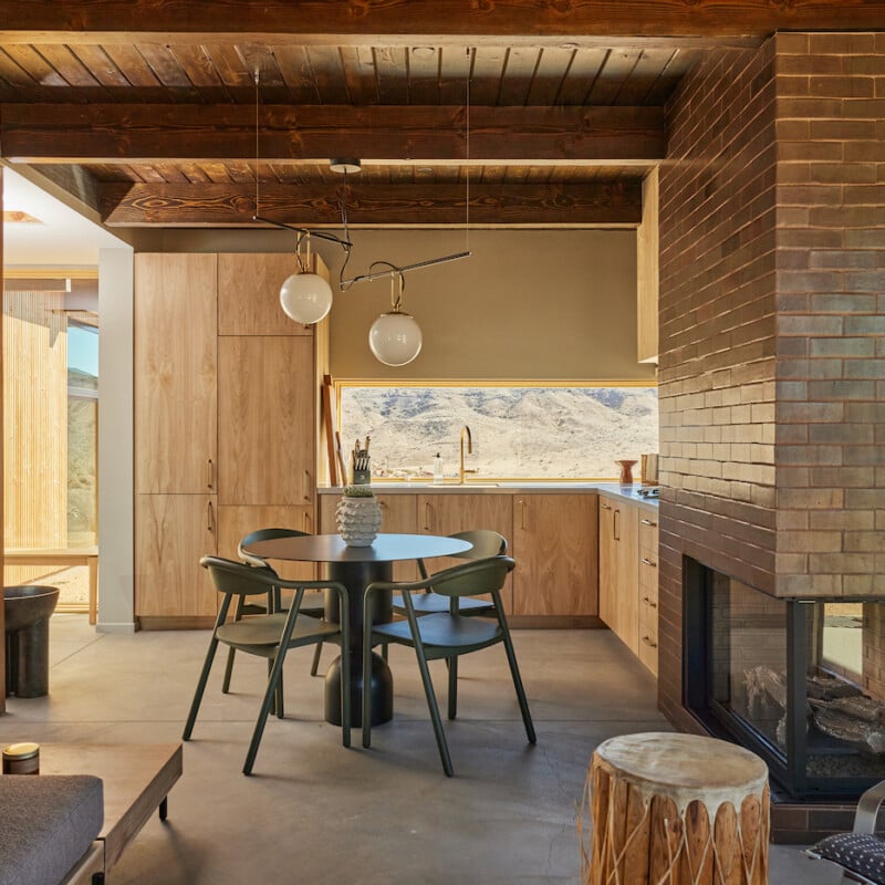
Featured inspiration image of Brandy Joy Smith’s Joshua Tree cabin by Zachary Gray.

A Color Journey
Finding paint colors that speak to the soul of a home is a personal journey. It requires time, inspiration, and a keen sense of how you want the finished rooms to feel. We looked to the surrounding landscape for our color answers: Coastal California’s rocky cliffs, deep blue waters, wild grasses, and sandy beaches provided the palette from which we drew. From the beginning of our design process, we’ve drawn on Malibu’s incredible natural environment as inspiration. I want every element to feel as close to its natural state as possible.
The colors of Benjamin Moore provide an endless palette from which to feed this inspiration, believes Andrea Magno, the company’s director of color marketing and development. “Inspiration can come from so many different sources, and we want to provide the colors and resources that help both designers and homeowners bring that color inspiration to their walls,” Magno adds.
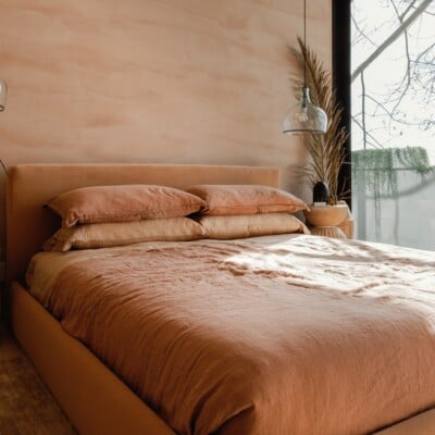
From the saturated blues of the ocean to the variations of blue found in the sky at different points in the day, to the warm neutrals that remind us of walking on a sandy beach, we’ll have beautiful choices that reflect my points of inspiration.
I love how a simple, fresh coat of paint can bring out the beauty of a room. It’s something you can’t always put your finger on but makes a huge difference in the overall feeling.

A Sea of Options
With more than 3500 colors, the Benjamin Moore offering is quite expansive. With hues ranging from bold and saturated, to muted and soft, to a wide range of whites and pastels, Magno admits the vast array may be overwhelming at first glance. But Benjamin Moore groups the colors into collections, each with distinct characteristics that can help customers navigate the options and find the colors that speak to them.
“For example, our Affinity collection is ideal for the customer who wants to mix and match colors with confidence, while our Off-White Collection is designed to offer a range of white paint colors all within one collection, making it easy to appreciate the nuances and subtleties within the white color family.”
We aim to keep our Malibu home color palette in lighter, more neutral tones that both honor the inspiring landscape and make the house feel expansive. When the main house is done, it’ll be 2,500 square feet, and my vision is that it’ll feel much larger. We’re designing the floor plan to be as open as possible—the vaulted ceilings, open living space, natural light, and muted palette will create that sense of airiness I love. Washes of lighter shades will create a flow and cohesiveness throughout the home, allowing a seamless transition from room to room and an overall sense of inspired ease.