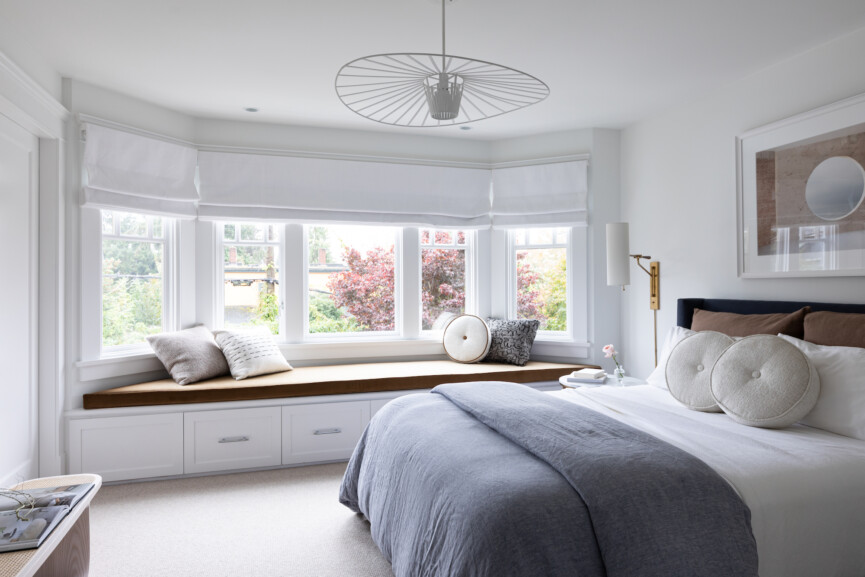
Designing a home for someone else is both a creative and collaborative experience. To honor the aesthetics and values of those living in a space, an interior designer will play journalist of sorts, asking questions and evaluating what’s critical and loved. But occasionally, a design project begins with intuition. This is often the case for interior designer Gillian Segal. “Deciding which projects to move forward with is a gut process,” the principal and founder of Gillian Segal Design tells us, emphasizing that this was the case for the renovation of this stunning Craftsman house in Vancouver’s beachy Kitsilano neighborhood. “I immediately fell in love with the client.”
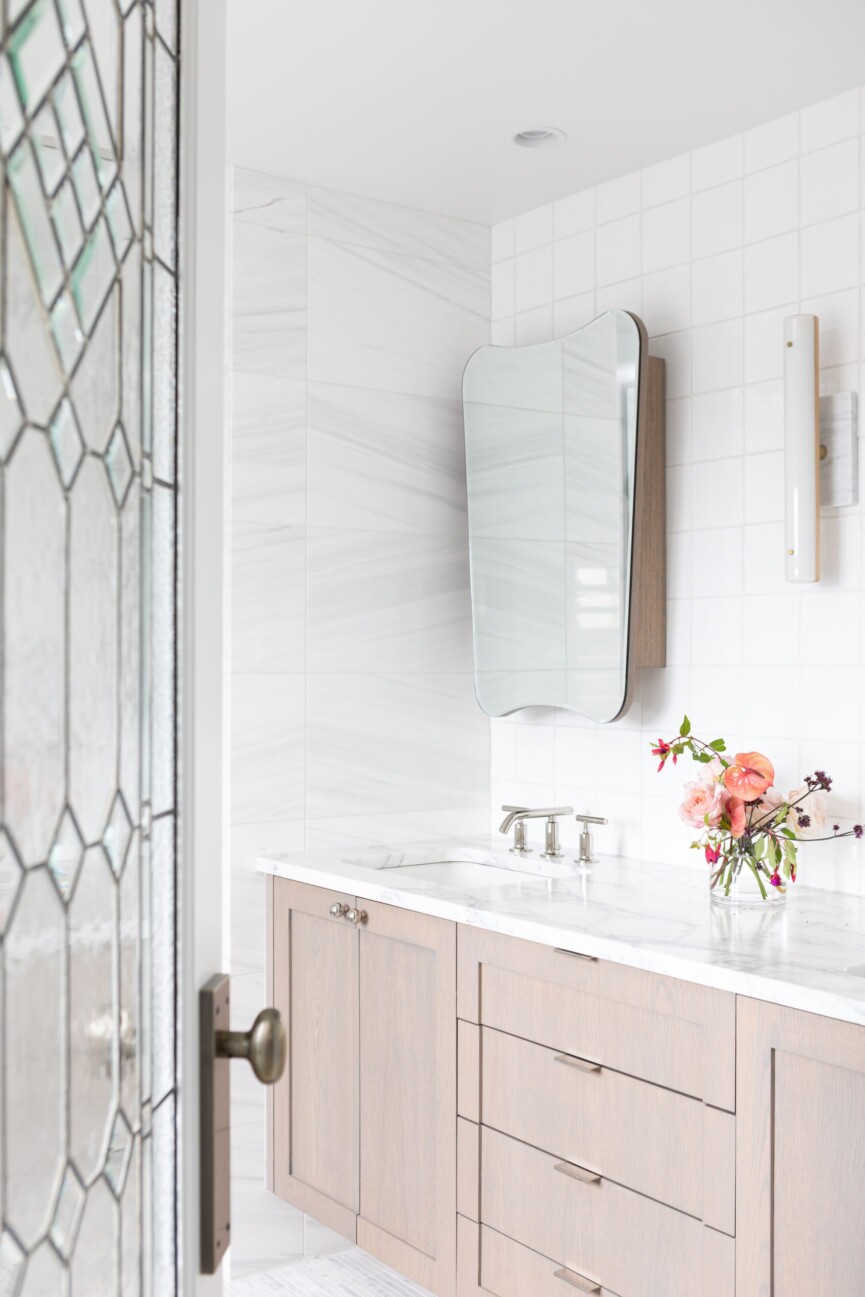
Segal let this kinship guide her as she renovated the charming home of her client, an “incredible” retired woman who lives with her dog Lexie and occasional long-term guests (mainly the client’s two college-aged children). While most of the house’s elements were “in dire need of updating,” Segal recalls, the house, which was built in the 90s, had solid bones. The original heritage-style oak inlay floors, gorgeous stained glass, and “old beat-up” brass door hardware were treasures that Segal salvaged to honor the eclectic, vintage character of the neighborhood.
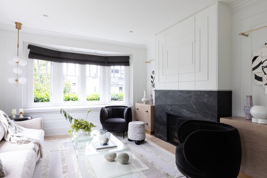
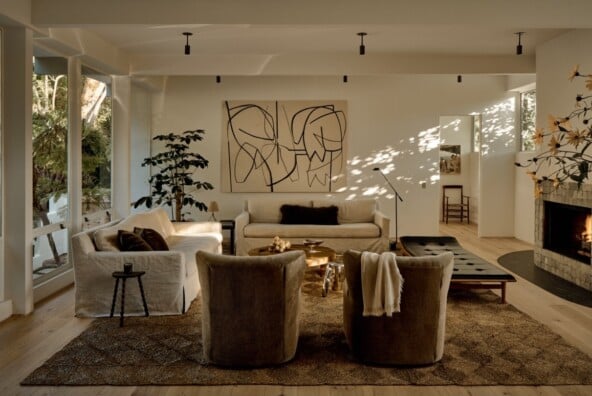
With her love of blending old and new, bespoke and vintage, Segal chose décor elements that honored the house’s “storied” feel. This included blending heritage and contemporary features, showcased through vintage floor lamps, custom ottomans, a Montauk Sofa couch, Arteriors Home sides tables, and B Zippy & Co. ceramics. A neutral palette allows the eclectic pieces and art collection to shine.
The finished home is “elegant, unexpected, and effortless,” as Segal describes it. We couldn’t agree more. To get a deeper look at how she pulled it all together, we connected with the talented designer. We must say: this stunning Craftsman house renovation really is the product of sheer talent and intuition.
How did you honor the original bones of the home?
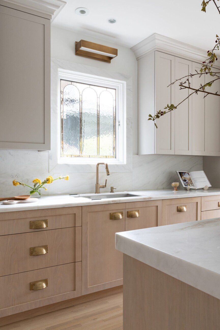
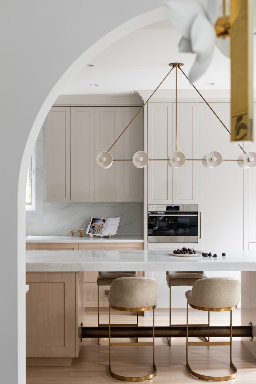
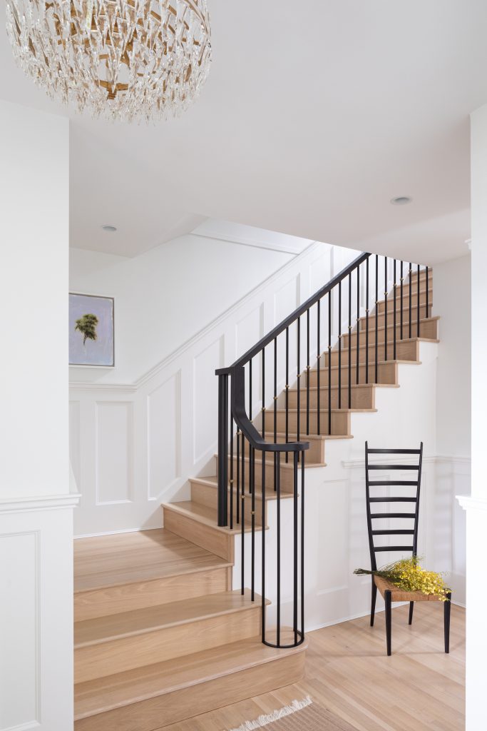
We wanted to achieve eclectic elegance. To do this, we maintained some of the original features like the inlay oak floors, which we stripped and re-stained to make them feel modern. We kept original wainscoting in the areas we could and added new, more refined moldings with pencil rails for an updated twist. The home featured several stained-glass windows. These were beautiful but the client disliked how traditional they felt, particularly with their palette of all primary colors. Instead of removing them, we designed new windows by creating our interpretation of stained glass. This turned out to be one of my favorite features.
Talk to us about a room that you particularly love.
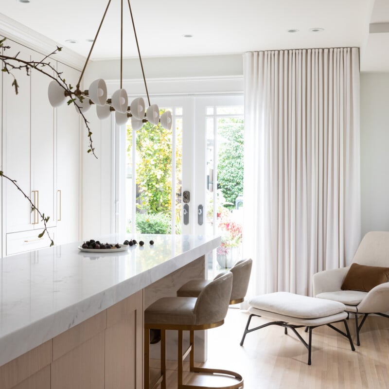
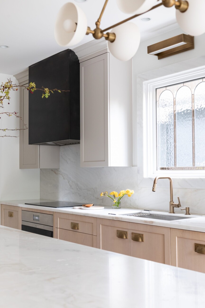
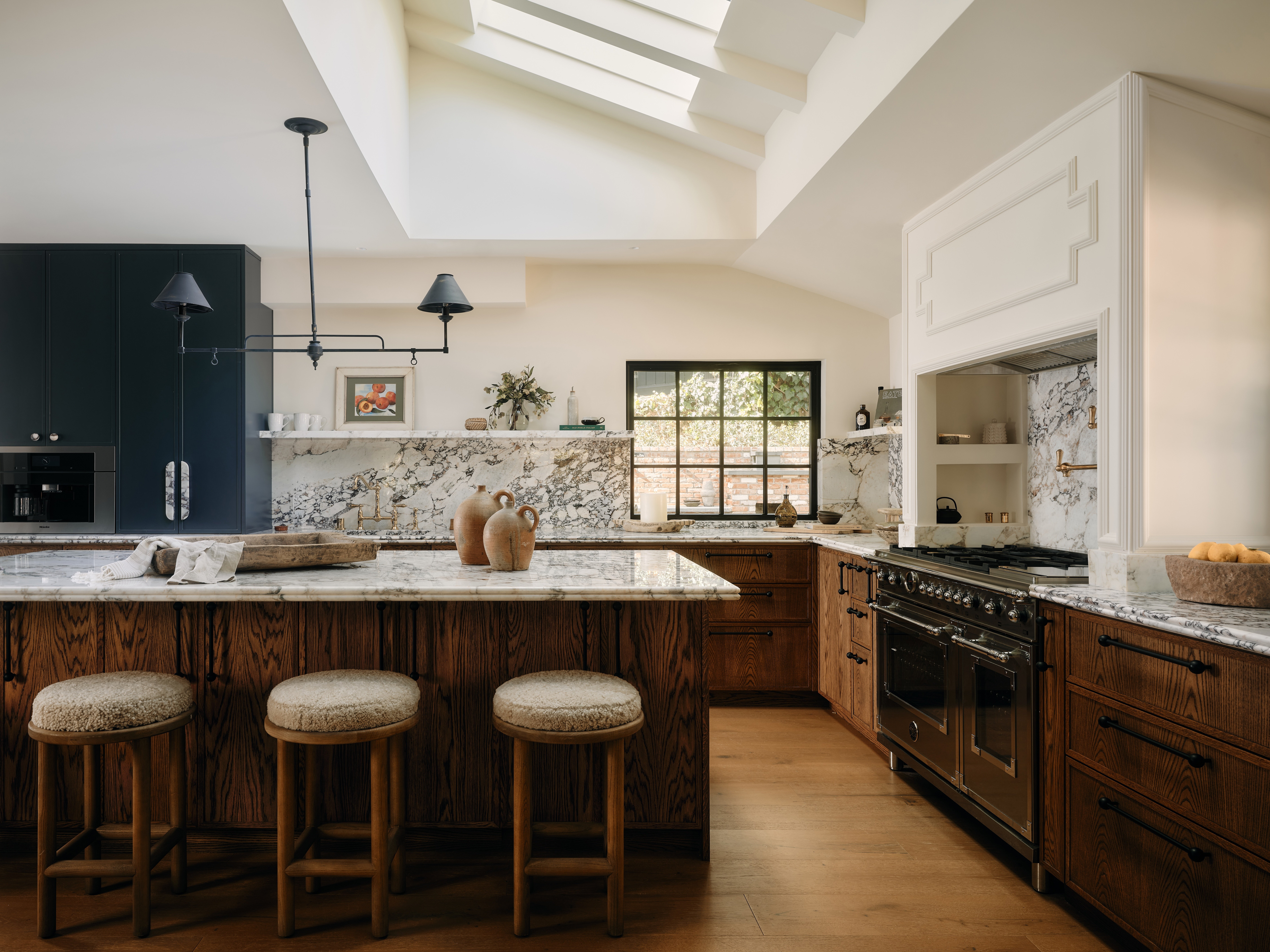
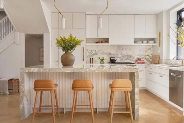
This kitchen is one of my favorites that I’ve designed to date. It feels so peaceful, elegant, and inviting. While the materials are seemingly quiet, we focused on the detailing such as the cast metal post running through the island, sculptural bronze pulls, minimalist Bocci Design plugs, and a marble casing around the newly designed stained glass. Selecting light fixtures is always one of my favorite parts of the design process, and this project was no exception. The Pelle pendants with brass with cast paper flowers are a work of art. And the Apparatus Studio fixture in the kitchen is another favorite. It gives off the most beautiful light.
Resilience is key, no matter where you are in life, what you are doing, or what field you are in. Failure happens, you need to learn from it and continue to push forward with a positive mindset.
What is the inspiration behind the color scheme?
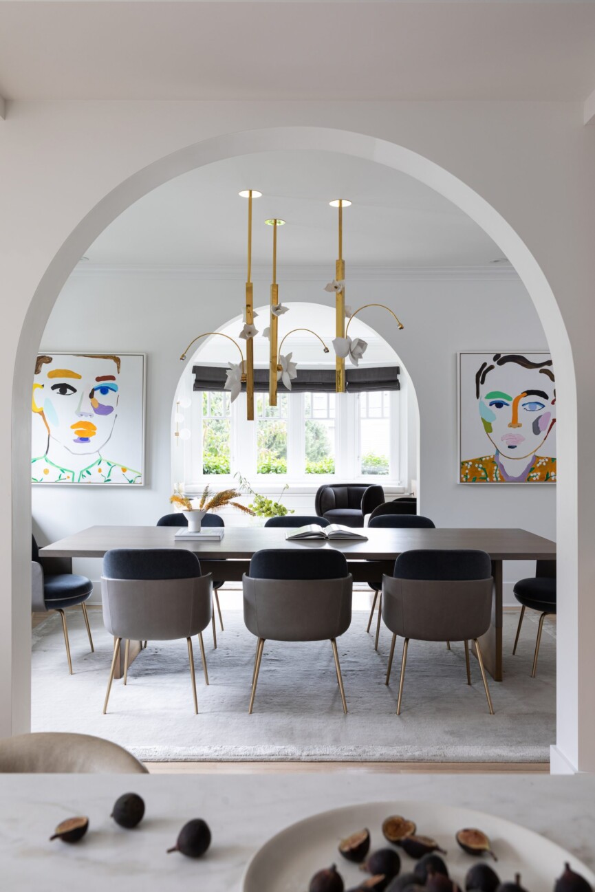
We worked with a fairly neutral palette, layering in subtle hues of color and saving the most saturated hues for the incredible art. We wanted a palette that felt warm, sophisticated, textural, and also representative of the natural hues found along the beaches of the Pacific Northwest.
You layered in so many incredible décor elements. What were some of your greatest finds?
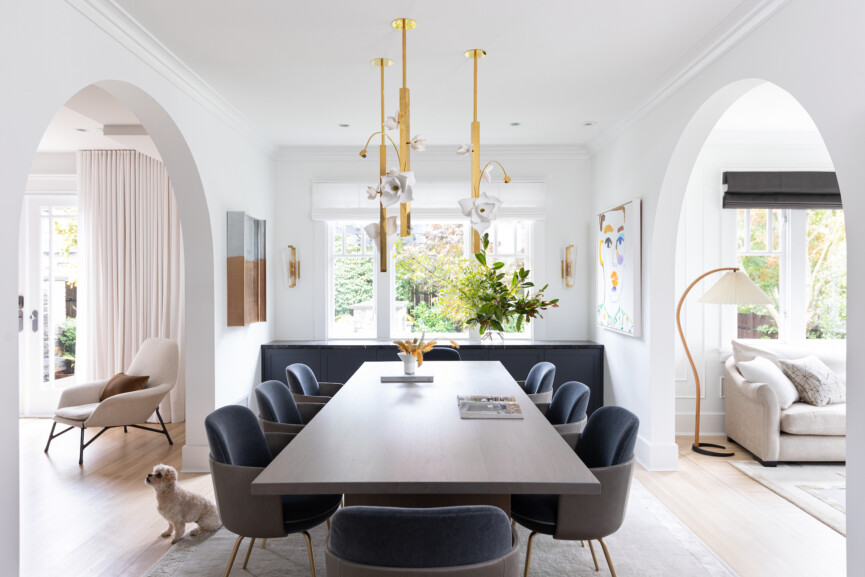
With the more neutral palette, we wanted to focus on materiality to create a layered and warm look. We used lots of natural stones, mostly marbles, and worked with oak in a variety of finishes throughout the home. We also worked with several metals, including cast bronze, patina brass, and blackened steel.
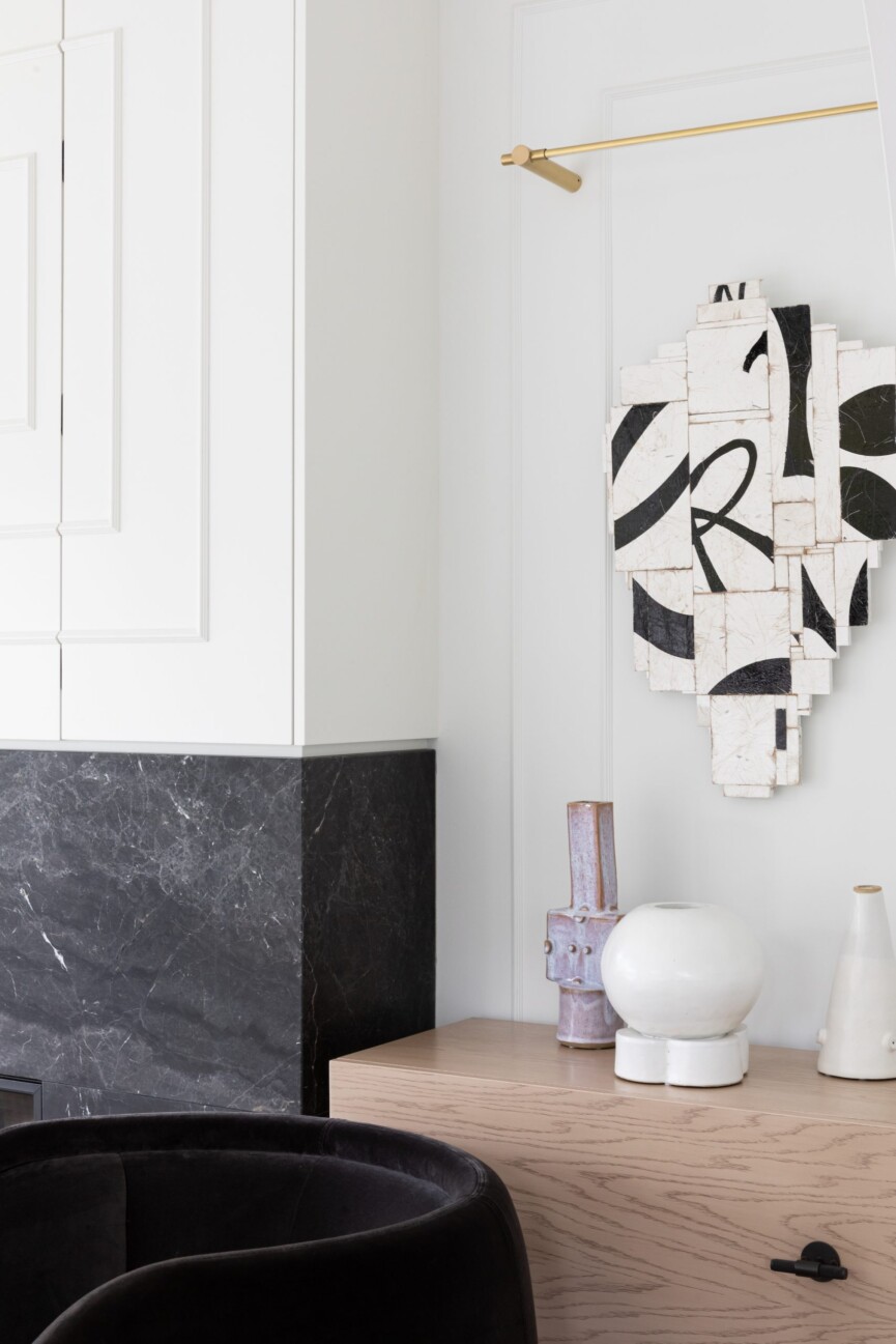
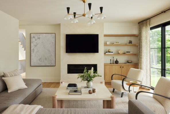
I also love the art collection we built together, which has an emphasis on Canadian artists. The Erin Armstrong pieces in the dining room are so bold and whimsical. We also commissioned Curtis Cutshaw to do the two black and white wall sculptures in the living room that mirror the fireplace and the TV, which is concealed in a cabinet above it. The area rug from The Rug Company in the living room is another personal favorite. A fun fact: After her first party in the home, our client called us with a design emergency: A guest had spilled red wine all over the rug! Thankfully, the wool-silk blend is so durable that it was like new after cleaning it.
You have a talent for keeping the spaces you design balanced and timeless, as well as minimal yet warm. What’s your secret?
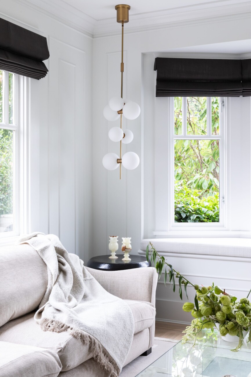
I have made a conscious effort to move more and more towards working with natural products and materials, handmade items, and small-batch pieces that have a story and support a craft or a trade. It’s that bit of imperfection that brings the magic. It’s what brings life and feeling into our home. Without these things, spaces can feel sterile and new rather than timeless.

Add in layers. Make sure that the layers are different materials, whether it’s for bedding, paint, wallpaper, drapery, or lighting. This approach creates a cozy ambient space.
What advice can you share for those who are new to design?
The most important thing to offer your client is a personalized experience! We pride ourselves on educating our clients in the design process while making it as stress-free and fun as possible. We strive to create original work for our clients that pushes design boundaries while simultaneously feeling like it represents them. Ultimately, we want to do everything we can to make our clients happy.
