
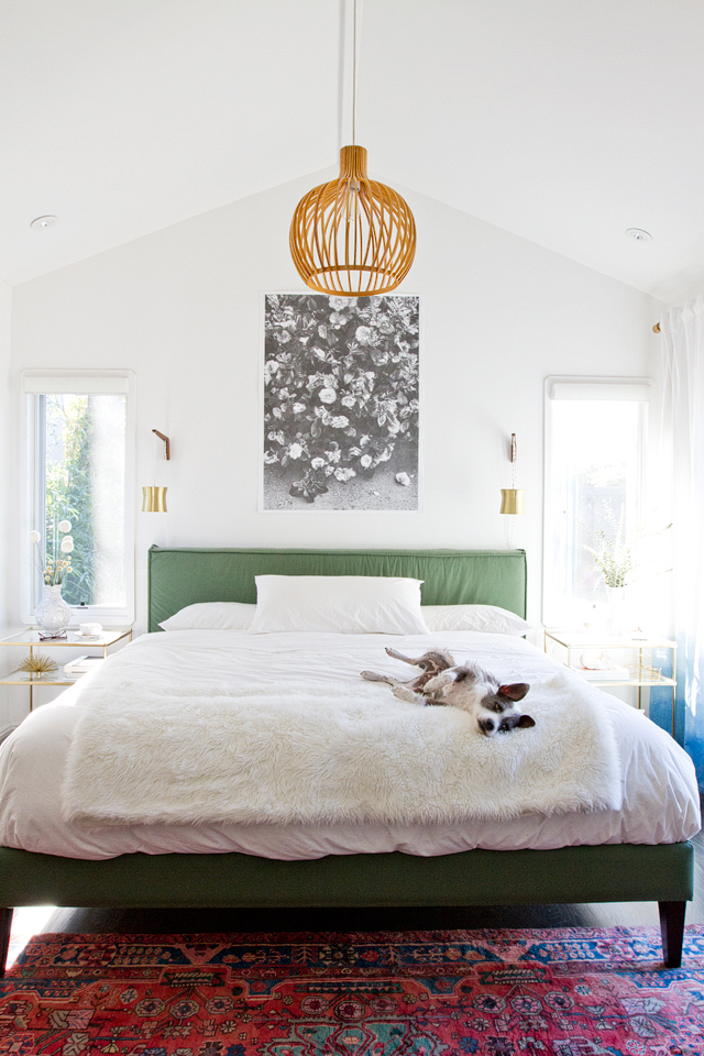
One swipe through my Instagram feed and it’s immediately clear that spring is here. Pastels and florals have officially taken over, but I must confess – that’s not my thing. You won’t find many pastels and floral prints in my neutral wardrobe or my home, but I still like to find ways to express my love for the warmer weather! Have you found ways to fit spring trends into your aesthetic? The black and white print in this photo is a perfect example of bringing spring trends into a neutral home. Keep reading for more of my picks.
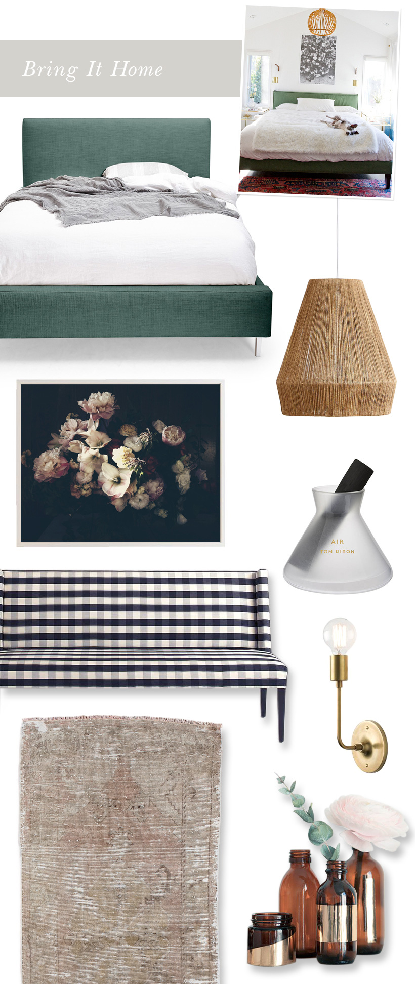
Bed – The upholstered headboard in the inspiration photo is a fresh shade of green that would look lovely all year round, but if you already have a bed that you are happy with then you can create a similar look with large throw pillows in the same shade.
Jute lighting fixture – Jute would not have been my first choice if I were picking lighting for this room, but I love the unexpected texture and lightness it brings.
Florography print – This may be a floral print, but there’s nothing saccharine about it. Can you believe this photo was taken and edited entirely on an iPhone? Ashley Woodson Bailey’s Dutch-inspired artwork is endlessly inspiring to me, and if you want to learn from Ashley yourself you can take one of her Florography Classes!
Bench – This gingham print evokes a spring picnic to me, but still falls in my comfort zone of black and white. Find ways to bring seasonal touches into your home without compromising your color palette.
Scent diffuser – Winter wouldn’t be quite the same without a crackling fire, or at least a firewood-scented candle, but for spring I’m loving diffusers with a fresh scent. Plus, this design by Tom Dixon is near perfect.
Wall sconce – You can’t beat the simplicity this L sconce. Lighting stores might just be the most overwhelming place on earth, so if you’re stuck for bedside lighting options in your bedroom, try these understated lamps.
Distressed rug – I know I professed my love for neutrals and aversion to pastels before but this worn, dusty pink is practically a neutral, and I predict it will be the color of 2015.
Vases – These simple DIY vases were created using Aesop bottles and gold mirror paper. While I don’t have a collection of empty Aesop bottles laying around, I do have jars and bottles that could definitely stand to be dressed up by a little gold this spring.
*Inspiration photo via Smitten Studio

I am totally late for all the Spring decorating, haha. I’ve got to say that I do love my pastels, especially when it comes to furniture. I would love to get one of those green headboards for my room. It would match perfectly!
I really feel like you and I are on the exact same design frequency. I love your interpretations SO much.
I love the vibe of that room!
love this! you are so sweet! thank you! xoxoxo