Timeless design can feel elusive—you know it when you see it, but giving the exact words to what makes a long-lasting piece or a classic color endure can feel hard to pin down. While maximalism, saturated color palettes, and bright and cheery décor have kept many of us energized and inspired during the past year and a half, there’s an undeniable elegance to be found in choosing the perfect neutral paint colors for your space.
And because there’s nothing more fun than switching up the look and feel of our homes on a whim, the good news is that opting for a neutral backdrop helps maintain a grounding consistency even as shifting tastes and the changing of the seasons inspires new artwork, fabrics, and furniture. Neutrals provide you with the creative freedom to explore different vibes and try on various aesthetics because when it comes to these paint colors, the options are truly endless.
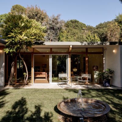
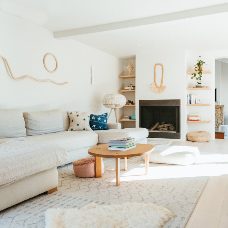
Feature image by Michelle Nash.

To help you navigate the wide (and sometimes intimidating) world of neutral paint colors, we tapped several trusted interior designers—Kim Lapin, Arvin Olano, Nicole Salceda, Killy Scheer, Shaolin Low, Sarah Stacey, Stefani Stein, Elizabeth Gill, Lauren Meichtry, and Erin Hiemstra—to share their expert advice. Keep reading to get their guidance on choosing the right hues for your home, plus all the details on their personal faves.
Neutrals are a welcome departure from the ever-changing cycle of interior trends.
Timelessness implies an ability to withstand the pull of fads, and while in certain contexts “neutral” can seem synonymous with being dull or uninspiring, each of our designers pointed to the possibilities of application and intention that neutrals allow. Hiemstra reminded us that, when designing a room, you have to consider the neutral as an essential element. With the color as a foundation, neutrals can be used to create a color scheme or layer in an array of cohesive textures.
Olano agreed, pointing out that with neutrals, you can use a mix of materials throughout your home to bring interest to the space. Muted tones provide plenty of opportunities to build depth through contrasting accessories or art, and because timeless style provides the freedom to grow and change with your space, Lapin noted that you can explore leaning into the variety of emotions and feelings neutrals can evoke.
Without further ado, here are our experts’ picks for neutral paint colors that are anything but boring.

White and Cream Neutral Paint Colors
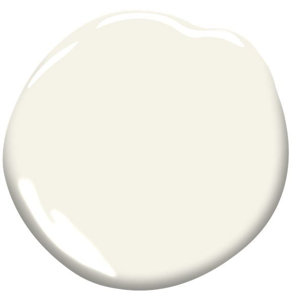
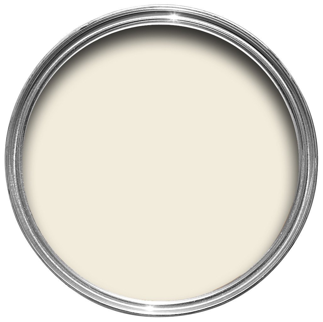
Simply White by Benjamin Moore
There’s more to picking a perfect white for your walls than you might think. A rich and creamy tone can create a far different experience of the space than a choice that’s more clean and crisp. Olano named this is a favorite for bringing warmth to his walls and admits he’s used it all over his home.
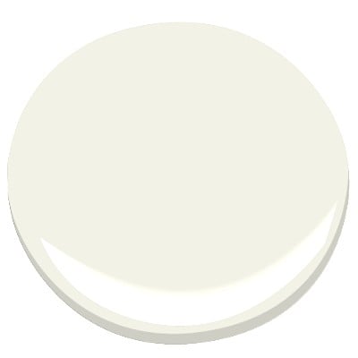
Subtle, sophisticated, and glowing with light. “I have looked high and low for a white that doesn’t feel too yellow in a space or too stark,” says Lapin. “I love this white for a room that has some natural light.” She used the color in nearly every room of her Redondo Beach Mid-Century Renovation and noted that it provided a soft glow while still feeling modern and bright.
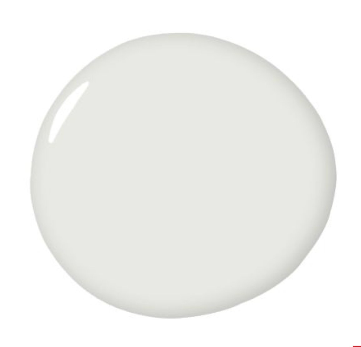
White Cliffs by Portola Paints & Glazes, $10 Sample Jar
Clean, classic, and perfect for just about any ceiling. Some homeowners may avoid white walls out of fear that the result will be too jarring and stark, but this warmer tone maintains a minimalist look while also offering resonance. “I love White Cliffs. It is bright and crisp with just the slighted touch of warmth,” says Stein.
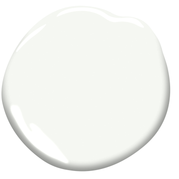
Easygoing and exactly what you need to create a tranquil environment. Continuing on the theme of neutrals’ seemingly limitless versatility, Hiemstra loves this cool white chameleon-like quality. She shares that she painted her entire house with this color and loves how, depending upon the time of day, each room can feel like it’s giving off its own unique hue.
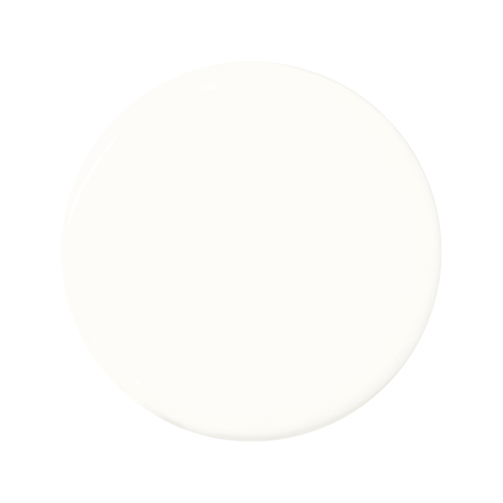
Chantilly Lace by Benjamin Moore
This delicate color captures the celestial hues of soft and silky fabrics. Salceda finds this true, crisp white to be the perfect shade for nearly any paint job. “We use this shade on everything including walls, trim, cabinets, and beyond,” says the designer. “The trick is to use this color in different sheens for just a bit of contrast.”

Beige and Blush Neutral Paint Colors
Savannah Clay by Benjamin Moore, $10.99 Sample Pint
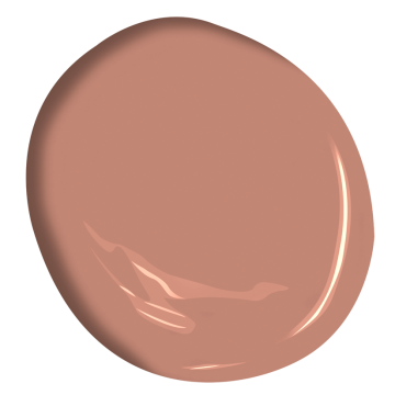
Rich, upbeat, and multi-dimensional. Even the most subtle shifts in color and hue can impact the energy and impression of a room. With a timeworn and antique quality, this shade of clay adds a touch of character and charm, and if you’re still searching for your happy color, this is Olano’s top choice for creating positive vibes.
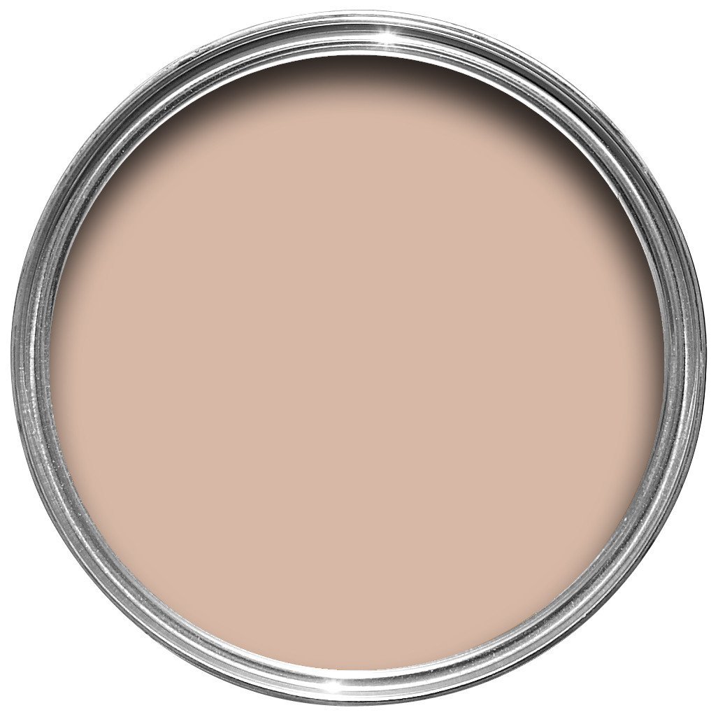
Setting Plaster by Farrow & Ball
Beautifully blush, dusty, and soft. If you’re looking for a color that’s rich in tone without dominating the space, this is your answer. Because the slightly mauve tint lends warmth without feeling monotonous, Lapin considers it a great choice for accenting elements of a room. “I used this in a project on cabinetry, shelving, and a pair of doors leading to the master and it was stellar! It looked so pretty, but not at all overwhelming.”
Green Neutral Paint Colors
Subdued, but provoking. If you thought green couldn’t be considered neutral, this pick proves otherwise. It works well both in classic as well as more modern and contemporary contexts. Olano suggests trying it in a kitchen or a smaller space like a powder room for a subdued but provoking choice of color.
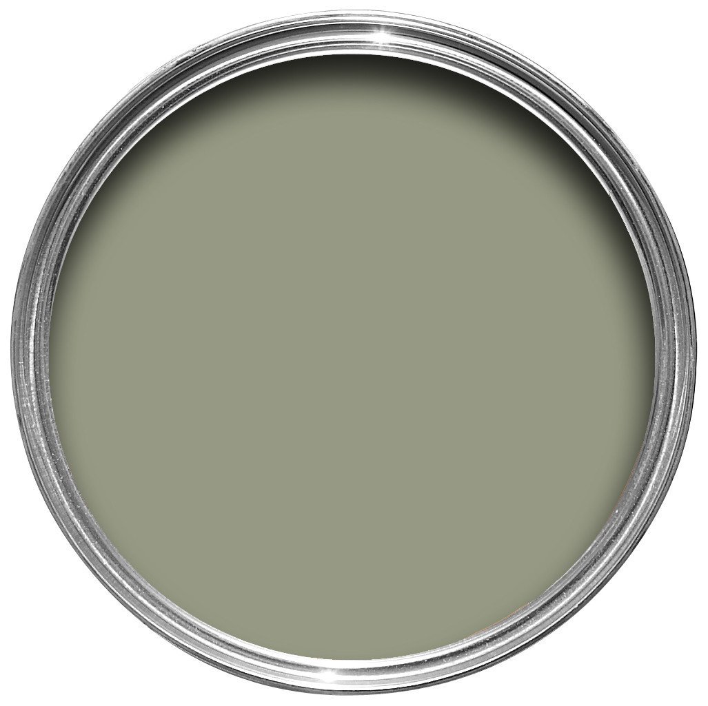
Muted, quiet, and appropriately-named. Lauren Meichtry, owner of Elsie Home, appreciates this green’s ability to adapt and bring an organic element to any room. “It is the perfect middle-of-the-road green—not too blue, and not too brown. I also find that it makes rooms feel bigger than a white would!”

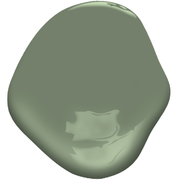
A little gray, a touch of green, and a lot of impact. Classic and able to complement any style, this gorgeous gray and green shade is Scheer’s favorite for highly-detailed crown mouldings. “It’s a soft, cool off-white that works well with a variety of other tones. With neutrals like this, I like to paint the whole room in the same color—walls, ceiling and trim.”

Cool Neutral Paint Colors
Sensible Hue by Sherwin-Williams
Stacey loves the cool and calming effect of this mid-tone blue-gray hue. “Gray doesn’t always work with beige, so pay attention to the undertones,” she notes. “For example, the gray might act as a purple and the beige as a yellow. Since they are opposite on the color wheel, they will intensify each other.” The Austin-based designer recommends trying this in a bedroom to encourage deep, restful sleep.
Fresh and able to soften even the strongest of colors. This widely-loved neutral can carry a luminous sheen and depth of finish that’ll beautify bathrooms, bedrooms, and really any wall your brush or roller can reach. “It is actually a shade of yellow, but will recede and act as a neutral as long as you avoid using it next to a harsh white,” says Stacey.
Warm Neutral Paint Colors

Neutral Ground by Sherwin Williams
Capable of making any room feel larger while still maintaining intimacy. This warm and calming neutral is a surefire shade for creating a cozy environment, and it’s an inviting color that Olano says is a safe choice for just about any room.

Dreamy and dramatic. Lapin loves this paint for its capacity to create a dreamy and dramatic mood while still offering a zen and soothing feel. “Brooks is amazing. It is fresh, modern, warm, and when applied in its Roman Clay finish (a type of plaster-like finish) it provides a depth of movement without being too busy.” She used this white last year in a Los Feliz renovation project and loved how it anchored the energy of the home’s office space.
Dynamic and compelling while offering a peaceful depth. This refined gray adds an intelligence and perspective to any space. Gill loves the color in a satin finish for library built-ins or simply used on any wall to create a serene and harmonious feel.