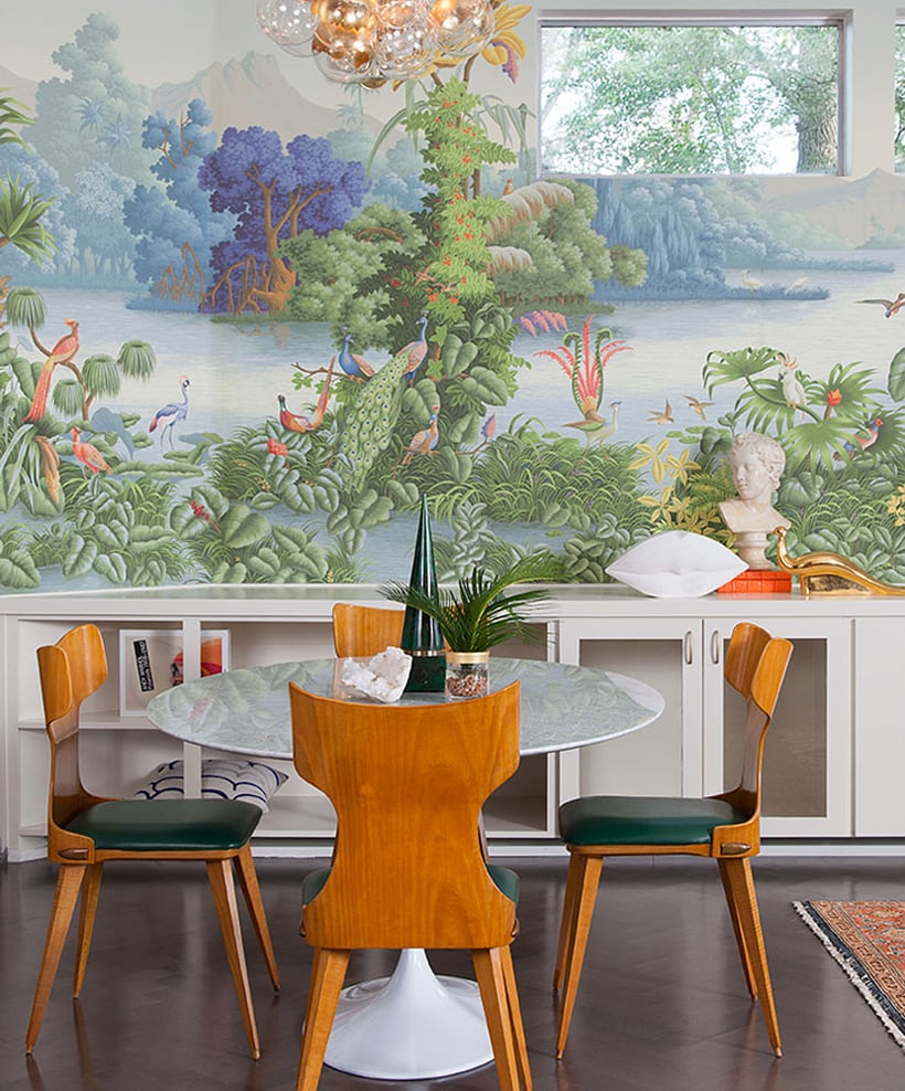
I have enough difficulty picking a pattern I won’t get tired of for my clothes (hence all of the stripes in my closet), so I can only imagine how nerve wracking it can be to pick a wallpaper. How do you make sure it’s not something you’re going to get tired of? And how do you avoid the common pitfalls? That’s what I asked Maureen Stevens, Austin designer who’s mastered the statement wallpaper in a way that’s bold yet still approachable. “Every wallpaper has its own style and personality,” Stevens told me, “then I make sure that the choices I make for the furnishings and accessories around it exudes a similar personality, it can either complement or intensify it.” She’s into Maximalism Minimalism lately, which means pairing “an over-the top wallpaper but the furniture I choose may be streamlined ones with clean lines, it’s ying and yang, bold and muted all at the same time.”
Don’t imitate what’s all over Pinterest and Instagram by choosing paper that’s been used before and many times over. I must admit once in a while, I’ll have clients who just love a certain design they’ve seen before, then I make sure that the space and the wallpaper is not similar to how it’s been used before. Choose something distinct and different, be your own design trendsetter! If you’re not sure where to start, sometimes the clues can come from your wardrobe — go on, look at what your closet tells you.
2. Don’t DIY it
I have no doubt, there are a lot of great DIY’ers out there and installing wallpaper may be easy-peasy for them. But if you’re someone who cringes at the word DIY and you’re certainly not a weekend warrior, hire a professional. It’s worth it! A good installer will make sure that the seams are almost invisible, no bubbles are seen and the pattern is lined up correctly.
3. Don’t judge the wallpaper by itself
Just the wall covering doesn’t make a room. Every element in your home is made to be a layer, including a wallpaper, which is a base for your wall. A bold pattern will look extremely bold without the other layers to it — the furnishings, the accessories, other textures. Wait for the “complete look,” and you’ll be happy with the end result. When you’re putting your room together, the pattern and palette of the wallpaper should be cohesive with the other furnishings and accessories in the room.
4. Don’t get stuck picking a pattern
Sometimes people get stuck mulling over which design to go with for a long, long, long time. Decisions, decisions, it can be extremely tough at times but make one, commit and everything else will fall into place. Sometimes the best choices are the ones we are so scared to do, so I say go for it! If you’re intimidated by the commitment or you haven’t used a wallpaper in any of your spaces, go for smaller rooms – a powder room, the entryway, or the like. That is where it will make the most impact but won’t overwhelm you as it’s not something you’ll constantly see. It will wow your guests and they’ll give you two thumbs up for the daring, yet beautiful choices you’ve made.
5. Don’t skimp
Not all papers are made the same. Some may be amazingly affordable but the quality is not there. Same as with everything else, you get what you pay for. If you are using it for a house you will stay in for a long time, splurge a bit. You’ll pay more up front but will enjoy it for a longer time.
Inspiration image Maureen Stevens, wallpaper Anthropologie, vases Spartan, credenza cb2, surfboard Consort Design, tray Aelfie


Love this post. Could you tell me the source for the pendant light please?
Those tips are great! Never thought that I could want a wallpaper instead of white walls but now I changed my mind, thanks!
I’m a recent wall paper convert… it’s so, so fabulous.
My number one tip would be Go Big. Even with the expensive papers, it’s a huge impact and its going to be more affordable than major artwork or incredible designer furniture.