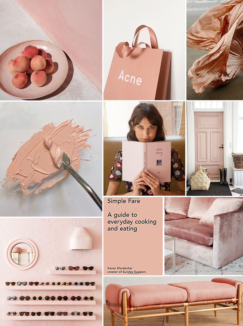
First we called it “blush”, then we called it “Acne Pink” (after the clothing studio nailed the shade with their signature shopping bags). Finally, the internet decided that this shade demanded it’s own hashtag: meet #millennialpink. If design history has taught us anything, it’s that when a single color becomes ubiquitous across fashion, interiors, and graphic design, it’s destined to become dated to that era. It’s tempting to think that once a shade becomes popular enough to warrant it’s own viral hashtag, it has probably jumped the shark*. That said, there may be good reasons that we can’t seem to move on from this shade: it works beautifully with neutrals, paired with indoor plants, and has even been scientifically proven to be calming, even sedative. We’ve been going in circles about what shade to paint the front door at our new office, and despite ourselves keep coming back to a sandy blush. I still love this shade for it’s beauty and feminine energy, but I can’t help but wonder… what’s next?
*Jumping the Shark: This is one of my very favorite pop-culture references. The phrase “jumping the shark” is used to describe the moment when something that was once great reaches a zenith of popularity and overdone-ness, then quickly declines in appeal and quality. It’s a reference to the once great show Happy Days, whose decline is marked by one fateful episode where the Fonz attempts to jump over a shark on waterskis.
image sources: peaches via tumblr, acne shopping bag, girl in peach dress by m.k. sadler, peach paint via weheartit, alexa chung with book via teen vogue, pink door via nousdecor, sunglasses on shelves in lucy folk shop, simple fare cookbook, blush velvet sofa via another mag, linen rhys bench




Really interesting blog post, I’ve seen this colour being ever so popular. I do love it actually! Have you noticed how big marble print has become too? 🙂 xx
Helen | Helen’s Fashion, Beauty & Lifestyle Blog
I painted my office Sherwin Williams Romance earlier this year. If you love it I say still go for it! Within my (local) friend group its a fun & unique color.
I’ve never heard the phrase Jump the Shark before but I love it! I’m getting really tired of seeing millennial pink everywhere but it really is a great color! It’s the perfect balance of color and neutral. I think I’d like to see it a little less to appreciate it even more!
Love this color and have always done so!
I combine it with SO many other colors and it always look georgeus:-)
No matter what happens next, please let me have my orange!
Loved the pink cap!
I love love love love your blog!
Keep it up! Stunning x
-Daria
https://www.bloglovin.com/blogs/daria-edu-19010657
http://dariaed.com/
I have been having these very same thoughts lately. Once I heard the term “millennial pink,” I immediately cringed and thought about how the color may soon be so overused that wearing/designing with it becomes a cliche. I’m not against things becoming trends, but I hate to see when something so great becomes SO overused that its beauty is overlooked due to its association with a cultural trend. Even though I am a millennial, I’m going to continue to use it and keep calling it blush!
Erin | Tartan Haus
tartanhaus.com
I love this color! I use it as an accent, though. I hope it sticks around a while.