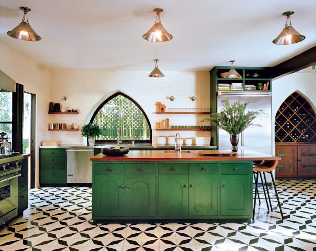
While I consider myself an aspiring minimalist when it comes to my home, I also feel right at home in an antique mall. The collections of Depression glassware, vintage hats and antique chairs really get me going, but how do I exercise my love of these things and avoid my number one enemy: clutter? This kitchen inspired me because if you look closely, they have two sets of salt and pepper mills, three mortars, at least eight kitchen canisters, and 25 glasses. All of this, and I don’t think anyone would consider this kitchen cluttered. This space was designed by L.A. design firm Commune Design, which is responsible for Instagram magnets like the Ace Hotel in Palm Springs and L.A., and the Heath Ceramics space in West Hollywood. Their Southern Californian sensibility mixes the look of bohemian, nomadic travelers and collectors with an enviably clean modern, aesthetic. Keep reading to see how to bring this look home.
Don’t force a style – This 1926 Spanish modern home belongs to the firm’s managing partner, Ramin Shamshiri and was designed by his sister Pamela Shamshiri to capitalize on the Moorish-inspired architecture. The firm feels strongly about working with what’s best for the architecture or style of a space, rather than pushing or forcing a certain aesthetic. If your home has distinct architectural elements that suit the style or period of your home, like this kitchen’s arched windows, it’s best to incorporate that into your décor. This might mean that what worked perfectly in a previous home doesn’t make sense in a new home.
Collections don’t have to mean clutter – The repetition of the glasses and the canisters in this kitchen make the open shelving look thoughtfully organized rather than cluttered. It may feel slightly OCD, but organizing items in evenly spaced rows (and when it’s applicable, at 90 degree angles) can go a long way. The kitchenware was also kept within a neutral palette of whites, browns, and blacks, with the only color being the bold green of the cabinets.
Mix woods – Designer Pamela Shamshiri told One Kings Lane “Mixing woods is tricky. I’m not a fan of the matchy-matchy look, but when you mix woods they need to be far enough apart that they don’t clash. I think contrast and value change is another one that people should be more aware of. Your furniture should contrast enough with floors or walls so that you can actually see everything.” Kitchens can be full of wood when you consider the cabinets, the dining table and chairs, and wood cutting boards or accessories, so keep contrast in mind so that you don’t wind up with one uniform brown happening.

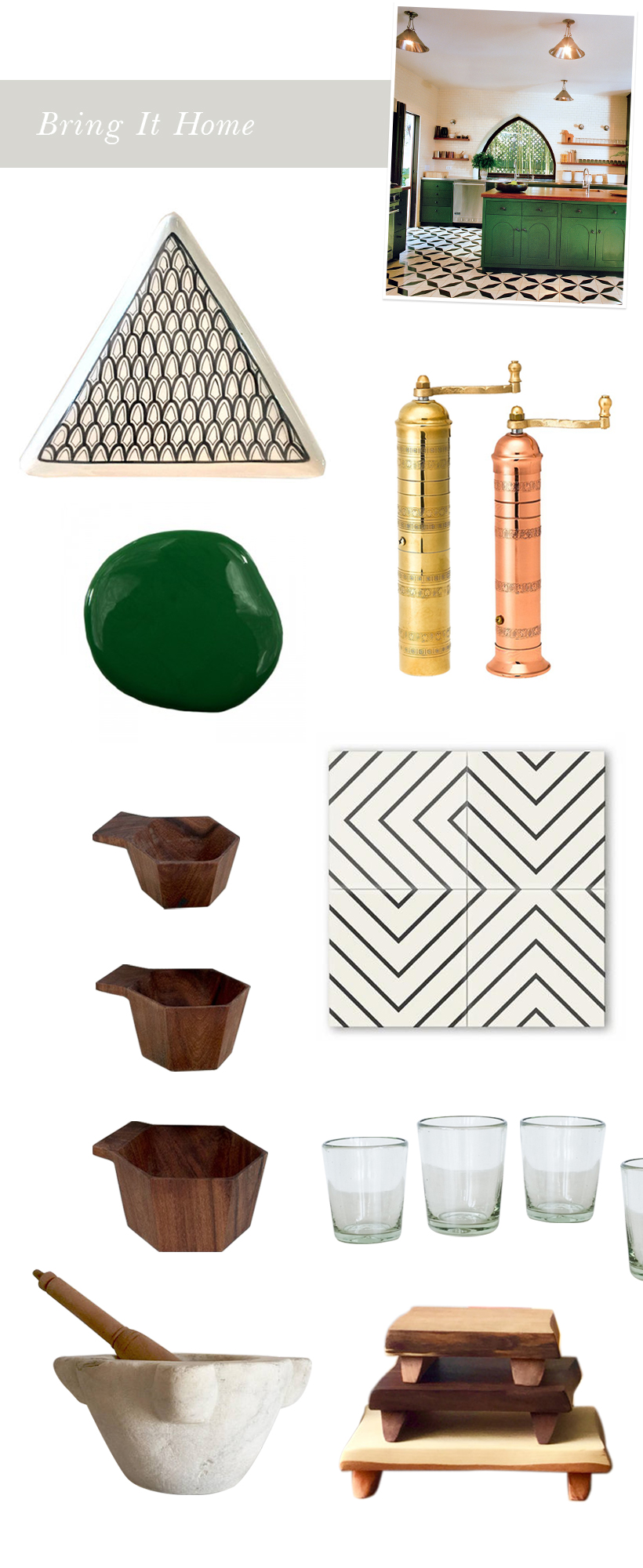
Photo by François Halard for Vogue, triangle platter atelierBOEMIA, gold and copper mills Pepper Mill Imports, cement tiles Cle, wood measuring cups The Citizenry, glasses Spartan Shop, French antique mortar Unearthed Savage, footed wood boards gray works design


Cristina! I totally relate to this topic. I’ve often wondered if being both a collector and a minimalist meant that I was just eternally conflicted… but your ideas here are proving that you can be both without contradiction. I’d never heard of Commune Design before and enjoyed looking through their portfolio this morning.
This kitchen is stunning! I cannot get over those floors with the deep green island. This is a great post considering I too have such issues with clutter, but this design pulls it all together and avoids the issue all together.
X
Samantha
http://www.thenewyorkblonde.com
This is such a helpful guide. I feel like all I do is create clutter no matter how hard I try to make everything work. I will keep your tips in mind!
OMG, you described my conundrum perfectly. I, too, love beautiful things and like to display them yet I love a clean, minimalist look. What is a girl to do? Thanks for the much needed info.
Well done and so true! Needless to say, those of us in the vintage and antique business, love to see this kind of article. Old treasures bring so much warmth to a home and keeping it uncluttered is all about display. Thank you!
This is a huge kitchen! Plenty of space for collections without looking cluttered.
Thanks for this insight, I thoroughly enjoyed it.
PS – I am totally addicted to that colour green!
What is the green color’s name? It’s outstanding. Great kitchen! Great article.