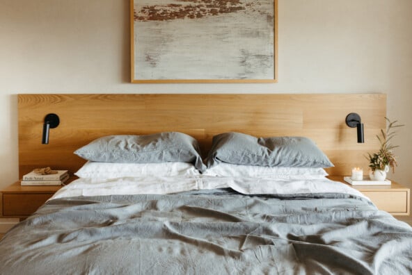
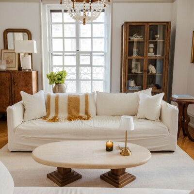
If you’ve seen our studio space, then you already know that Team CS favors monochromatic spaces. In fact, I’d describe our new bungalow as white-on-white-on-white. And we love it! If you know how to utilize variations in texture and pattern, single shade spaces are anything but boring. We’ve rounded up 12 monochromatic spaces (and no, they’re not all white) that prove when it comes to color, sometimes less really IS more.

image via coisasdcasa

image via elle decor

image via pinterest

image via redbook

image of casa cook

image by ryan saghian for devol kitchens

image of villa palmier

image via pinterest

image via @mimithor

image via theabsoluteblackobsession

image via tucker and marks

image via vogue


