Design

7 Things to Know About Our Zuma Beach House Renovation

I’m calling it “Minimalist Beach Ranch.”

By Camille Styles
montauk beach house outdoor backyard living room, vanessa alexander design, photo by Chris Mottalini (used with permission), beach house inspiration

Last month, I gave you guys a little tour of the beach house as it is now. The fact that it’s already so special to our family makes this renovation project that much more fun—we can’t wait to bring its full potential to life. So today, I’m going to share an overview of what exactly it is that we’re doing at #ZumaBeachHouse!

For the last several months, Adam and I have spent our nights and weekends heads down working on this project—it’s truly been like a second full-time job (but instead of getting paid to do it we’re paying a lot to do it, haha)—and it’s been tough keeping all of this initial planning a secret when there were so many things I wanted to share (and ask your opinions on!) Now it’s time to make up for lost time, because although we’ve pretty much figured out the vision and architectural plans, there are still so many decisions to be made. Tile, plumbing fixtures, exterior siding colors, windows… we’re about to get into the good stuff.

But before we get granular, I wanted to zoom out and share our big picture plan so you know where we’re headed. Don’t worry, we’ll get into the nitty-gritty design details, but before we do… here are 7 things I’m dying to share about our Zuma Beach House inspiration.

image above: Montauk property designed by Vanessa Alexander, photo by Chris Mottalini

Book a night at the Surfrider Hotel in Malibu.

image by kristen kilpatrick at surfrider hotel in malibu

I’m calling it, “Minimalist Beach Ranch” style

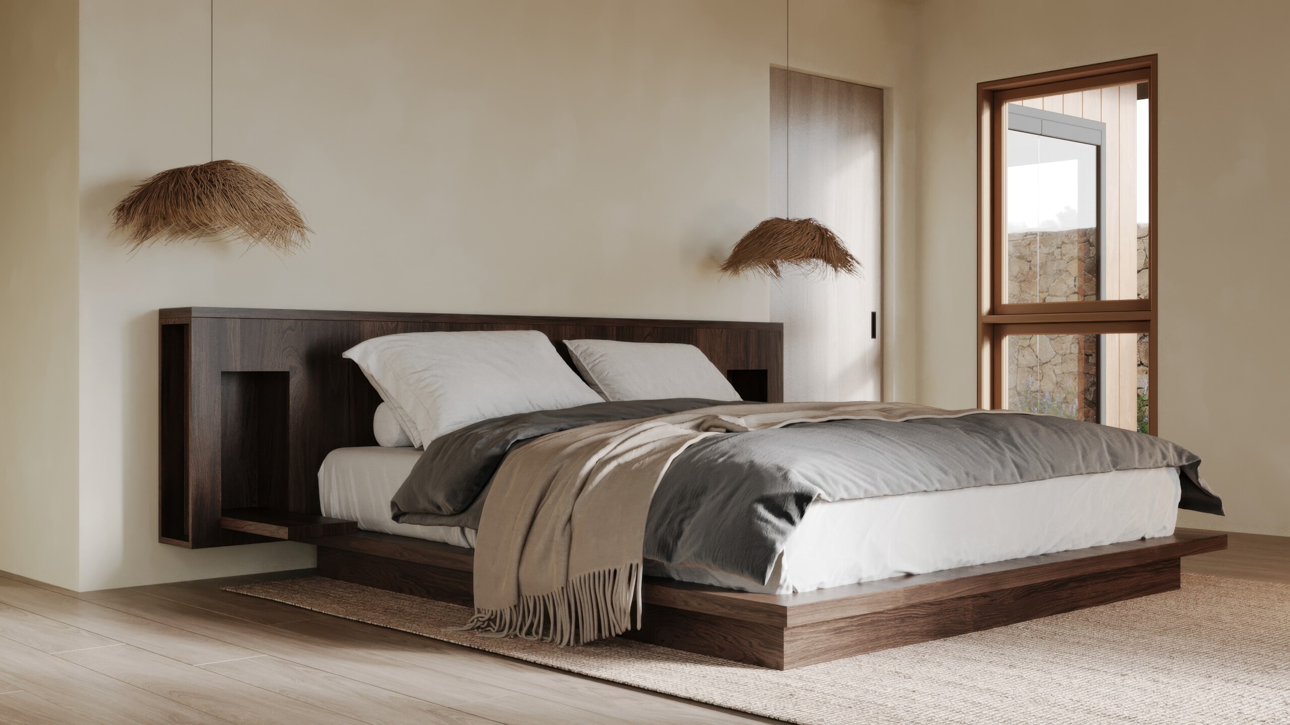
(And yes, that’s subject to change, lol.) Our architect, Doug Burdge, designed the new plans to make the most of the natural environment, whether it’s shifting the orientation to see the full view of the ocean, or adding protection to block the wind. To create the casual, warm aesthetic we’re envisioning for Zuma Beach House, we’ll be leaning into a lack of ornamentation to create a sense of calm. That means that decorative details will be kept to a minimum, allowing the clean lines and lush nature outside the windows to take center stage.

In keeping with the ranch-style qualities of the current house, we’re sticking with a one-story layout with an open floor plan, large windows, and sliding glass doors. And the “beach” comes into play with white walls, vaulted shiplap ceilings, planked cabinetry, and overall casual vibes.

No surprise that I’m embracing a bit of minimalism here as I do with most all of my design projects. My goal is to include just enough interesting elements and thoughtful details while avoiding anything overly trendy—I want it to feel timeless. The architecture and design will create a simple canvas, and then we can layer on interest with furniture, textiles, and decorative details.

Ashley Merrill Home Tour, Lunya, Teal Thompson

image by teal thomsen at ashley merrill’s beach house

We’re keeping the original footprint—and adding to it

The current house is a 1950’s ranch-style bungalow with a low horizontal ceiling and a somewhat bizarre floor plan that somehow makes guests feel lost even though it’s only 1400 square feet. We’ll be keeping the original footprint of the current house, but reworking the existing interior rooms so that the layout makes more sense. We’ll also be adding a 1000 square foot great room (a large open kitchen with living space) as well as vaulting all the ceilings so it feels airy and open. The guest house will keep its footprint, but we’ll be gut renovating the interior to turn it into a small but chic, boutique hotel-style one bedroom loft.

Ashley Merrill Home Tour, Lunya, Teal Thompson

image by teal thomsen at ashley merrill’s beach house

The goal? Turn it into a peaceful retreat

When designing any space, I start by thinking about how I want to feel when I’m there. My dream is that Zuma Beach House will be full of warm energy, a happy, soul-filled house that lets the beauty of nature take center stage. Yes, I want it to be interesting and beautifully-designed, but what’s even more important to me is that we create a space that’s relaxing, light, airy, and intentional—the kind of house you want to curl up in and stay awhile.

The plan is to not have a lot of surfaces to house clutter, instead embracing negative space, even leaving a wall bare here and there. I want it to feel like a true retreat, a deep cleansing breath of fresh air that allows me to reset whenever I’m there. That means few decorative details, clean lines and negative space that allows me to breathe. A true retreat.

modern dining room design_jodie fried

image by sam frost at jodie fried’s home

Materials are inspired by nature

From the beginning of our design process, I’ve been hyper-focused on using materials drawn from nature. I want every element to feel simple and slightly rustic, as close to its natural state as possible. On the exterior, we’re using timber siding and stacked stone. Inside, warm wood cabinetry and floors will sit alongside stone countertops and earthy clay tile.

My favorite part of the current property is the sunlight that floods every room, so letting in plenty of natural light through large windows and doors is top priority. We’re planning to use clad doors with interior wood frames.

open living room design_jodie fried

image by sam frost at jodie fried’s home

Comfort reigns supreme

At this point in my life, I want to be comfortable all the time—and I want everyone who enters our home to feel instantly at ease. Everything in the house should make us happy—it’ll be full of meaningful pieces that we love and that foster creating memories together as a family.

My plan is to create coziness through lots of texture and soft materials, avoiding overly sculptural or hard-lined furniture pieces. We’re incorporating soft, ambient light that will make each room feel like a cocoon (more on our lighting plan to come… I still have some major decisions to make.)

Let’s talk about the fireplaces, because few things make me more comfortable than curling up in front of a fire for the evening (especially on a chilly evening, which is just about every evening in Malibu.) When we built our house in Austin, our architect initially included a fireplace in the primary bedroom. We cut it due to budget constraints, and I’ve been kicking myself over it ever since. When we started building our wishlist of “nice to haves” for this house, I knew that if we could swing it, a fireplace in the bedroom would bring so much joy and coziness to our lives every single night that we were there.

montauk beach house, dining room, vanessa alexander design, photo by Chris Mottalini (used with permission), montauk beach house, poolside lounge chairs, outdoor furniture, vanessa alexander design, photo by Chris Mottalini (used with permission), beach house inspiration

image above: Montauk property designed by Vanessa Alexander, photo by Chris Mottalini

A neutral color palette will create expansiveness

No surprise here, but I’m happiest with a neutral palette and I’ve learned that there’s no point in trying to fight it. Plus, keeping the palette in light, neutral tones will help the house feel more expansive than it actually is. When the main house is done, it’ll be 2500 square feet, and my vision is that it’ll feel much larger. We’re designing the floor plan to be as open as possible—the vaulted ceilings, open living space, natural light, and muted palette will create that sense of airiness that I love.

montauk beach house, poolside lounge chairs, outdoor furniture, vanessa alexander design, photo by Chris Mottalini (used with permission), beach house inspiration

image above: Montauk property designed by Vanessa Alexander, photo by Chris Mottalini

It’s all about indoor-outdoor living

The only downside to having so many windows and doors is that it doesn’t leave much room to hang art! But I’m okay with that since they’ll be framing the stunning eucalyptus trees, Santa Monica mountains, and crashing waves that are “nature’s art” all around us. Doug designed the house to open up completely to the outside, blurring the lines of whether you’re indoors or out. When we’re in Malibu, we treat the backyard like our living room, working, playing, eating, and exercising outside every chance we get. In the new house, I picture doors and windows open all the time, nights spent around the fire pit, bare feet throughout the property, plucking lemons and avocados from the tree outside the kitchen—basically, living outdoors as much as possible.

***

If you’re still reading, I’m shocked that you’ve stuck with me this far, but thank you for caring! Drop any questions you have about #ZumaBeachHouse in the comments, and sign up here if you want to get house updates delivered straight to your inbox. More updates soon!