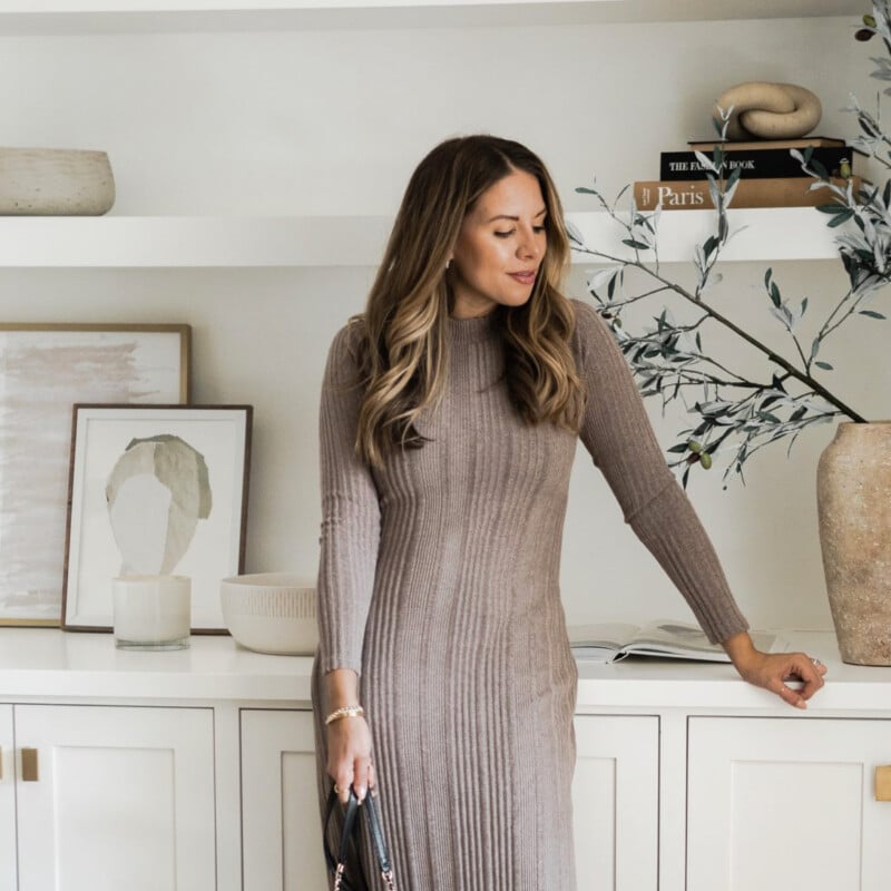
There’s no denying we love to decorate around here. In fact, restyling bookshelves or a coffee table is our version of meditation. But what if you had the opportunity to build and decorate an entire home from the ground up? Now, that is the dream and it’s why we fell in love with Ashley Robertson’s home tour so much. The founder of The Teacher Diva fashion blog built her five-bedroom home in Dallas, Texas from scratch in 2018 and we’ve been living vicariously through her ever since. Now she and her husband, Austin, and their two boys—George and Charlie—live happily ever after, well, at least it looks that way from the pictures.
But, of course, she didn’t do it alone. For this project, Robertson joined forces with award-winning interior designer, Ginger Curtis of Urbanology Designs to create a home that really was an extension of her personal style: modern elegance with a hint of glam! “I like to consider the entirety of a space, its surroundings, as well as the people living in it,” explains Curtis. “I also look back in time to find inspiration from decades past. I’m very moved by nature and organic artisan moments.” Being able to design this home from start to finish with full creative freedom was a dream come true for Robertson and Curtis really delivered on her wish list. “We wanted to create a space for Ashley and her family that was not only livable/comfortable but on-brand with her style and business, too,” she outlines. “She uses her home as the backdrop for a lot of her content and it was so important we considered this.”
Keep scrolling to learn more from both Curtis and Robertson on how this beautiful home came to fruition, including some tips for new designers or homeowners just getting started. Get ready to pin everything because this one is a stunner!
How would you describe the home’s architecture style?
GINGER CURTIS: Traditional modern. Recognizable architectural features but with a fresh modern take.
Did you run into any budget or timing constraints?
CURTIS: We stayed right on track with the budget (with a few splurges). The biggest time delay was in the construction phase, we patiently worked through that. Ashley and Austin had such a great attitude and were so incredibly patient.
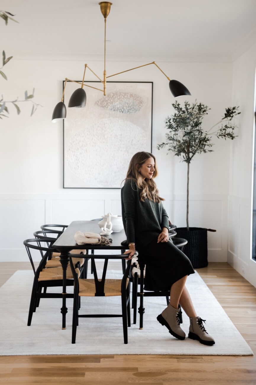
How did you and Ginger decide on the color scheme?
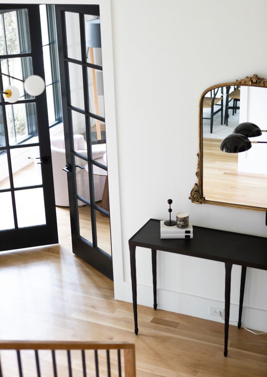
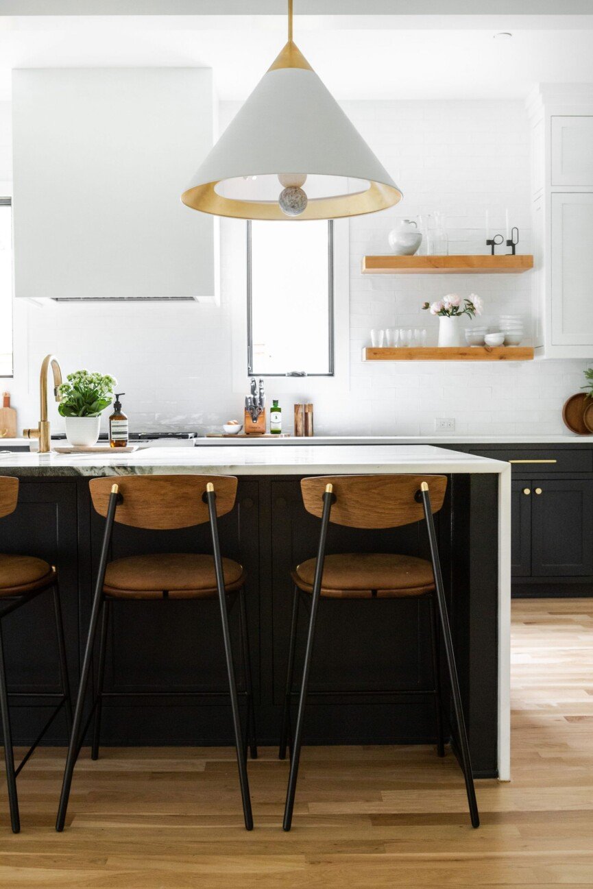
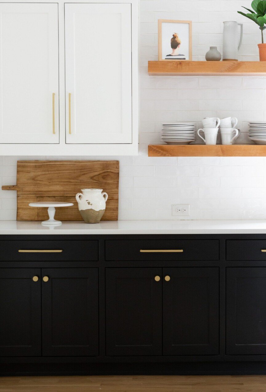
ASHLEY ROBERTSON: She knew I wanted neutrals but also stretched me to do things out of my comfort zone… and I’m so glad she did!! I was set on an all-white kitchen and she encouraged me to use black and wood details. I love it.

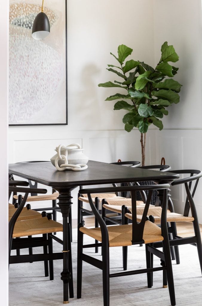
What were your greatest finds?
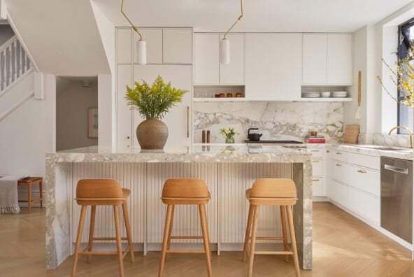
ROBERTSON: Gosh so many. Probably our light fixtures. I love all of them so much. Oh, and the marble on our island. It is so different from what I see in a lot of other spaces. It feels like art to me.
We love the nuanced, neutral approach throughout—how do you keep your designs so balanced and timeless?
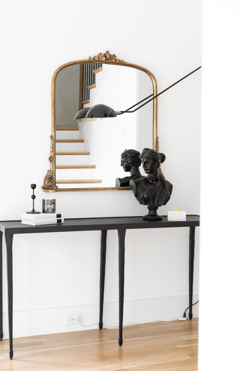
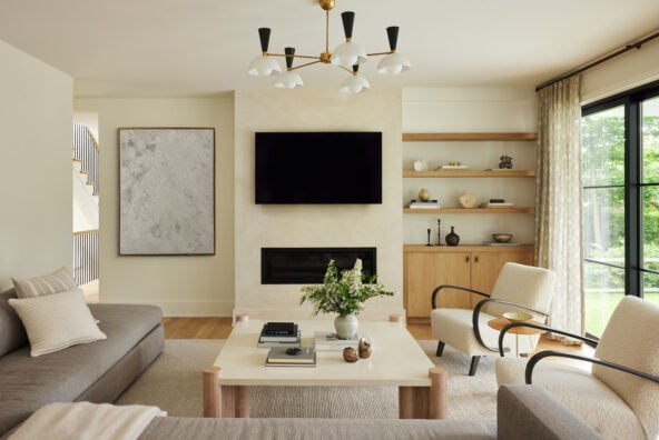
CURTIS: Lots of texture and interesting moments with art, lighting, and soft pattern.
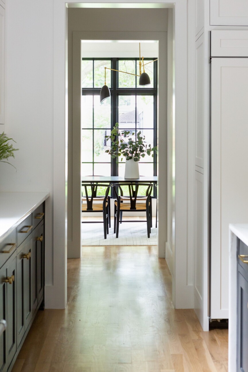
Can you outline your minimalist approach to designing?
CURTIS: We start and consider the most foundational elements of the home first, this includes, floors, walls, ceiling, and outside view. It is such a fine balance of not adding too much or too little. We work to carefully edit pieces in and oftentimes edit back out until we get just the right balance. Color is really important, this above anything else will evoke and drive mood in the space. Choose the colors you want to incorporate carefully. Ask yourself what mood/feeling do you want each room to evoke. In our new book Beauty by Design, we have a whole chapter dedicated to this.
What do you think your home says about you?
ROBERTSON: We like to be design-forward while having a home that we can actually “live” in. We have two little boys and needed a space for them to grow and play. Curtis was able to give us the design and look we wanted while having space for the boys to play. I don’t want people to come in and feel like they can’t sit on or touch anything.
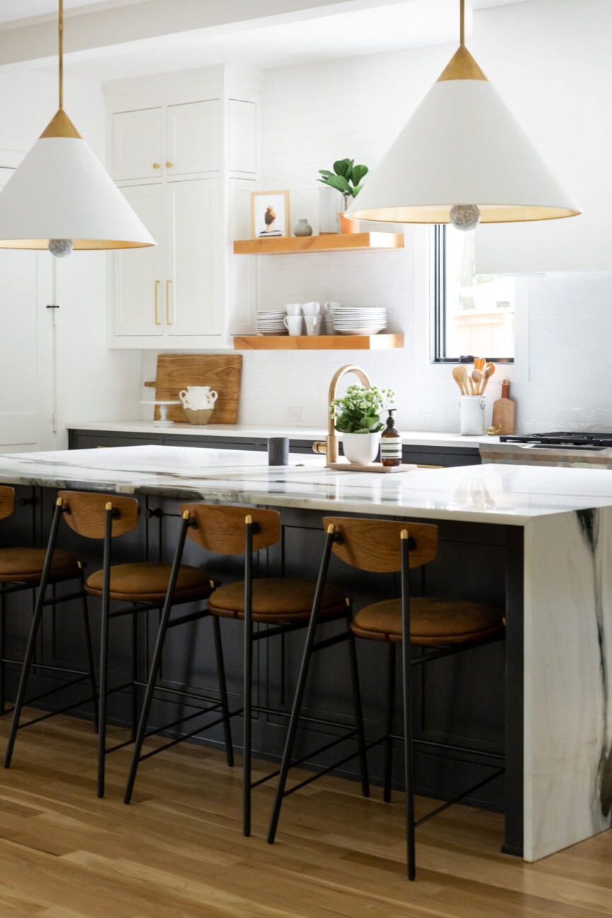
Any advice for creating a space that’s minimal yet still warm and inviting?
CURTIS: Natural and organic elements always bring a beautiful warmth and texture to a space. That lovely mix of modern but cozy.

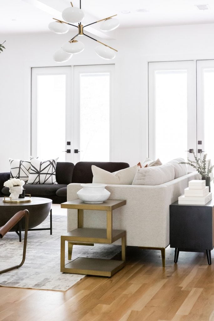
What’s your favorite thing about the space? Do you have a favorite design feature or room?
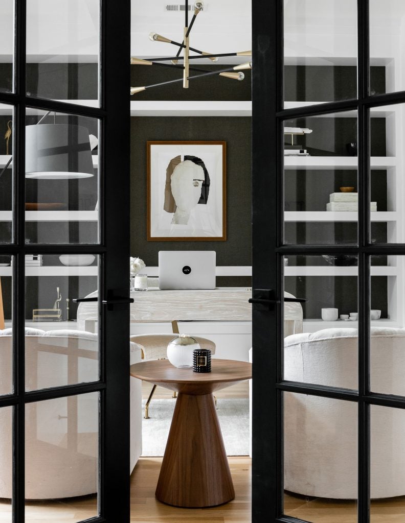
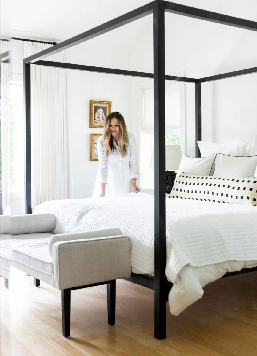
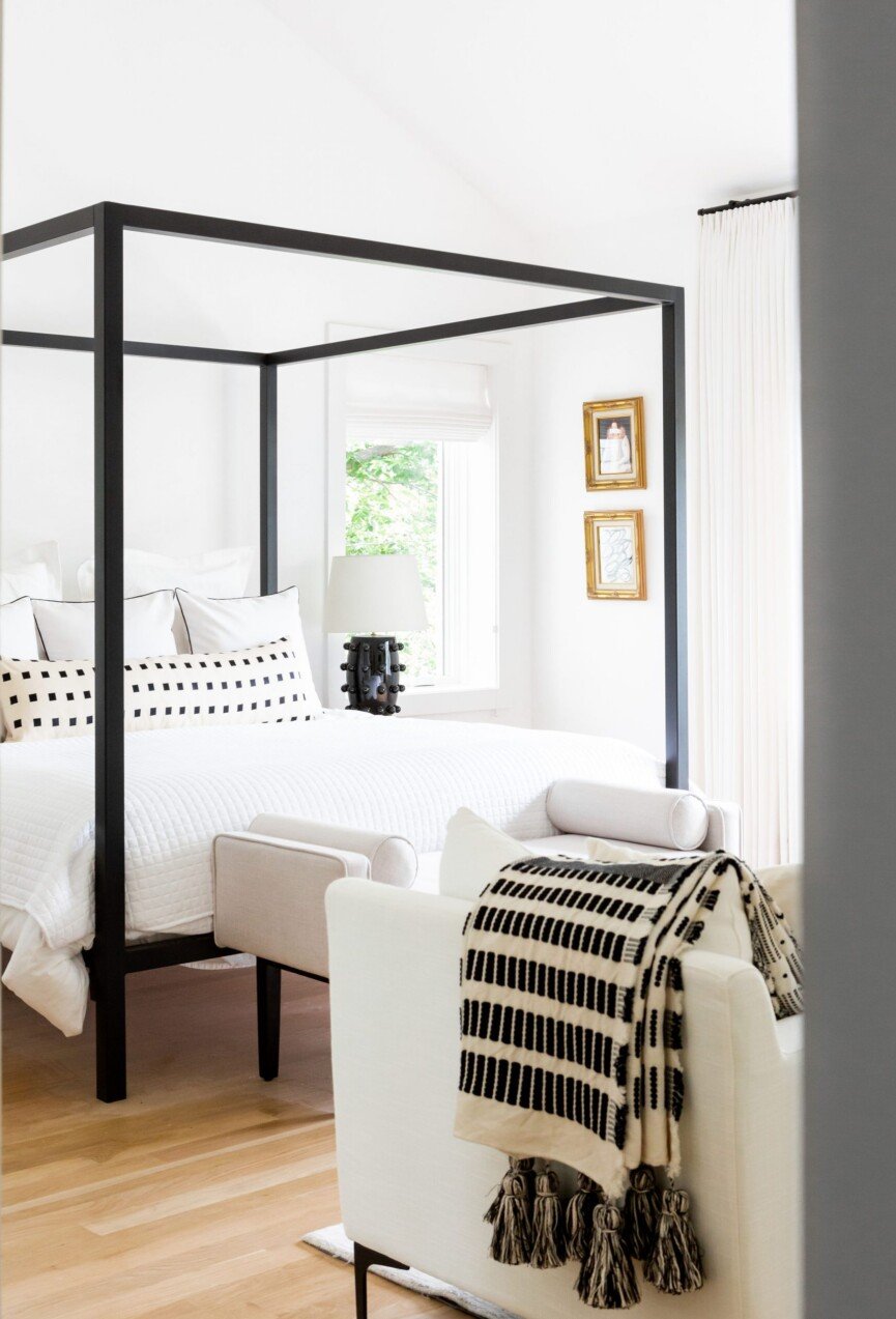
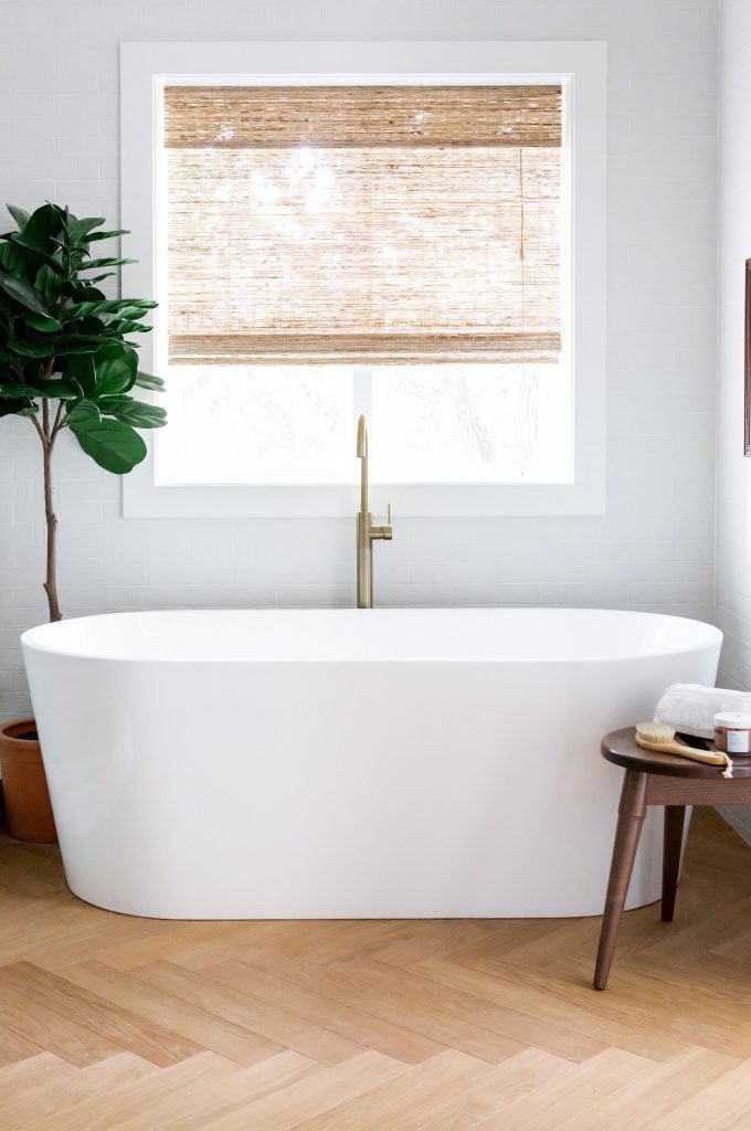
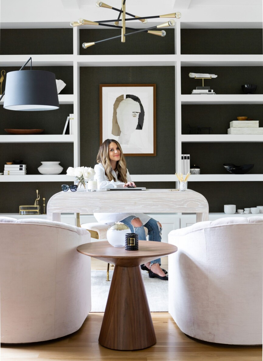
ROBERTSON: My favorite rooms are the office and the main bedroom. The office is very dramatic and everyone who comes in the house wants to stop and take a peek inside. This also means I have to make sure it’s clean, ha! My office has some really cool moments that I think people are naturally curious about it. Our bedroom just feels so relaxing and calm. Curtis wanted it to feel like a hotel room, and I think she nailed it.

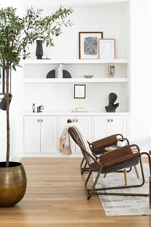
What advice can you share for those who are new to design?
CURTIS: Take risks, don’t be afraid to experiment with new ideas or where you draw your inspiration from.

List your primary design influences specifically, what design principles do you borrow and implement within your own practice?
CURTIS: I have to point to the queen here, Kelly Wearstler. Her ability to break away from symmetry and still create balance is a marvel. We often look for intentional ways to create interest through asymmetry.
Any design tips or tricks you can share?
CURTIS: Double up! We love to do double or even triple the width of curtain panels to create massive volume and texture. Fabric is great, but more fabric is even better!
Do you have any words of wisdom to share with would-be decorators about to embark on a home design project?
CURTIS: Be patient—so, so patient. There are a lot of industry challenges beyond anyone’s control due to the supply chain issues, and we are all going to have to wait just a bit longer for our projects to be complete.

