We may receive a portion of sales if you purchase a product through a link in this article.
With longer days and the allure of well-deserved PTO, summer is the perfect time to infuse your home with color. 2024 summer paint color trends align with this year’s theme of making bold design choices and paint is a simple and cost effective way to dip your toes into a more daring interior. It also means paint can move beyond just the four walls of a room. “Adding color to a ceiling, cabinetry or built-ins, interior doors, front doors, shutters, and architectural accents unique to your home are great areas to make a statement,” Isabella Broglia, a color expert with Dunn-Edwards DURA, shares. Long story short? Paint is powerful.
2024 Summer Paint Color Trends to Look For
This season, familiar hues associated with summer (think coastal blues and soft pinks) and richer tones like mustard and deep browns are steadily growing in popularity. We continue to move away from cool tones and stark grays and are embracing warm neutrals instead. Curious to know more? Read on for a deep dive into this summer’s paint color trends, according to designers and paint pros alike.
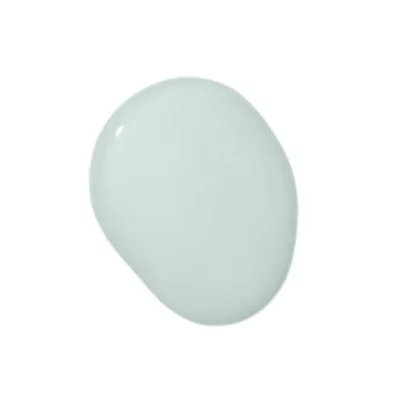
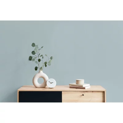
Soft Blues
Decorating with coastal blues is a no-brainer come June. Reaching for a can of soft blue paint is a fantastic way to welcome the season, and Broglia suggests painting with Dunn-Edwards DURA’s Marine Layer. “Reminiscent of the ocean and warm summer days, this misty, light blue hue is the epitome of the season in my eyes,” she says. “Channeling serenity and slower days, this hue is sure to be everywhere this summer.” No matter where you live, a dreamy coastal blue will infuse your home with the laid-back, casual vibes we all crave over the summer.
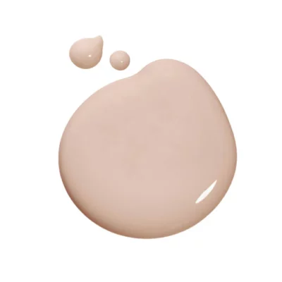
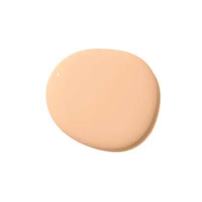
Pinks and Peaches
If summer inspires you to play around with color, you’re not alone. “During the summer months, we see a noticeable uptick in sales of brighter colors,” Nicole Gibbons, Founder of Clare Paint says. “Summer is the time when people are more willing to embrace their colorful spirit and therefore more likely to introduce more adventurous colors into their home.”
Gibbons specifically notes that brighter pinks gain popularity over the summer, which matches the season’s playful spirit. Summer is also the perfect time to embrace this year’s Pantone color of the year, Peach Fuzz, if you haven’t already. Bonus points for pairing pink and peach together!
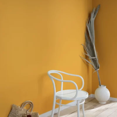
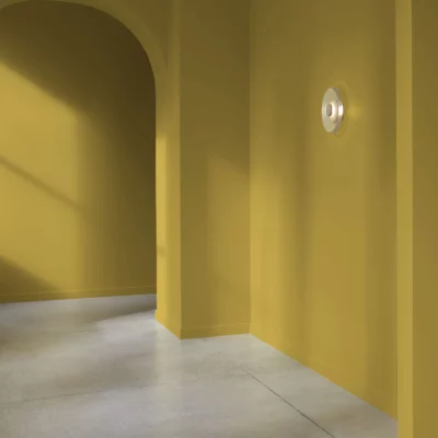
Mustard
While you might think summer paint color trends are for pastels and brighter hues, richer tones are trending as well. Paulina Hospod at AhA Interiors was recently at the International Contemporary Furniture Fair in New York and she noticed one particular color trend that’s sure to turn heads. “I have seen quite a bit of color interest in the muted or deep versions of mustard, amber, or pumpkin,” Hospod says.
Iantha Carley of Iantha Carley Interiors loves this shade and encourages her clients to be bold with their color choices this season. “If you are more fearless when it comes to color, don’t be afraid of using deep tones, particularly ones with yellow undertones,” she says. “One of my favorites is Ben Moore’s Dragonwell, which is particularly beautiful in a sunny room as it changes color during the day and evening. It’s quite remarkable.”
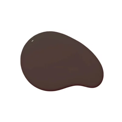
Deep Browns
Rich browns have been trending all year, and Broglia specifically loves a shade that embraces two trends at once. “Lately, I’ve been loving the deep brown colors seen in Dunn-Edwards DURA’s Bourbon Truffle, which has a surprising punch of red,” she shares. “As the ‘unexpected red theory’ continues to grow in popularity, I think summer hues can mean more than just pastels, and this earthy hue is evidence of that as we reconnect with the outside world this season.”

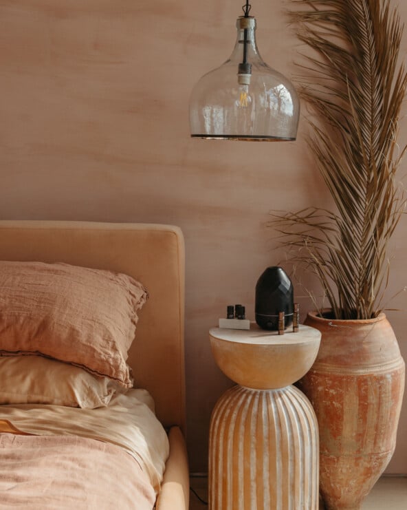
Mauve
Deep purples like rich plums and amethyst shades have been popular this year, and Hospod is leaning toward lighter shades of purple, namely mauve, this summer. “I have seen a lot of mauve shades and Benjamin Moore’s Angelica is one of my favorites,” she shares. “I am overall drawn to purple undertones in many shades of lighter colors. Another lovely shade is Antique Pearl, slightly lighter than Angelica.”
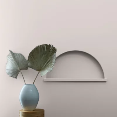
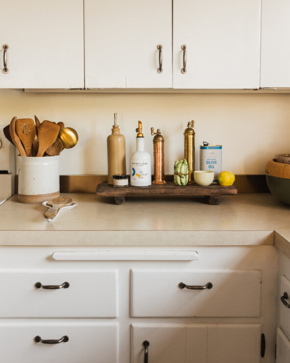
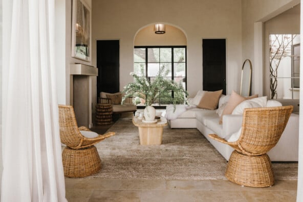
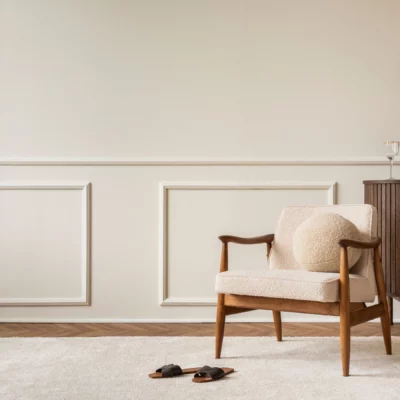
Creamy Whites
Let’s face it, white walls are timeless. “By using a more neutral base, you’re allowing more freedom for play in other areas of your home,” Broglia notes. But not all whites are the same, and this year, cool tones are out and warm tones are in. Broglia’s white of choice? Dunn-Edwards DURA’s Historic White. “This sandy neutral white is the perfect base color for bringing a versatile summer style to life through furniture and design,” she says. “This color is great because it has proved to be timeless and lives beyond trends.”
Another option? Benjamin Moore’s Chantilly Lace or Calm—both are Hospod favorites. “I use Calm whenever I need the room to look lighter and I don’t want to use white,” she explains. “It has great purple and pinkish undertones, it’s warm, and it matches well with other shades. It goes great with Chantilly Lace trims, with just enough contrast.”
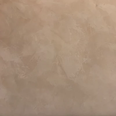
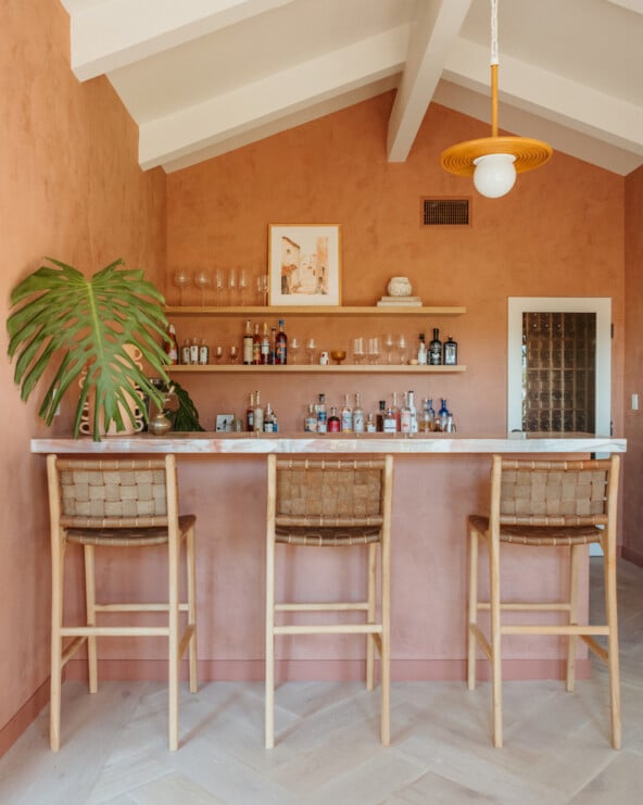
Roman Clay
2024 summer paint color trends are moving beyond just shades and hues. Brittany Farinas, CEO + Creative Director at House of One is noticing a specific plaster finish is making waves in the design world. “The biggest paint trend we’ve been seeing is ‘Roman Clay’ by Portola Paints,” she says. “Everyone is using it. It’s like a matted Venetian-style plaster that is so versatile across different design styles.”
Roman Clay is a paint/plaster hybrid that is applied with a putty knife. It goes on smoothly and gives walls the appearance of stone, stucco or marble—very chic. It’s available in both light and dark colors, and truly is for every space. “It can work in a cozy cabin lakeside setting as well as a more organic, minimalist design aesthetic,” Farinas says.