Is it strange that when we were first designing the #CSBungalow, I was most excited about getting to work on the bathroom? Powder rooms have always been a sort of playground when it comes to interiors, and I’ve seen even the most traditional of homes utilize the space to go wild with color, texture and pattern. But with the latest boom in clay tile and unexpected wallpaper, we’re now seeing a bathroom renaissance unlike ever before — tiny spaces with big personality. Though the rest of our new studio space is mostly white and neutral, we knew we wanted to play with some trends in the powder room. We teamed up with our friends at Kohler to create a space that is fun and feminine, but still super serene. Using their IDEAS inspiration hub, we were able to easily visualize the finished space and pull the trigger on tough decisions, as it presents content in a simple way that allowed us to sort inspiration based on room, color and style.
 This post brought to you by Kohler. Click here to get inspired!

We couldn’t share the finished product without first showing the you the “before.” There wasn’t really anything salvageable from the original bathroom, but we were thrilled to rip through sheetrock to find original shiplap throughout the entire house.

We took great care to keep everything in our new office proportional. Though going big is tempting and often more comfortable, the truth is that sometimes smaller is better. In lieu of a vanity, Kohler’s Bancroft Pedestal Sink was just the right size, plus, the style honored the age of our 100-year old space. I’ll share our alternative storage solution below.
Also pictured: San Souci One Piece Toilet from Kohler, Artifacts Toilet Tissue Holder for Kohler, Linen Waffle Bath Mat from Nannie Inez, Popham Design’s Hexagon Tile from ANN SACKS

This angled jute side table from Anthropologie sits in the corner of the room with a folded hand towel, scented candle, and (usually) an arrangement of fresh blooms.
I know, I know. The tile! Isn’t it fun? The lovely folks over at Ann Sacks helped us zero in on the perfect pop of color and pattern for this space, and in the end, we landed on hexagon tiles from Popham Design in a white, cream, light pink and dark pink color combination.

For the mirror, we knew we loved the arched top of a classic French King Louis Philippe, but this wooden version is a touch unexpected and beachy.

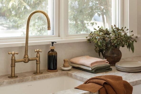
While most people might not give a sink’s faucet and handles a second glance, we agonized over choosing ours. The Artifacts Bell spout and the Artifacts prong handles were the winners in the end, and we love how classic and simple they are.

Since we don’t have any built-in storage, we were on the hunt for a glass-front cabinet for the bathroom. This one from Target checked every box: not too deep, not too tall, and in a light color, it’s the perfect way to showcase all our pretty powder room must-haves.

The cabinet is the perfect height for leaning artwork and arranging flowers at eye level. How great do those yellow blooms look in the Form Vase from Nannie Inez?
Also pictured: Line drawing by Ricardo Jaén and Italy photo by Kristen Kilpatrick

Thanks to our friends at Kohler for helping bring this bathroom vision to life. And special thanks to Monte Goertz builder and Lowdo architects for help with our office renovation project. Stay tuned for more studio reveals coming soon!


So lovely! Where are the light fixtures from? I have been looking for something just like that! <3
Hi Amy! They’re from Visual Comfort: http://bit.ly/2zLkbw1 and we replaced the shades 🙂
That floor is the stuff of dreams!
So pretty! What color paint was used on the shiplap?
Love that the tiles are really different from most bathroom renos and I love the vintage fixtures. The curio cabinet is another great touch!
Blush & Pearls by Angela
Love, love, LUUUV the floor tile. You nailed it. I am a pink girl and really like seeing the color used well.