The biggest question by far that I’ve received since announcing our soon-to-launch home goods brand, Casa Zuma, is, “Where did the name come from?” And the second biggest is, “How did you create the logo and branding?” So, I thought that was as good a place as any to dive into the details of how we’ve been building Casa Zuma over the past two years. Suffice it to say—it’s been an evolution.
First, the name
When we first started tossing around the name Casa Zuma, it was in reference to the 1950’s beach house overlooking Zuma Beach that we bought in 2020 to turn into our family’s retreat. Over the (still-ongoing) years-long process of renovating, it slowly began to represent something more: a slower way of life that was rooted in feeling more deeply connected to nature, each other, and ourselves.
For years, I’d wanted to create something that I could share with others to help cultivate more meaningful everyday experiences in their own lives—to enhance the small moments and be a cue to enjoy the present. It’s my vision for this site, and I dreamed of how that could come to life in the physical world. So, Casa Zuma began to grow into that thing—not just the place that I love so much, but also a way of life, and ultimately, a brand in itself. When I think of Casa Zuma, I picture the rhythmic beat of the waves, the waving grasses at Point Dume, and the sunset over the mountains that leaves us speechless each night.
A couple of weeks ago, I shared about the products we’ll be offering, but way before making those decisions, I had begun the process of unearthing who Casa Zuma is.
What does the brand look, feel, smell, and sound like? And so began the process of creating a new brand from the ground up.
Establishing the domain
First, we bought the URL, casazuma.com, as well as the closest social handles that were still available. I started asking friends if they knew any branding/design wizards who could help bring our ideas to life visually. One of them mentioned having worked with Matt Titone and Ron Thompson, who own ITALIC Studio based in Southern California.
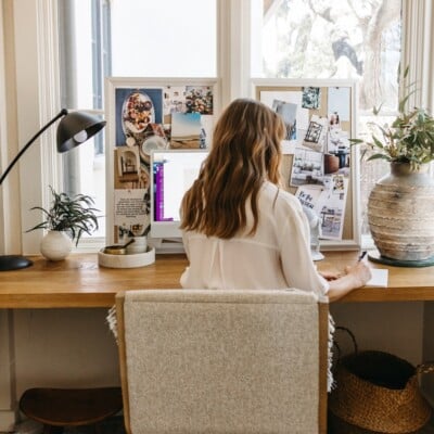
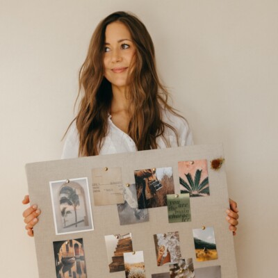
A long breakfast meeting in Malibu revealed that not only did we love their creative direction, but their passion for surf culture felt serendipitous. I handed off a deck I’d put together that contained my mood boards and descriptions of how I wanted the brand to feel. It was full of images and words that nodded to the natural elements—terra cotta, agave, and sand—that inspired me. And we were off.
Creating the brand identity
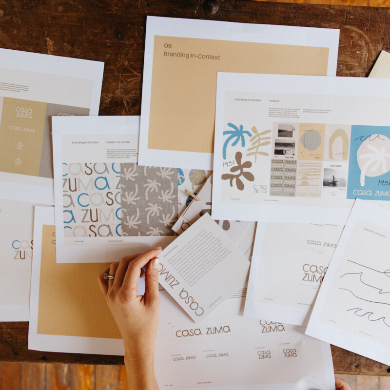
With ITALIC, we began the process of looking at a wide range of visuals and graphic elements to see what we were drawn to—everything from surf hotels in Montauk to artistic references like Matisse cutouts. We made detailed notes—we liked the edginess of the hand-drawn elements; we wanted to stay away from anything that felt tribal or Aztec. Our muse was the place, Zuma Beach, and the sun-drenched, laid-back life that drew us there.
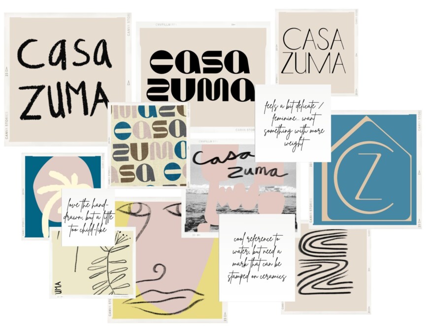
A few weeks later, Matt and Ron sent us our first branding concepts to review. It included ideas for colors, logos, graphic elements, and fonts. Here were some of the initial logo concepts that I liked, but didn’t make the final cut:
Logo
The concepts were challenging to narrow down at first. Every logo option was so good! I loved the carefree nature of the hand-drawn font on the left, the sculptural curves of the top middle, and the quiet sophistication of the top right option. I went through all the options, absorbed them, then didn’t look at them for a solid 24 hours so the ideas could marinate. When I came back to it the next day, there was one option that just felt right:
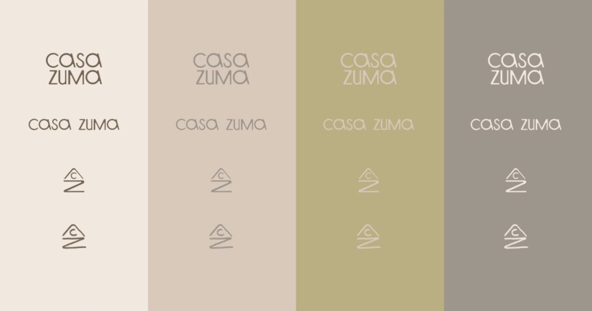
This is the one I kept coming back to—it felt cool and just unexpected enough, but with a refinement that balanced the more raw and free-flowing parts of the other branding elements.
We wanted a smaller “mark” that could be used to stamp the bottom of our ceramic pieces or carved into our wood boards and bowls. The ITALIC guys came up with a brilliant solution (see above) that included the CZ brand initials, but also reminded me of my favorite view from the beach house, where the mountains and sun meet the water.
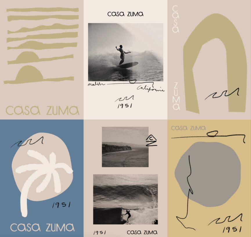
Color palette
Our brand colors were inspired by those natural elements that define Malibu: canyons and ocean, seaweed and agave, eucalyptus trees, rocky beaches. Since our actual products will be made in earthy neutrals, it’s nice to have some color options to play with in our branding elements.
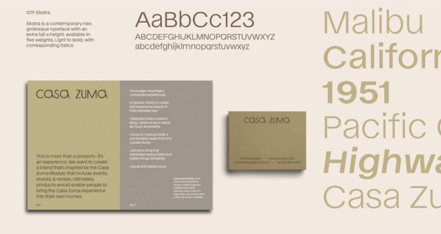
Fonts
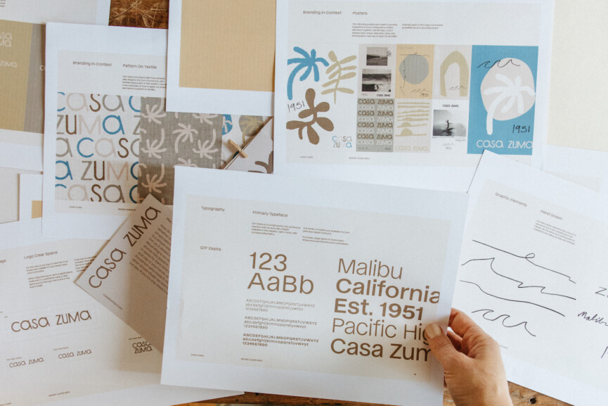
We also chose fonts. We settled on GTF Ekstra for our primary branding materials (i.e., presentations, marketing, and business cards). But for the website, we chose a similar Google font that would work seamlessly with our branding elements. (Google fonts are free and often result in faster load times on a site.)
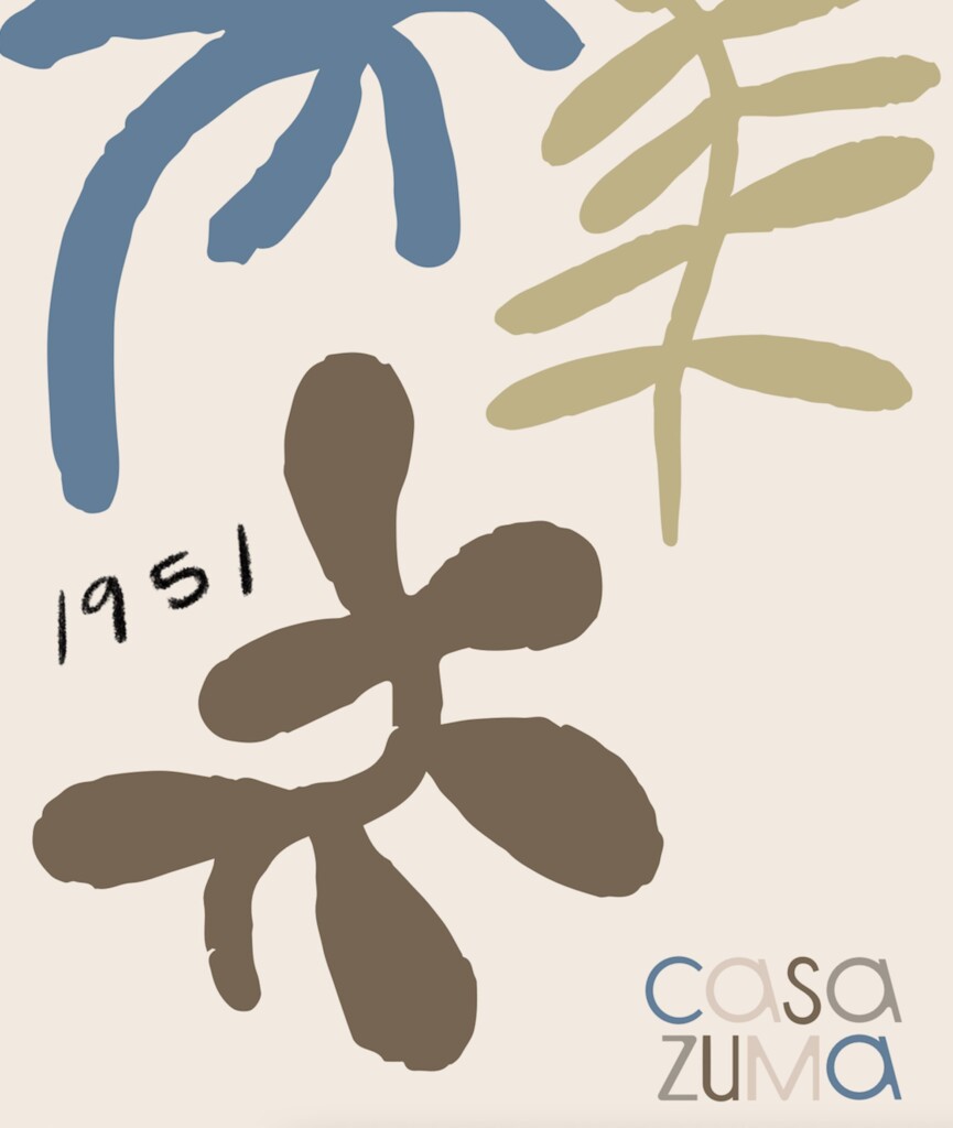
And, we had a brand. The whole process took a few months, and when it was done, this project felt real. The logo, colors, fonts, graphics, and mark were there. And just as important, we’d spent time cultivating the personality and purpose of Casa Zuma. It was almost a living, breathing thing, and this brand identity would inform all the steps we took next, from the website design to the social channels to the products themselves. We refer back to this deck time and again for inspiration, to guide us on whether or not a choice is aligned with our vision.
Starting with the brand before anything else, even the product design, made every decision that came after it easier. We had clarity and confidence that we were creating something special with a strong point-of-view. Now we just had to bring it to life.
Next up: I’ll be diving into the design process of a few of my favorite products from our launch collection as we gear up to launch Casa Zuma in just a couple of weeks!


