As I’ve shared here before, window treatments are the number one aspect of interior design that intimidates me most. Reupholstering a couch? Done. Styling shelves? Got it. But when it comes to choosing window treatments, it feels like there are just so many things that could go wrong. When I started mapping out the plan for our recent renovation, my main fear was ordering the wrong size—even a 1/2-inch error can end up being a costly mistake. (Trust me, I’ve learned the hard way.)
Plus, there were so many decisions to be made: drapes or blinds, roman shades or rollers, sheer or light-blocking?
This time around, I knew that it would be worth calling in the experts to help me get it just right, and I’m so glad I worked with Graber on our custom window treatments throughout the house.
I’ve gotten a lot of questions from you guys about our shades and curtains, so now that everything is installed, I thought I’d share a window treatment tour of each room! From choosing materials that go with my aesthetic (check out my Pinterest board!) to helping me think through the functionality of what we need in each space (living vs. bedroom, etc.) the Graber team was so helpful in helping me bring our vision to life. Quite literally, since we started with the online “visualizer” that let me try out my window treatments in my own space, virtually. Read more about our design process here, then scroll for the final reveal of our window treatments in each space, plus the window treatment design tips and “Do’s and Don’t’s” I learned along the way.
A Few Window Treatment Design Tips to Get Started…
Create an inspiration board. Gathering images of window treatments you love will help hone in on the look and feel you want to capture in each room of the house.
Consider the function of each room. Do you need to minimize glare or block light for sleeping? Are there safety factors you need to consider if children are in the house? Do you have hard-to-reach windows? For a home office or media room, consider motorization which allows you to raise and lower the shades without having to leave your desk or couch. Knowing your goals for each space will help guide a conversation with a designer or vendor.
Use Graber’s visualizer tool. It helps you “see” what different choices may look like in your own space, to help you narrow and compare styles. You can also share them for opinions or inspiration boards. Graber also offers free swatches. In fact, a dealer can bring you an entire swatch book/s so you can touch and feel the product before making your final decision.
Have an expert take measurements. This is my number one stress-reducing tip. Measuring for window treatments is not easy, especially when you don’t know the difference between product lines, inside mount or outside mount—it can be overwhelming! Having a Graber expert take all the right measurements based on the product I selected gave me peace of mind and a perfect end result.
Read on for a few window treatment do’s and don’t’s I learned for each space in our house…
Do: Allocate Budget to the Most Important Windows in the House
The Space: Master Bedroom
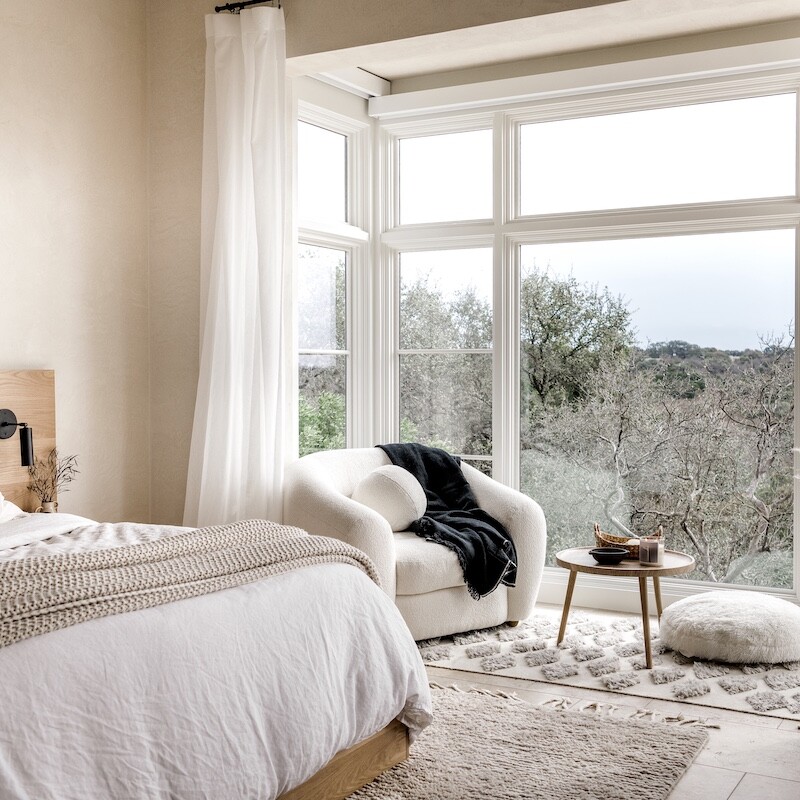
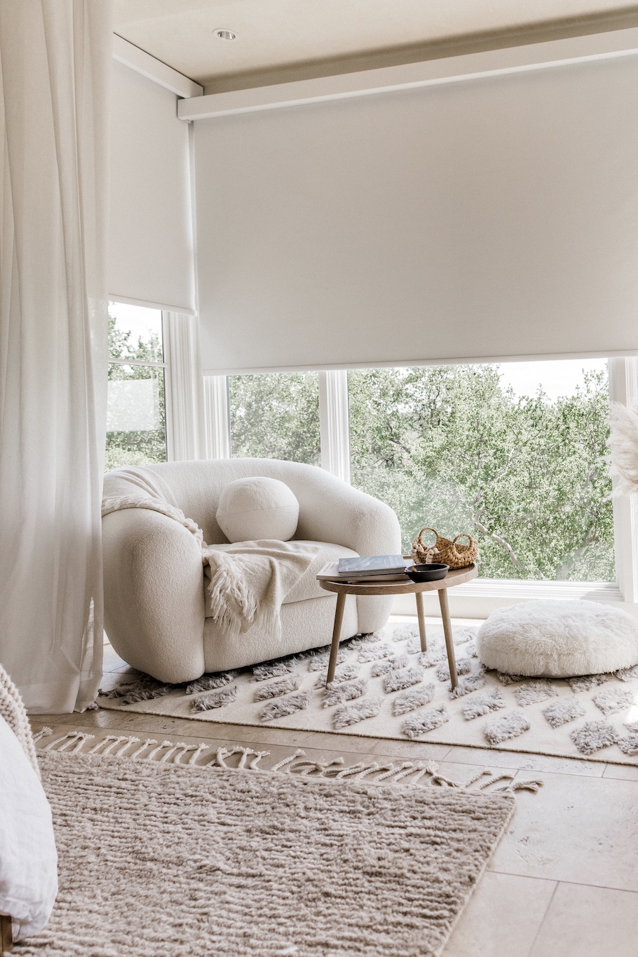
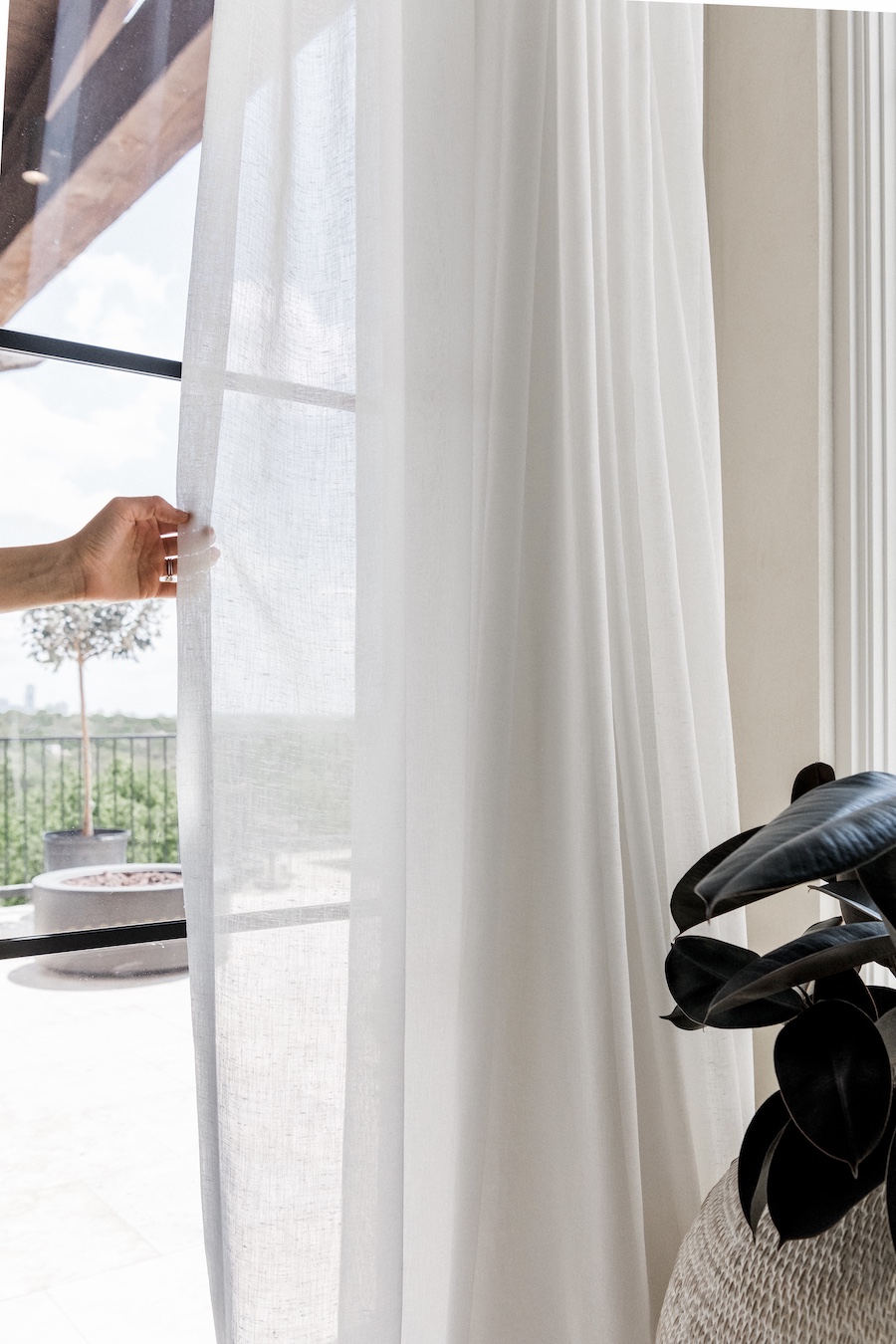
Practical Considerations: I’ve long fantasized about having motorized blackout shades in our bedroom, but our huge cantilevered bay made for a challenging window treatment solution. But still: in my dreams, I would read in bed with the blinds open to our downtown views… then when I started getting sleepy, I’d take the room to blackout mode with the push of a button. Well, guess what? It’s a fantasy that turned out to be totally doable, and I worked closely with the Graber team to design an innovative solution to house the blackout shades and hang sheer curtains, without sacrificing the open, streamlined look of our big picture window.
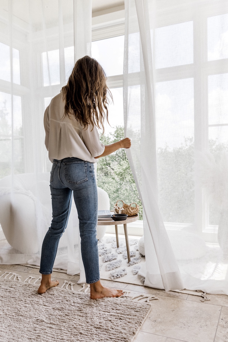
Window Treatment Solution: We ended up installing three made-to-order motorized room darkening roller shades from the Shadow collection in white—the blackout liners fit perfectly within each panel of the bay window. The team installed a streamlined white flange (the little box that holds the roller) that virtually disappears during the day. At night, we push the button on a remote (or on the app on our phones) when we’re ready for the shades to close. It makes for the coziest, most cocoon-like sleeping environment that doesn’t close off our little reading nook.
To create a soft, neutral frame for the window itself, we installed two panels of Graber Artisan Drapery from the Tuzee Collection (color is “White”)
Don’t: Be Afraid to Keep It Simple
The Space: Living Room
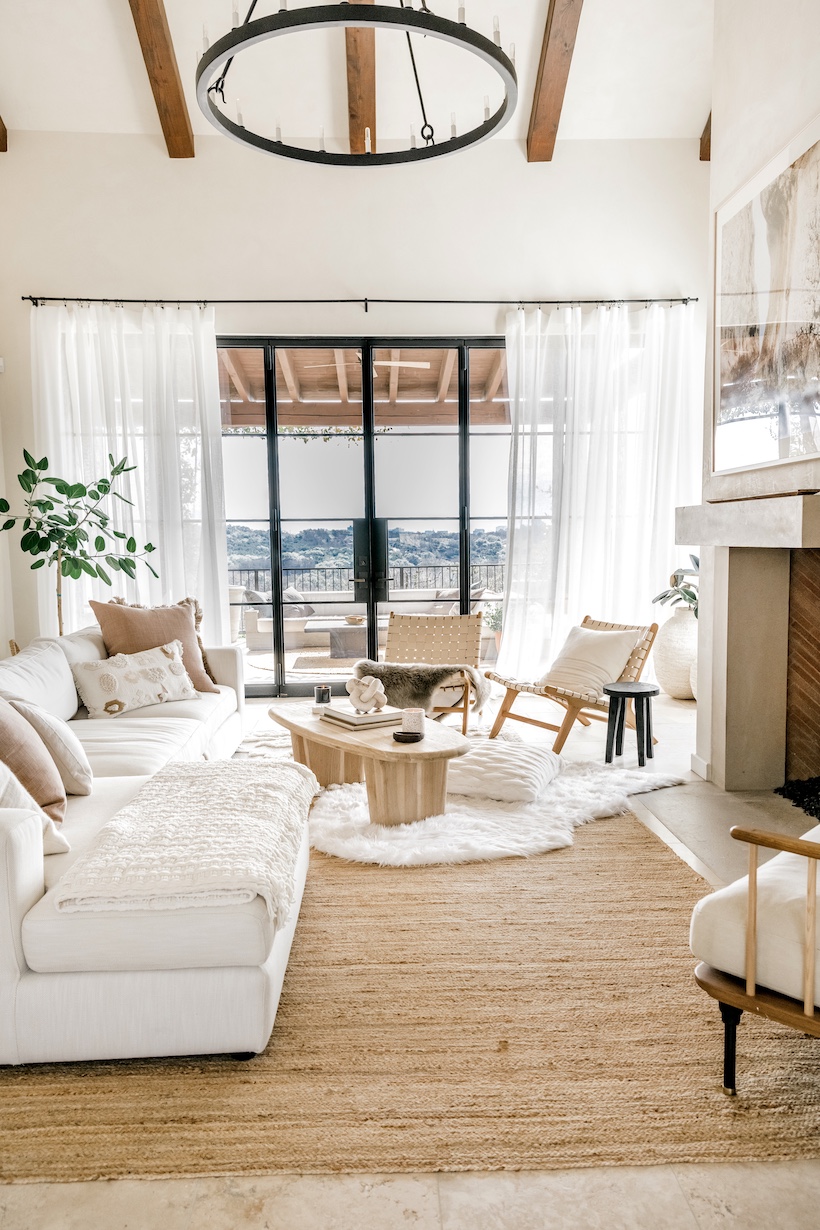
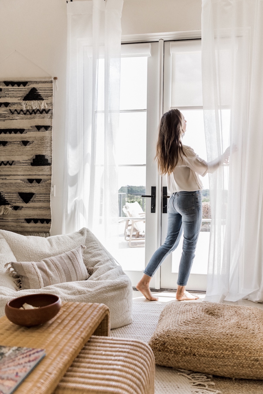
Practical Considerations: The centerpiece of this space is the big wall of steel doors that open up to our back patio. I wanted to soften the hard lines of the doors without losing any of the openness, or natural light. Had I gone with a layered look or busier drapes, it might have blocked some of the beautiful light coming in and detracted from the statement-making doors, which are one of my favorite architectural details in our house.
Window Treatment Solution: We installed four panels of White Sheer Graber Artisan Drapes from the Tuzee Collection. I love that they can be left open for softness around the edges, or pulled closed for a cozier feel that still lets light in. When we open up the steel doors, I love the way the white sheers blow in the breeze, and when you get close, the texture feels warm and dimensional.
Do: Layer Window Treatments
The Space: Guest Bedroom
Practical Considerations: With its woven materials and beach-inspired artwork, this room of the house gives the most literal nod to the ocean vibes that I love so much. So I wanted our window treatments to reflect that, with light and airy natural materials. Only thing is that I also want our guests to sleep like babies, which means the ability to totally block the light when it’s bedtime.
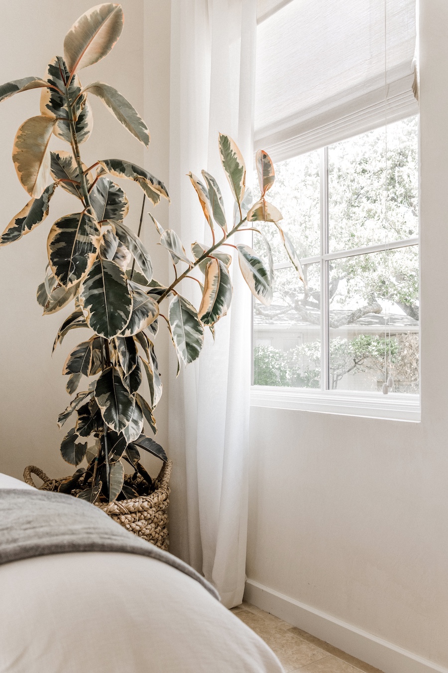
Window Treatment Solution: Layering two different window treatments adds so much interest and dimension to a window. I started with Tradewinds Natural Shades (from the Moniz collection – color is “Finland) and Graber Artisan Drapery (from the Tuzee Collection – color is white.) Whether you go with wood blinds, natural shades, statement-making drapes, or light-blocking rollers, layering two types of treatments together can make it more functional and make any room feel more “designed.” The Graber team had tons of window treatment design tips as we determined the right combination for our spaces.
Graber’s natural shades are sustainably sourced and handwoven, and I’m so happy I went with something more textural and interesting for this space. During the day, we get that open-air blowing-in-the-breeze feel… and at night, the natural shades keep it cozy. Each of the natural shades is handmade, so they have that earthy, one-of-a-kind look I love. I ordered these shades with custom liners so they block the light at night.
Don’t: Skimp on Curtain Measurements.
The Space: Adam’s Home Office
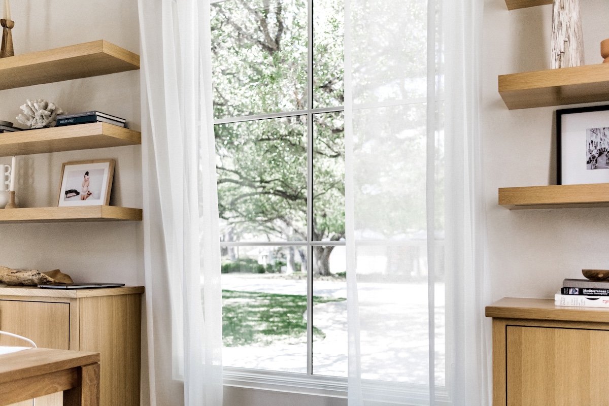
Practical Considerations: Adam loves having lots of natural light and having a clear view to the front yard to see when people drive up. But when he’s deep in computer work or on a Zoom call, he requires some light filtering to minimize glare on his screen.
Window Treatment Solution: In order to make the room look more expansive and full of light, we installed our rod to take these sheer curtains a few inches higher and wider than the window frame itself, and ordered a curtain length that would slightly pool on the floor for a more luxurious look. By using a wider rod it allows drapery to fully pull back from the window for maximum light.
For a more tailored look, your drapes could just “kiss” the floor. Here’s another area where custom curtains have a leg-up on store-bought—you can order the dimensions that are exactly right for your particular window, and the details make a major difference.
Do: Ensure You Can Block Light When You Need to.
The Space: Adam’s Home Office
Practical Considerations: Since Adam is on a computer most of the day, including lots of Zoom calls, anti-glare was crucial. Especially as the sun moves into the afternoon hours and shines directly through the window opposite his computer screen. We knew that he needed a way to block out the light, without feeling like he was in a dark cave.
Window Treatment Solution: We went with Solar shades in the color, Renewal from the Plexus Collection with 3% openness, and continuous cord loop operation which provided the streamlined privacy and light blocking that he needed. But I was also amazed by the beautiful light that they allowed to filter into the room. No cave vibes here! Plus, the breezy sheer drapes that gently filter light during the day aren’t enough to give any privacy at night—lowering his solar shades allows him to feel a little more protected from passing cars who could otherwise see right into the house.
Graber’s solar shades also protect furniture from harmful UV rays, and can even reduce cooling bills by lowering the heat gain in a room.
Don’t: Go With a One-Size Fits All Approach
The Space: Media Room
Practical Considerations: This room faces the back of the house, just like our living room. Previously, since both spaces have doors that open up to the backyard, we ran the same sheer curtains in each door and window that faced this direction for a cohesive effect. However, that approach turned out to not be ideal for the media room, where we tend to get cozy and watch movies as a family. We needed the ability to block light, without sacrificing the airiness of the space.
Window Treatment Solution: These Solar shades in the color, Renewal from the Plexus Collection with 3% openness and continuous cord loop operation came to the rescue again. We installed two panels (one on each french door) to diffuse the light and minimize glare on the TV. Then, in keeping with the laid-back bohemian vibes of this room, we installed sheer white curtains that slightly pool on the floor to soften and add style to the space.
Do: Hang Curtains Higher and Wider Than You Might Think
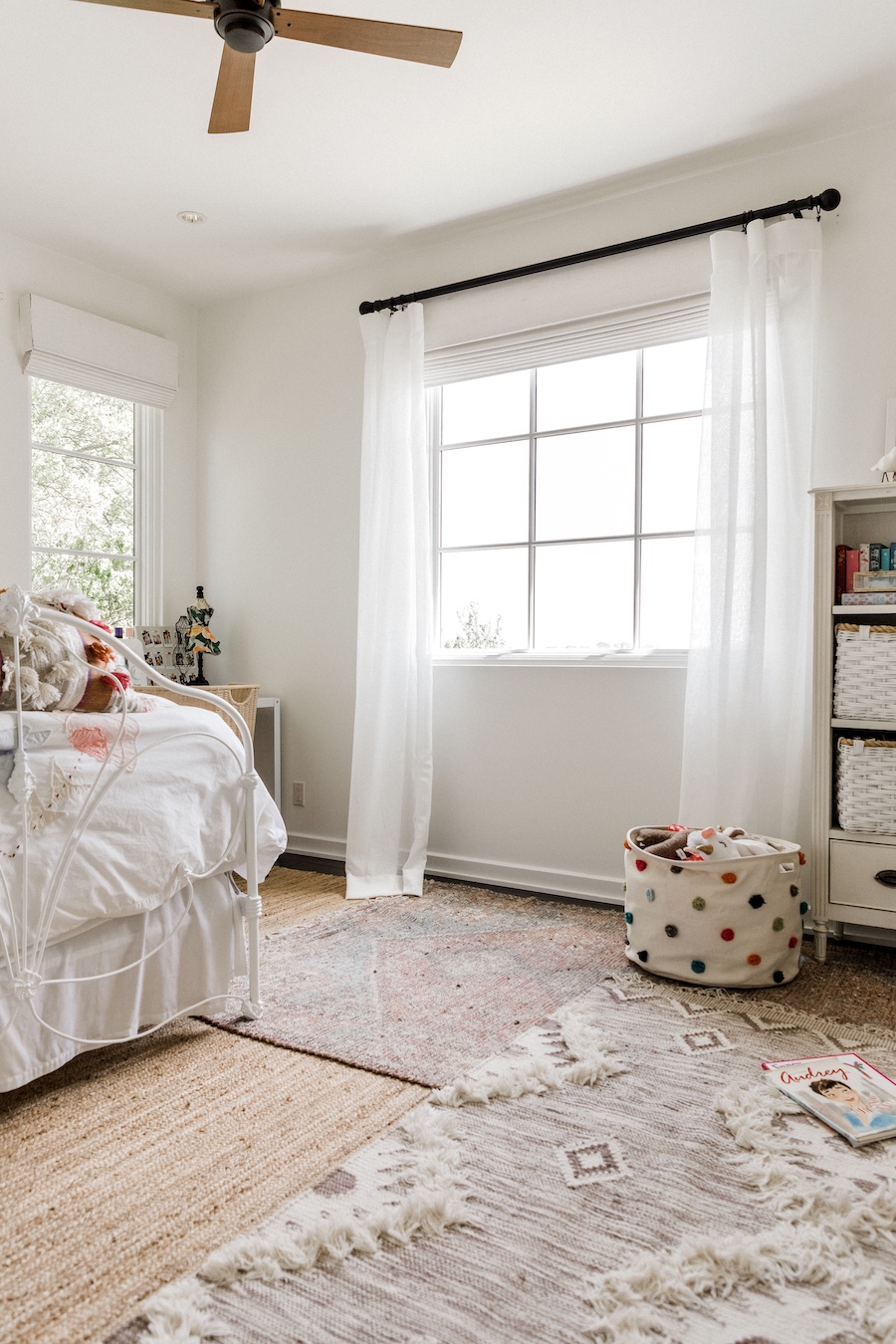
The Space: Phoebe’s Bedroom
Practical Considerations: Phoebe has one big picture window as the focal point of her room, and since she’s on the second story of our house, it has incredible views. The challenge was to keep the open airy feel created by the window while providing light blocking for nighttime.
Window Treatment Solution: We made the space look bigger by hanging her drapes 12 inches above the window frame, and extended the curtain rod out a few inches on each side to make this beautiful window look even bigger. We also installed these gorgeous Tradewinds Natural Shades (from the Moniz collection—color is “Finland) to add texture and decorative interest to the space.
Since the kids usually forget to raise the shades in the morning (making our upstairs feel dark during the day) we installed motorized shades that we can put on a timer but can also be controlled at other times whether you are using the app or a remote or smart home device. At 7 am, the shades “magically” go up and signal to the kids that it’s time to rise and shine.
***
I could not be happier with how these spaces came together, and major thanks to the Graber team for guiding me through the process. I’d love to hear in the comments if you guys have any hard-won window treatment design tips from creating your own spaces! Let me know—and feel free to drop a comment with any questions about my window treatments, too.


