We may receive a portion of sales if you purchase a product through a link in this article.
Home should feel like a sanctuary. I always want to feel a sense of peace and calm as soon as I walk through my door—especially after being in the hustle and bustle of whatever’s happening outside. Your home can, of course, evoke whatever sort of feeling you like, but at the end of the day, home is where we rest. It’s where we wind down after a hard day’s work, it’s where we lounge around in our pjs on slow Sunday mornings, and it’s where we drift off to sleep and wake up each day. Having a home that emits calm is a good goal for the new year, and there’s one surefire way to help you get there: color.

Top 2026 Color Predictions
There’s no denying that color has an effect on our mood and well-being, and 2026 paint color trends show us that we’re all collectively looking to chill out. “Homeowners are seeking out comfort and stability, and will look to create this at home especially,” Carolyn Fife Bever of Foundry-House says. “The future of paint colors is a big warm hug from nature: comforting, familiar, and grounded.”
Designers are reaching for warm neutrals, soft blues and greens, and desert-inspired tones meant to help you feel at ease. Ahead, interior designers share their favorite 2026 paint color trends and how they can create a sense of relaxation in every room.

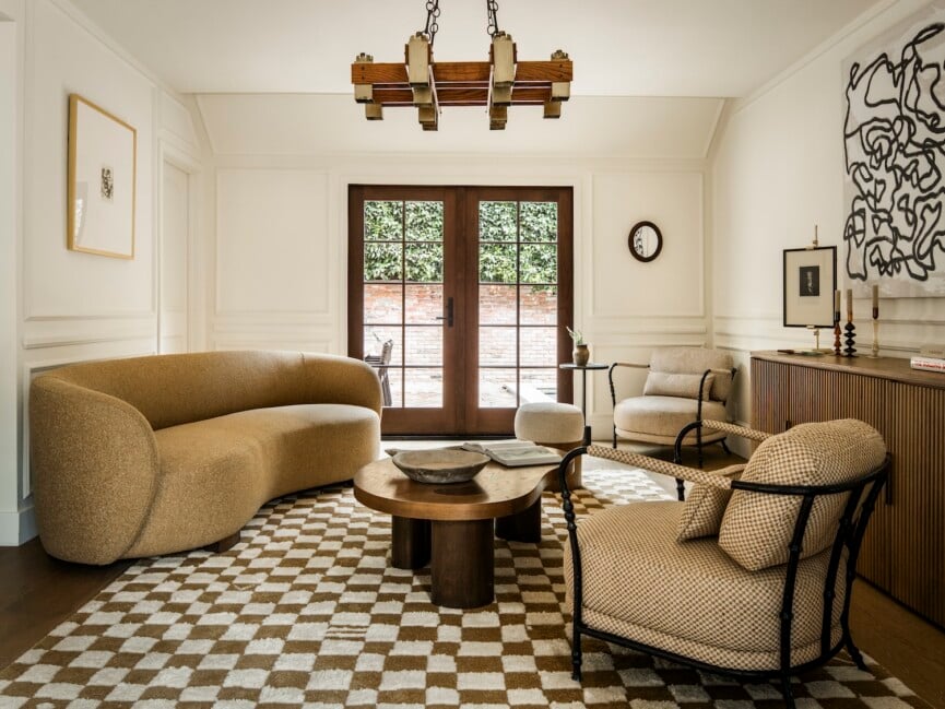
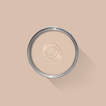
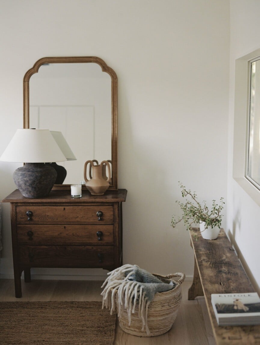
Warm Neutrals
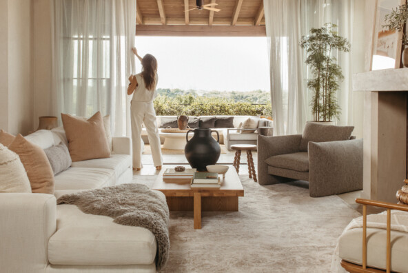
Cool grey used to be the it neutral years ago. Coined “millennial grey,” the tide has turned, and warm neutrals continue to reign supreme. “Instead of cool greys, we’re seeing a shift toward warmer neutrals, like a mushroom taupe, soft stone, or warm-toned beige,” Daniele Doerge, a color expert from California Paints, shares. “These colors are timeless, and can create a space that feels comforting rather than cold or stark.”
If you think neutrals feel a bit boring, Lauren Lerner, founder and principal designer at Living with Lolo, suggests otherwise. “Warm neutrals create an inviting backdrop that lets the architecture, furnishings, and textures really shine,” she says. “Colors inspired by limestone, sand, clay, weathered wood, or mushroom tones feel timeless to me because they’re grounded in nature, not trends.”
Paint finishes can also create calm, especially when you’re working with warm neutrals. “You’ll see higher gloss paints tossing sunlight back into rooms, particularly on warm paint colors like Broccoli Brown by Farrow and Ball and Creamy by Sherwin-Williams,” Fife Bever adds.


Greige
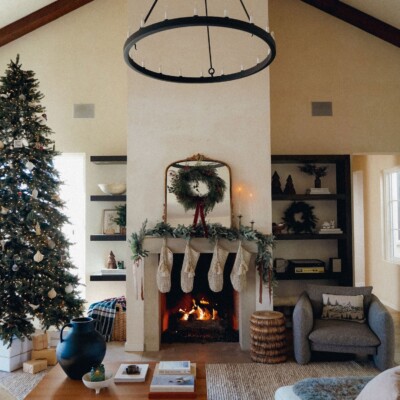
If grey continues to call to you, all is not lost. 2026 paint color trends include greige—a warm, creamy grey that doesn’t include cool, stark tones.
“As we look ahead to 2026, I recommend a warm greige for its calming, grounding qualities,” Erica Yaw, Lead Designer at Rumor Designs, says. “With cool grays finally on their way out, this neutral feels fresh, clean, and welcoming without any yellow or dated undertones.”
Current interior design trends are embracing unique, highly personalized spaces, and Yaw explains that greige works in both calm, relaxed spaces and those that are a bit bolder. “I’ve applied this color to both the walls and ceilings in a living room, establishing a warm, welcoming environment while providing a neutral foundation for striking design elements, such as icy-blue lounge chairs, a patinated-metal fireplace, and a vibrant accent rug,” she says. “The overall effect felt rich and inviting, with the warm greige tying together every component of the space.”


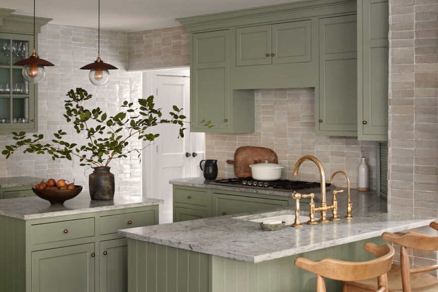
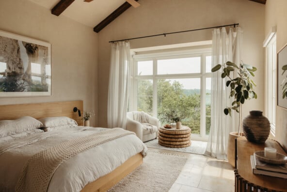
Nature-Leaning Greens and Blues
There’s a reason lush green forests and a sun-soaked body of water make us feel relaxed. Being in nature calms us, so it makes sense to use the same calming paint colors in our homes. “Earthy greens continue to lead the charge into 2026 because they create that immediate connection to nature,” Doerge explains. “These tones feel restorative and relaxing, making them ideal for living rooms, bedrooms, and anywhere someone wants to encourage calm.” As for what shade of green? “Deep greens like Dakota Woods Green by Benjamin Moore will be warming up reading rooms and grounding kitchen cabinetry,” Fife Bever predicts.
The same goes for soft blues. “A secret to serene paint that will be popular in 2026 is selecting a color that mimics natural light,” Leigh Falkner of Leigh Falkner Interiors shares. “A space with few windows, particularly a bedroom, can be enhanced and calmed with the gorgeous light aqua color Pale Powder #204 by Farrow and Ball.”


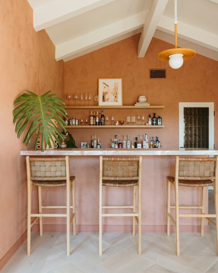
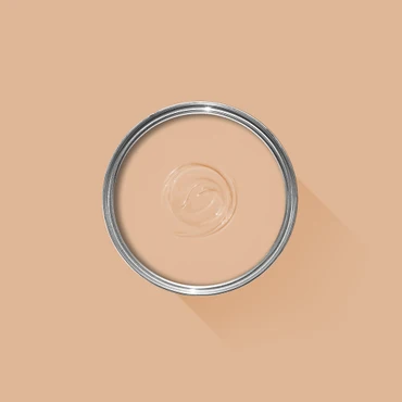
Desert-Inspired Colors
Camille is the queen of desert-inspired color palettes, and it’s no surprise they’re trending in a big way this year. “We’re seeing more play with clay, terracotta, and those ‘sunbaked’ earth tones,” Doerge shares. “These bring warmth and serenity to a space, while still encouraging color for those who want to add some different tones to a room.”
“Clay, putty, soft terracotta, and warm charcoals feel incredibly grounding,” Lerner adds. “They’re calming because we already associate them with the outdoors, so they create balance instead of demanding attention.”
Desert-inspired neutrals are also incredibly flattering—and who doesn’t want to both look and feel good in their own space? “While visiting a spa with beautiful plaster walls painted similar to Farrow and Ball #231 Setting Plaster, I noticed that the color complemented a wide range of skin tones—enhancing the blissful experience for all,” Falkner shares. “As an additional option, this color can be satisfactorily softened a touch by mixing at 75% intensity.”