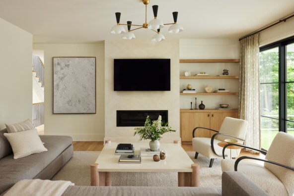
It’s finally time to show you guys the finished spaces in our house renovation, and I couldn’t be more excited to share the photos we shot earlier this week. For those of you following on Instagram, you’ll know that we’ve been refreshing certain areas of our house over the last several months. Turns out, a pandemic is a very interesting time to embark on a big home project: between minimizing the number of people in our house at a given time, and not wanting to completely move out of the house when it also served as our office and the kids’ school, there were certainly a new set of challenges to consider. That said, Adam and I have been in this house since we built it 11 years ago, and we knew it was time to make a few major changes.
We truly love our home, but we wanted it to more closely reflect the way our own aesthetic has evolved through the years. Think lighter, earthier, and more expressive.

So, we’ve finally wrapped up the countless loose ends that come with a construction project (especially one where I’m the GC in charge, lol), and I’m so excited to finally share the fresh, new spaces with you guys. We’ll be rolling them out, room by room, here and with videos on Instagram over the coming month. Especially in this year of chaos, there’s never been a better time to create a haven from the outside world. This year has convinced all of us that when we love where we live, it can massively impact our mental state — because when you spend all your time there, home really can change everything.
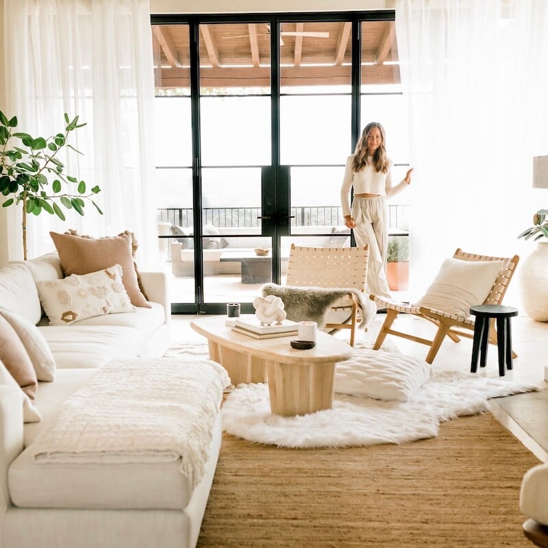
We’re starting with the living room, because it’s the center of our home and the first thing you see when you walk in the front door. It’s probably no surprise that I stuck with my signature neutral palette, but I’m sharing lots of neutral living room ideas that are anything but boring. Scroll on for the lessons I learned along the way, plus lots of links to my favorite pieces.

The back story.
So, as most of y’all know, Adam and I live in Austin with our two kids, Phoebe (8) and Henry (5). We built our house in 2010 right after we got married. It’s been the backdrop of countless dinner parties, family Thanksgivings, Christmas mornings, and kids’ birthdays. My sister even got married on our back patio! Both of our kids were babies here, and for many years, my entire team worked out of our house. The memories are too many to count, and I can genuinely say that I never knew it was possible to feel as attached to a house as I do to this one. It almost feels like a part of me. The old girl’s been through a lot – and not surprisingly, Adam and I have grown and evolved quite a lot over the past decade+ too. (It sounds like I’m about to announce our conscious uncoupling, hehe. Not true!!) Anyway, over the last couple of years, we’ve felt that it was time to update a few elements of the house to better reflect our style.
Checkout the “before” home tour right here.

The project pivot.
We met with our architects back in the fall of 2019 and worked on what turned into a pretty extensive renovation. We applied for permits and were just about to begin work – when Covid hit and threw a wrench in everything. As we paused on construction, the extra time spent at home turned into a blessing in disguise. It gave us an unexpected opportunity to think about how much we truly love our home, and we realized that maybe we didn’t need to give it a complete overhaul. What if we got strategic and confined ourselves to a much smaller budget, while still bringing the most important elements of the project to life? Or to say it another way, can we do just those things that will give us the most bang for our buck?
We reworked our plan and honed it down to the essentials so that we could keep our budget in check — and get it done without having to move out of the house during covid to make it happen. Here’s what we decided to do, along with my learnings.


Textural walls change the whole energy of a space.
I’ve long admired textural walls, including plaster, lime wash, and other finishes that give walls an old-world, patina’d texture. And when I started researching, I was surprised at how many options there are out there! As I started to learn more, I realized I wanted a totally matte finish that felt earthy and textural, but didn’t show as many of the trowel marks as something like a Venetian plaster. The guys at Champion Drywall turned me on to a product called American Clay that I fell in love with immediately. It’s a natural earth plaster made in New Mexico, and the finish has the exact soft, organic vibe I was envisioning for our house. I also love that the company is committed to sustainability, and the clay is a nontoxic, environmentally conscious option for walls.
We decided to plaster the entire downstairs of the house in American Clay’s shade called Forté White. The final product is so beautiful that I’ve found myself wanting to keep some of the walls bare, just so that the wall itself can have its own moment. I will say that this is not an easy DIY project; you want to either do your research and practice with lots of test patches, or as I did, hire someone who really knows what they’re doing. Our walls required a base coat and two layers of top coat, with drying time in between, and start to finish it was about a three week process. The application requires a fine attention to detail to make sure the texture and color are applied evenly.
This is one of my favorite neutral living room ideas, since it’s a subtle way to add dimension, texture and major wow factor, without adding any color at all.

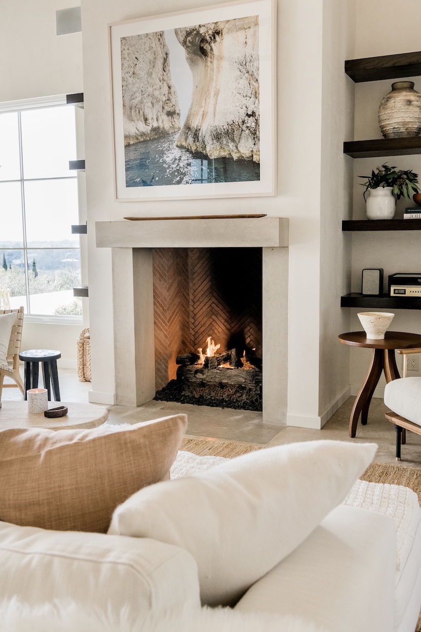
Honing the stone floors was our most budget-friendly move.
We have travertine tile floors throughout our house, and while I love how classic and durable they are, I haven’t been super pleased with the way the sealant has yellowed over time. Plus, the tile had a shiny finish that was applied over the top when it was installed (I have no memory of choosing this, but they do have an undeniable sheen.)
We started by pricing out all new tile floors, and let me tell ya, there was some major sticker shock in that conversation. Plus the logistics of having to move out all our furniture (and ourselves) for the lengthy process of tile removal and re-installation made us question whether it was even worth it. Enter: a process called honing that we learned about from a local stone care company. In a nutshell, honing tile involves slightly grinding the top layer to achieve a smooth texture and matte finish. Whereas our tile had a ridged, shiny surface before, after honing, it was uniform and completely matte.
The whole process took only a couple of days, and in the end, we felt like we had new tile floors and a neutral, matte backdrop to the entire house. And what’s even better: we did it for under $5,000 — about one-tenth of what we would have spent on new tile and installation.

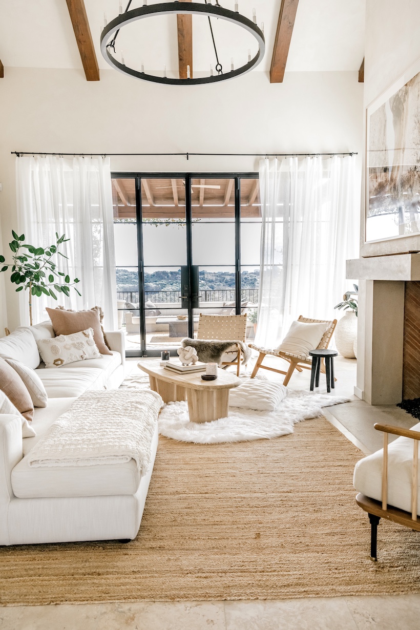
Sometimes, the perfect couch is already under your own roof.
These were my main issues with our old couch, which we’d purchased when we built the house:
- Even though the textured material didn’t show it that much, the couch was super dirty from years of abuse from two small children. And let’s be real, even though we have a “no eating on the couch rule,” we totally eat on the couch.
- The color skewed too yellow, and the bouclé material was starting to pill.
- The cushions were super firm to the point of not being that comfy. I wanted something that you could really sink into and kick your feet up.
So, I set off on a quest to find the perfect couch, and after weeks of searching, came up empty. There was something wrong with all of them – the wrong dimensions, not low enough, not soft enough, so soft to the point that it looked messy, etc. We almost bought a Restoration Hardware Cloud sectional, but after pricing out the entire configuration we’d need to fill such a large space, it was more than I wanted to spend. I spent an entire afternoon googling “RH Cloud Sofa dupes,” but none of them were quite “dupe” enough.

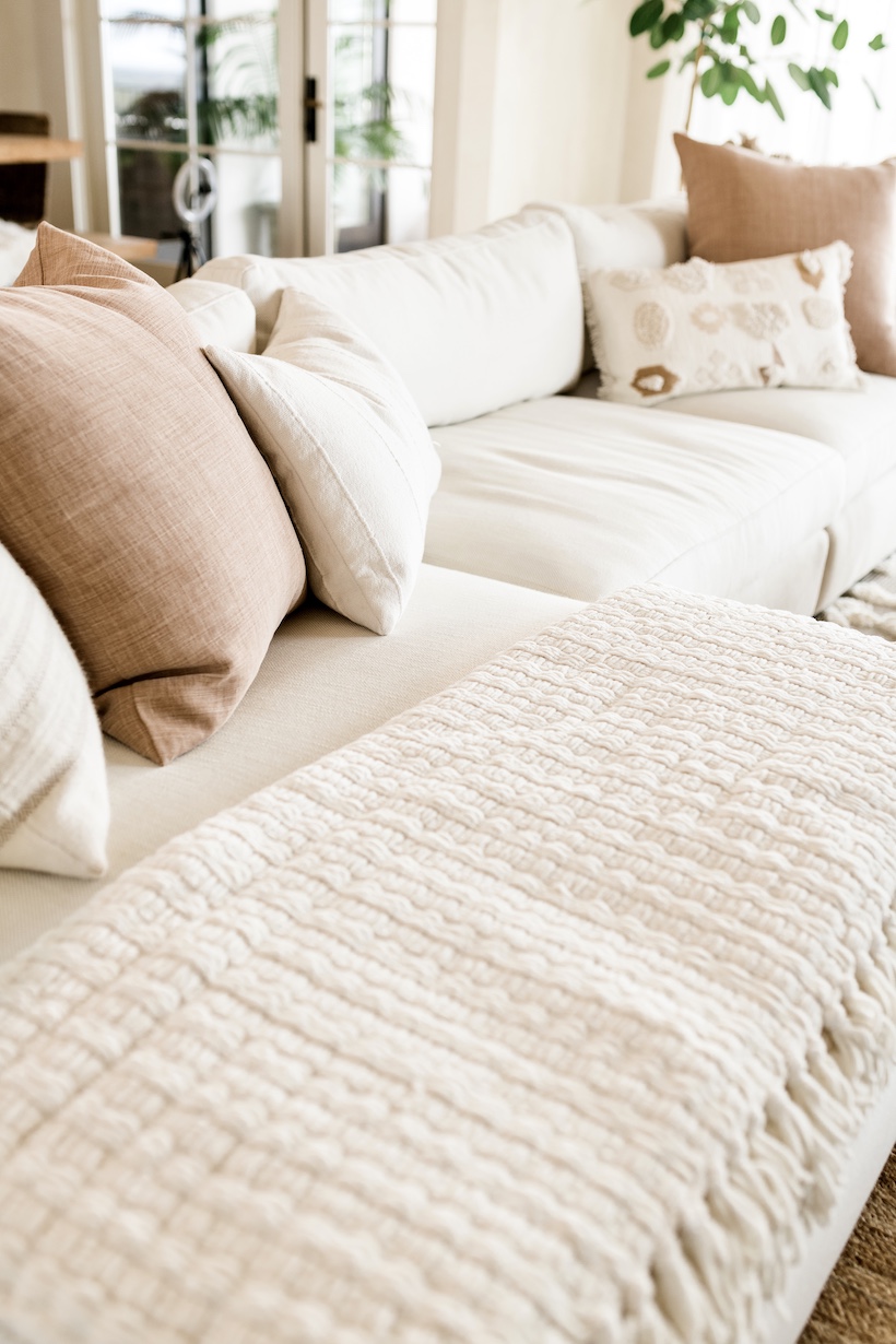
And then I realized: the couch that I already owned was the perfect size, shape, and low profile for the room. And everything I didn’t like about it could be changed. So in the end, I called a local upholsterer who came out and took measurements to recover the entire sectional.
Pro tip: if you love white couches (like I do) but don’t want to stress about spills, go for an indoor-outdoor material that won’t be any worse for the wear. I chose a beautiful Perennials material that’s made for indoor-outdoor use (aka it is practically indestructible and stain resistant.) I went with a tweed two-tone fabric that is white-ish, but provides lots of cozy texture, in colors “Whippersnapper / Sea Salt.” We also wrapped the cushions in a layer of down that would provide extra cushy padding, while still allowing the interior foam to give shape and structure.

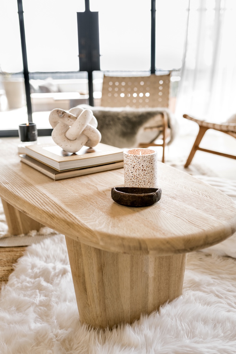
Think outside the square coffee table box.
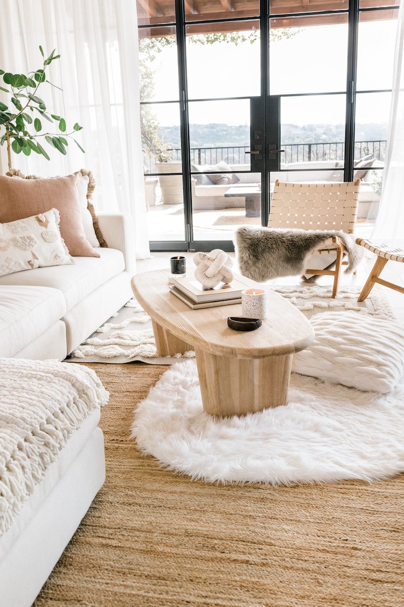
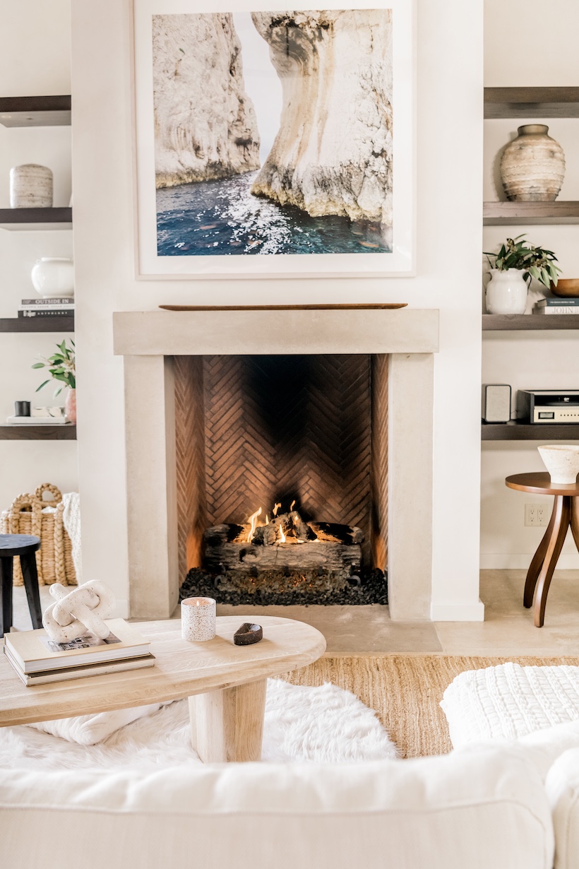
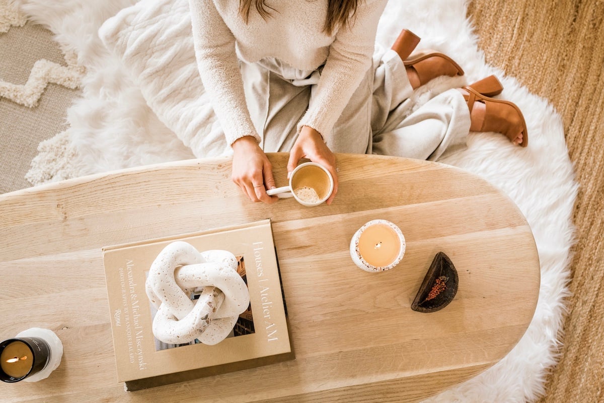
Our almost-black square wood coffee table had served us well, but it was feeling a bit severe in our otherwise light and airy living room. The hard angles didn’t quite jive with the soft, earthy look I was going for. When I laid eyes on the organic oval shape of this Aliso Natural Coffee Table from Dear Keaton, I swooned. Maybe it was because of the natural white oak wood, or maybe because the shape quite literally reminded me of a surfboard, but I got instant beach vibes and I knew it was perfect for our living room.
Mixing different wood tones is one of my favorite ways to add interest to an all-neutral space like this one. The blend of white oak, medium warm tones, and dark espresso wood provides necessary contrast and even a bit of drama.

Buy affordable rugs, then layer them on.
My kids are still at ages where expensive, delicate rugs just aren’t an option. They’d have goldfish ground into them in two seconds, plus I never want to be that person that’s constantly telling people to take their shoes off before coming inside. Don’t get me wrong, I love being barefoot as much as the next person, but I really want everyone to feel comfortable in my home, regardless of their footwear situation.
My affordable solution is to buy inexpensive rugs in neutral shades, then layer them artfully for a look that appears way more high-end than it actually is. In the living room, I layered these three rugs:
- NuLoom Ashli Solid Jute Area Rug (currently on sale for just over $100)
- The middle layer is an indoor-outdoor rug from Target that will be online in March, but I have this one in Adam’s office and it’s very similar: Savannah Moroccan Fringe Rug
- Faux Sheepskin Rug

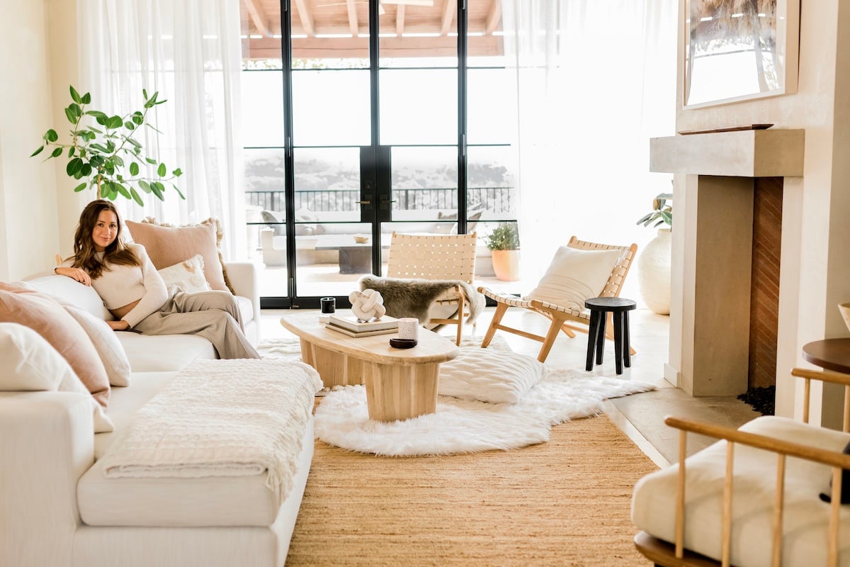
When layering rugs, choose materials with different pile heights, that is, the thickness of the rugs measured from the surface of a rug to its backing. Then layer them in order, with the flattest rug on bottom and the plushest on top.
Remember that high-traffic areas like a living room can benefit from rugs with some density, as they tend to hold up better to wear and tear.

Mix up the furniture configuration for an instant living room makeover.
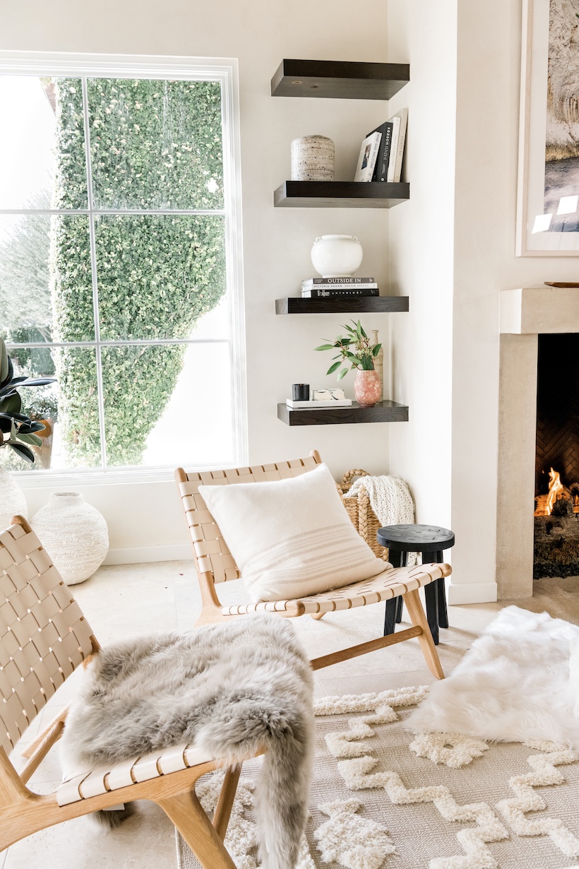
I asked my friend, designer Claire Zinnecker, to help me create some alternate layouts to help me think beyond how I’d been arranging my furniture for the past ten years, which I shared in this IGTV episode. Based on her drawings, I decided to place two new chairs in the corner near our big steel doors leading to the patio, and it totally transformed the feel of the room — it was just the finishing touch we needed.
I love love love these woven leather armchairs from Australian furniture brand, Barnaby Lane. The Rose Blush shade reads as a neutral — Adam was very worried about having “pink chairs in the living room,” but he loves them as much as I do. And the white oak frame perfectly ties in with our coffee table of the same material. They’re the perfect low, loung-y height for curling up with a book by the fire.

Open shelves are the most fun place to show off your style.
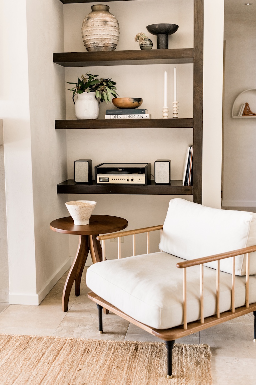
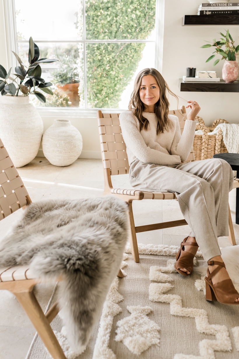
With this project, I’ve been inspired to mix it up and take a few more decorating risks, and nowhere is that more true than our open shelving. Whereas I used to find what I thought was the “perfect” arrangement and keep it that way for a year, now I view our shelves as an ever-evolving place to express my style. Plus, I find shelf rearranging to be the most satisfying weekend project after a long workweek with lots of screen time.

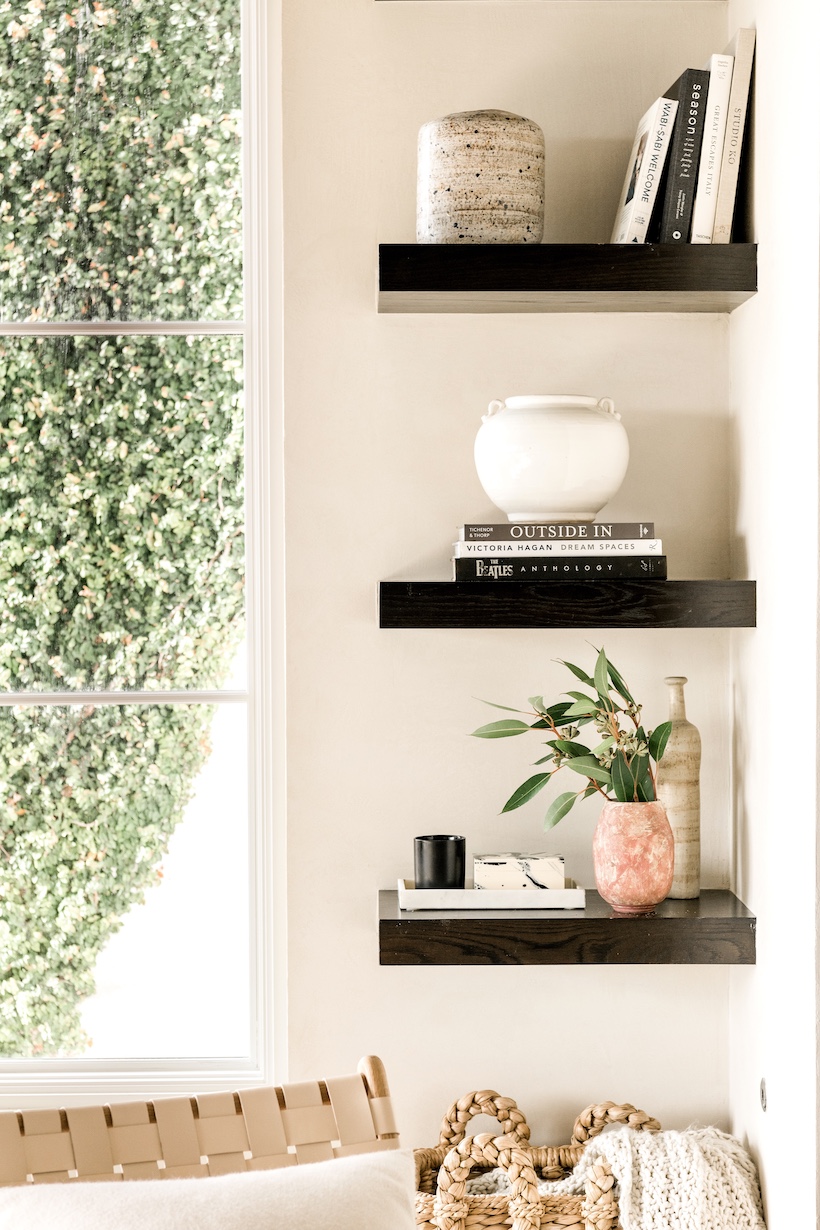
I shared this video of me arranging my shelves just a few weeks ago… and look how much they’ve already changed! Chanel came over the day before this shoot so we could play with the styling, and her fresh perspective really challenged me to get out of my comfort zone and try some new arrangements. Plus, the turntable I bought Adam for Christmas ended up doubling as the perfect decor addition to these shelves.
I’ve gotten lots of questions from you guys about the basket under the bottom shelf: it’s the Briarwood Large Rush Basket from Dear Keaton.
***
Let me know if there are any neutral living room ideas or tips that you’ve used in your space, and stay tuned for a shoppable post next week where I’ll share links to everything pictured here. Also next up… the kitchen reveal!
Architecture: 787 Design Studio, styling: Chanel Tarlo, design layouts by Claire Zinnecker.


