I know, I know: we’re releasing the room reveals of our #CSBungalow painfully slow, from the butler’s pantry to the craft room to the bathroom it’s been a one-by-one tour as we put the finishing touches on each space. And while I’m dying to share every last inch with you guys (soon!), today’s post checks off a big box since it’s one of my favorite spots in the entire studio – and probably the area that our team spent the most time deliberating over. When we first laid hands on our 100-year-old bungalow, there was not a kitchen in sight. One corner of the house had an old sink and a pot-bellied stove (not kidding), and we knew that we had some major work ahead of us in order to achieve the spacious, light-filled kitchen of our dreams. Keep scrolling for the before shots and the full reveal, along with the talented people and brands who helped us bring it to life.
architect: Low Design Office // builder: Monte Goertz // kitchen design: LAVISH

As soon as you walk through the front door, you catch a glimpse the waterfall edge on our kitchen island. The pattern of Caesarstone Calacatta Nuvo is the perfect neutral for our mostly white space, and the non-porous quartz surface means minimal maintenance.
pictured: perch stool from anthropologie

We designed the kitchen to be photo shoot-friendly. Rather than having the sink in the center of the island with a faucet obstructing the space, we put the stovetop there. Now we can cook while facing forward, and the downdraft ventilation system allowed us to nix an overhead hood for these pretty light fixtures.

From the dishwasher to the oven to the refrigerator, our KitchenAid® appliances are truly a dream.

Our team at LAVISH helped us achieve cabinetry that was just right. The white shaker style feels classic but still clean, and those floating shelves complement our light wood floors perfectly.
Does anyone else think choosing hardware is the hardest thing ever? We ended up going with classic mushroom knobs for cabinet doors, and cup pulls for drawers.

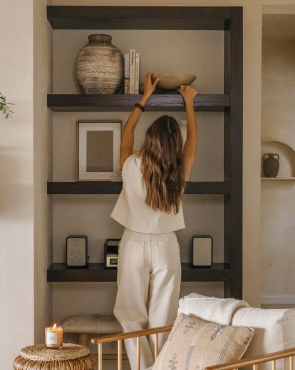
The items on our floating shelves are always changing as we pull pieces down to use in photoshoots and actually eat off of. A shallow lower shelf allows for head clearance, and two deeper ones up top for larger items.
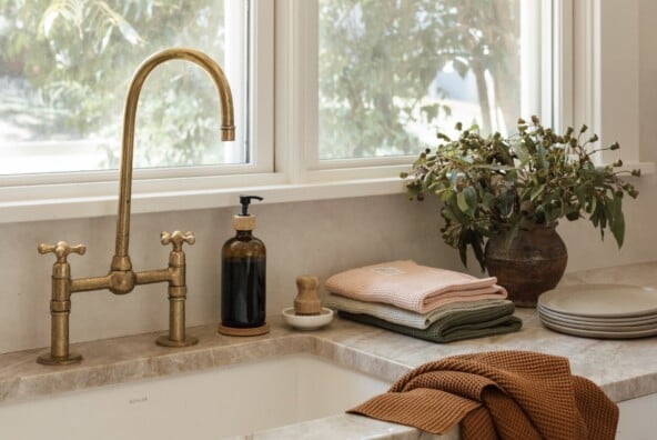
pictured: Whitehaven Apron Sink from Kohler, HiRuse Faucet from Kohler, Hand-Blown Carafe from Kettle & Brine, Copper Kettle from Kettle & Brine

LAVISH took care to ensure that not only does the kitchen look beautiful, but that it functions super well too. This silverware solution makes it easy to keep our many sets of flatware organized.

We’re so thrilled with our new kitchen space, and of course, we’d be remise to forget thanking our builder Monte Goertz and our architect Ryan from Low Design Office for helping us bring our vision to life.
Stay tuned for even more, coming soon!


Absolutely gorgeous. What lucky ladies to work in such a beautiful space!
http://www.shessobright.com
Gorgeous kitchen! Where is the beautiful knife block from? Thanks!
Great idea for kitchen my home! thanks so much!
What is the wall color?
Can you tell me the wall color and the barstools?
I love your kitchen! What colour are your cabinets? They go perfectly with the Caesarstone calacatta nuvo!