It’s a boy! When my husband and I found out the news, I couldn’t help but start dreaming about the cozy space we’d create for him at home. But it was a little tricky: the only extra spot in our new-ish house was the guest room… that we’d just finished decorating the day before I took a pregnancy test (funny how life works out like that!). But after some creative brainstorming, we decided to turn the home office into a guest room, leaving us the perfect blank slate to welcome baby boy.
Since our home’s design is a unique mix of rustic Texas meets coastal California, we knew we wanted to keep that style going in the nursery.
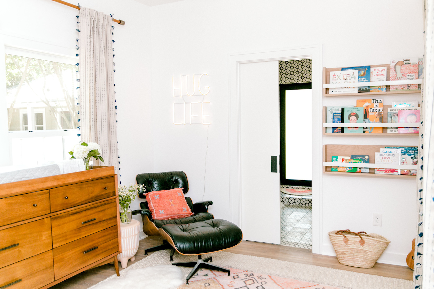
With some help from Minted’s new nursery collection and our friend and designer Claire, we quickly decided that a beach-inspired nursery with a mix of mid-century furniture would feel just right for our baby’s room.
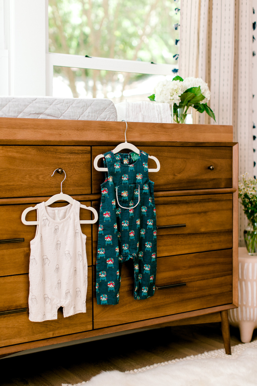
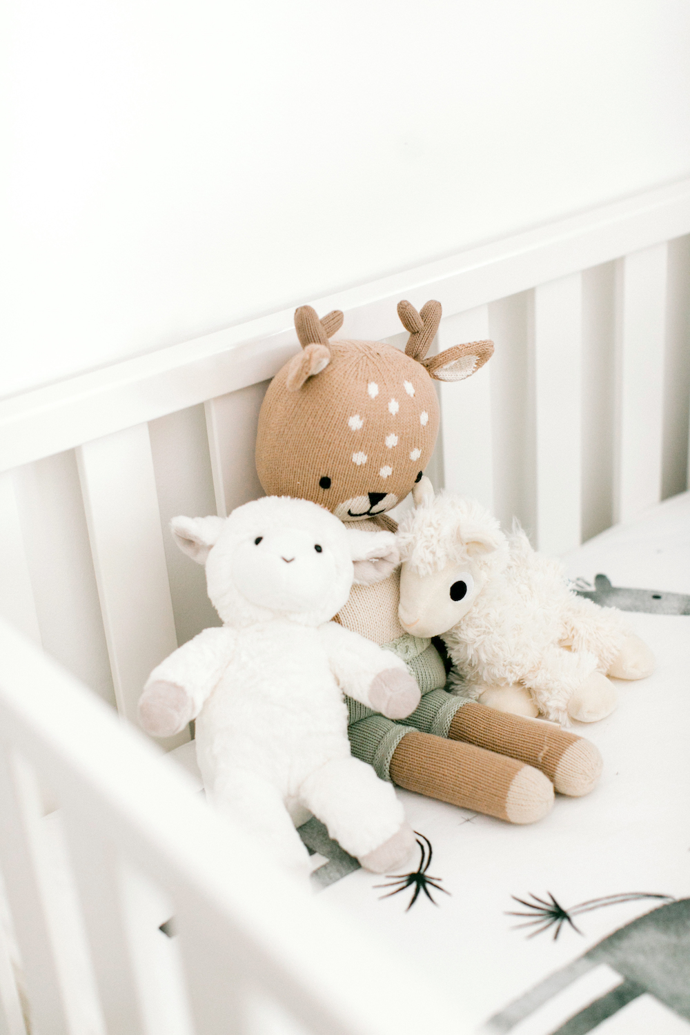
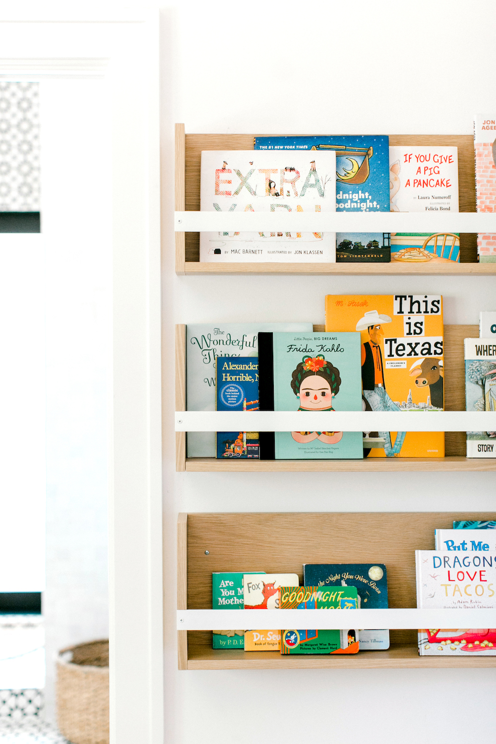
My husband, Peter, and I love the beach. We both grew up going to the beach as much as we could and actually got engaged by the ocean, lived at the coast for a couple years before we got married, and our favorite vacation spots on earth are all beaches… so this just made sense. If the beach is our happy place and where we have our best memories, why not incorporate that into this exciting new chapter of our lives?
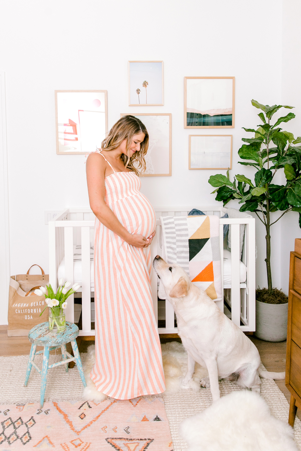
We wanted the nursery to be a totally neutral, calm, and relaxing space that would fit in with the rest of our house and grow with him for many years to come. We combined textures like soft fabrics, midcentury furniture, sheepskin rugs, and used ocean-inspired colors like off-white, blues, greens, coral, and gray to tie it all together. The wood finishes and sea-inspired colors and accessories bring in that coastal beach vibe we love so much, without going too “nautical.”
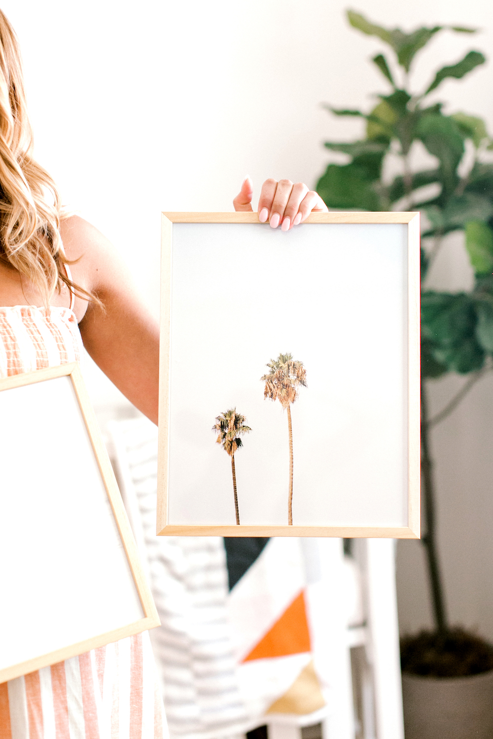
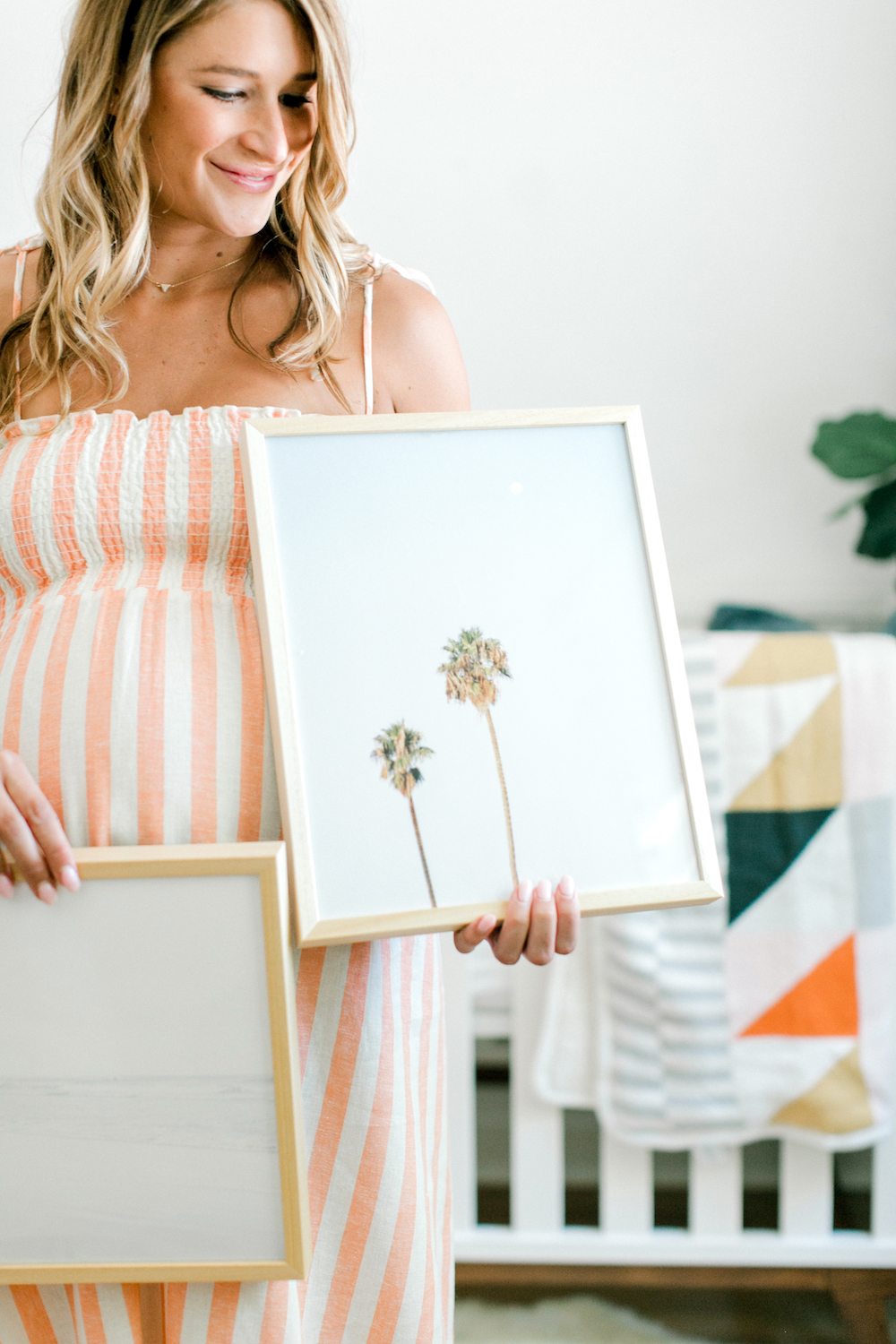
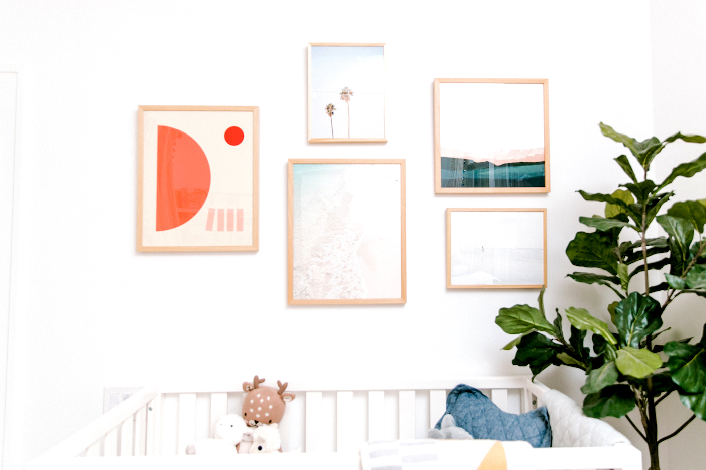
After we got the lounge chair, crib, changing table, curtains, and rugs, we still felt something was missing — and I realized that a gallery wall above the crib was exactly what we needed to create that welcoming, homey feel we wanted. So when our friends at Minted turned us on to their new nursery collection, I knew they would have exactly what we were looking for: perfectly curated prints that are high-quality, fresh, and timeless. And as always, when we shop Minted we’re supporting the work of independent artists across the country.
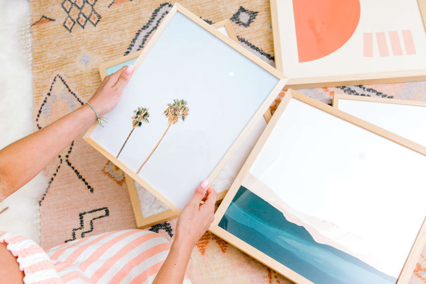
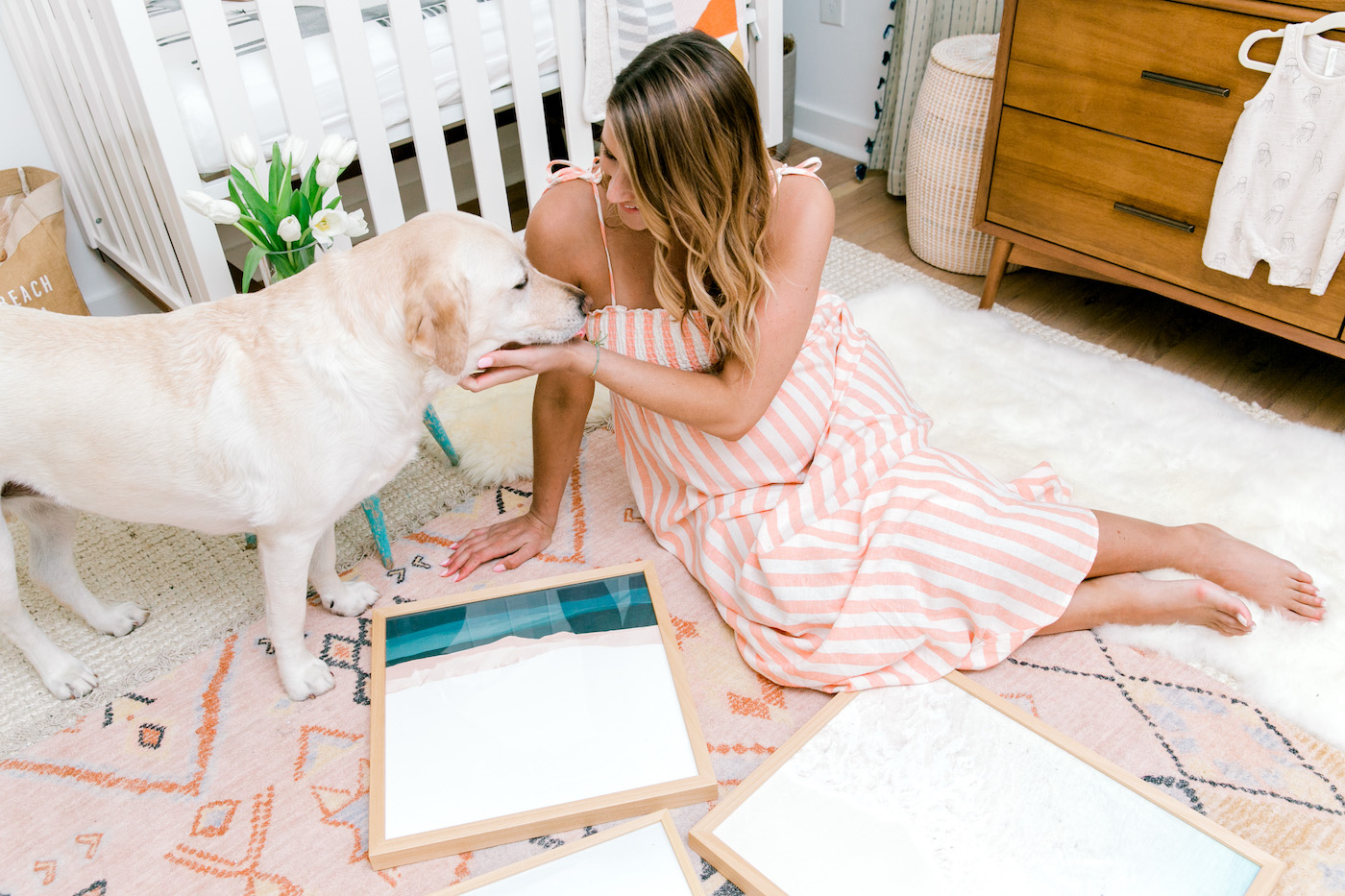
The wide selection in their new children’s collection was tough to narrow down, but we ultimately chose prints that we felt reflected the style of our home — ocean waves meets desert sun. I love that the Minted prints we chose don’t scream “baby room”, and that our son will love them for years to come. When I mentioned to Camille that I didn’t want to go the traditional nursery route in terms of art, she told me that Phoebe still has her Minted collection on her walls (and loves them even more!) 6 years later. Win-win!
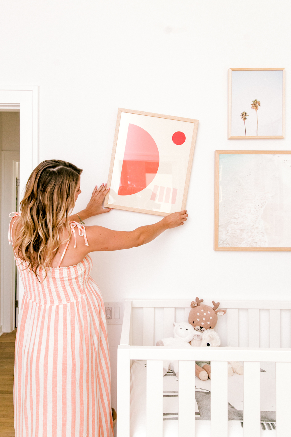
Minted’s prints made it easy to create the gallery wall we had always envisioned for our nursery–they arrived perfectly framed in a beautiful natural wood frame, and I loved reading about each artist and the inspiration behind the designs.
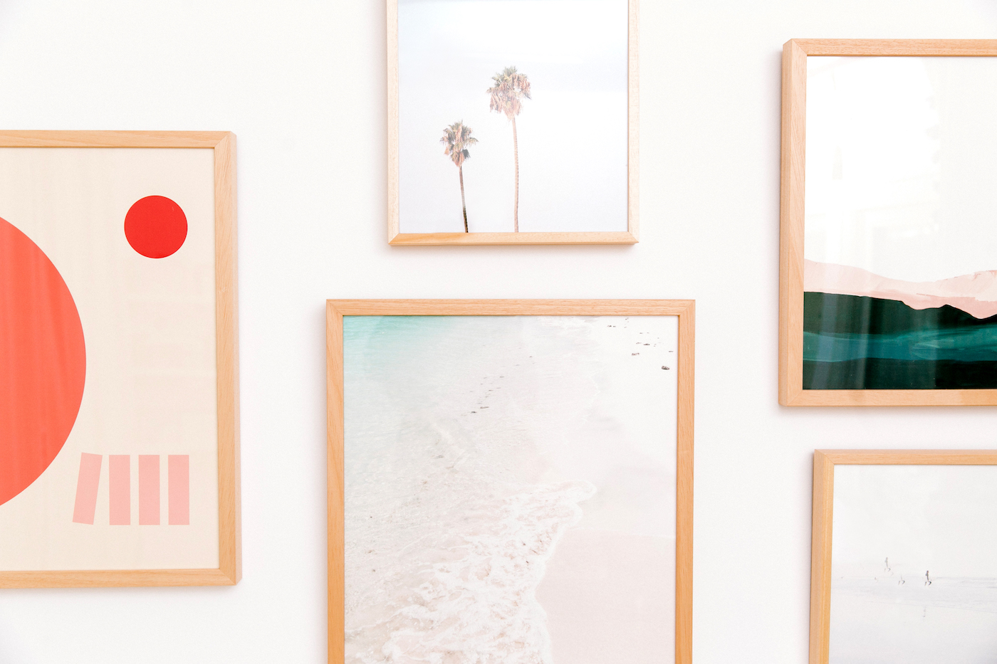
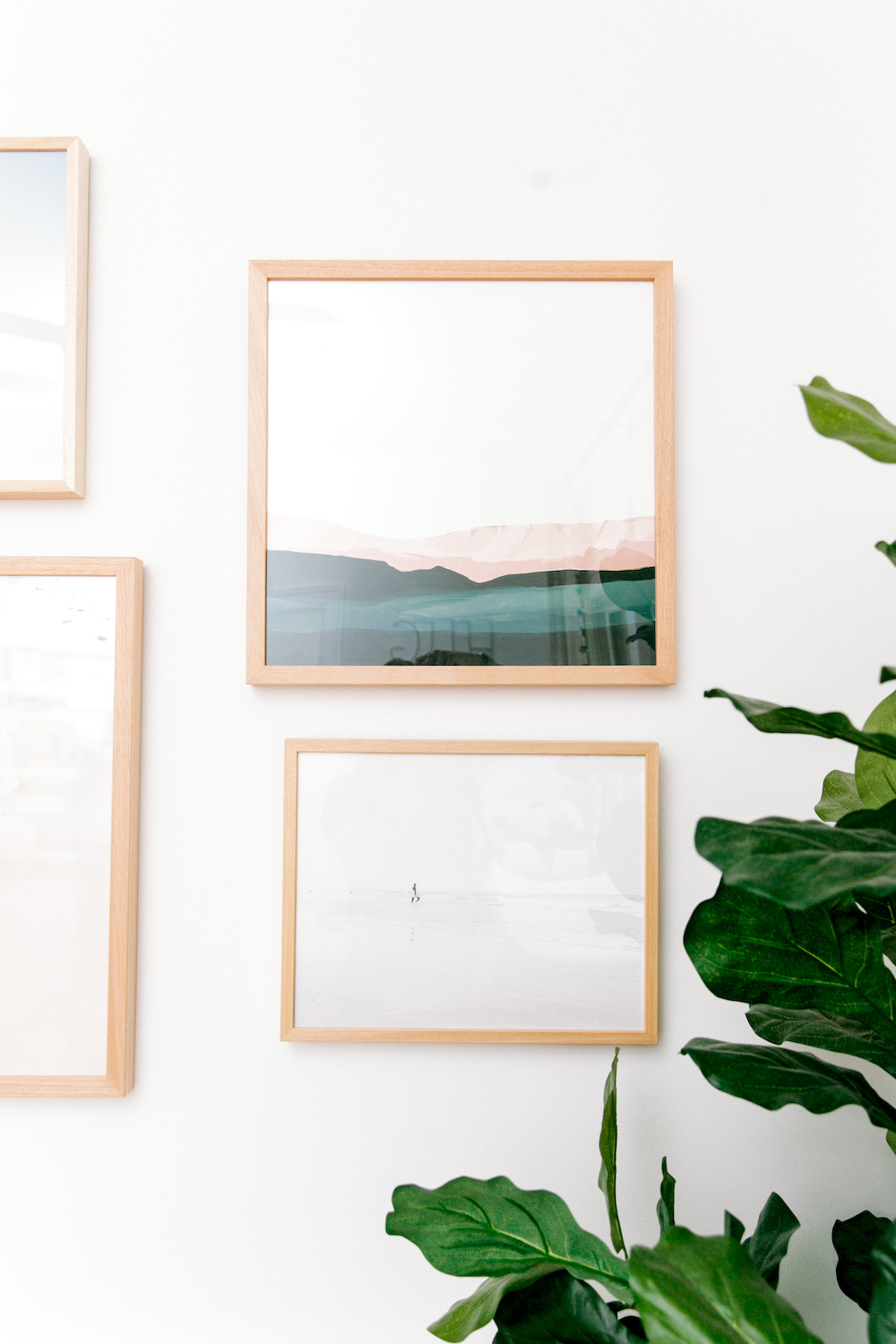
After some creative rearranging of the frames (they all looked so great next to each other I couldn’t decide what layout was best!), we were finally ready to mount the gallery wall. With some help from big sister (June, our yellow lab), our gallery wall was complete and baby boy finally had the dream ocean-inspired nursery we always wanted.
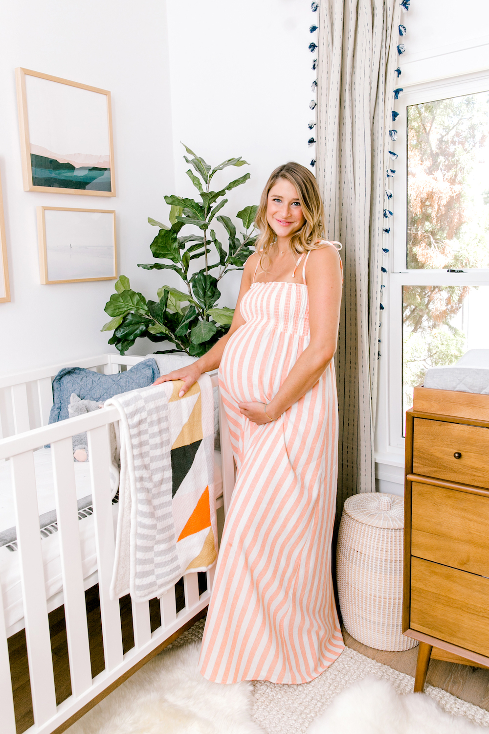
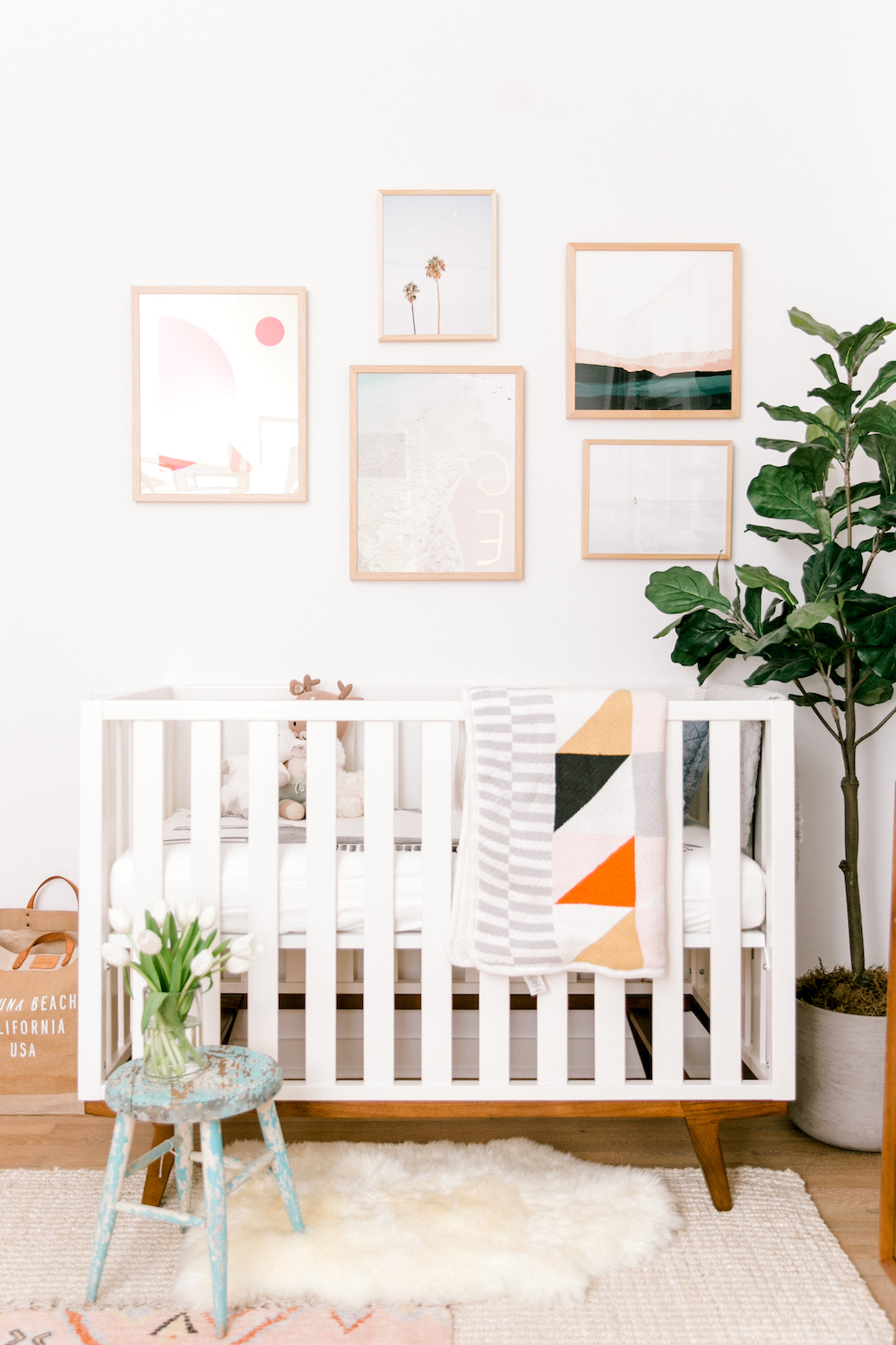
After going through this process, I’ve learned that when it comes to decor, the only rule to follow is that there aren’t really rules. If you fill your space with things that make you happy, the result will be beautiful and will make you happy. When designing a nursery, the room doesn’t have to scream “baby.” It should be a reflection of your taste and style, just as the rest of your home is a reflection of your family.
Remember, it’s your home. It’s your family. If it makes you smile, then it’s perfect.


