There are many reasons I can’t get enough of romantic comedies. The optimistic, albeit often naive, depiction of love, the hilariously-convoluted (but satisfyingly predictable) plots and narratives, and, if Nancy Meyers is directing, the stunning interiors that beautifully balance contemporary and comfortable design. This genre provides a sense of hope that overnight transformation somehow feels within the realm of possibility.
What else makes such a sudden and swift shift of things happen so quickly with ease? Refreshing your space with a few new coats of paint, of course. There’s never a better time to do that than when the season changes and you’re ready to welcome a whole lot of cozy into your home. To help you out, I spoke with a few interior design experts to get the low-down on the winter paint color trends you need to know in 2021.
But I’ll continue to wax poetic for a moment about the transformative magic found in paint: Just as a little spring cleaning can help you reconnect with your home, intentionally committing to a new paint color can breathe a little life into spaces that may have begun to feel stale or static. Transitioning from a neutral palette to something a bit more maximalist can bring forth a new perspective and instill entirely different energy in the room. And while we’re all about timeless aesthetics (some things just work!) it’s always exciting, fascinating, and fun to dive into what’s trending within the world of interior paint colors.
So, if you’re in need of a fresh start not only for your home or apartment but for yourself as well, consider one of the colors below when you’re mapping out your makeover. I tapped Brittany Farinas, Kate Lester, Sarah Stacey, Nicole Fisher, Claire Zinnecker, Shannon Eddings, and Stefani Stein for their expert insight and thoughts on what colors we’ll be seeing more of this winter. Get ready to be inspired, energized, and perhaps even a bit surprised by a new-to-you color you might end up using all throughout your space.

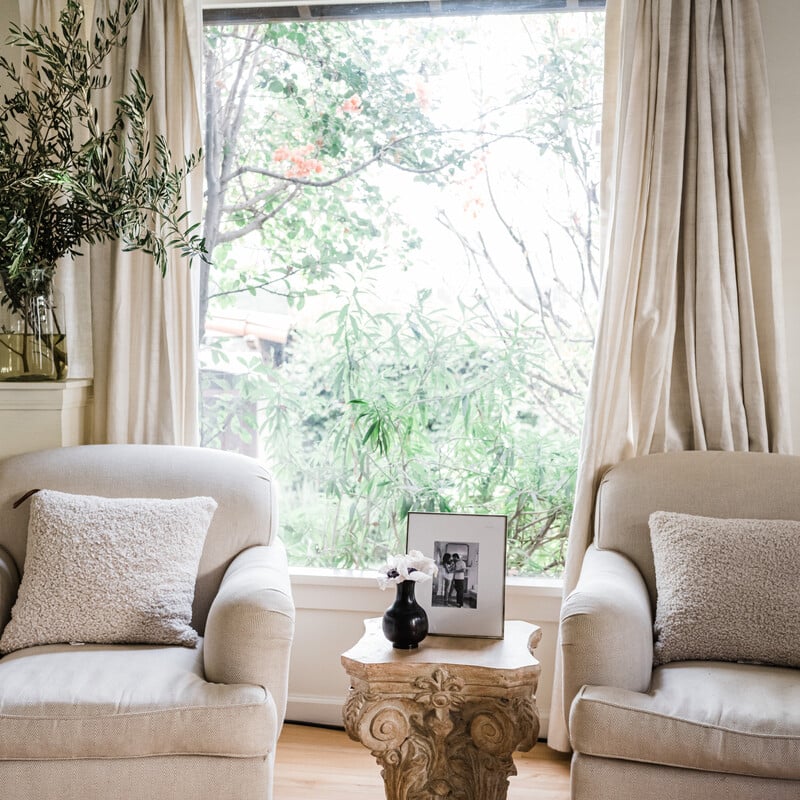
School House White by Farrow & Ball
This light and soft off-white is aptly named, evocative of the muted tones once used in old schoolhouses. Stein can’t get enough of this warm, slightly creamy white: “It imparts a classic-yet-inviting mood and isn’t just for traditional spaces. It’ll work surprisingly well with minimalist and contemporary aesthetics too.”

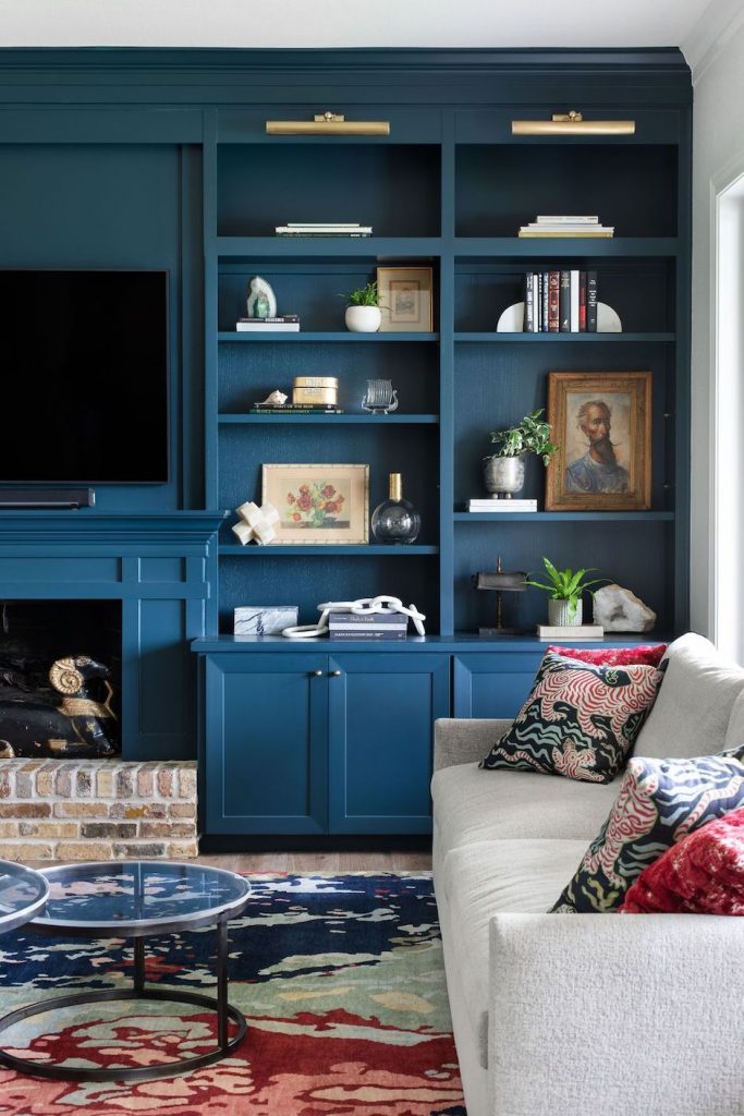

Strong and saturated, this color’s name is inspired by deep and dark Dutch-colored woodwork. With rich green undertones, this dynamic blue brings dramatic appeal to single walls or smaller rooms. Stacey notes that it’s a great option used as a backdrop to freshen up a bookcase or can be used for an accent wall as well. “Jewel tones are still going strong, especially with the maximalism trend,” notes the designer.

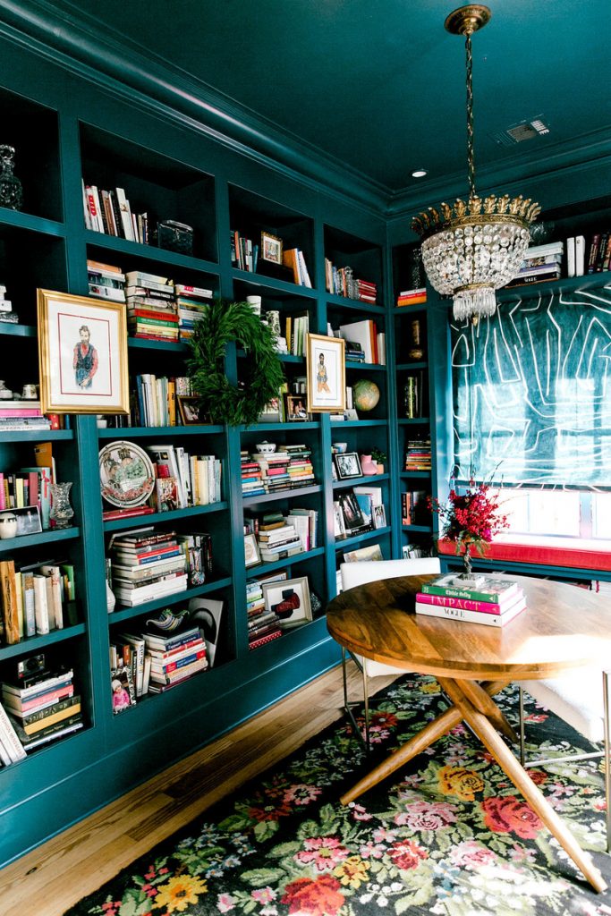
Hunter Green by Benjamin Moore
Beautiful, bold, and capable of illuminating any room with its striking and saturated hue, Hunter Green is the perfect choice for adding eye-catching and extraordinary color to your home. Farinas agrees: “I love this color because it’s rich and sophisticated, yet can be played off with funky pieces in a room. It’s a very calming color that can also add drama to any interior. My favorite way to use green is on an accent wall to create a strong focal point in a space.”

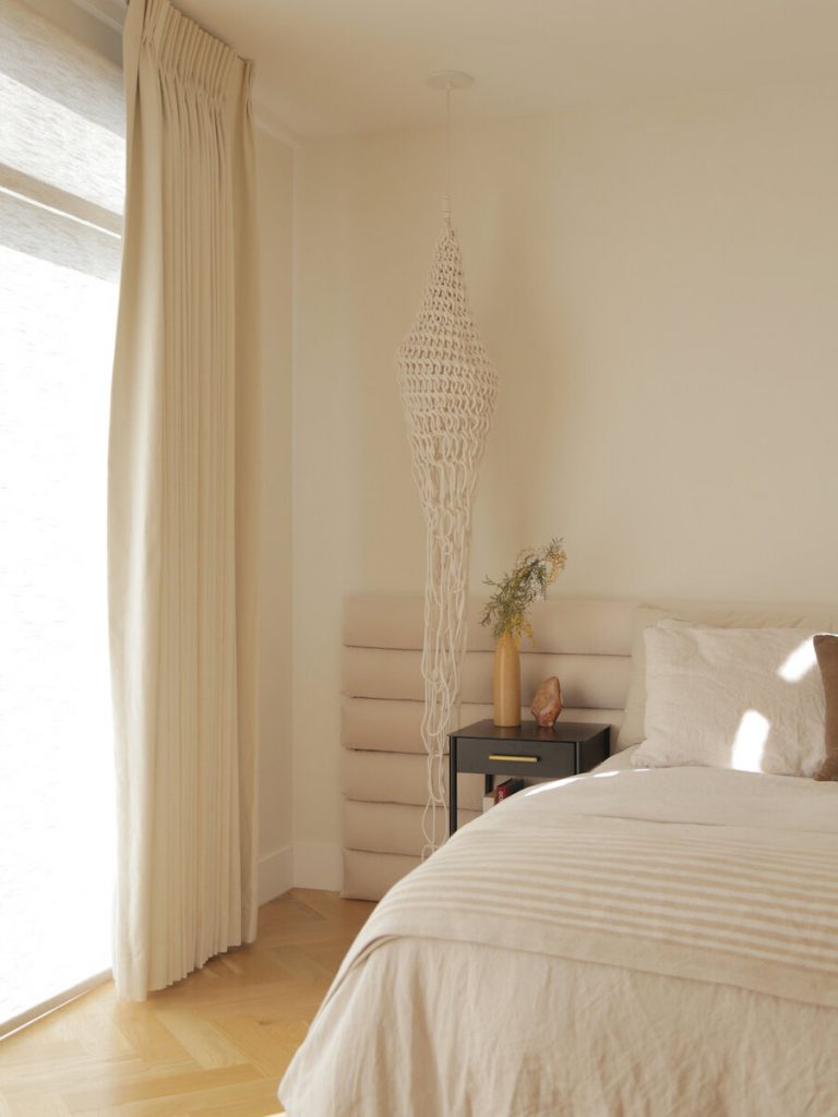
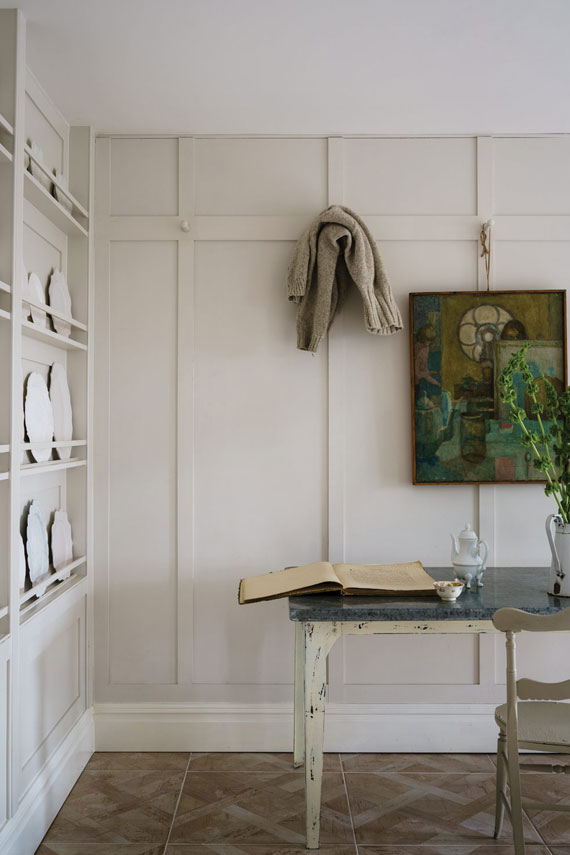
Blondie by Portola Paints & Glazes
This is another one of Stein’s favorite creamy whites for winter. She loves its versatility and ability to seamlessly transition between a variety of aesthetics and tastes. Be sure to take her tip to heart when you’re working with warmer whites: “The secret is to avoid those that get too close to vanilla.” Remember: Creamy, not cloying.


Black Magic by Sherwin Williams
Soft and best used in a space with plenty of natural light, this color takes a top spot on Stacey’s list of favorites for winter. “Most blacks have an undertone or a hint of gray, but Black Magic is a deep, almost true black. This can be used in powder baths, on passage doors, or accent walls.”
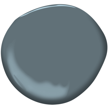
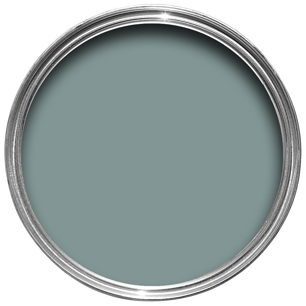
This color strikes an impressive balance between being timeless, yet beautifully on-trend. Lester loves its undeniable elegance and considers it the perfect classic dusty blue. “I feel like this is the perfect shade for any season, but it can also play well into the winter months. It’s a great option that will get you the perfect sheen every time around. This is timeless and can be used in a variety of ways including cabinets, or a full room for a moodier look.”

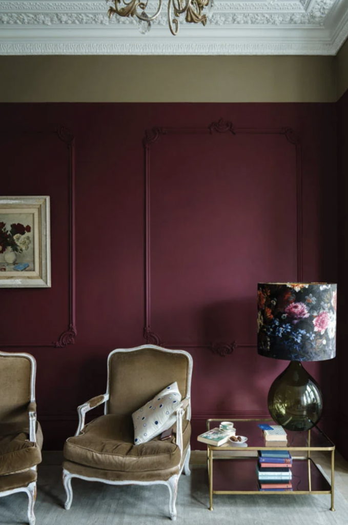

Preference Red by Farrow & Ball
Beautifully rich, this striking red adds a dark and dramatic depth to your rooms. Fisher, founder of BNR Interiors notes that, with the upward trend of people spending more time at home, they’re more likely to experiment with color. “I see a strong pivot to bold and moody colors. Preference Red reads differently in all lights, bringing out shades of red, brown, and plum. It’s perfect for a sitting room or any space you curl up in and relax.” By that measure, I’ll be tempted to swipe a few coats of this color on every wall.

Oval Room Blue by Farrow & Ball
Perfect for a hallway or a cozy living space, this blue feels elegantly timeworn thanks to its black undertones. Fisher considers this the paint to choose if you’re going for a major impact. “This is the perfect green/blue that evokes joy. It’s a beautiful color done on woodwork where it’s unexpected. For winter, it looks so dreamy with snow outside and all this rich, bright color inside.” An interior winter wonderland awaits.

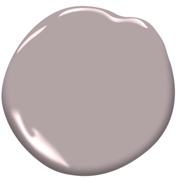
Mauve Desert by Benjamin Moore
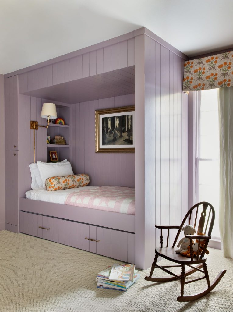
This color is an easy and impactful way to illuminate your space. Bold, but slightly dusty with warm undertones, Mauve Desert is the earthy hue that can support nearly any look you’re trying to achieve. Eddings loves it for the endless options it presents: “I’m predicting seeing more of this shade this winter as people are moving toward more color and looking to stay moody in their color schemes. When it’s dark, the mauve can get very calming. When the sun is out, the color reads bright and inviting.” She recommends trying it in intimate, small-scale spaces such as built-in bunks, library bookcases, or a powder bath.

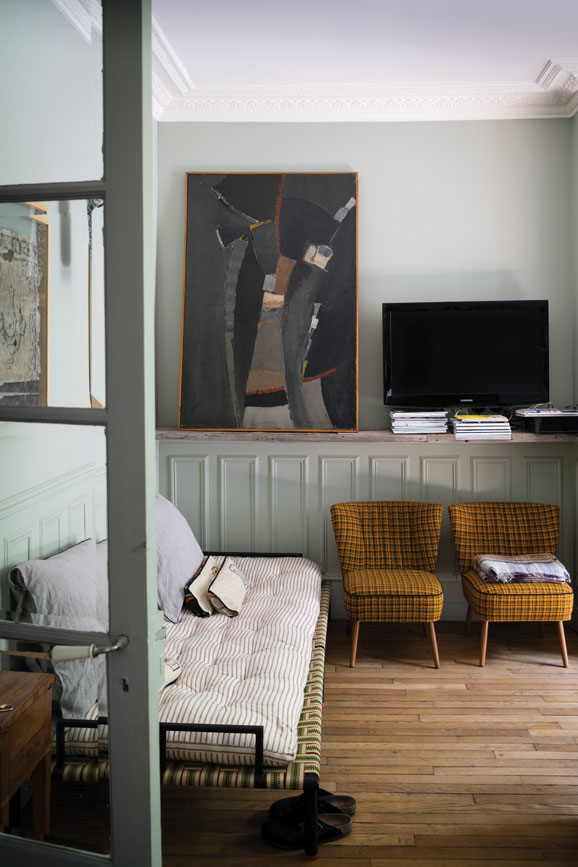
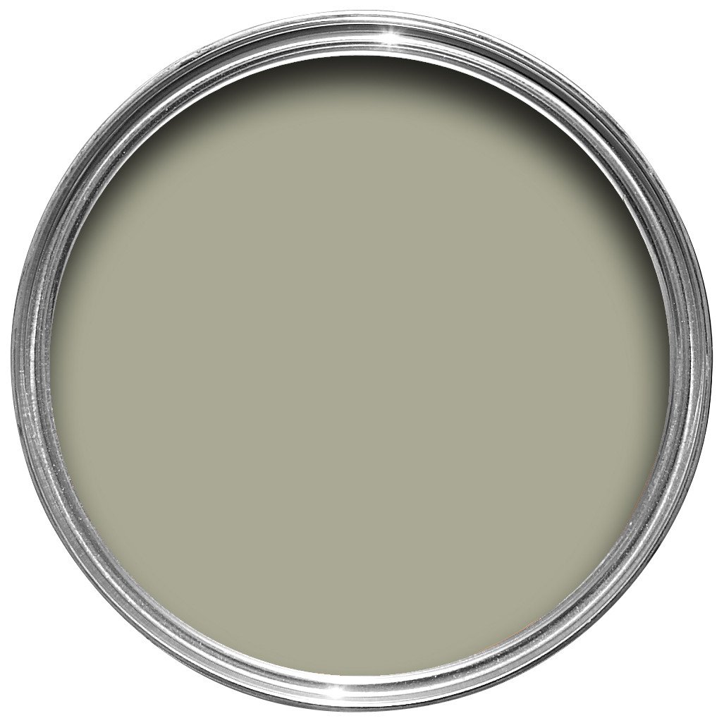
A green-gray to soothe the soul. Depending on the time of day and the way the light hits your walls, this color can easily transition between the two hues. Able to imbue any room with a relaxing feel, French Gray is one of Zinnecker’s favorites because of the sense of calm it can provide. “We have been trapped in our homes for so long that people are itching to have a change of scenery within their personal spaces,” says the designer. “The green renaissance will be in full swing this winter.”
While Zinnecker considers her love of green a departure from the more neutral palette she often gravitates toward, she can’t help but use even just a bit of this green in her projects. “Introducing soft greens keeps the design neutral while introducing a subtle change. It’s calming as it brings a sense of nature into any home and it goes with almost anything!”
Did any of these winter paint color trends surprise you? Which one would you try? Sound out below.