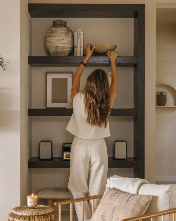
I’ve got to admit, these last few weeks of our #CasaCamille reno feel like they’ve slogged along. When we got back from Malibu in early October, the house was a construction zone, so I went a little crazy trying to pull it all together, fast. Within a couple weeks, things were looking pretty good… but then, it was time for the infamous punch list. All the tiny little loose ends that needed to be tied, from touch-ups on the plaster to fixing our haywire plumbing to running electrical to light our new open shelves. They’re the small details that can feel like afterthoughts, but actually end up taking a space to the next level.
One of those final details that can make or break a room? Window treatments – and they’re often the decor detail that people (myself included) feel most intimidated by… because they’re kind of easy to mess up.
When Adam and I built our house over a decade ago, I was totally clueless about how to approach shades and curtains throughout the house, especially when it came to our huge steel windows and doors in the main living space. I ended up asking an interior designer friend for her thoughts, then ordered the closest off-the-shelf curtains I could find. They’ve been up ever since, and I’ve frequently thought – they’re okay, but they could be better.
I’m so happy to be teaming up with Graber to help me nail the window treatments throughout our house this time around. From choosing materials that go with my aesthetic, to helping me think through the functionality of what we need in each space (living vs. bedroom, etc.) the team has been incredibly helpful in helping me build a vision for the windows throughout our house. Since I’ve heard from you guys that the thought of DIY’ing your window treatments stresses many of you out as much as it does me, I wanted to share the process, from start to finish, of working with a custom blinds and drapes company like Graber. From an online “visualizer” that lets you try out window treatments in your own space virtually, to an IRL expert that can help you walk through the process start to finish, it’s been a pretty dreamy process so far. And now I just can’t wait to see the products we’ve chosen up in the space.
But for now, my inspiration for a few key areas of the house. Scroll on to see what I’m planning for each space, and stay tuned for a little Window Treatment 101 and the reveal of our finished spaces coming soon. That is, if this punch list ever gets done.

The Living Room
Vibe: Warm minimalism, simple, open, airy.
Practical Considerations: The centerpiece to this space is the big wall of steel doors that open up to our back patio. I wanted to soften the hard lines of the doors without losing any of the openness or natural light.
Window Treatment Solution: 4 panels of white sheer drapes that can be left open for softness around the edges, or pulled closed for a cozier feel that still lets light in. Why break it up into 4 panels instead of 2 larger ones? When we open up the steel doors, I love the way the white sheers blow in the breeze. Separation between the panels allows for more movement.
fabric swatch pictured above: Graber Artisan Drapery: Tuzee Collection, Color: White
*inspiration image: amy bartlam; design: jette creative
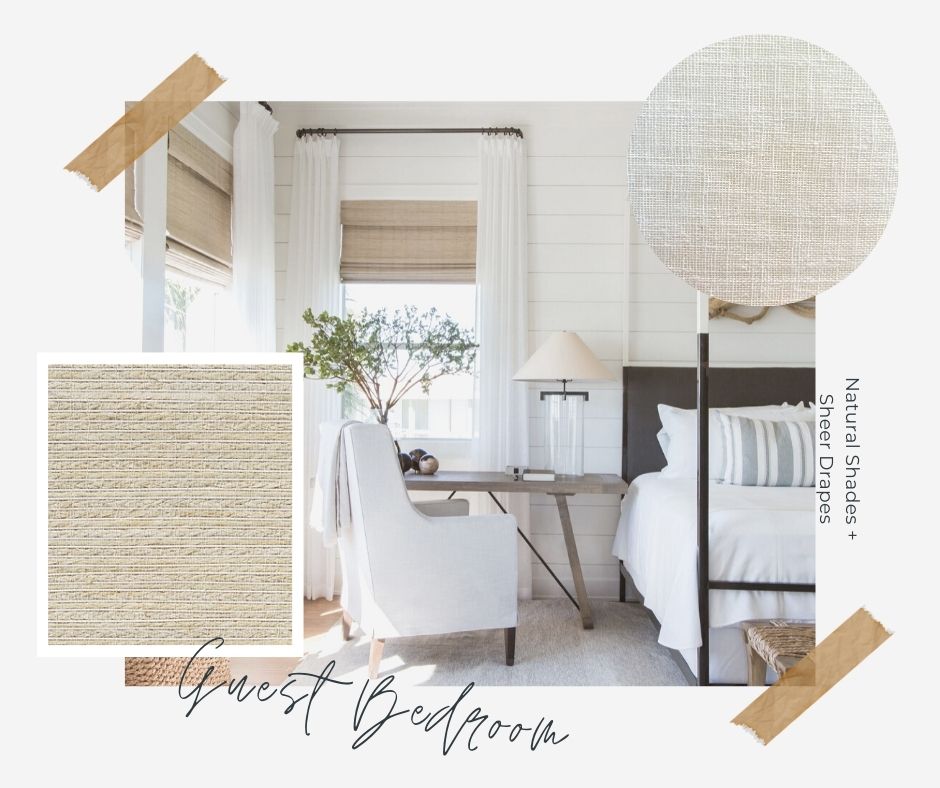
Guest Bedroom
Vibe: Beachy with a touch of boho.
Practical Considerations: With its woven materials and beach-inspired artwork, this room of the house gives the most literal nod to the ocean vibes that I love so much. So I wanted our window treatments to reflect that, with light and airy natural materials. Only thing is that I also want our guests to sleep like babies, which means the ability to totally block the light when its bedtime.
Window Treatment Solution: A combination of Graber’s natural shades (they’re sustainably sourced and handwoven) and sheer white curtains to frame each window. During the day, we’ll get that open air blowing-in-the-breeze feel… and at night, the natural shades will keep it cozy, while still feeling beachy and cool with it’s neutral, textural finish. Each of the natural shades are handmade, so they have that earthy, one-of-a-kind look I love. Since natural shades don’t totally block the light, I’ll order these with liners, which Graber allows you to customize for exactly the opacity you’re looking for depending on the space.
fabric swatches pictured above: Tradewinds Natural Shades, Moniz Collection, Color: Finland // Graber Artisan Drapery: Tuzee Collection, Color: White
*inspiration image: Julie Soefer Photography for Marie Flanigan Interiors
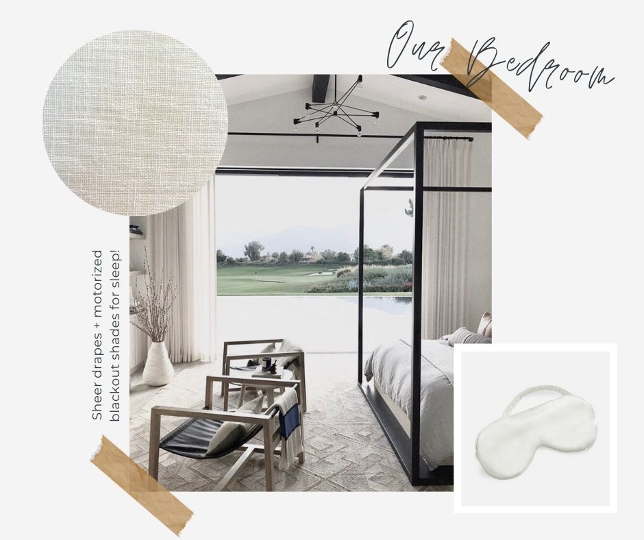
Our Bedroom
Vibe: Neutral and cozy with all the hygge feels.
Practical Considerations: We have one huge cantilevered bay window that is a centerpiece to the room, but makes for a tricky 3-sided shade situation. And since I’m one of those people that needs total dark in order to get a good night’s sleep, I’m determined to find a solution that will allow for that in an aesthetically clean and simple way. We used to have heavy blackout curtains that could be pulled across the entire window panel at night, but it did sort of close off the room and make that window feel cramped. This is definitely the trickiest space, and I’m relying on our Graber team big time to help me come up with a game plan.
Window Treatment Solution: 3 made-to-order roller shades that will fit perfectly within each panel of the bay window. Each fabric is offered in different opacities—from sheer to blackout—so we were able to choose a truly room darkening option for these. We’ll have a streamlined white flange (the little box that holds the roller) that’ll basically disappear during the day, and then at night, we’ll get the full blackout effect without closing off our cozy little nook to the rest of the room. The cherry on top is that these shades will incorporate Graber’s motorized functionality. We’ll have it connected to an app on our phone, and programmed so that when it’s time for lights off, the shades slowly lower automatically. You’re getting sleeeeeeepy…
fabric swatch pictured above: Graber Artisan Drapery: Tuzee Collection, Color: White
inspiration image found here, original source unknown.
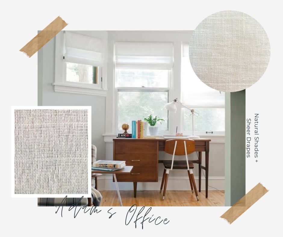
Adam’s Office
Vibe: Clean, streamlined, and productive.
Practical Considerations: There are three large windows in Adam’s office. He loves having lots of natural light and having a clear view to the front yard to see when people drive up. But when he’s deep in computer work or on a zoom call, he requires some light filtering to minimize glare on his screen.
Window Treatment Solution: Solar shades that let a beautiful filtered light come into the space yet minimize glare while Adam’s working – and can provide privacy while still allowing a view outdoors. They roll up to be super subtle and streamlined when not in use, and sheer white drapes soften the front window and provide coziness (and protect the furniture and art from UV rays.)
fabric swatches pictured above: Graber Artisan Drapery: Tuzee Collection, Color: White
***
As you can see above, I had a lot of thoughts when it came to the look, feel, and functionality of our window treatments. But when it came to taking precise measurements on shades, drapery, and hardware, thankfully the Graber team took the reigns. It is such a weight off my mind to not have to stress about getting a measurement just a little wrong, and making an (expensive) mistake that ultimately won’t work at final install.
Next up, we’ll be sharing our tips for choosing window treatments for challenging spaces, and how to pair shades and drapes together for a design-driven look.
inspiration image by melissa oholendt for emily henderson


