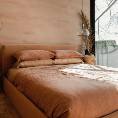
It’s no surprise that countless artists look to color first as a means of ultimate expression and inspiration. There is an unparalleled power that comes from looking at a verdant row of trees, a glossy red apple, or the calm-inducing blue fo the ocean—color is the ultimate medium for transformation. Designer Rebecca Atwood knows. In her book Living with Pattern: Color, Texture, and Print at Home, the designer, and textile artist outlined the transformation force found in the hues around us. “Color is one of the most powerful visual tools that we have for influencing the mood of a space. It has an unconscious emotional pull,” writes Atwood. This transformative pull is also why we’re so intrigued to learn what the major designers predict will be the biggest paint color trends for 2022.
The most fascinating thing about color is how it pulls at our emotions in various ways and how we, in turn, crave different shades at different times in our lives. No group of artists knows this better than interior designers, who work color into our living spaces in ways that speak to both our individual desires and the collective external world. Every year a wave of popular interior colors come into play that speaks to the zeitgeist. And for 2022, the forecasted color players speak to what we crave: Ease. Comfort. Warmth. Respite.
“The last few years have put us through the wringer,” says interior designer Shelly Rosenberg, owner and principal designer of Shelly Rosenberg Studio and Acorn & Oak. “With everything around us in turmoil, we will instinctively begin to turn inward seeking comfort. Biophilia is our intrinsic urge to connect with nature, and like little burrowing animals creating an earthy cocoon for themselves, I see us reimagining a physical hideaway in den-like hues.”
The 7 Most Popular Interior Design Colors of 2022—Forecasted by the Aesthetes
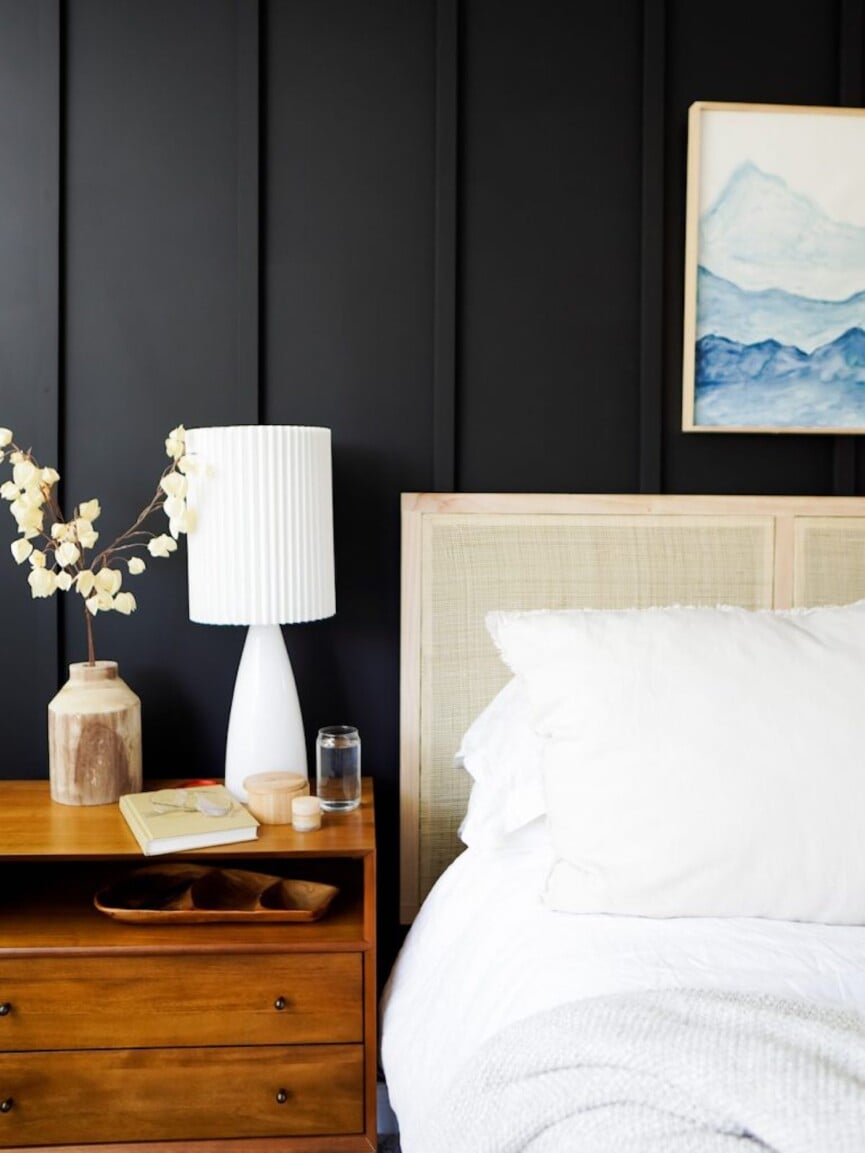
image above: Anna Mae Groves’ bedroom, from our interview
#1. Brown-Toned Grays and Muddled Jewel Tones
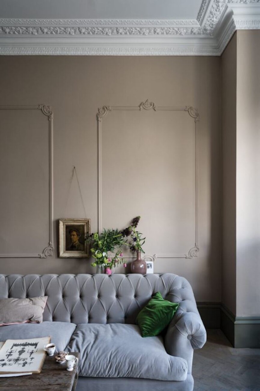
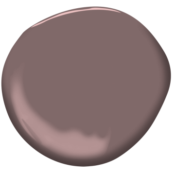
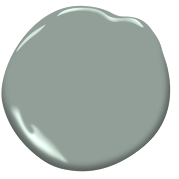
Farrow & Ball Jitney. Photo courtesy of Farrow & Ball.
There is a natural pull to colors that innately elicit a grounded steadiness right now. Rosenberg predicts that this respite will be sought out in cozy brown grays and muddled jewels tones. The brown-toned grays allow a room “to breathe softly, calming our nervous systems like a nap in soft sunlight,” she explains. While the jewel tones “quietly inspire, yet drape and add weight like a thick blanket.”
Paint Picks:
Suitable Rooms:
Rosenberg says it may be easy to assume these colors are best suited to family rooms or bedrooms, as they’re designed for our resting state. But she sees these in more unexpected spaces, such as entry halls, breakfast rooms, and kitchens for the auspiciousness they offer. This reassuring palette will confidently ease into these rooms “to greet us with fortitude and faith for our future,” she notes.
#2. Creamy Whites
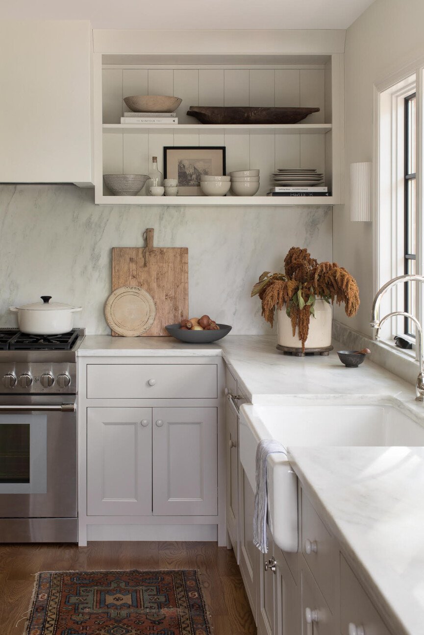
Benjamin Moore Dove White. Photo by Megan Lorenz courtesy of Allison Dozier Interiors.
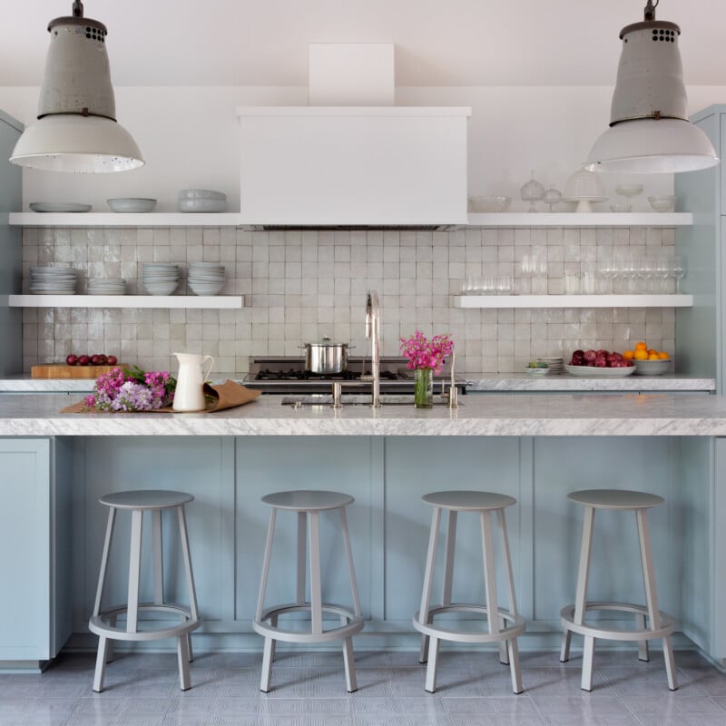
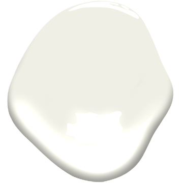
This hue isn’t exactly a full-on true white, nor is it beige, describes Liz Lipkin, owner and principal designer of Liz Lipkin Interiors. “Think of them as historic or vintage whites,” she remarks. “These colors both have a comforting and calming effect that bright whites don’t.” Allison Dozier, owner and principal designer of Allison Dozier Interiors is also looking to warm whites in 2022. “A warm white is timeless and flexible and plays nicely with any kind of décor,” says Dozier, who used Benjamin Moore’s White Dove in this open kitchen.
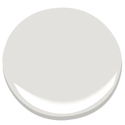
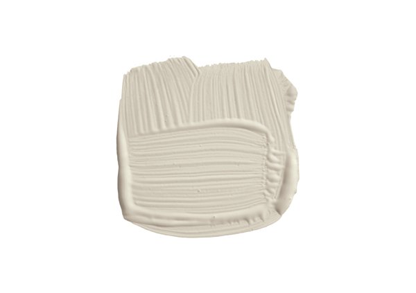
In a similar vein, Rosenberg foresees chalky whites coming into the fold, as they, too, offer a calming effect and complement the other grounding colors of the moment.
Paint Picks:
Suitable Rooms:
Draw outside the lines when it comes to these whites. While these shades work for a complete living room or bedroom, they also inspire just as well in a study or as a unique accent wall shade.
#3. Terracotta
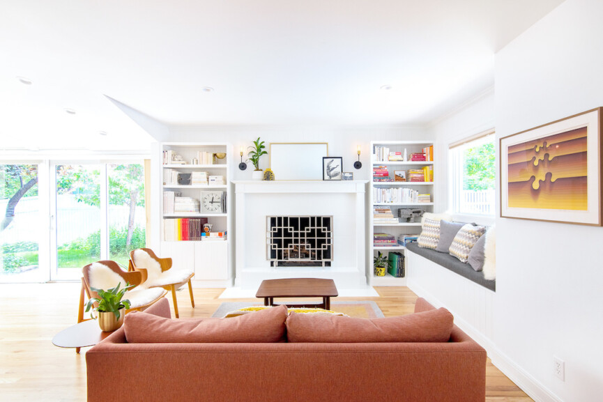
Photo by Heather Knierim of HBK photography, courtesy of Jennifer Rhode Design.
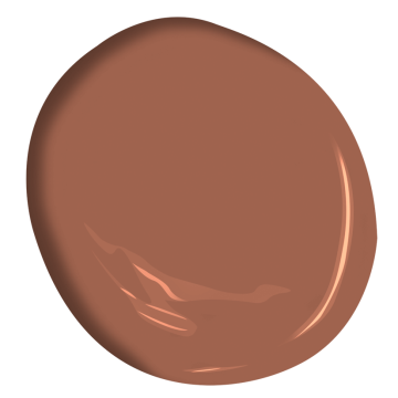
Think of the beautiful rich clay dirt covering the Arizona desert or a patinaed Italian vessel holding a leafy plant. This terracotta hue is alluring and calming, and something of “a big color right now,” according to Jennifer Rhode, owner and principal designer of Jennifer Rhode Design. “There is something about the warmth and earthiness of that color that I think is grounding right now with all the craziness happening in the world,” Rhode adds.
Paint Pick:
Suitable Rooms:
This hue is gracing rooms that get a lot of traffic, from kitchens to living rooms to libraries and dens. Rhode’s proclivity to use terra cotta mainly includes weaving it with accessories, like a planter or stools, or larger pieces including a terra cotta couch (like she did in this this living room). If washing the walls in all terra cotta is too bold a move, she suggests taking this route, which goes well with white walls.
#4. Soft Gray Natural Greens
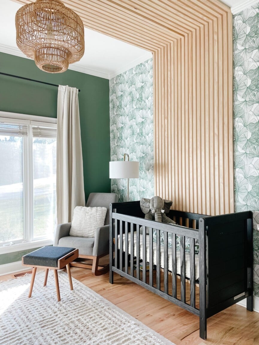
Sherwin Williams Basil. Photo courtesy of Little Black Dresser Interiors.
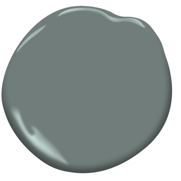
No other color conjures images of nature and optimism quite like green does, which is why so many designers are running with this hue for 2022. “It always been a neutral color in my mind, but it pairs well with so many other colors,” says Marissa Matiyasic, principal designer of Reflections Interior Design. “There are so many shades of green that I think we’ll continue to see, including soft greenish-gray tones all the way to a rich deep emerald.”
Emily Contrucci and Elizabeth Van Maanen, co-owners and co-principal designers of Little Black Dresser Interiors, say they’re also leaning into the natural greens, but more on the “dusty” side. If the word “dusty” causes any confusion (i.e. does it mean dirty?), have no fear. Contrucci and Van Maanen say this adjective simply means this version of the color is more subtle and muted. “Dusty colors bring in another element, keeping it cozy, subdued, moody but also being light and airy,” Contrucci declares.
Paint Picks:
Suitable Rooms:
The inherent complementary nature of this soft natural green pairs well with “literally any room,” says Matiyasic, who used Benjamin Moore Porch Swing in this regal airy kitchen. Contrucci and Van Maanen recommend muted dusty greens for bathrooms, nurseries, and living rooms. They say the key is to think accent and addition, as dusty green makes for an unexpected contrast as an accent wall, as well as an incredible layer when painted onto cabinets and shelving.
#5: Violet
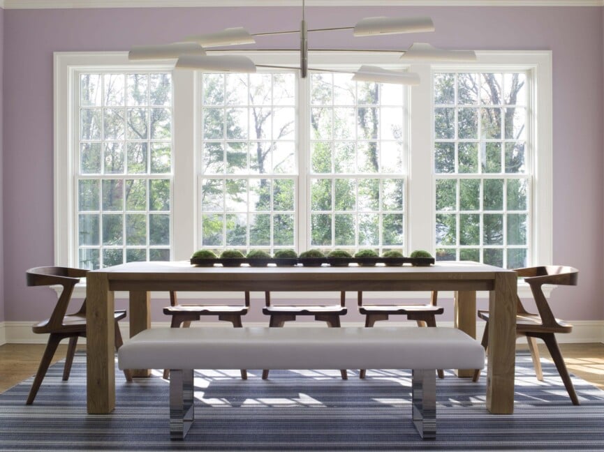
Benjamin Moore Violet Petal. Photo courtesy of Susan Bednar Long of SB Long Interiors.
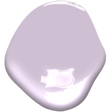
Let’s face it: Life is always filled with hardship, but recent times have proven particularly challenging. Considering this, Susan Bednar Long, owner and principal designer of SB Long Interiors, says 2022 will call for interior colors that infuse our lives with vibrance, joy, and positivity. The top of her forecast is violet. “Shades of purple have regal roots and especially softer violet and lilac tones are calming and reminiscent of happy things like candy confections, flowers, and springtime,” she predicts.
Paint Picks:
Suitable Rooms:
Since this color is meant to uplift and evokes a smile—there are no rules. Paint the walls of a bedroom, bathroom, even an entryway hallway in this happy hue. Bednar Long chose it for a client’s breakfast area. As she says, “There are no grumpy mornings in this space!”
#6 Seaglass
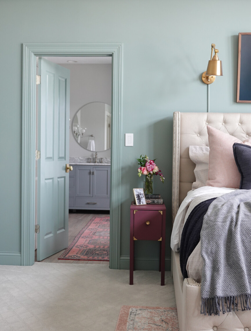
Benjamin Moore Seaglass. Photo by Sara Davis.
“Remember all the teal in the 1990s?” asks designer and creative Sara Davis. “It’s back and ready to make a comeback in 2022—but in a more sophisticated way.” Davis, who chronicles her design projects on her site Sincerely Sara D., says the polls are showing that green and blue are current favorite hues, with teal being the happy medium. “Teal combines the stable tranquility of a royal blue with the optimism and nature that are inherent in green,” she says.
Paint Picks:
Suitable Rooms:
Because teal has an understated elegance that encourages a calm, reflective mood, she says it’s the perfect hue for the bedroom or bathroom. “Teal is the color of restfulness and mental and spiritual balance,” she outlines.
#7: Black
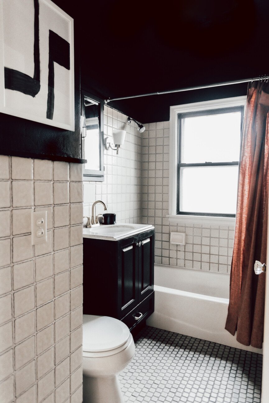
Behr Black. Photo by Cindi Yang.
It is quite fascinating: Even with all the gravitational pull toward the earthy, grounding colors for 2022, one of the most dramatic will hold a winning card and that is rich black, says creative and design influencer Cindi Yang. “There are people looking for quite a bit of change and drama after so many years of it,” says Yang, who believes black adds “lovely drama” to a room while still being neutral and complimentary. “I am definitely starting to see black being used a lot more frequently.”
Paint Pick:
Suitable Rooms:
Black makes a space feel a lot cozier and intimate, according to Yang. She recommends opting to paint a basement, creative space (like a music studio), or a bathroom (seen here in Yang’s home) in this deep hue. “It’s a great color to help bring out other elements in the room, like playful colored fabrics or sophisticated metals,” she notes.


