If you’re like me, then the desire to constantly change the look of your home never goes away, regardless of whether you rent or own. I’m constantly shifting furniture around, looking for cute new accessories, and staring at paint swatches. My current obsession? Trying to figure out what color to paint my room. After months of rocketing back and forth between options, I’ve tapped four interior designers to give us all the scoop on which paint color trends are big right now.
It’s time to get the definitive list of what’s in, what’s out, and what’s next—straight from the experts. You might be surprised to find that some of your favorite shades are no longer trending. Painting a room is one of the most low-cost and deeply satisfying ways to completely change the aesthetic and vibe of a room. And whether you want your bedroom to feel like a zen-like sanctuary, a moody romantic space, or a happy, bright welcoming room, these new paint color trends have got you covered.
I spoke to interior designers Javaneh Pirooz, Beth Dotolo and Carolina V. Gentry of Pulp Design Studios, and Jamie Nusser of J Designs about the most up-and-coming paint color trends. All of them agreed that warm tones, comfort, and bold hues are having a serious moment.
Read on for our experts’ thoughts on current paint color trends!
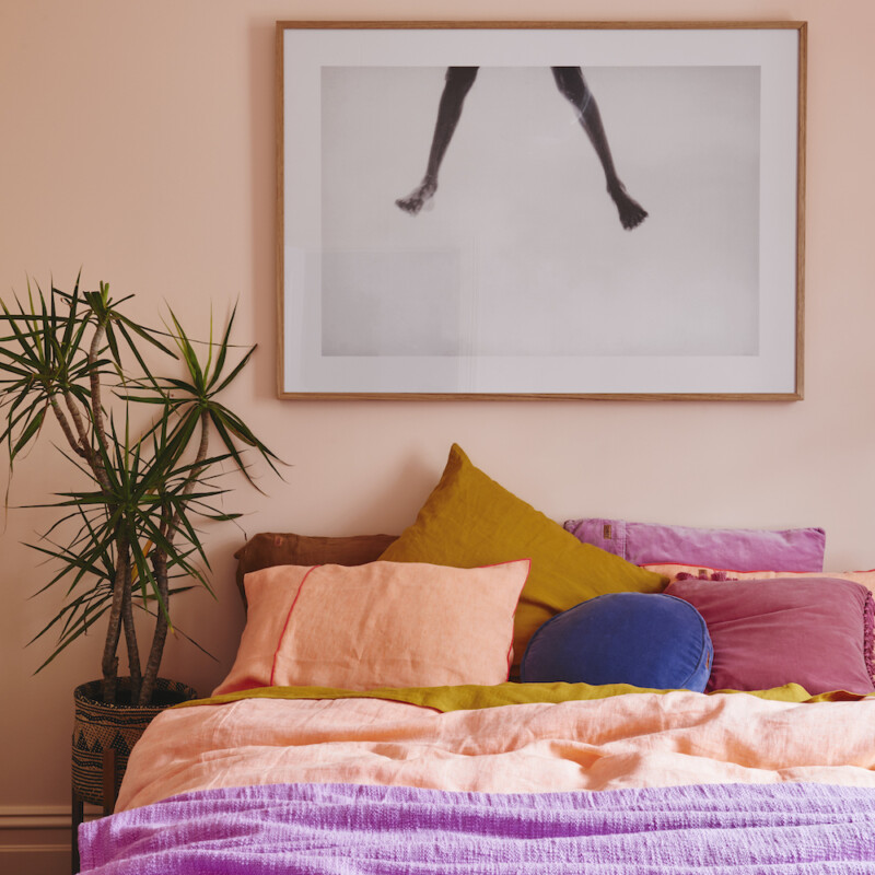
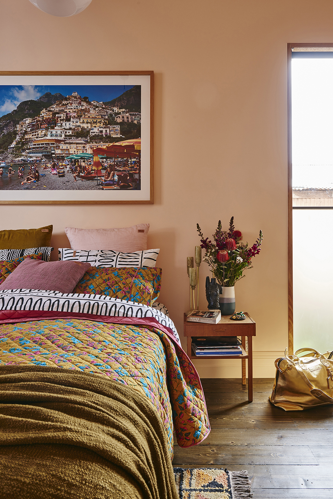
In Pirooz’s opinion, people are craving travel, which is why she’s seeing a lot of limewashed finishes and muted toned walls. Her clients are also shifting away from bright white walls and transitioning into warmer terracotta, sage green, and muted marigold hues. She’s also noticed a recent pastel takeover with many of her newest projects. Her favorites combine pistachio and rose blush, and they’ll definitely be having a moment through 2022!
Before the pandemic people were still very much into lighter tones and whites, Nusser notes that we’re seeing a lot of people shift to using more color and making bold statements in their space. After spending so much time in their spaces over the last year, she believes people are looking to liven things up and add some brightness, mood, and fun to their homes.
Gentry points out that, “we’ve been locked down and scared for a while, and now people want to feel joy. That’s part of why the maximalist trend has been gaining ground.”
Earthy hues, jewel tones, and creamy, rich textures will reign supreme well into 2022. As Dotolo mentioned, “people want exuberant design in their homes, looks that make them happy and are more celebratory.”
Say goodbye to stark whites and gray!
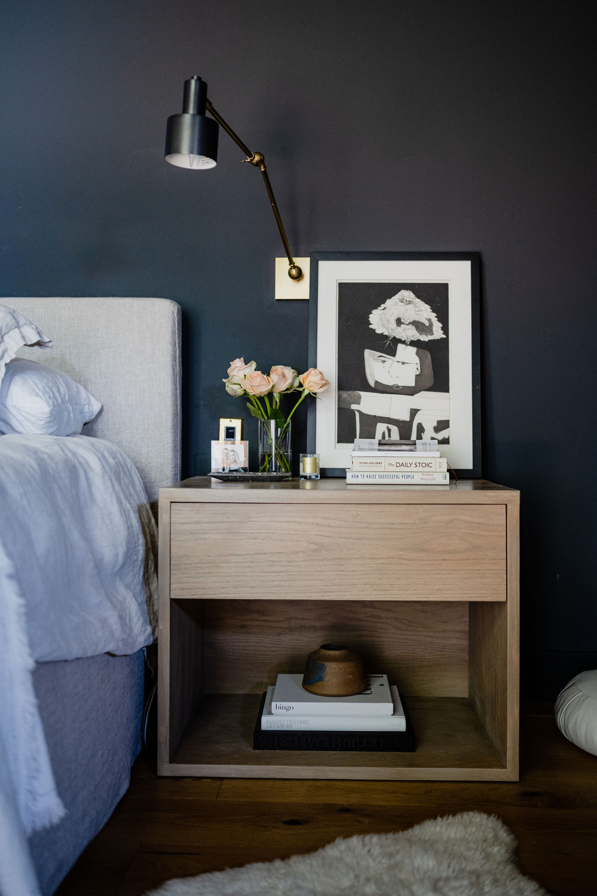
All four of our design experts mentioned that gray paint shades are no longer in style—that’s pretty definitive if you ask me! Gentry explains that “we’re setting aside cool grays and replacing them with creamier neutrals.” Think paints with yellow and pink undertones instead of blue and green hues.
Doloto has noticed creamy and warm whites being prioritized over stark whites and believes it’s a response to how people are feeling today and what they want in their homes. Yes, we will always need a few white walls to tie a home together, but blindingly white walls are no longer going to be the go-to for an entire house. It’s all about adding a touch of softness, even to the brightest whites.
Colors are trending warmer, even when it comes to neutral shades. Doloto stated that for most, it’s about comfort and warmth that makes the home feel like a respite from the world.
Keep reading for our experts’ favorite paint shades:
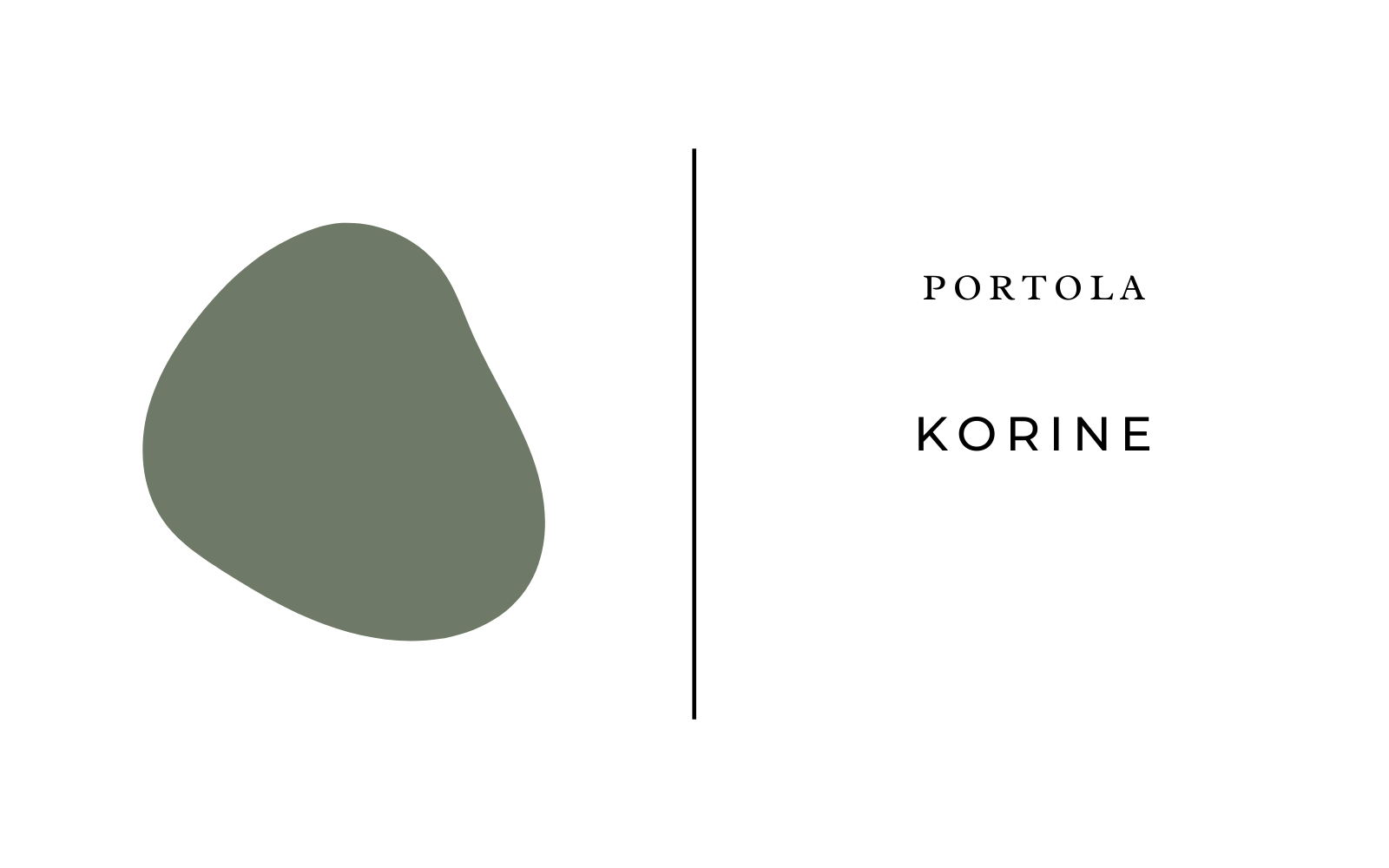
Portola Paints Korine Lime Wash
Get those imperfect limewash walls that Pirooz mentioned with this romantic green shade. It adds a bit of texture and romance to the bedroom.
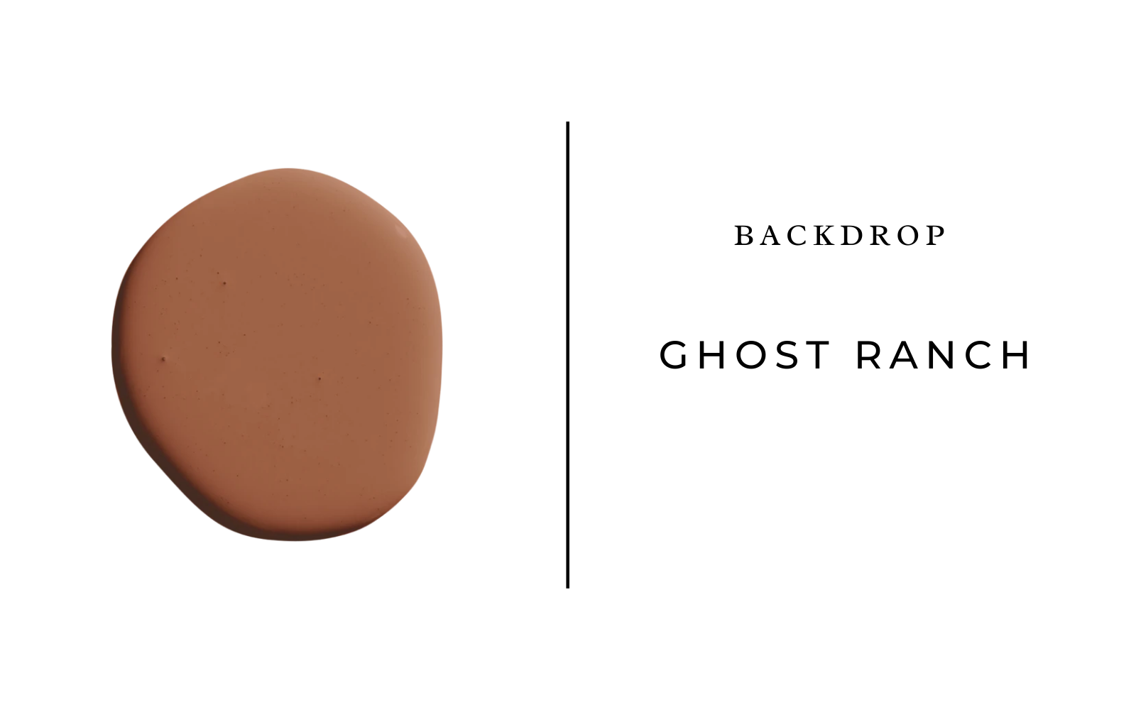
Backdrop Ghost Ranch
You’ll be seeing this gorgeous terracotta shade everywhere, it’s a rich, earthy tone that is incredibly grounding but doesn’t feel muddy.
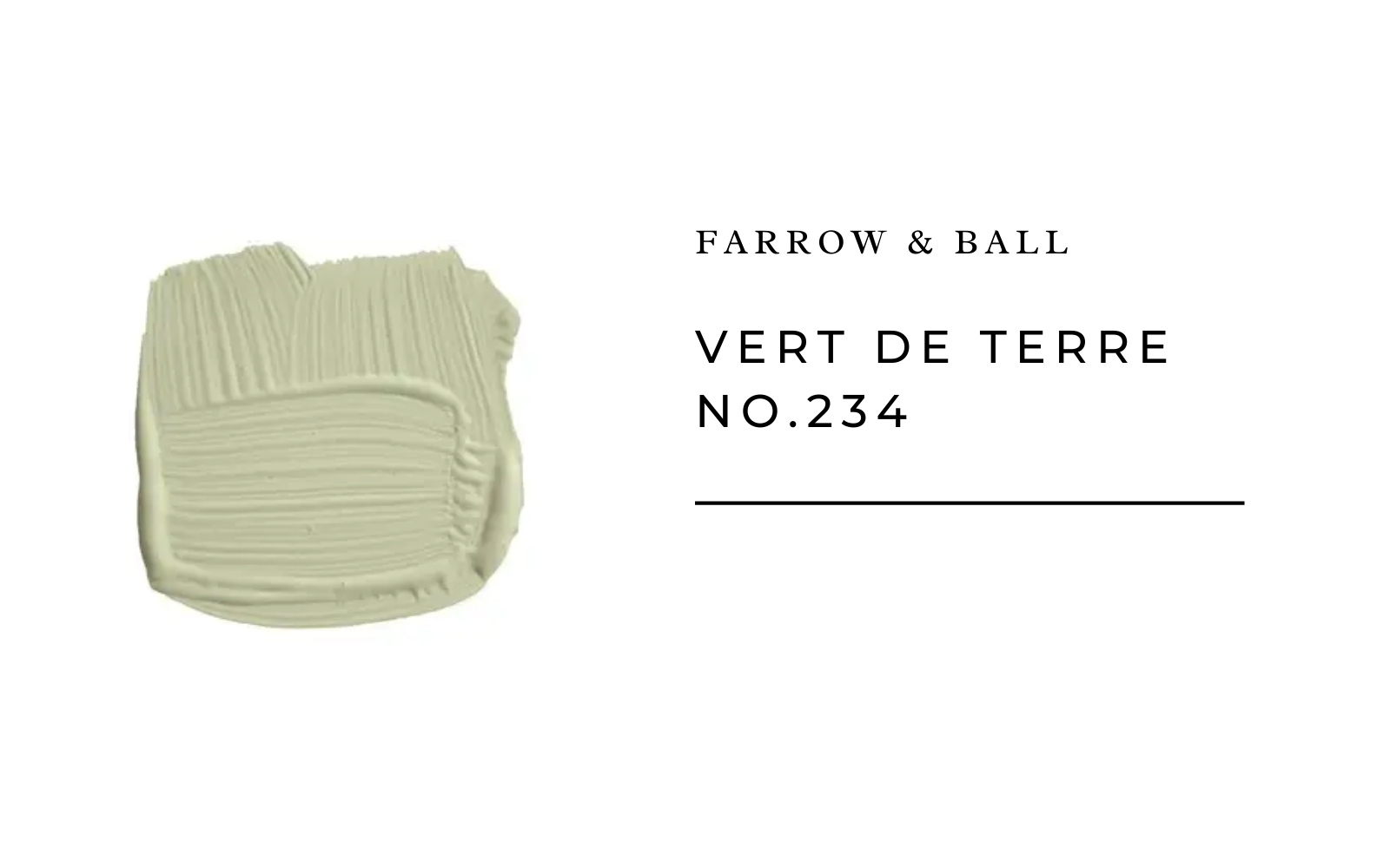
Farrow and Ball Vert De Terre
Ready to dip your toe into color but feeling overwhelmed by the bright hues? Then Nusser thinks you’ll love paints like Vert De Terre.
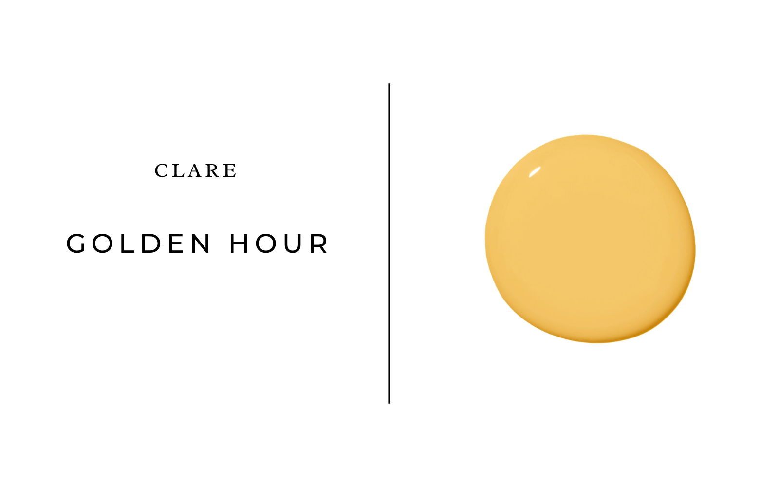
Clare Golden Hour
You’ve probably noticed some gorgeous marigolds and yellows popping up on the scene, and Pirooz thinks they’re here to stay.
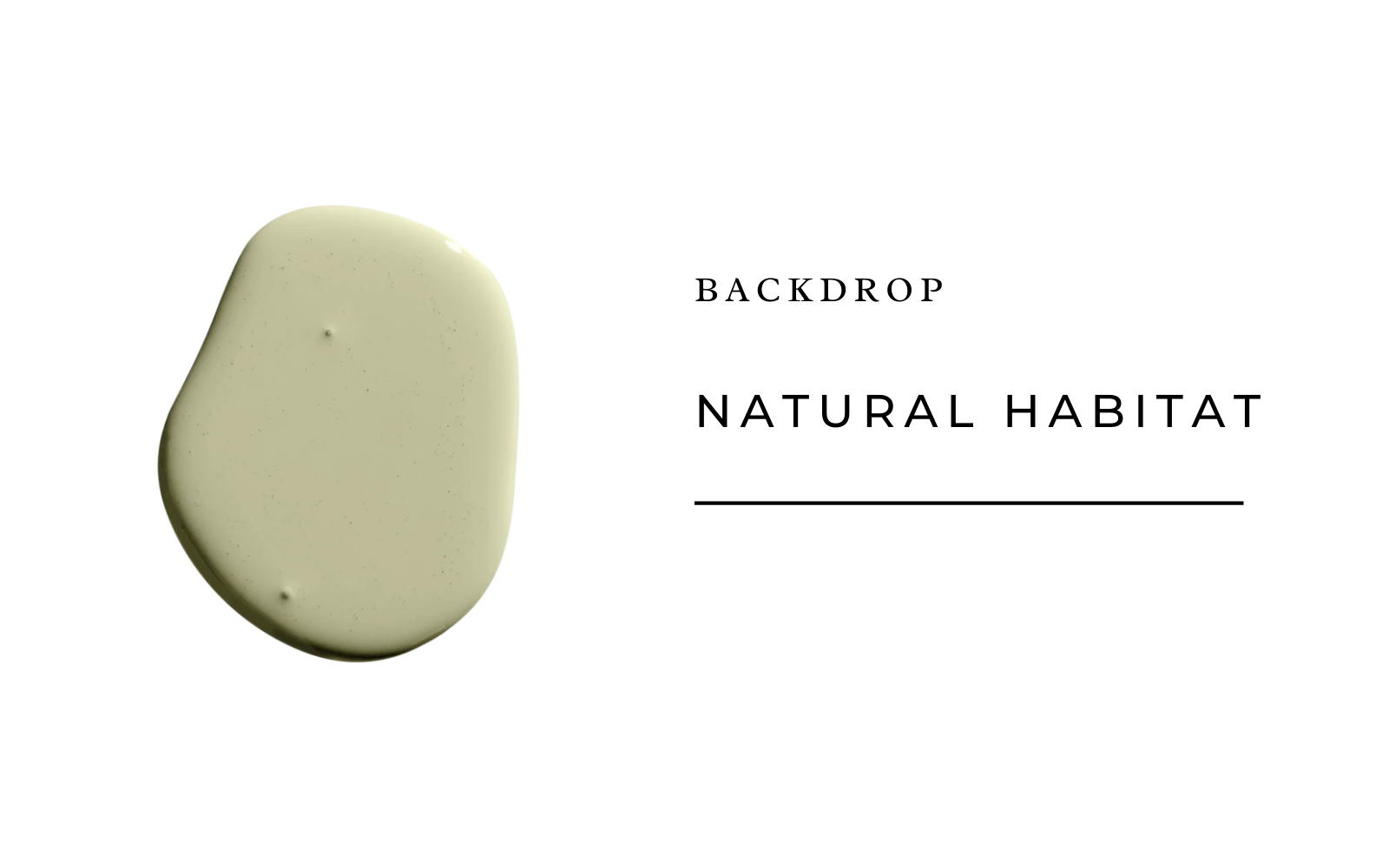
Backdrop Natural Habitat
Looking for the perfect green shade? Give this lovely pistachio a go.
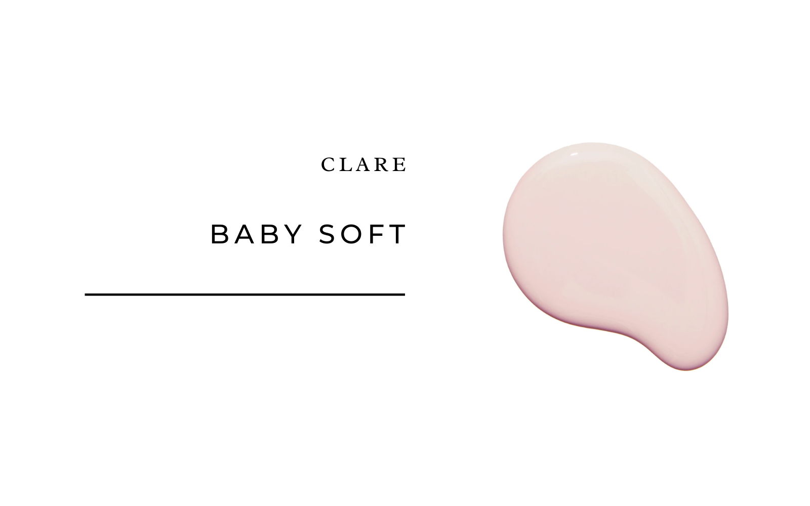
Clare Baby Soft
Pair your pistachio with this lovely, sweet, and timeless shade of pastel pink for a lovely color combo that isn’t too aggressive.
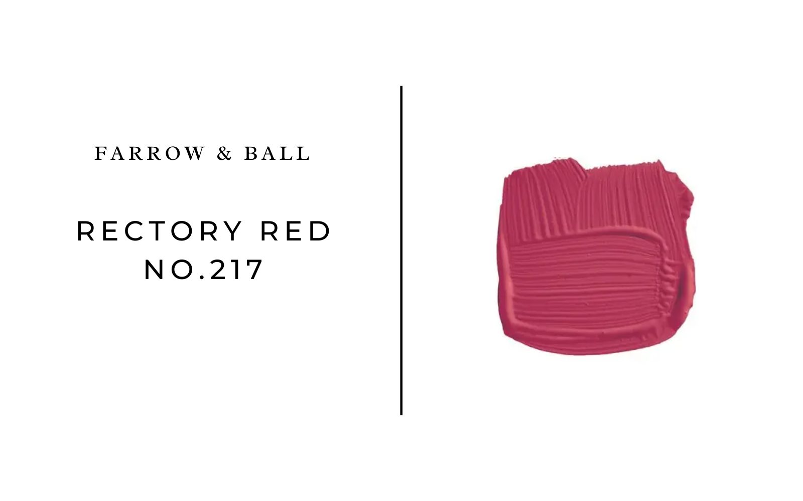
Farrow & Ball Rectory Red
Dotolo is a fan of the deep reds and opulent metallics that are going to be trending come 2022.
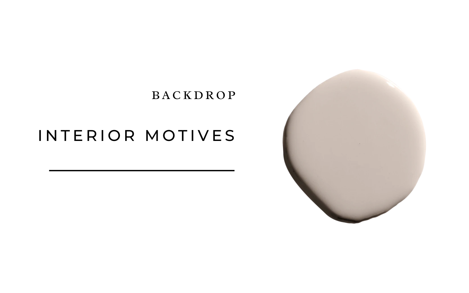
Backdrop Interior Motives
Want to dabble in earthy tones but are afraid to go too brown or dark? This pale taupe is the perfect way to dip your toes into the water.
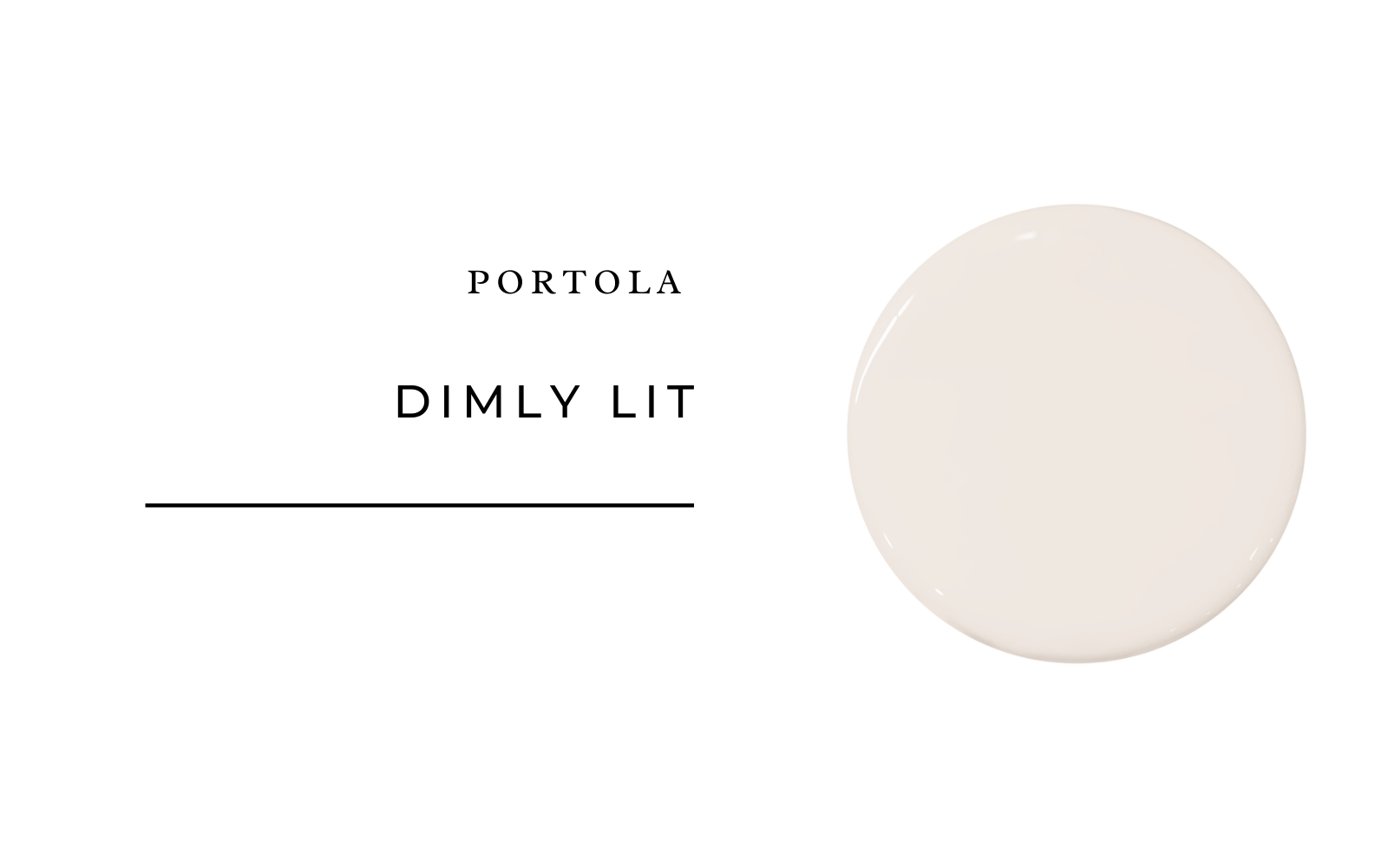
Portola Paints Dimly Lit
Nusser has been loving more off-whites like Dimly Lit for base shades.
What’s your favorite new paint color trend? Keep us posted in the comments.