Effortlessly chic gray hues will always stand the test of time, even if more people are generally trending towards maximalism and bright shades. So while you’re probably seeing a big shift away from neutral tones (as many designers have recently mentioned) gray paint colors remain ever popular. Yes, we all got the memo that neutrals are out and bright, bold paint colors are in. After the last year and a half, it’s not surprise that people want joy and comfort to be reflected in their home’s interiors. Who can blame them?
That said, there’s nothing like some classic subdued hues to make a space feel zen-like and cozy. Not only does it fit with just about every vibe and aesthetic, but it’s a great way to add a touch of mood to a room without going overboard. You can keep a neutral palette, add a bit of calm to a brightly decorated room, or even juxtapose it with sweet pastels for a baby’s room.
Intrigued to know why this subdued hue is resistant to trends, we asked four interior designers—Katherine Carter, Andi Morse, Abbe Fenimore, and Kara Mann—to give us the full scoop on why gray paint is eternal and the best ways to use it.
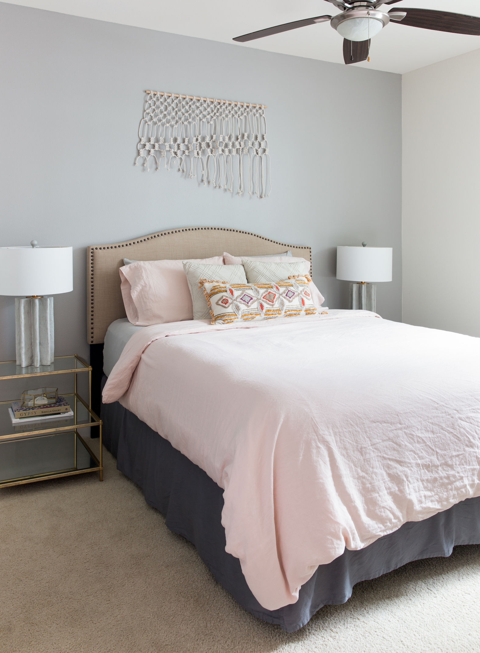
Trends come and go, but gray stands the test of time.
All of our designers spoke to the timelessness of gray paint—it’s the perfect neutral shade! Fenimore pointed out that it is a great option for anyone who isn’t a fan of white walls or color that they don’t want to commit to for the long haul.
Gray works well with pretty much any color palette, making it a versatile pick for the homeowner who wants to change out their décor more frequently.
Morse noted that it is a great way to bring warmth into the space while still remaining a neutral palette. And don’t forget to test various shades first! Carter reminds us that gray paint can be tricky since you don’t necessarily want it to read as blue.
Some people make the mistake of not testing on their walls in different lighting and end up with blue walls! You want to make sure it’s a perfect gray.
Now, check out our experts’ favorite gray paint colors for every room of the house:
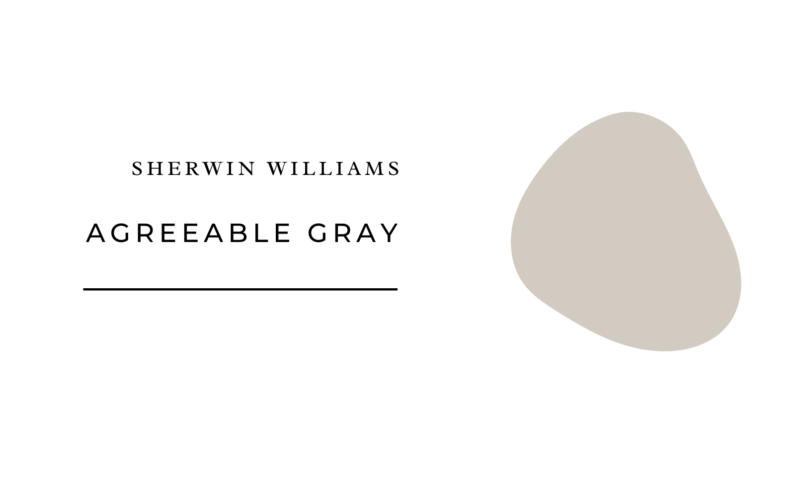
Sherwin Williams Agreeable Gray
According to Morse, this shade of gray is a great way to warm up a space without going dark and it works in almost every situation. She recommends using lighter shades of gray in a family room, bedroom, and living room.
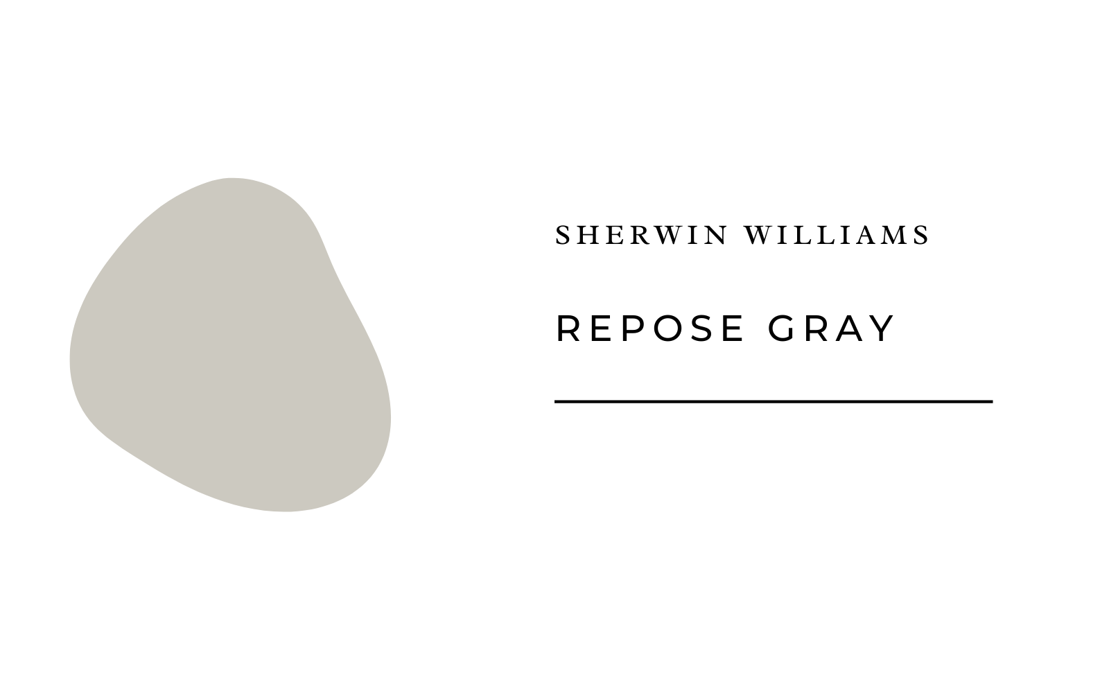
Sherwin Williams Repose Gray
How cozy is this shade of gray? Morse tells us that you can pair any of them with white trim or even use this hue as trim on white walls. She’s also a fan of using pink trim with gray walls for a soft, feminine touch in a girl’s room or study.
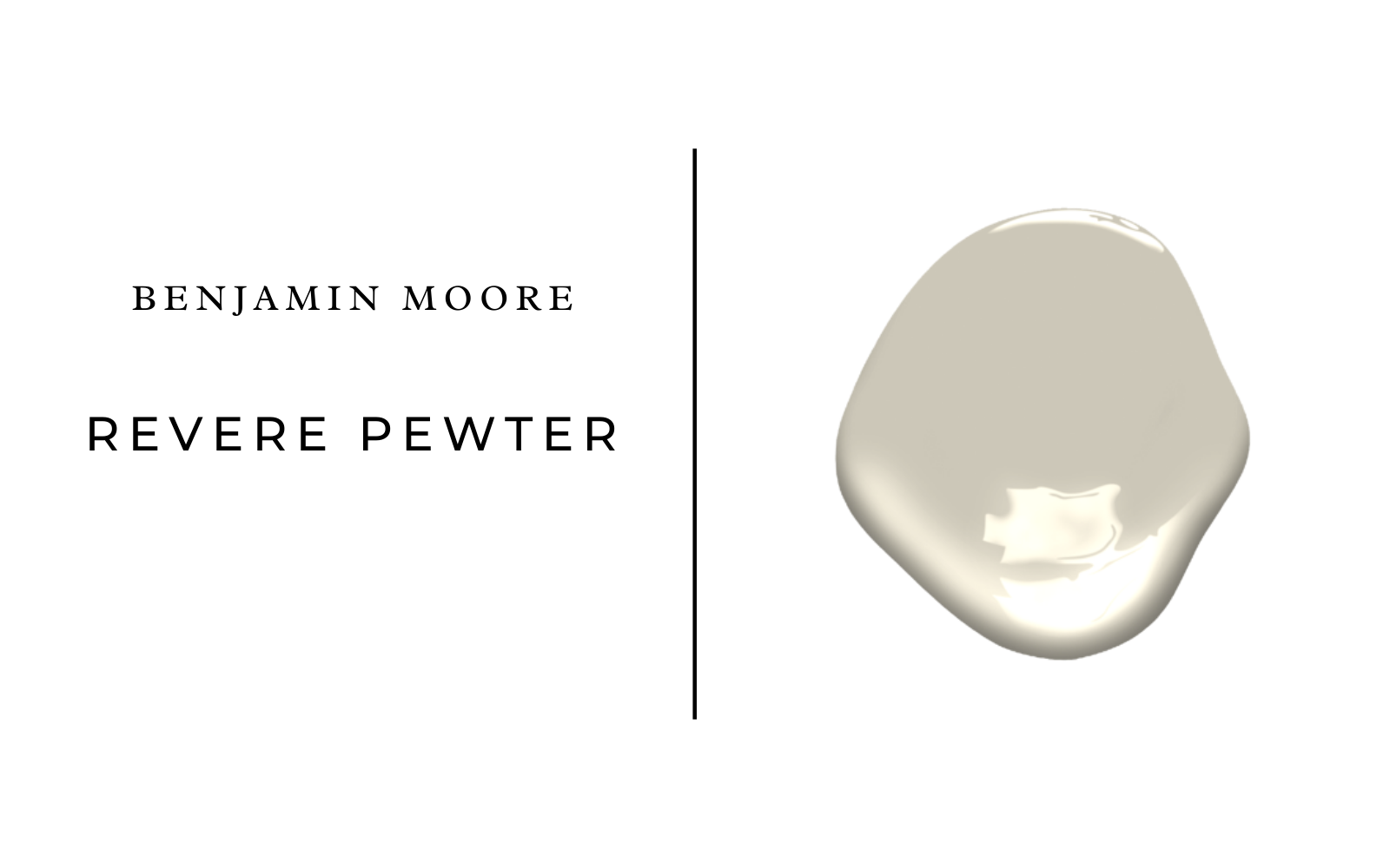
Benjamin Moore Revere Pewter
Fenimore finds this to be the perfect greige. It’s a warm gray that can be used throughout the home when trying to keep shades consistent throughout, but it also works well in open-concept spaces.
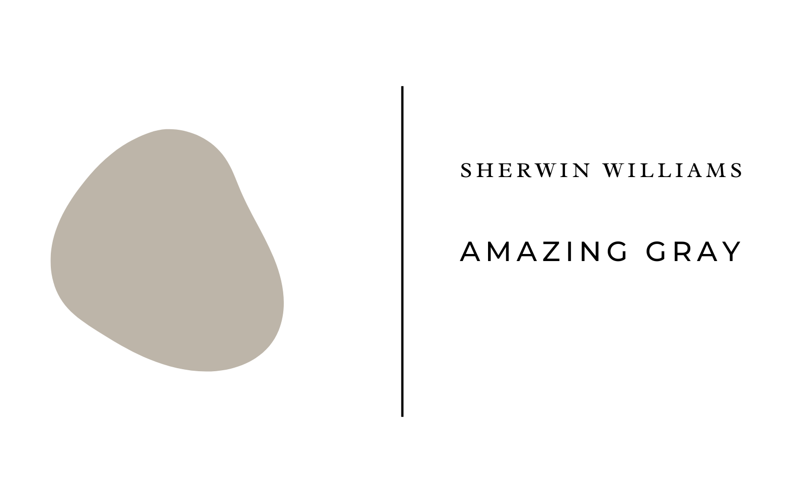
Sherwin Williams Amazing Gray
This is another warm gray that looks beautiful in both spaces with ample natural light and those with very little light. Fenimore loves using Amazing Gray in formal spaces since it’s sophisticated and complements any aesthetic and color palette.
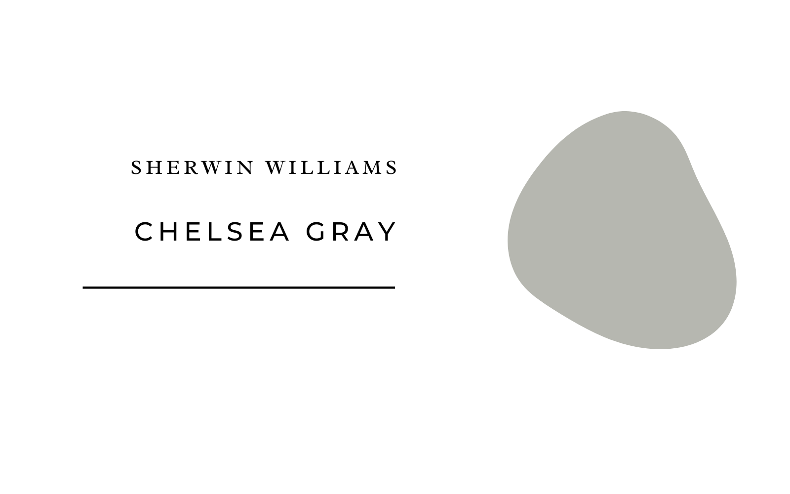
Sherwin Williams Chelsea Gray
This is a true gray that isn’t too blue—it has the perfect amount of warm undertones. It is Fenimore’s go-to for accent cabinets, doors, and furniture.
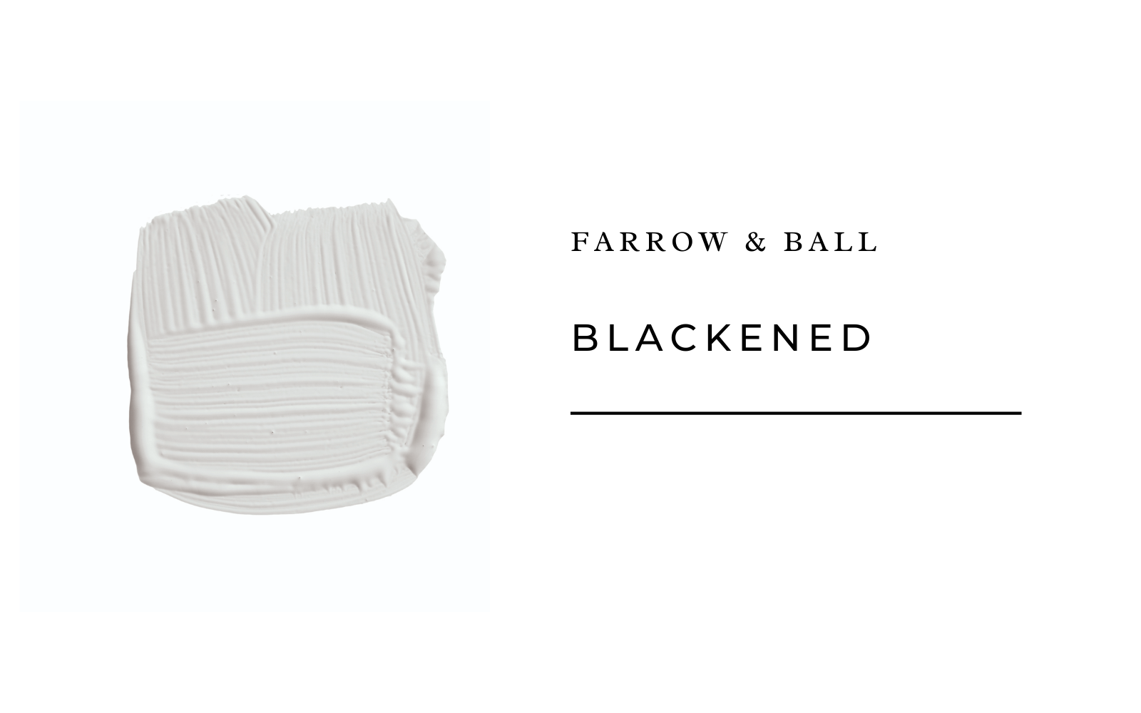
Farrow and Ball Blackened
Carter pointed us in the direction of this gorgeous cool gray shade. Use it with a stainless steel kitchen or contrast with a brilliant bright white for a modern, minimal, or industrial feel.
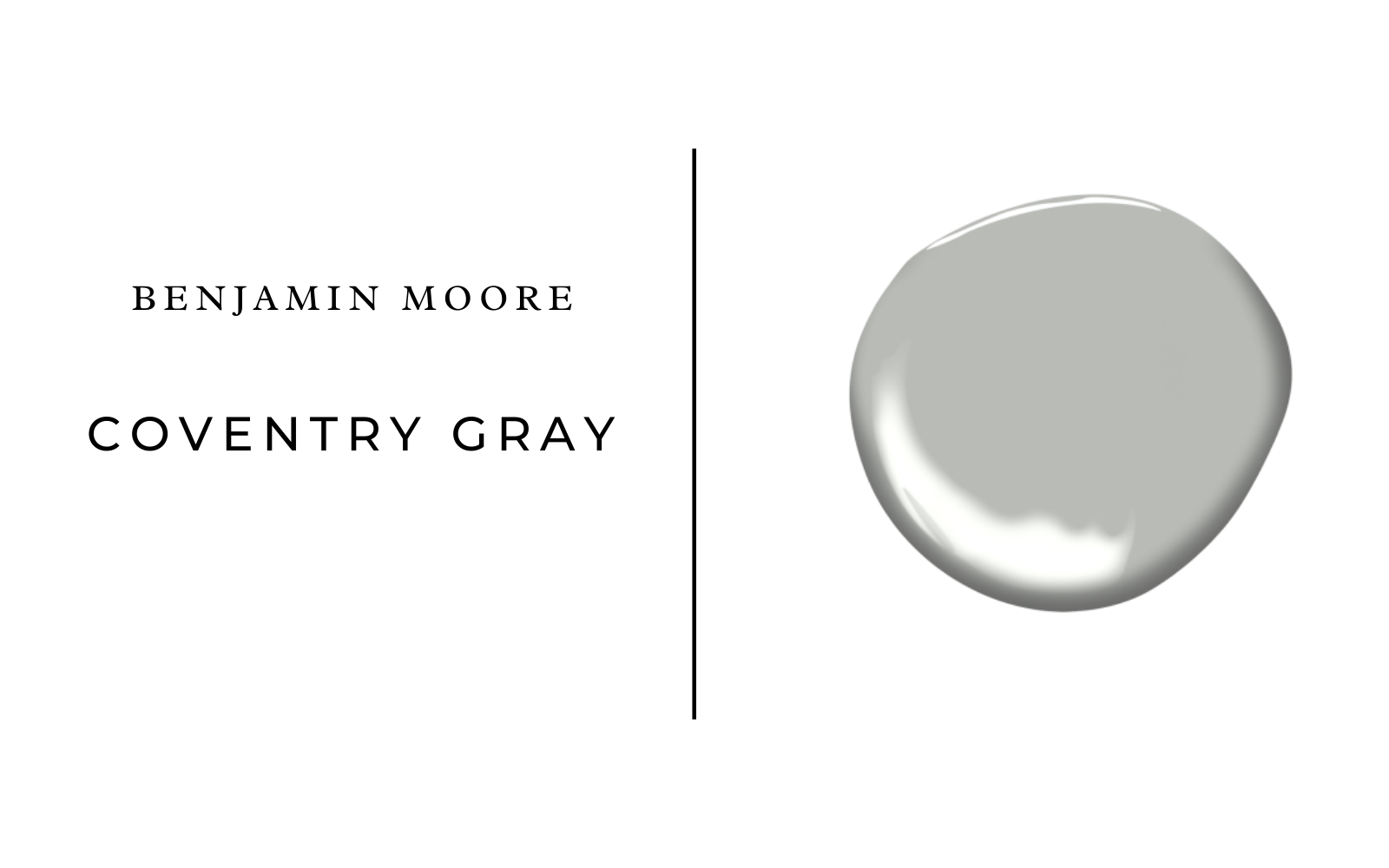
Benjamin Moore Coventry Gray
Staying true to her devotion to warm-toned grays, Carter suggests trying out this lovely dove-hued shade.
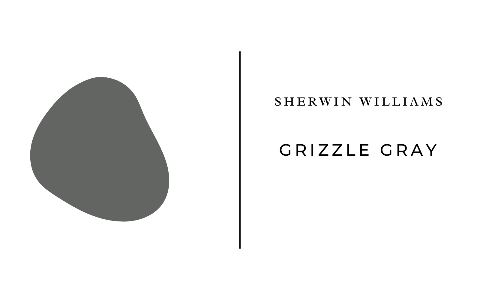
Sherwin Williams Grizzle Gray
Dabble in some darker hues with this chic shade. Perfect for just about any room of the house and an easy way to add a bit of mood and attitude without committing to a bolder color.
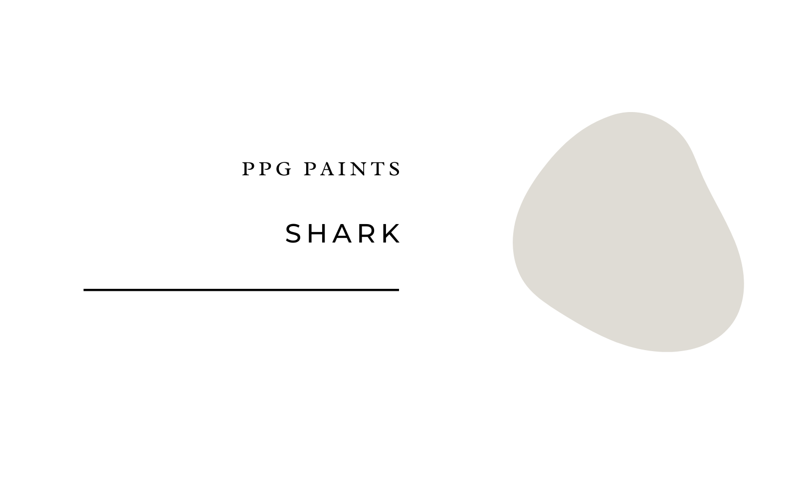
PPG Paints Shark
Mann recently used this gray hue in a client’s master bedroom, noting that it works well with both warm and cool tones. But what makes it especially soothing is the way it subtly changes throughout the day as the light shifts. It’s beyond beautiful!
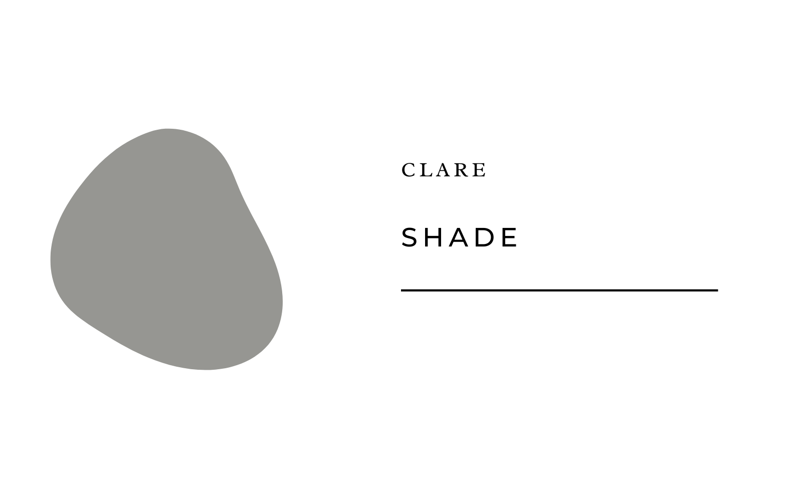
Clare Shade
Morse recommends using darker shades of gray in studies or dining rooms. This moody shade sets a perfect romantic setting without feeling too goth or bleak.
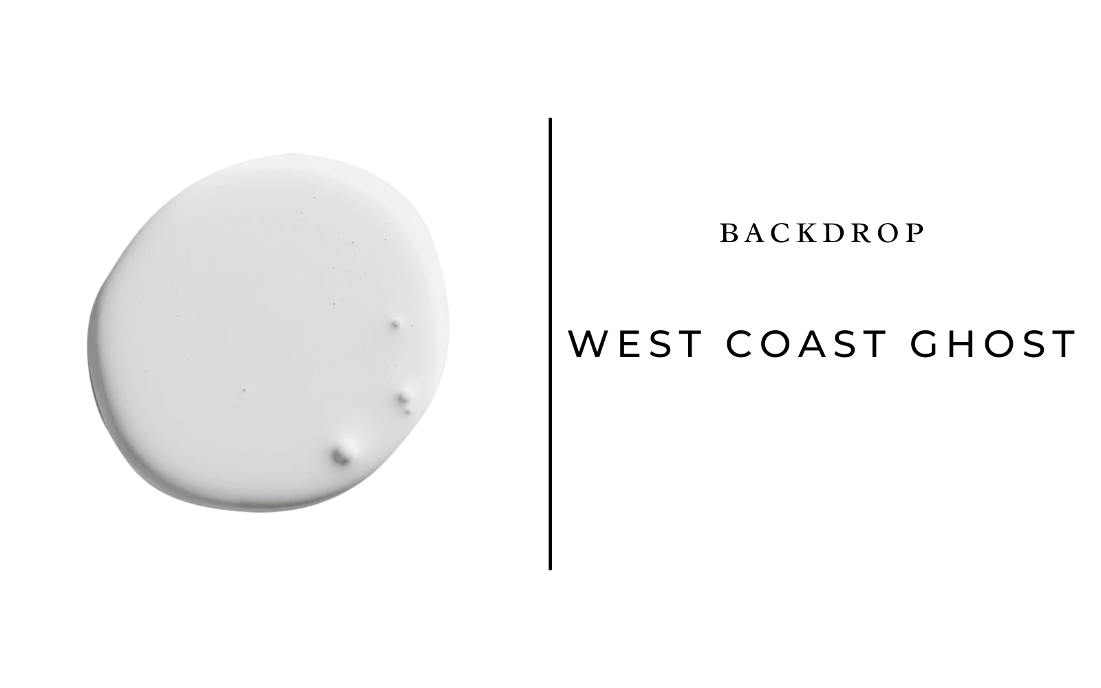
Backdrop West Coast Ghost
If you’re still on the fence about gray, go with this stunning pale hue. It’s a super light gray with blue undertones that adds a touch of drama while still feeling safe, neutral, and lovely.
What’s your take on gray paint—are you over it or will you love it forever? Let us know in the comments below!


