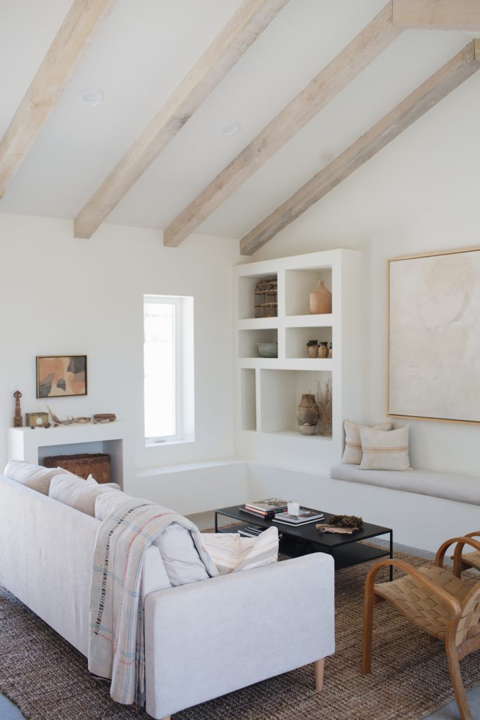
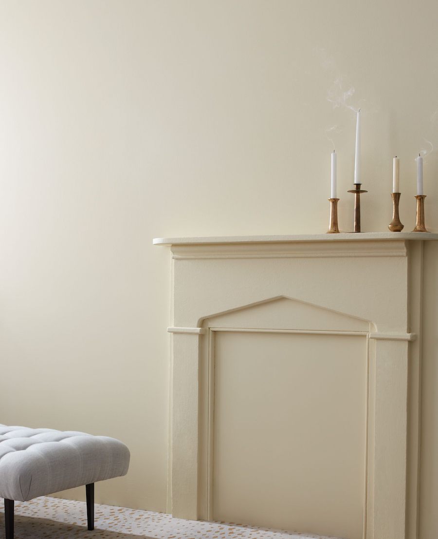
Neutrals are the Switzerland of design hues. A reliable symbol of domesticity and ease, neutrals—which generally cover whites and creams to beiges and grays—often get disregarded as the complementary colors, the safe bet, the sideshow to a bold blue or hot pink. But more recently, the design world has been elevating neutrals to claim the spotlight. They’re getting their due as the grounding, calming, pull-it-all-together answer to a space. From ethereal neutral paint colors for the living room to textural camels and greys for accessories, neutrals are—finally!—moving beyond the expected.
Because when you think about it, nothing shines without neutrals peppered throughout. They’re like the negative space that allows a chair to stand out. The paragraph break in an essay that gives the reader a moment. Neutrals are, as Rachael Grochowski, founder and principal architect of RHG A+D, eloquently puts it, a calming reason to pause and reflect. “They are the base of what pulls a project together.”
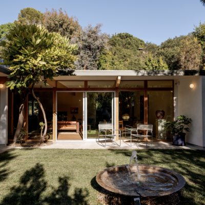
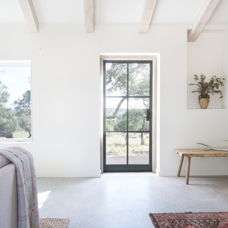
Feature image by Kate Zimmerman Turpin.

Grochowski further points out that within the world of neutrals, there’s a kaleidoscope of possibility. “Lighter neutrals are calming and air-like,” she says. “Darker neutrals are grounding and more earthbound.” Here, she walks us through why neutrals deserve applause—plus, five gorgeous neutral paints for the living room.


How do you approach decorating with neutrals?
Neutrals are the backdrop to a grounding design. When creating a sense of calm with color, it’s important to use restraint so the space does not become overstimulating. We worked on a whole house project where the objective was to create a contemporary sanctuary environment to support life’s transitions. We created a delicate balance of neutral tones and pops of vibrant color.
How do neutral paints amplify a room?
Neutral colors reflect more light, which goes a long way in making a room look bigger. The key to letting neutral colors do their magic is to keep a tight edit on the rest of the décor. Also, continuing neutrals into accessories can help the space feel spacious and expansive, sometimes balancing off color or darker neutrals to bring the eye to an element or detail you want people to notice.
Any other ways you love to incorporate neutrals?
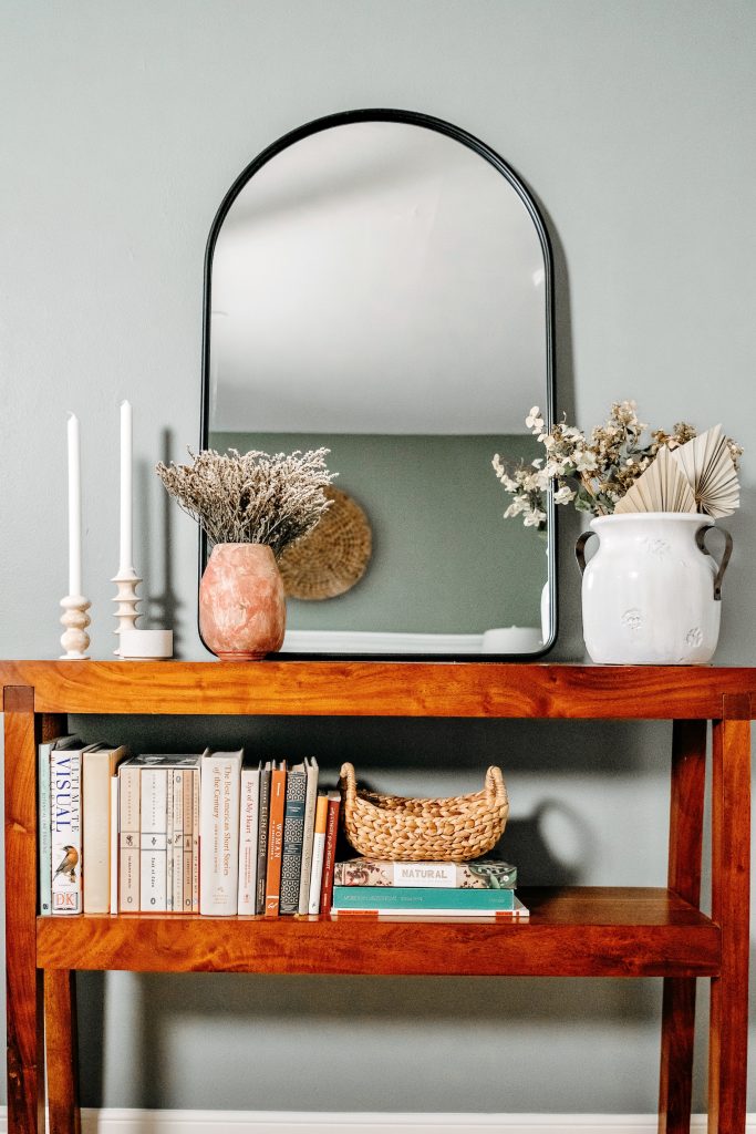
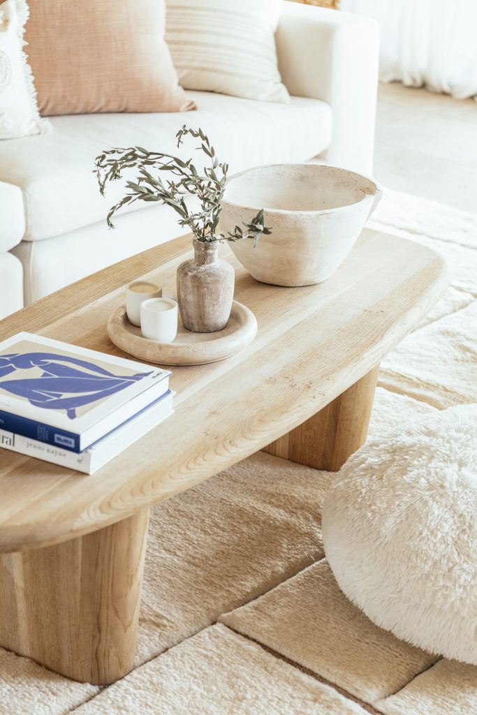
For décor, I love pottery in neutral or natural colors with an ultra matte or slightly textured finish. These can be balanced with matte black ceramics.

5 Stunning Neutral Paints for the Living Room

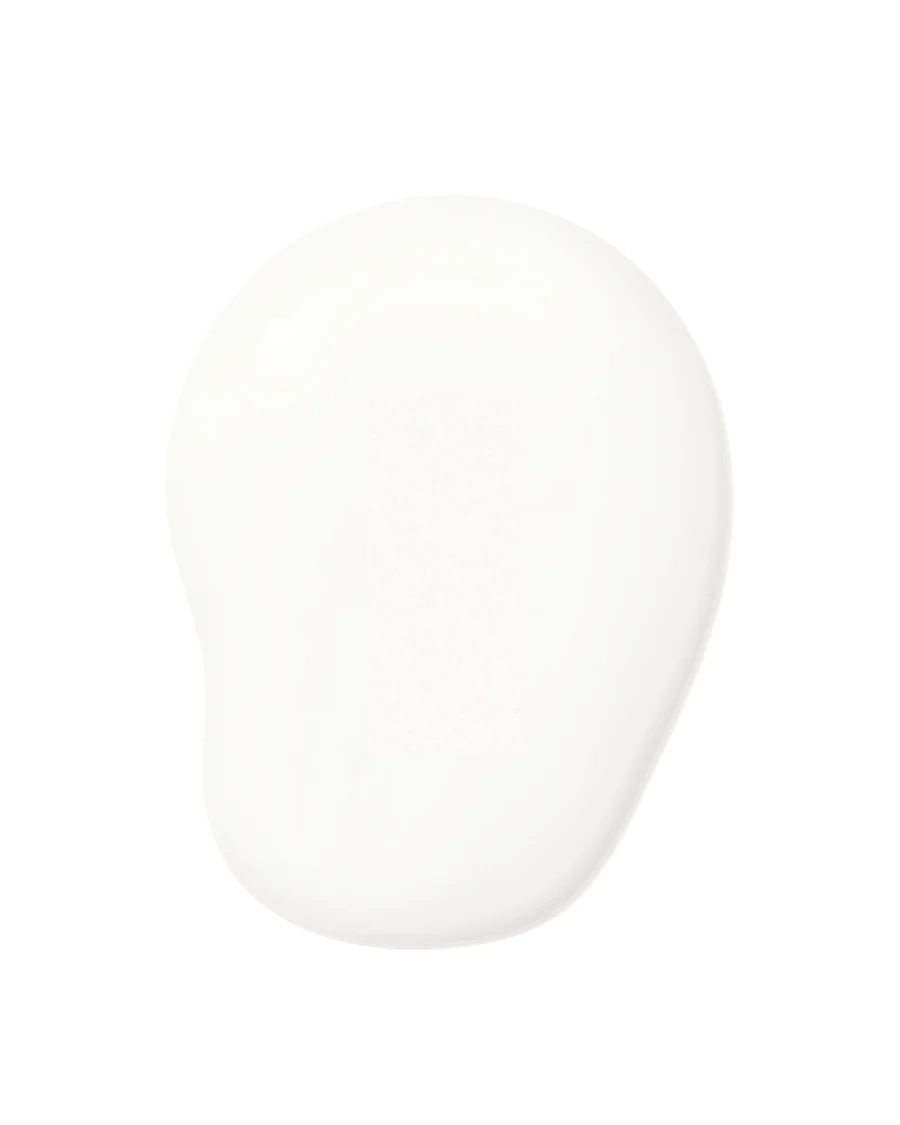
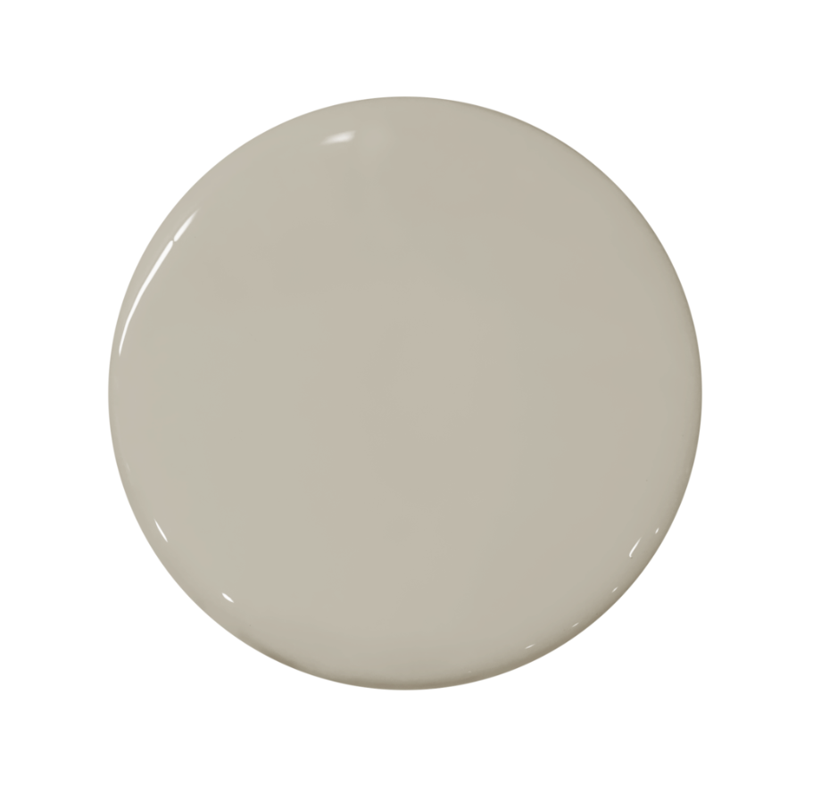
Portola Paints u0026 Glazes French Beige