Our homes are meant to be the most personal spaces we inhabit. They should be customized to our unique taste and lifestyles, but with all of the images we see every day, I find it’s incredibly easy to fall into trends by default. That’s why I’ve always been so impressed by interior designer Garrett Hunter’s ability to create unique and trend-free spaces. It feels rare in our Instagram world to consistently see rooms that look new and completely different from everything else. So I wanted to find out – how does he do it?
Each of your projects has its own unique personality, do you make a conscious decision to avoid trends?
I never really look at trends – it is dangerous as a designer to become a synonym to your peers. This is all about the client, for me. Not about what people say is “cool”.
Are there any 2018 trends that you’re bidding farewell to?
Since I don’t take design trends seriously, I have joked lately that while many declare “grey is the new beige”, that means that “beige is the new grey”. And for those paying attention… it seems the Europeans agree.
Do you have advice for designing to suit the style or period of your space, instead of re-creating your last home?
In today’s world, people tend to lean toward eclecticism of periods rather than being purists. With that, I’d say let the space have some breathing room so that the architecture can sing. Narrow it down to your very favorite things, and never buy something just to be a ‘filler’.
Where do you start when you have a new project, do you have go-to sources for inspiration?
I start with paying attention to the client, to find out what something means to them. At the same time, I’m also considering the vernacular of the project. I tend to source from Los Angeles, Mexico, and Europe.
Is there a feature, a piece of furniture or an accessory that you love to base your other design decisions on?
Sometimes color can drive a design; but I never consider matchy-matchy. It doesn’t seem authentic. In terms of building off of a particular piece, usually there will be that one “it” piece that drives a design, whether it be to celebrate the piece, or sometimes to create a power-clash which often creates beautiful friction in a space.
What’s the biggest design mistake that you try to avoid?
Caring about what the neighbors are doing. Everyone is unique!
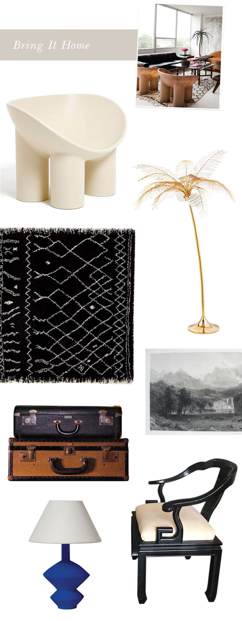
Inspiration of Hunter’s home taken by Jake Toler, white arm chair by Faye Toogood, Berber-inspired rug LaRedoute, palm floor lamp cb2, antique painting Etsy, vintage black suitcase Etsy, vintage tweed suitcase Etsy, black armchair Etsy, blue lamp Burke Decor.


