We may receive a portion of sales if you purchase a product through a link in this article.
Let’s begin with an ode to our senses. At times (and when able), we can smell, taste, see, touch, and hear our way toward tranquility. A glimpse at an image, a whiff of essential oil, or a moment in a sound bath can relieve stress and transport us to a place of ease. The takeaway? When we treat our senses well, calmness and relaxation are within our reach. This is so true in the context of interior design, particularly when it comes to the bedroom. By choosing calming bedroom colors, we can support our well-being and have better quality rest.
Read on for some of the most soothing—and beautiful—calming bedroom colors that ease the senses.
The Best Calming Bedroom Colors
2026 paint trends all point to creating a relaxing vibe at home. This is especially important in the bedroom, and color is a main ingredient for a space that feels calm and cozy. “When designing a bedroom, I think first about how the space should feel when you exhale at the end of the day,” Kimberly Oxford of Kimberly Oxford Interiors shares. “A calming palette is essential, but true tranquility comes from layering color, material, and light in a way that gently quiets the nervous system.”
Bedrooms are meant for deep relaxation, and when your space is designed with intention, you can count on a good night’s rest. Ahead, I chatted with designers to get their take on the best bedroom colors for sleep. Here are a few trending paint colors they recommend.

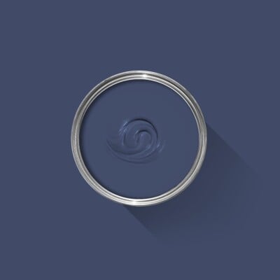
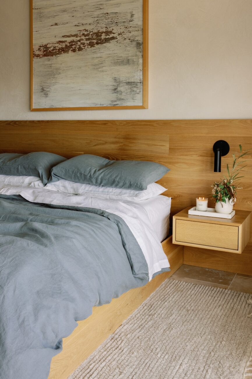
Soft Blues
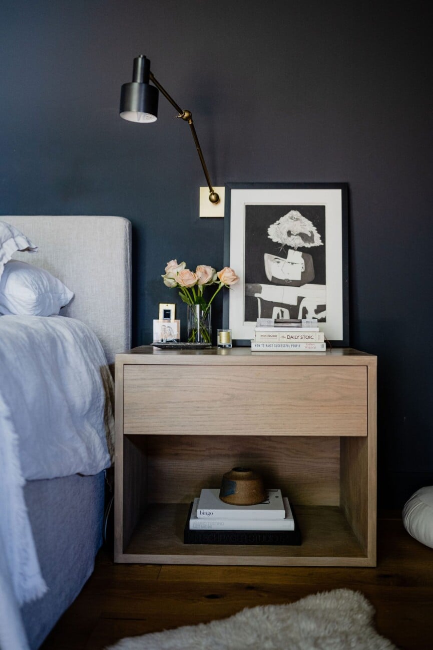
Research shows that spending time in environments near a body of water can lift your mood, lower stress, and improve well-being. The color blue is incredibly calming, so a blue bedroom is a natural choice. “I always lean on soft blue tones for bedrooms, as these colors are linked to relaxation and lower stress levels,” Daniele Doerge, a color expert from California Paints, shares. “A powdery, slightly muted blue creates a calm atmosphere that feels soothing—perfect for sleep-focused spaces.”
Soft blues can also mean darker shades. “Think evening sky, not navy. Softened blues can gently lower heart rate when desaturated,” designer, psychotherapist, and founder of Psychitecture, Dr. Rachel Melvald shares. With a background in both design and psychology, Dr. Melvald recommends thinking of your bedroom like a space that envelopes you. “In 2026, the trend isn’t bold statement walls, rather it’s cocooning, biologically calming tones that help the body downshift into rest and connection,” she says.
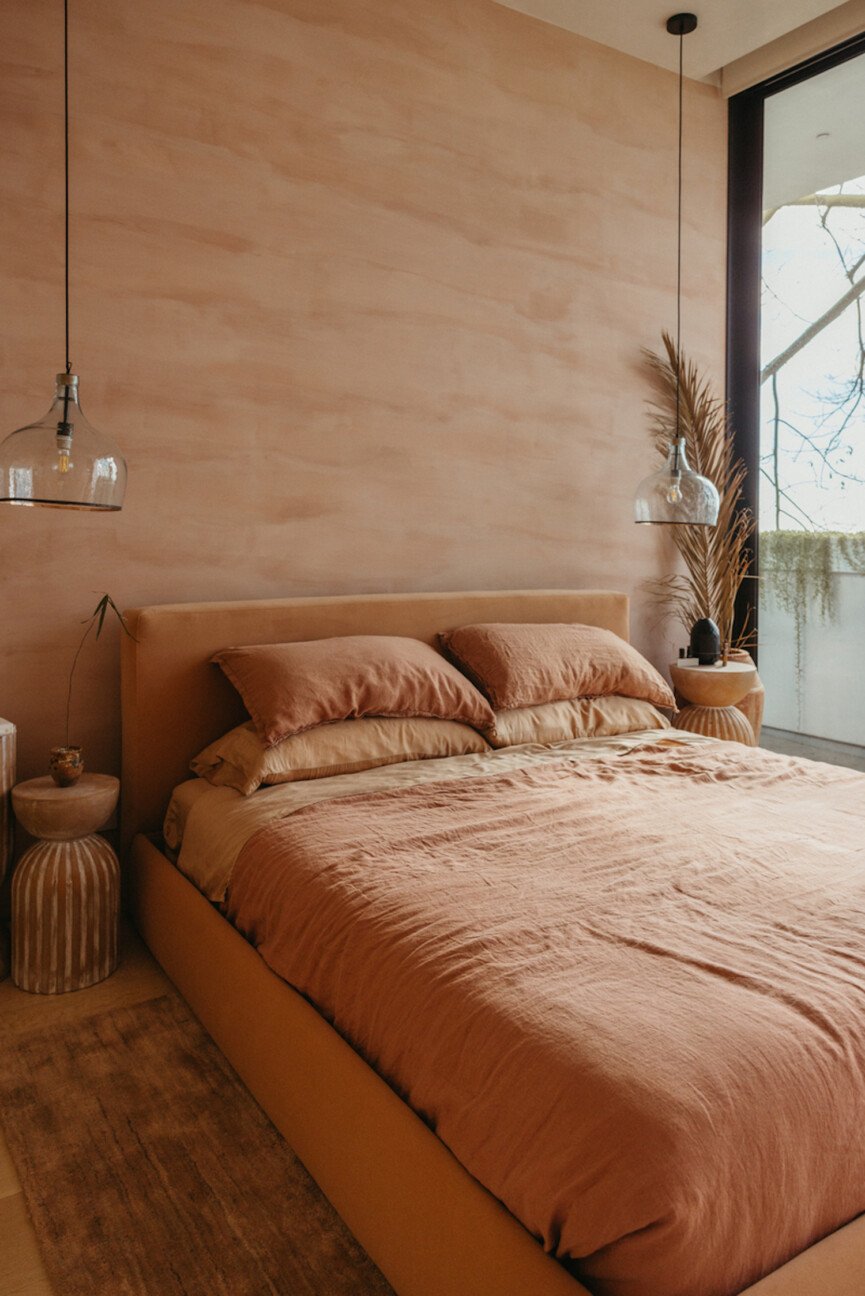
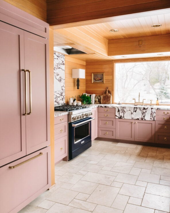
Light Pinks, Yellows, and Oranges
Think of the California desert on a late August evening. It’s a tapestry of terra cotta earth that kisses the gold sunset. These calming colors bring exactly that into the bedroom. “One color I return to again and again is Benjamin Moore CC-310 Dusty Road. It is one of those rare shades that instantly transforms a room,” Oxford says. “Softly muted with a warm undertone, it flatters every skin tone and creates an atmosphere that feels both moody and luminous.”
When it comes to painting your bedroom, don’t be afraid to wrap the entire room in color—especially when it’s in this warm color palette. “I often recommend painting the fifth wall, the ceiling, the same color as the walls. This creates a cocooning effect that visually quiets the room and removes harsh transitions, allowing the eye and mind to fully relax,” Oxford recommends.
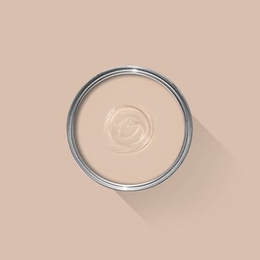
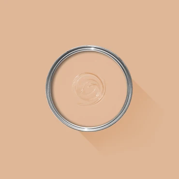
Shop Warm Pink, Yellow, and Orange Paint


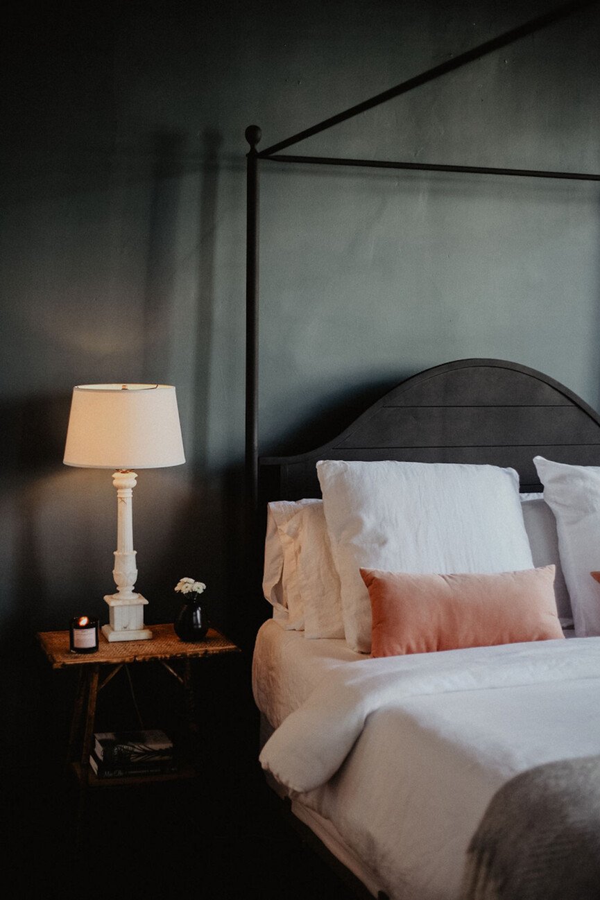
Earthy Greens
You know that calm feeling when you walk on fresh grass? That’s what this color does in our homes. Green speaks of peacefulness, nature, and harmony. “Muted and nature-rooted greens are very calming because they subconsciously connect us to the outdoors,” Doerge says. “Green is also associated with balance and restoration, which makes it an ideal color for a bedroom—a space most of us want to unwind and rest in.”
Not sure what shade to go with? You can’t go wrong with a muted sage, a soft olive, or even a dark hunter green. “Nature-based green hues signal safety to the brain and reduce cognitive load,” Dr. Melvald mentions. “Green shades are processed as ‘no threat’ in the nervous system.”
Shop Earthy Green Paint


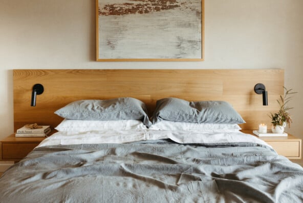
Mushroom and Taupe
Neutrals will truly never go out of style, but be on the lookout for warm taupes and mushroom tones this year, especially in the bedroom. “These tones are trending because they offer depth to a space without feeling overstimulating,” Doerge muses. “Unlike cooler tones like grey, these shades create a soft and warm environment, which can help create a sense of comfort and relaxation at the end of the day.”
“We are drawn toward mushroom hues for a few reasons,” Dr. Melvald says. “The palette variety of this shade provides safety, containment, and less visual stress. It’s regulating, so it not only works well with other colors, but it’s very soothing to our visual nervous system.”
Shop Mushroom and Taupe Paint


This post was last updated on March 5, 2026, to include new insights.