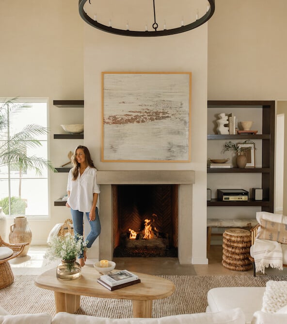
Having lived in our Mediterranean-style home in Austin for over a decade, I’ve shared much of our design process through the years. From simple updates to the kitchen, to plastering our walls, to completely overhauling the backyard—it’s been a journey and I’m grateful to all of you who have been along for the ride! It occurred to me recently that I’ve never shared a complete tour of the entire house, with the room-by-room details all in one place. So, along with the launch of my Sourcebook that includes links to everything in our house, I couldn’t be more excited to share the official Camille Styles Home Tour. Scroll on for everything you’ve ever wondered about my home in Austin, but first: watch the video below so I can show you around.
And now, the details on each space in our house…
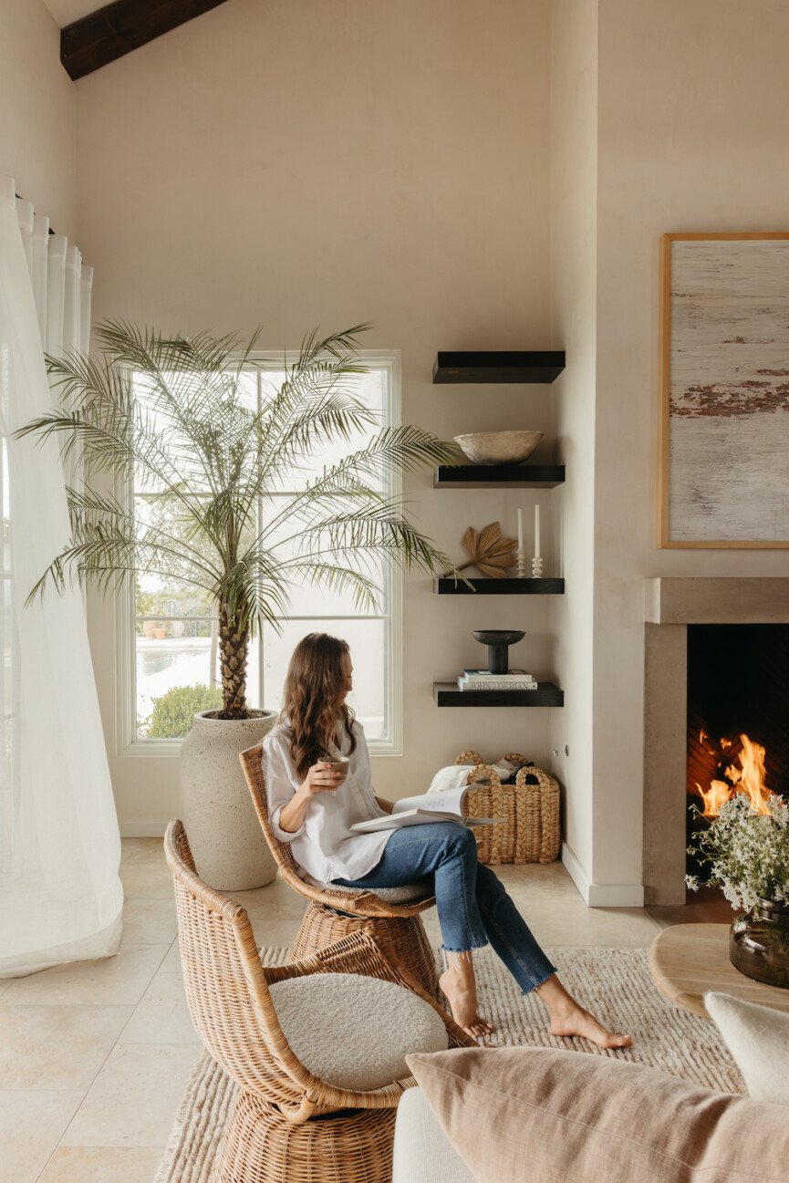
The story of our house
My husband Adam discovered this property back when we were dating, 16 years ago! There was an old 1950s house on the lot that was in pretty bad shape, and the lot itself was so overgrown that you couldn’t see any of the views. The current backyard was completely nonexistent. But we knew that this property had tons of potential, and over a year after putting in the first offer on the property, we finally got it.
We spent the first year of our marriage working with our architect, Ryan Street, and then building a new house from the ground up. At the time, I’d never done a design project close to this scale before—and honestly, had no clue what I was doing. But thankfully, the experience sparked a passion for design and construction in both Adam and me. We learned so much through the process, and I feel lucky that we ended up with a final result that I still love, so many years later.
Now that we’ve been in the house for 13 years, there are definitely a few things that I’d love to update. We approach our home as an ongoing project—every year we tackle one or two thing and the house just keeps evolving right along with us.
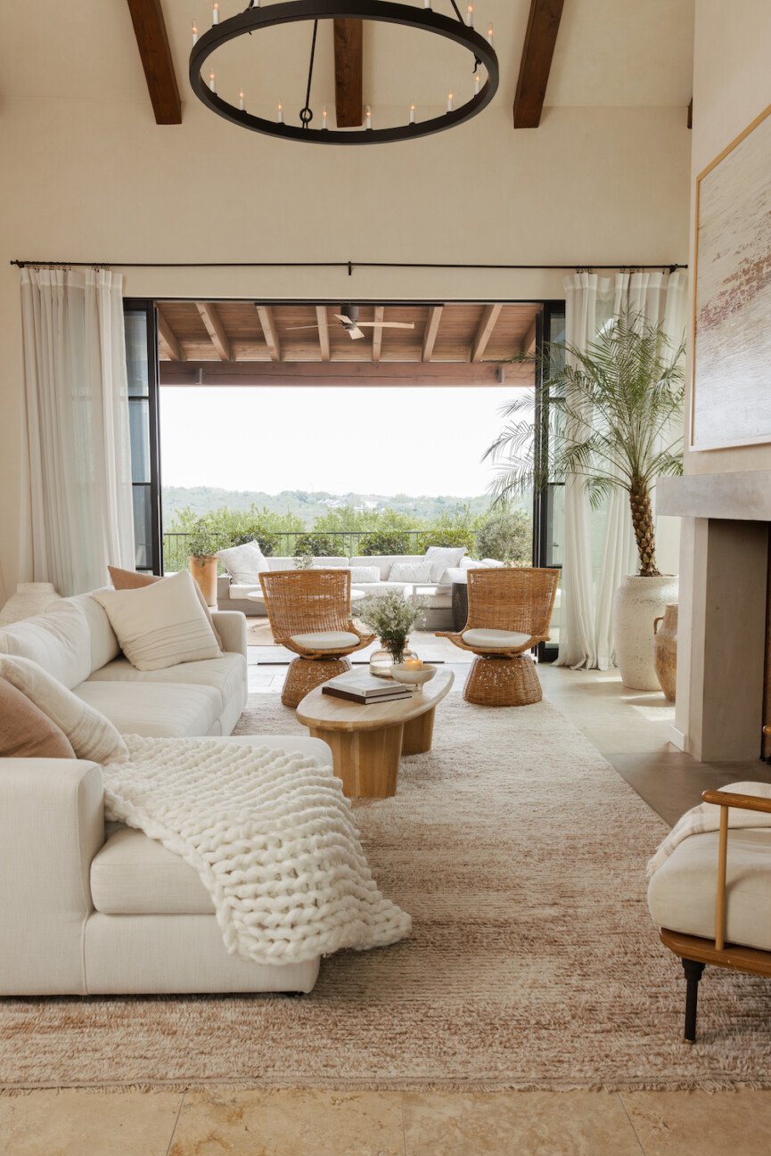
The “style” of our home
I often get asked what “style” our house is, and truthfully, I can’t point to just one particular design style since we’ve been inspired by so many different sources. However, I often use the words “warm minimalism” to describe our home. I’m always looking for simplicity, but want every space to feel warm and comfortable.

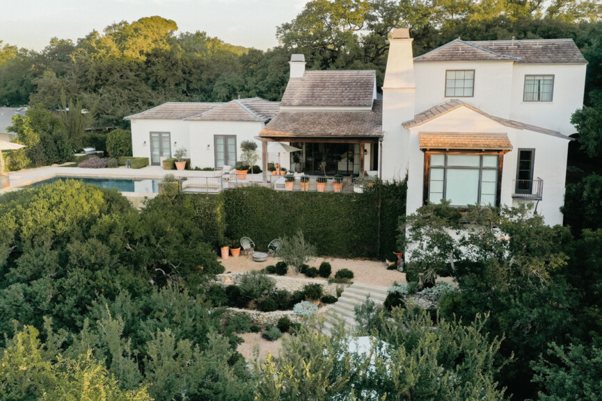
There’s also an undeniable Mediterranean influence in our design. Adam and I went to Italy on our honeymoon, and we were so inspired by the architecture and the outdoor spaces where we spent time on the Amalfi coast. When we came home and began our design process, we wanted to incorporate materials like terra cotta and plaster, as well as so many of the plants we chose for our landscaping, like olive trees and jasmine.
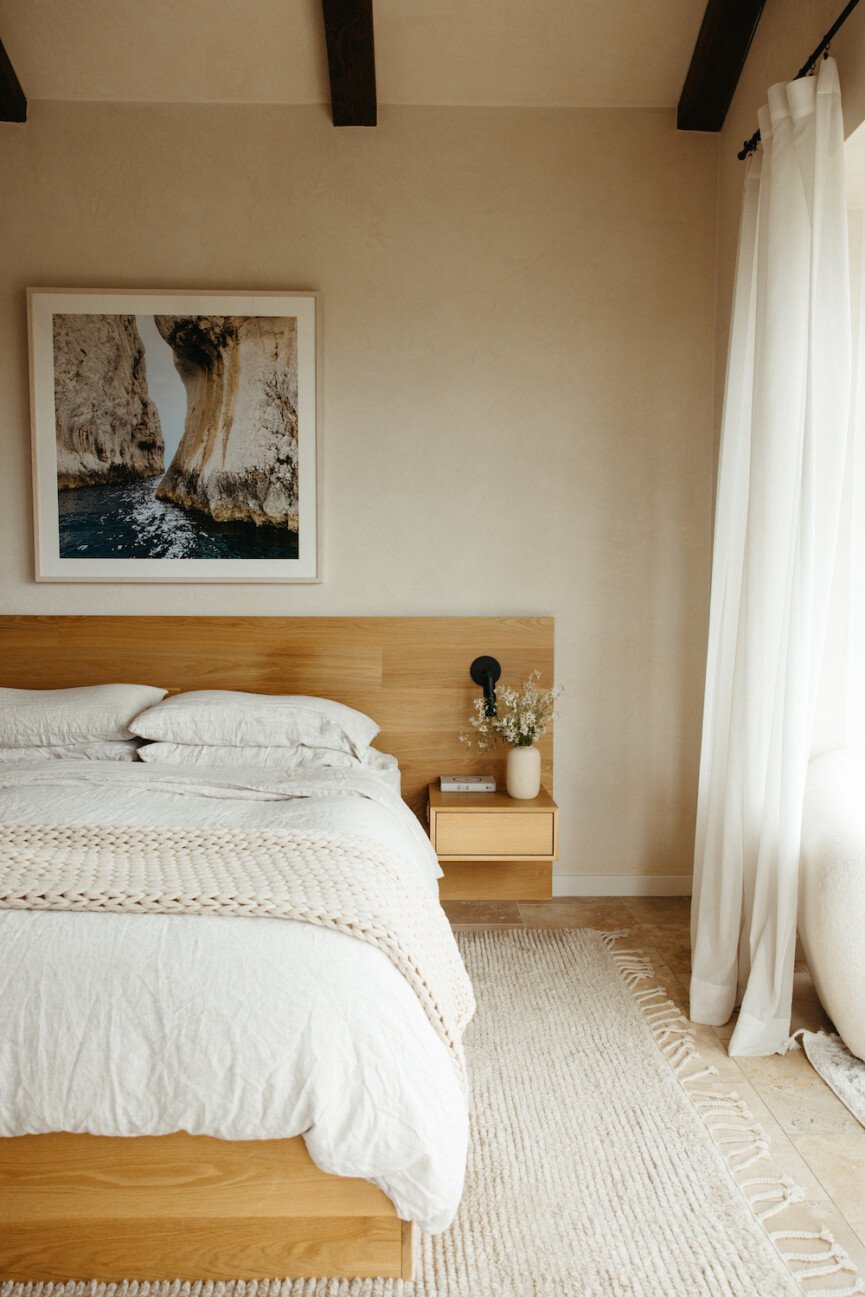
The walls
One of the main questions I get asked about our home is—what color of paint is on the walls? Three years ago, we decided to plaster the walls of the entire house. I’ve long been obsessed with the old-world character that plaster gives a house, so I was really excited about this update—and I’ve loved it every bit as much as anticipated.
For our walls, we wanted a matte finish that’s a little bit more earthy than a lot of the plaster on the market, and I found this product called American Clay that I fell in love with immediately. It’s a natural earth plaster made in New Mexico, and the finish has the soft, organic vibe I was envisioning for our house. It’s also nontoxic and eco-friendly. We plastered the entire downstairs of the house in American Clay’s shade called Forté White, and I love it so much that I actually keep some of the walls bare so that the plaster can have its own moment.
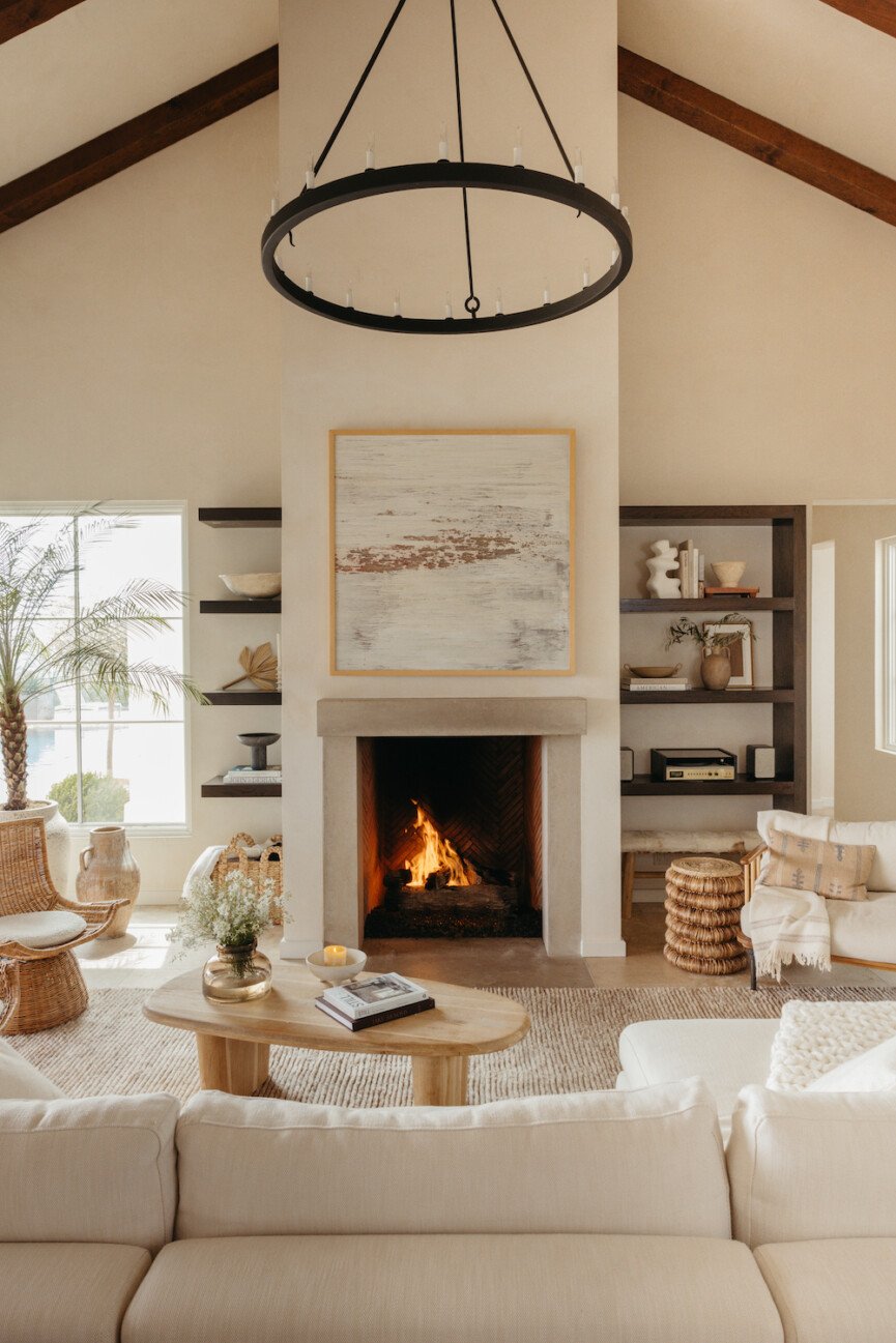
The Living Room
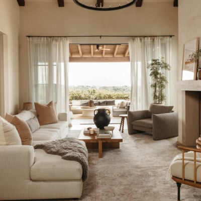
Our living room is all about the natural light and the indoor-outdoor flow. My favorite part of this room is the big steel doors that open up completely to the patio and create this beautiful connection to the backyard. We had them designed and built by Rehme Steel Windows & Doors here in Austin. My emotional state is so influenced by sunlight, so it’s an instant mood booster to spend time in here and let all that light in. Get the Sourcebook ->
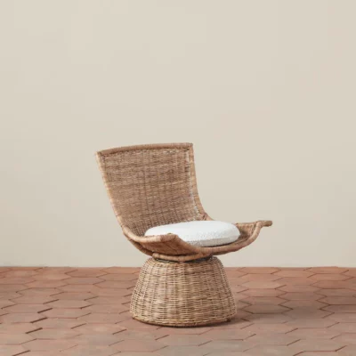
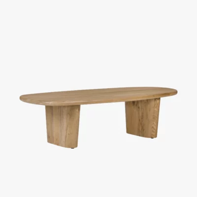
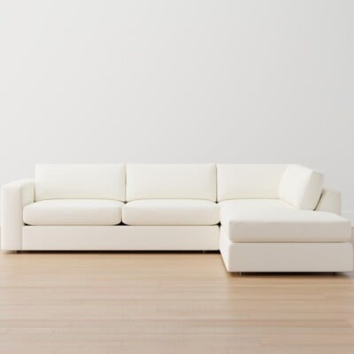
Shop my living room:
Read more about the living room, including the updates we made.
The Kitchen and Dining Room
Our kitchen is where the magic happens—all of my recipe development for the site, and all the meals we make together as a family. When we host parties, everyone congregates around the big central island, so I usually set out the drinks and snacks here for grazing.
This kitchen does have a few inherent design challenges—mainly the lack of natural light. I’ve explored every possible way to add a skylight or window in here, but the way the house is configured makes it impossible. So, I’m strategic with colors and styling to lighten up this space as much as possible.
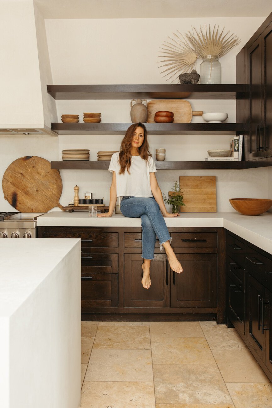
When we built the house, we added a stainless steel venthood that I really fell out of love with as my style evolved. A few years ago, we did a kitchen update and replaced it with a custom plaster hood surround that made the biggest difference. The hood has a hidden ventilation system that’s mounted to the inside of the surround which we then plastered over in American Clay.
We also replaced our old countertops with this bright white Caesarstone in the Cloudburst Concrete finish. I love Caesarstone and have used it in multiple projects—it’s beautiful and incredibly durable. This time around, we added a waterfall edge to the countertop and made a continuous sink all out of the same Caesarstone to make it all really seamless. Get the Sourcebook ->
Shop my kitchen:
Read more about our kitchen remodel here.
The Backyard
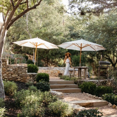
Where do I begin with our backyard? This is my favorite space on our entire property. The fact that it’s taken us 12 years of work to get it to this point makes it even more special—it’s been an ever-evolving labor of love.
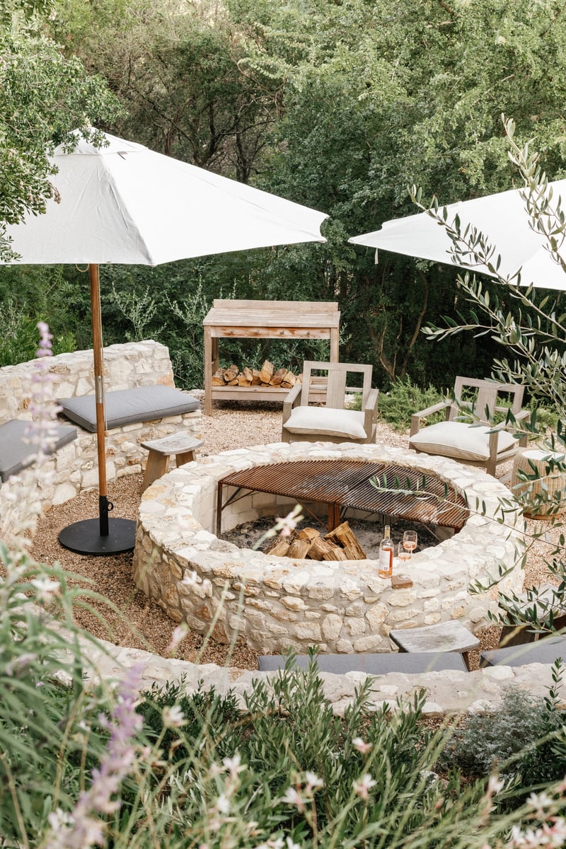
Up top, we’ve got our outdoor lounge area – this is where we hang out when we have friends over, and lots of times the four of us will actually eat dinner around this coffee table and just sit on cushions.
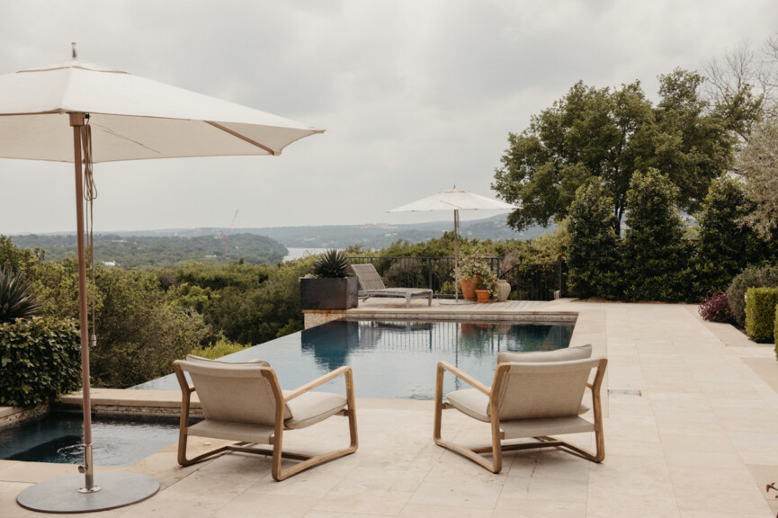
And then, we’ve got the infinity-edged pool. We designed it to maximize the feeling of being built into a cliff, and I love that when we’re in the pool, it feels like we’re almost suspended in the canopy of the trees. We swim all the time—starting in March all the way through November, we are in the pool constantly. My favorite thing about our pool is the color—the dark tile reminds me of the Mediterranean with its deep blue waters.
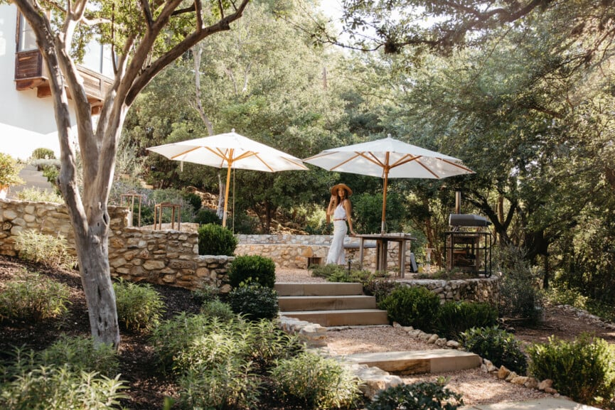
Since our home sits up on a high hillside, our foundation is built on a 30-foot retaining wall. The lower backyard on the other side of it has been our home’s biggest transformation over the last few years. It’s gone from being a dirt-covered hillside covered in brush and trees that we couldn’t even use, to a space that’s been featured all over the internet including in Architectural Digest. It’s taken us YEARS to bring our vision to life – we typically try to tackle one or two big projects a year back here and we’ll probably never be finished with this area. Get the Sourcebook ->
Tour the full backyard here, including more about our backyard design, plants we’ve used, and all about that fire pit.
The Primary Bedroom
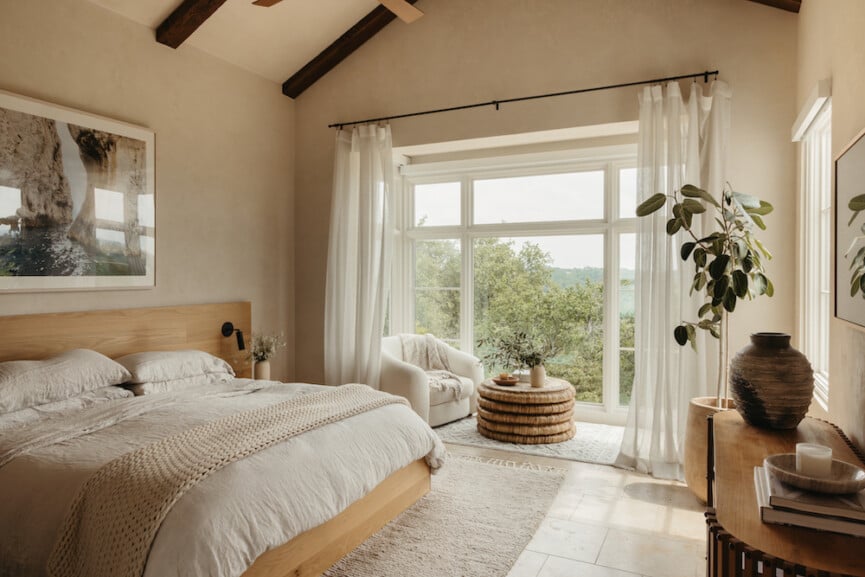
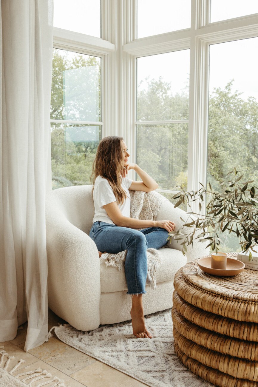
Our bedroom is my sanctuary – our days are so full, from work to family life, and this is where the hustle stops and we truly relax. I love my corner window spot for morning coffee, and I’ll often sit here in the evening and journal or read before bed.
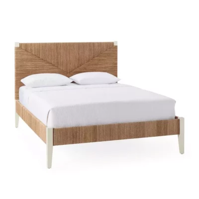
I get a lot of questions about our custom-designed and built bed. It’s made from unstained white oak for a matte, neutral finish, and then had two sconces hard-wired into each side of the bed—the switches are located into the side of the nightstand so they’re invisible. Get the Sourcebook ->
Lots more details on how we designed this bed in our bedroom tour right here.
Shop my bedroom:
Camille’s Tiny Office
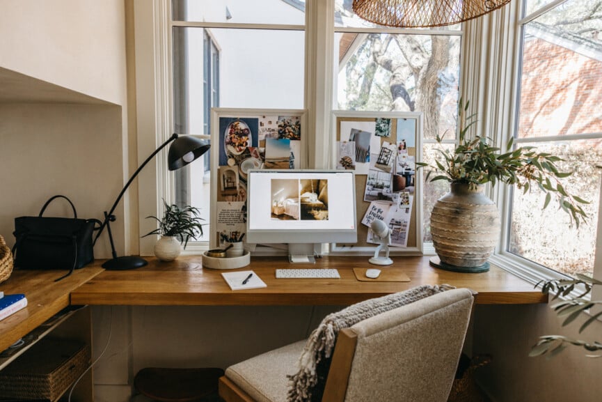
Here’s a peek at the alcove office connected to the kitchen where I usually work. A couple years ago, I reconfigured the space to be more efficient. We demoed the existing desk and cabinetry, and replaced it with a clean “floating” slab of white oak to serve as a simple, streamlined desk setup. I love having this cozy space to hunker down and get stuff done, and it’s so convenient to pop in and out of here while I’m hanging with the kids or cooking dinner.
Take the full tour of my office.
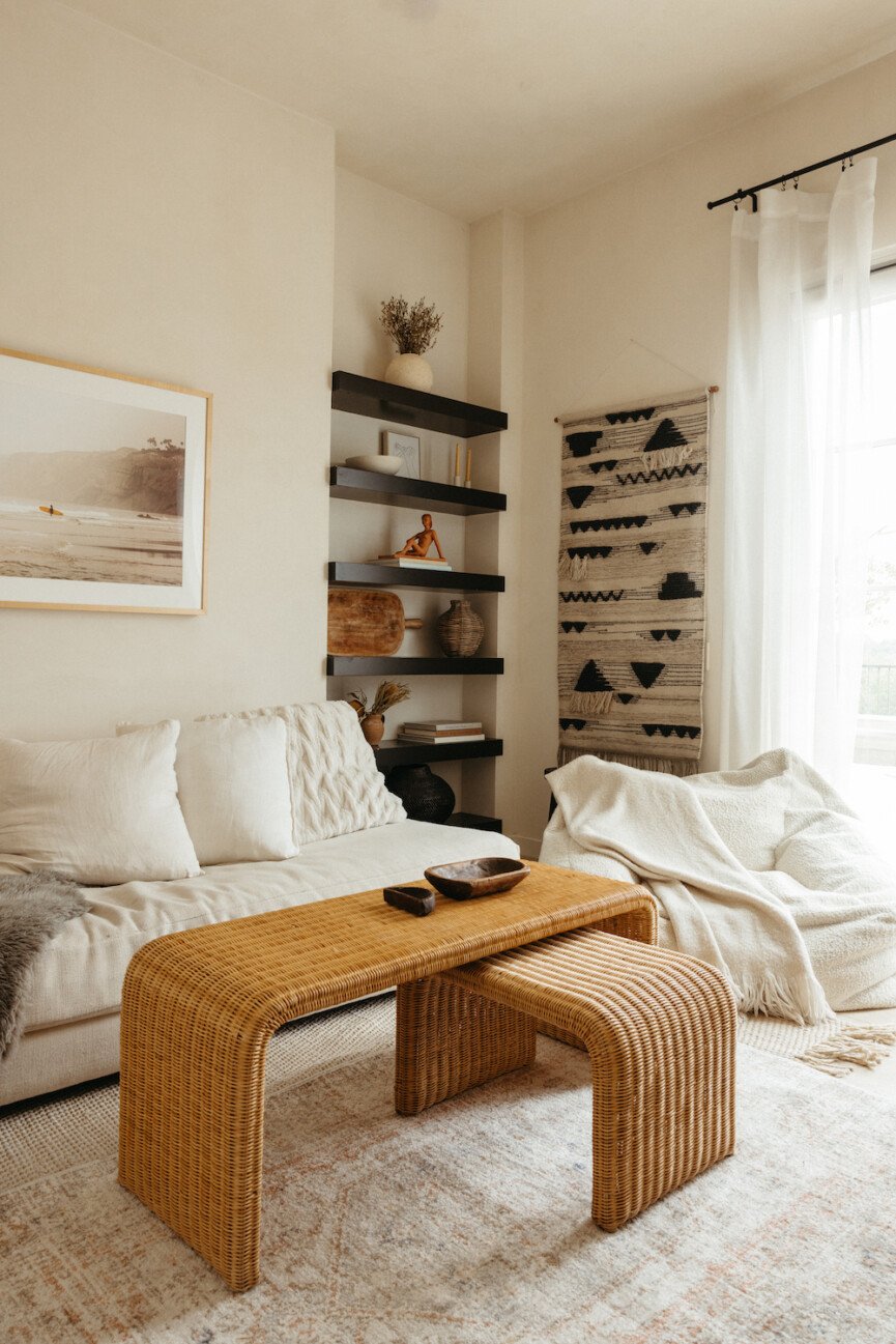
The Media Room
This room has been so many different things through the years—when we first moved in, it was our home gym… then it became my home office… and finally now that our kids are a little older, it’s our media room where our family watches movies or plays video games.
I kept the decor in this room really simple and affordable, from the Target rugs to the CB2 couch. When it comes to designing kids’ spaces, I usually stick with the same color palette and vibe of the rest of the house, but I don’t want anything precious or fragile. Let’s be honest—it’s probably going to get destroyed from the video game playing, sleepovers, and snacking that happens in this room! Get the Sourcebook ->
Shop the media room:
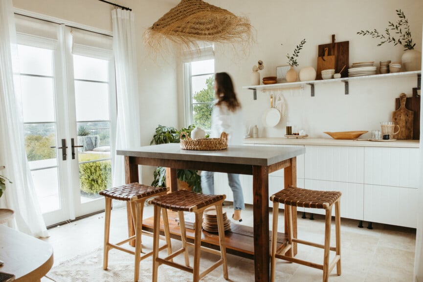
The Studio
Welcome to my team’s studio! We shoot a lot of recipe content for the site at my house, and as mentioned above, our kitchen doesn’t get much natural light. So, we transformed this back room of the house from a guest bedroom into a light-filled studio where we shoot recipes, as well as products for Casa Zuma.
I shared the entire before-and-after process of transforming our guest room into a studio kitchen here. We did it on a budget, and it’s such a great place for our team to collaborate and be creative.
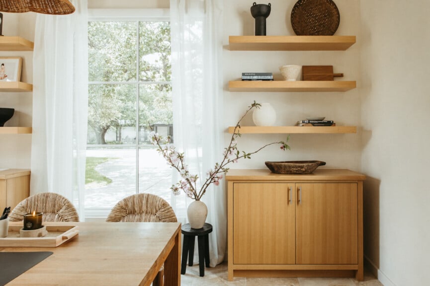
The Family Office
This is our “family office”, although usually Adam works in here and I work in my little alcove off the kitchen (see above.) This room tends to become the dumping ground for Casa Zuma prototypes and samples we need to go through, so our goal for this space is to keep it as minimalist and clean as possible. For me, a clear space equals a clear mind and when there’s too much clutter I cannot think straight. Get the Sourcebook ->
Take the full tour of the office here.
Shop the office space:
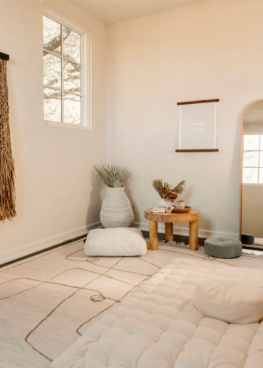
The Meditation Room
This loft area has also been a playroom, a TV room, and now—it’s what I call my “meditation room.” I turned it into a cocoon for relaxing, doing yoga or pilates, or where anyone in the house can escape when they need to chill and experience a low-stimuli environment.
Take the full tour of the meditation room here.
Shop this space:
Henry’s Room
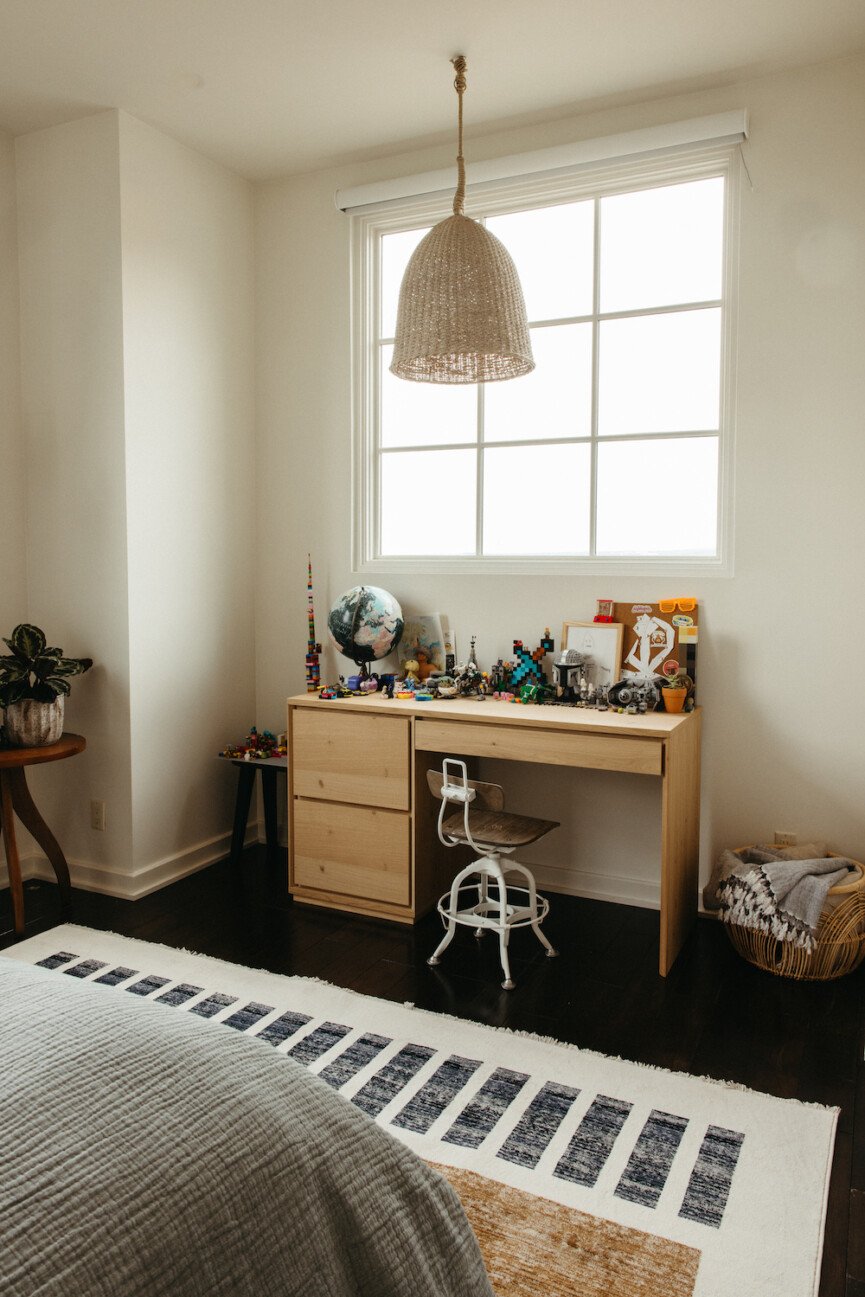
I haven’t shared photos of my kids’ rooms since they were baby nurseries! I’m a fan of letting kids express themselves with their bedrooms once they’re old enough to care, so I don’t get too involved with the design—I really want it to be a reflection of them.
Henry’s room is pretty simple—he naturally doesn’t like clutter and keeps his stuff weirdly organized. We recently upgraded his desk to a larger surface where he can spread out his legos and Star Wars paraphernalia. The cute poster above his bed has all the lyrics to Hotel California (his favorite song.) I ordered the digital version from Etsy, then sent it to Framebridge to have it printed and framed.
Shop Henry’s room:
Phoebe’s Room
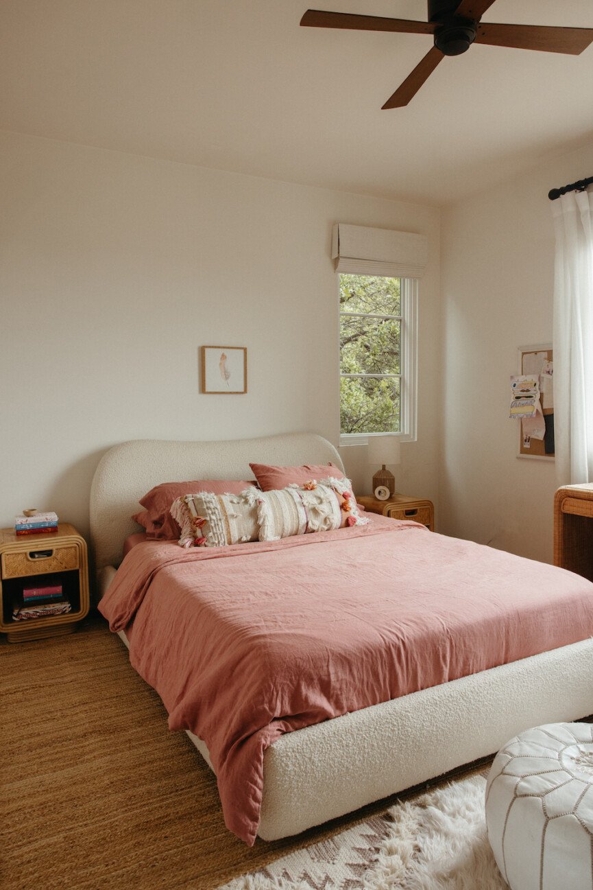
Phoebe is not quite as minimalist as her brother (lol)—she’s a big beauty product girl, loves her stuffed animals, and has lots of little collections of all kinds of things. One thing I love about both kids’ rooms is that they have these huge windows with trees outside them, and it almost makes them feel like they’re nestled in a treehouse. And then, they both have these incredible views of downtown Austin. At bedtime, we love to look out at the glittering skyline views and it’s so magical when you can see the moon up above.
Peek at Phoebe’s toddler room (I miss it!)
Shop Phoebe’s room:
And, that’s the tour! This house has been such an incredible home for us—it’s evolved right along with us through the years and really has a piece of our hearts. It’s our ultimate canvas for creativity and inspiration, and every room tells a story. Thanks for coming by! Drop your questions in the comments of the video over on Youtube, and don’t forget to sign up for the Sourcebook below to get links to everything!


