Of all the brilliant interior design ideas I cover, the latest in paint always excites me the most. This décor element arrests me with an allure that no sofa can hold. I can’t wait to see the latest hues of the season. The pigments the designers are choosing. The shades of grey, blue, and green winning over hearts. Thankfully, the fall paint color trends 2022 has in-store promise cozy and stunning interiors to come. As we soon turn away from summer toward the (hopefully) cooler days ahead, the warm, rich, and earthy shades below are calling my name as loudly as ever.
Paint always delivers. There’s something so alluring about the potential it carries. “What I love is the instant change in my mood when I’m surrounded by these colors,” says design YouTube star Arvin Olano about the fall paint color trends 2022 has already seen in abundance. “Color has the power to transport you to a place or season that just feels so familiar.”
And also so hopeful. Paint carries the unparalleled combination of being decadent, transformative, and entirely accessible. I asked Olano, as well as fellow interior designers Andi Morse, Jenn Feldman, and Stefani Stein to indulge me in what they’re seeing and loving in the color world this fall. Here are their top paint picks for autumn.
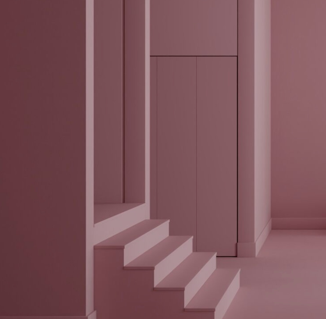
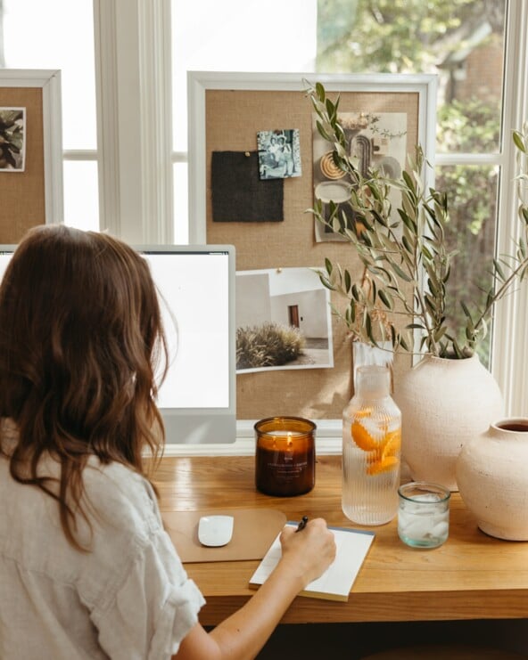
Image above: Alex Van Der Sluys home tour, by Nikole Ramsay

The 7 Definitive Fall Paint Color Trends 2022 Has In-Store
#1: Mixed Greens
Jenn Feldman, founder and principal designer of Jenn Feldman Designs, forecasts richer pigments for fall. “We are seeing clients go for paints that are richer and higher in texture,” she says. “It’s a great alternative to wallpapers and creates an intimacy in the room, almost like the feel of being wrapped in a cashmere blanket.”
In this light, Feldman says bold, deep greens are winning hearts these days. And Morse, founder of Morse Design, is on the same page, saying to “go deeper and richer instead of brighter and lighter.”
Best for: The family room, powder room, reading nook, and living room.
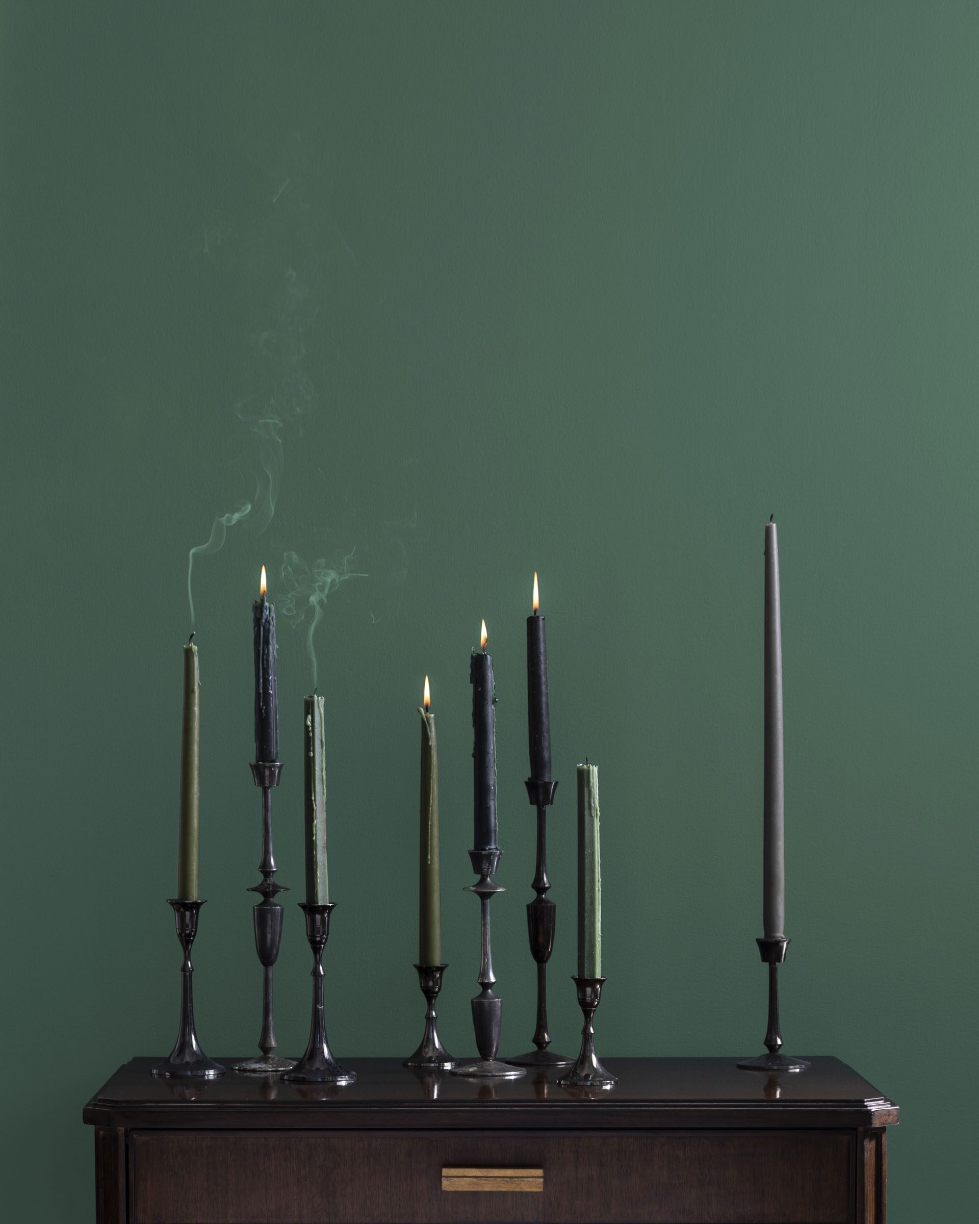
Benjamin Moore Lafayette Green
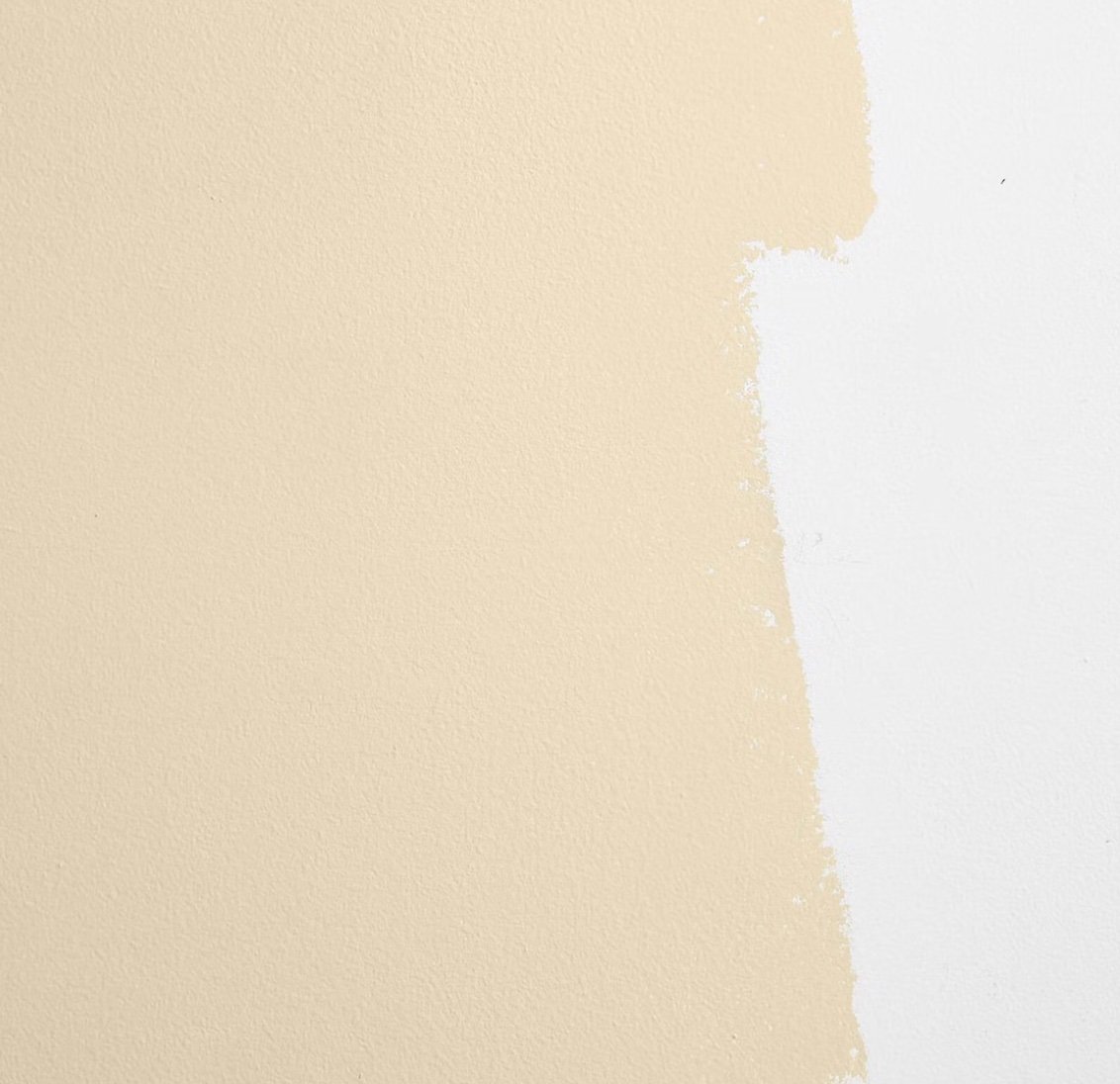
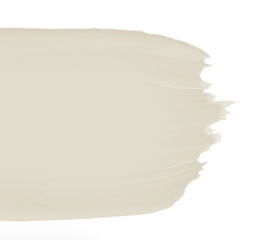
#2: Warm Beiges
The way Olano describes warm beiges makes me want to bathe in this shade. “It’s a warm cozy hug when you paint your walls this color,” says the designer and personality. “And don’t worry, it’s not going to be the beige yellow walls like our parents had. It’s a great neutral backdrop for modern furnishings and for other big colors we’re going to see this season—like aubergine and warm earthy pinks.”
Best for: The office or living room.
#3: Rich Taupes
Just like the deepness of the mixed greens, rich taupe is also winning over people this season, says Feldman. They’re as neutral as they are bold; rich as they are ethereal.
Best for: The bedroom, kitchen, or living area.

Portola Paints Rustica Roman Clay

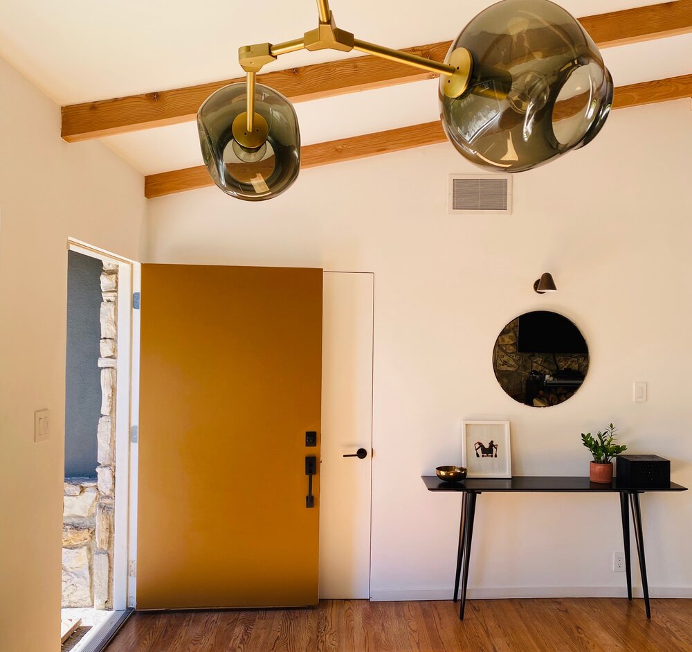
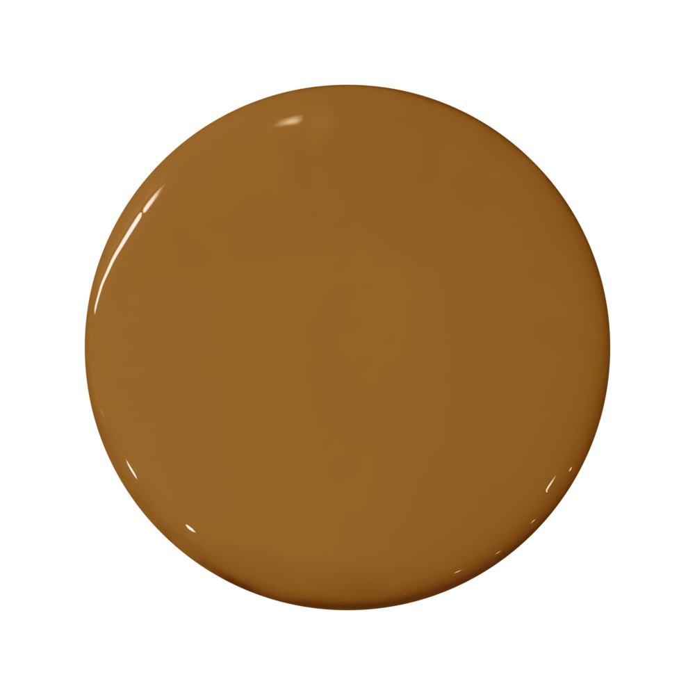
#4: Ochre
Think of the color of a late summer sunset, or a cup of Golden Milk, or the dried thistles in a Montana field. This is ochre in all its splendor—and this season is the time to bring it home, says Stein. “Yellows can, at times, feel too cheerful… too youthful. Ochre is a more elevated and elegant take,” notes the founder and principal. “The shift toward darker iterations and earthier hues isn’t going anywhere, and Ochre strikes just the right balance between color and neutral. It reads slightly moody, but not as intense as some of the blues, greens, and off-blacks that dominated the past few years.”
Best for: Living and dining rooms, or crown molding paired with antique white walls (per Stein’s suggestion).

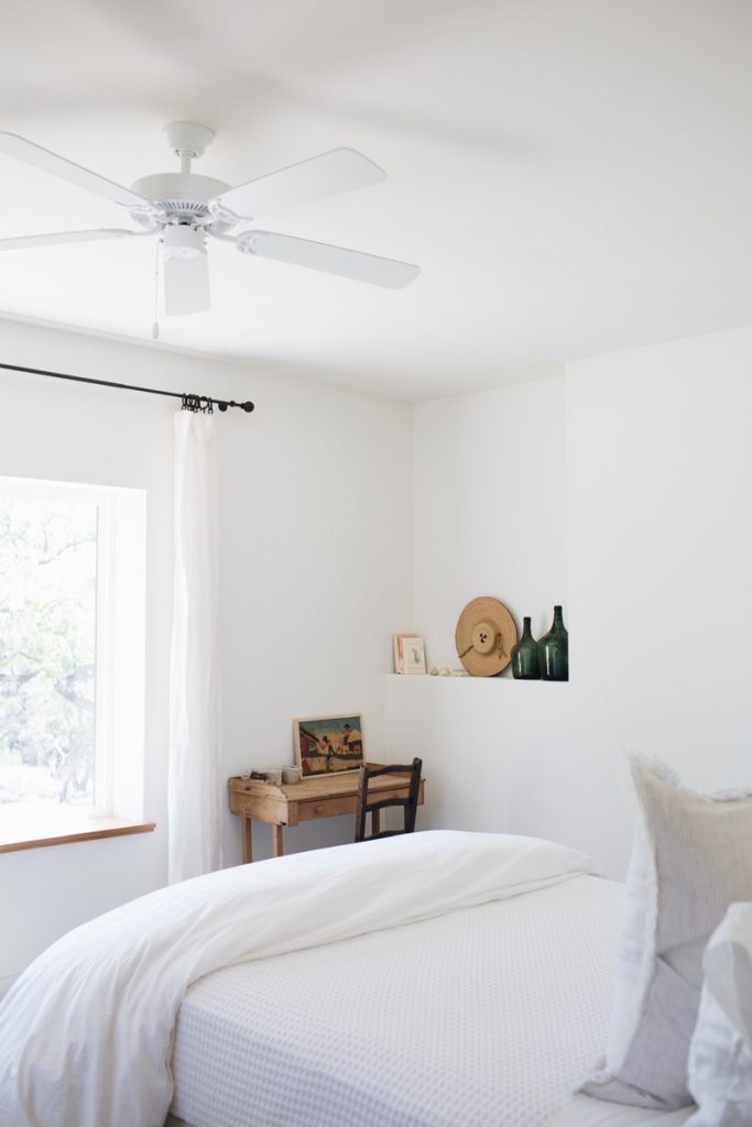
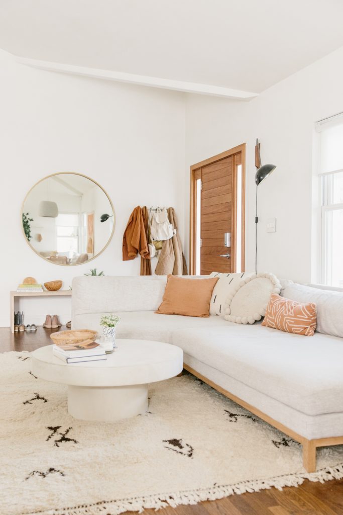
#5: Whites
This classic non-color will never—ever!—go out of style or season, says Morse. And considering all the rich hues in the forecast, white is the best complementary paint there is. Ranging from cool to warm and everything in between, it’s a textured choice that’s always complementary to what’s around it.
Best for: The bedroom, living room, or office—plus, as a trim.
Sydney Harbor Old Church White
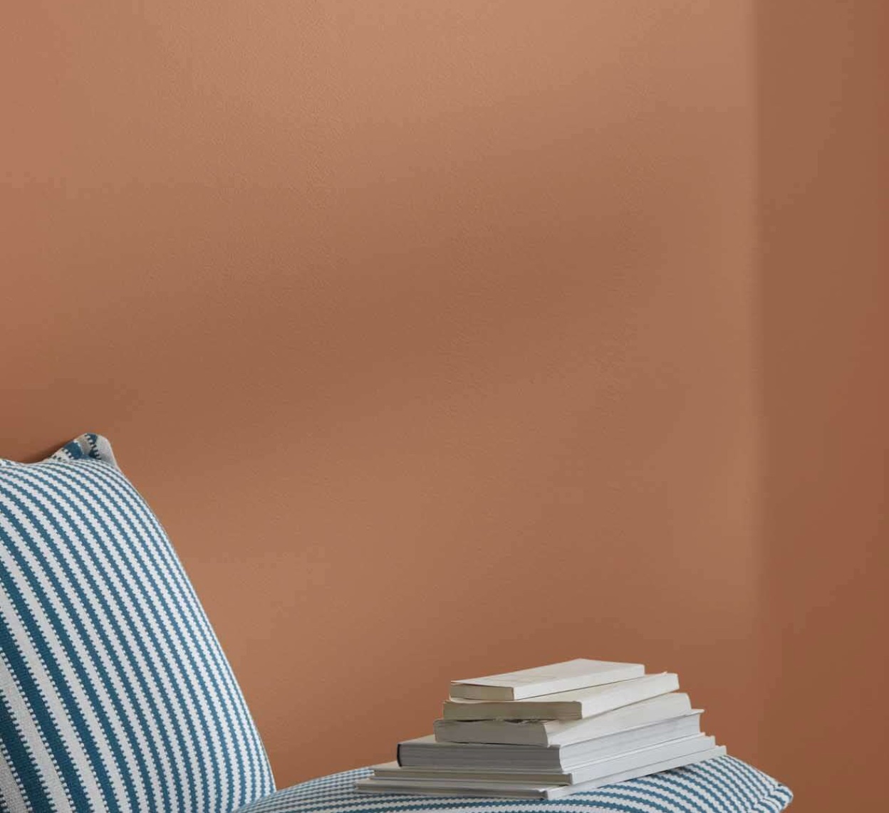
#6: Earthy Toned Oranges
The key to this paint color is seeing it in “pops,” says Morse. While it’s gorgeous enough to color an entire room, consider this eclectic color for an accent wall or funky trim. “We’re seeing this color in furnishings as well as clothing for the fall,” adds Morse.
Best for: The kitchen or an accent wall.

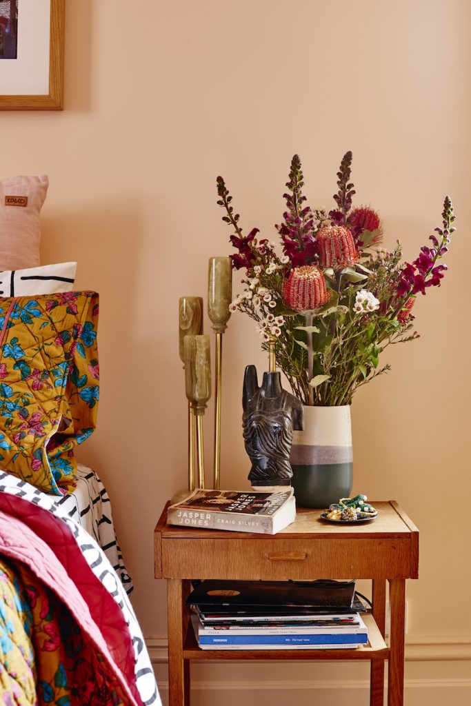
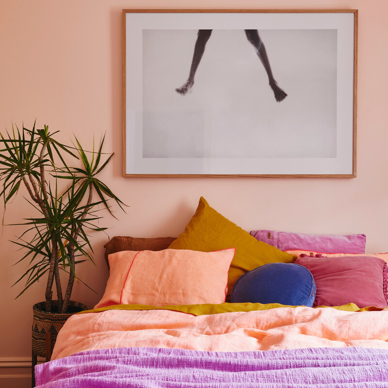
#7: Shades of Pink
Pink may just be the design chameleon of all time. It’s timeless and feminine while also being classic and gender neutral. Morse and Olano see pinks in all shades for fall of 2022—with warm hues winning Olano’s heart. Think of this color as the Annie Lennox of pigments: Its brilliance is bigger than words.
Best for: The bedroom, home office, or dining area.