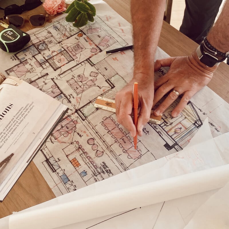
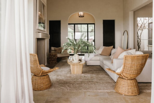
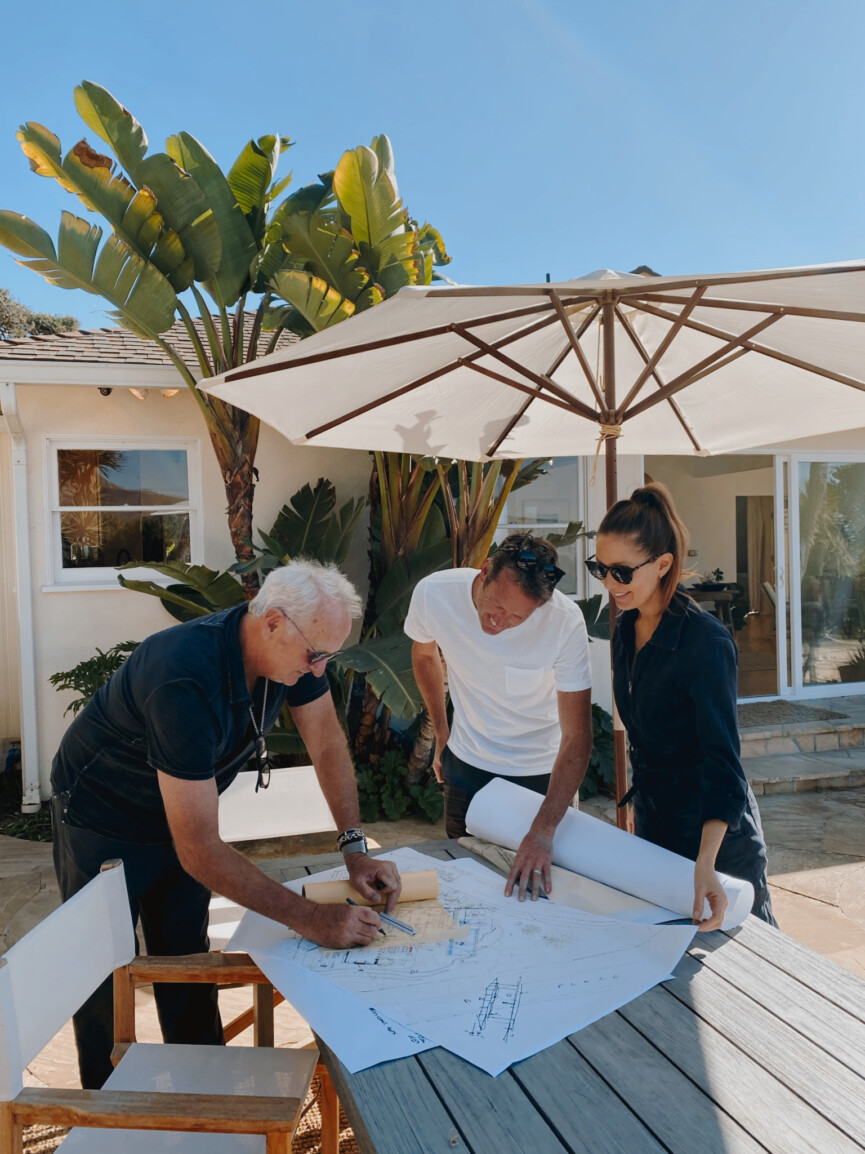
Our family is spending the last couple weeks of summer at Zuma Beach House, and we’re sincerely hoping that it’s one of the last times we’ll be able to sleep here before construction starts. Because that would imply that construction is starting sometime in the near future. But even though nails aren’t being hammered yet, things are definitely happening behind-the-scenes on this project. Permits are filed, and we’ve been meeting with our builders to hammer out interior elevations as we make decisions like the kitchen cabinet and drawer configurations, or the placement of the tub fillers and sink faucets in each bathroom. Our goal is to get ahead, so that once we’ve got those approved plans in hand, we can hit the ground running on construction.
So far, I’ve shared the backstory and our overall inspiration for this project. We’re creating a serene, minimalist beach bungalow, while keeping the 1950s ranch elements that give the house its character. Now, I’m excited to start diving into the nitty-gritty details of the design and renovation itself, and there’s no better place to start than by walking you through the new beach house floor plan. Ready to see how we’re laying it all out, and exactly what the added square footage will include? Come on in…
Let’s revisit the existing house floor plan…

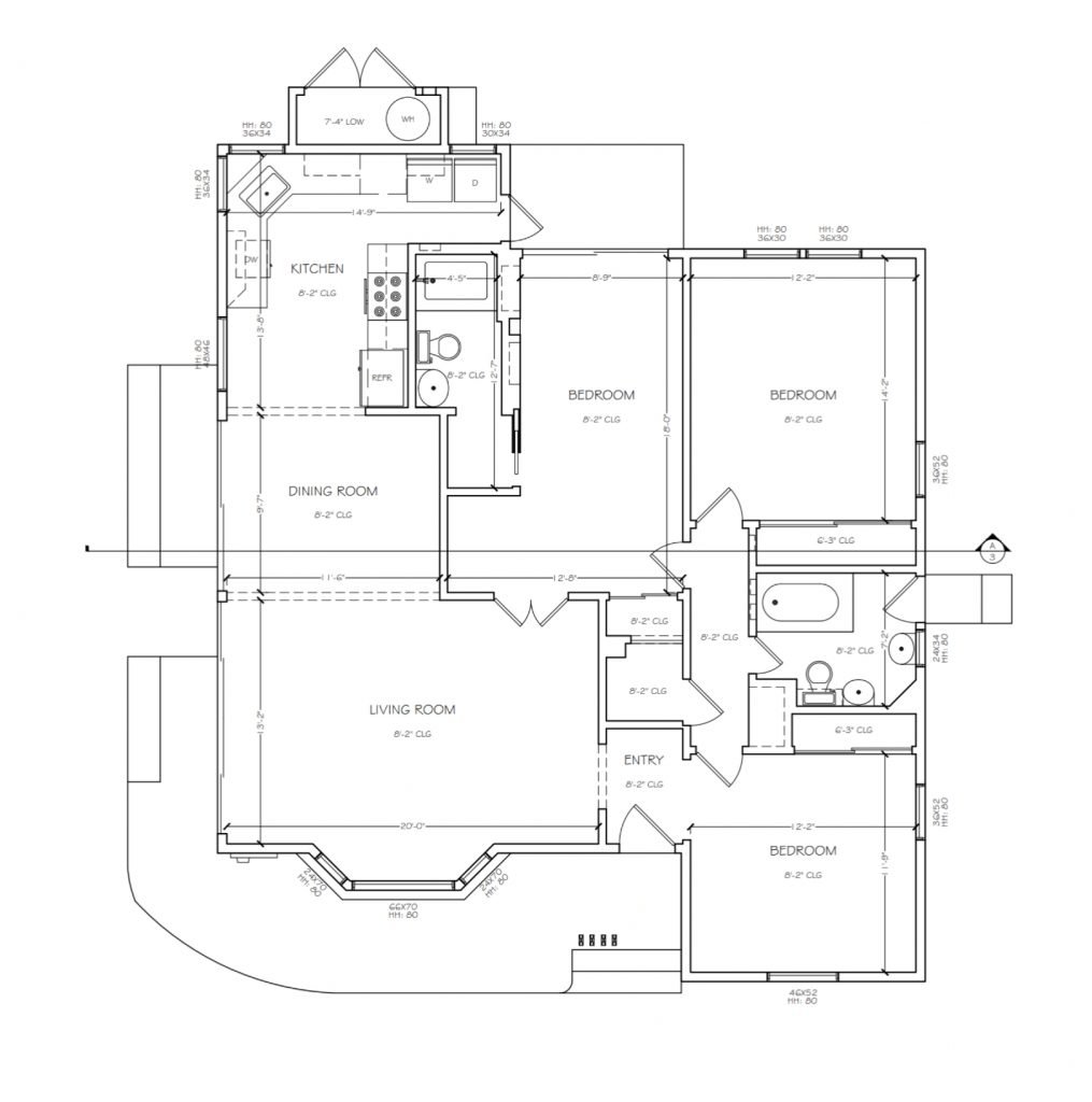
Here’s the breakdown of the current house…
Square footage:
1421 square feet in the main house
Room Layout:
The current 2 bedroom / 2 bathroom house has an undeniably awkward floor plan. It’s the only time I’ve ever seen people get lost in a house this small, because the floor plan makes absolutely no sense. The kids’ room connects directly into the living room (divided by a curtain, no less), and the “primary” bathroom is separated from the primary bedroom by a small den that was added on to the house at some point.
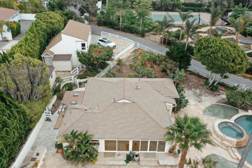
Issues with the current house
No clear front entrance. While technically there is a front door, it’s been used by exactly zero people since we bought the house. When you pull into the driveway, the path leads you down a sidewalk straight to the back door. So, no one is quite sure whether to circle around to the front of the house, or enter straight into the door of our laundry room.
Lack of space. Aside from the awkward floor plan, we’re also lacking space in general. It’s a cozy fit for our family of four, so when family or friends come to stay with us, we’re bursting at the seams. There’s also nowhere for me and Adam to work (which is a problem when you both work from home), so one of us usually ends up taking zoom calls from the bedroom while the other sits at the kitchen table with air pods in, praying that the kids won’t get into a fight while you’re on an important call.
Closed-off rooms. If you’ve seen our Austin house, you know that Adam and I are big on an open floor plan layout. We gravitate towards an open, airy vibe, so a house made up of small rooms that are separated off from each other makes us feel claustrophobic. We can’t wait to open this space up.
Low ceilings. In my opinion, low ceilings are one of the most concerning things about a house because they can be really difficult to change—and often, can lead to a house feeling dark and crowded. So, when we first considered the purchase of this house, making sure that we’d be able to raise up the ceilings was a prerequisite. More on that later.
Tucked-Away Kitchen. For me, the kitchen is the heart and center of a home, so having a small kitchen awkwardly tucked into the corner of the house (with dated granite and cabinetry no less) was going to be the first thing to go in any renovation.
GOALS for the new house
Clear front entrance.
As mentioned above, the current house lacks a clear entrance and leaves guests confused about where they should go. In the remodeled layout, we want anyone who arrives at the house to know exactly where to park, with a clear plan for how to enter the house. Did you know there’s an actual name for this topic? It’s wayfinding, and includes principles like creating “well-structured paths” and avoiding “too many navigational choices.” Not sure why I’m obsessed with this topic, but I find it endlessly fascinating.
Open floor plan.
For the areas where we live, eat, and play together as a family, I prefer a wide-open space that feels expansive and preferably, opens up to the outdoors as well. If you keep reading, you’ll find out how we’re achieving that with a 1000 square foot addition that is basically one big kitchen.
Vaulted ceilings.
When we considered purchasing this house, I knew that for the investment, we’d need to be able to raise the ceilings. Thankfully it wasn’t too complicated here, especially since we’re keeping it one-story. We’ll be vaulting the ceilings, which means that we’re extending into the triangular space between where a ceiling would normally sit and the top of the roof. This will not only help the rooms feel larger than they actually are—it’ll also let more natural light into each space.
Room for guests.
While we wanted to keep this a fairly modest-sized house, we also knew that this was a place we anticipated hosting family and friends for years to come. By adding a guest suite and a bunk room, we’d make room for an additional 4 – 5 people to stay with our family in the main house.
Big kitchen for entertaining.
Since the kitchen is my happy place, I naturally want to be able to spend time in it surrounded by family and friends. I need a kitchen large enough to accommodate cooking projects, recipe photo shoots, and lots of people, since most dinner parties end up with everyone gathered around the island. I knew that, based on the current tucked-away corner kitchen, this would require a complete reimagining of the space.
Lots of natural light.
The current house already has great light, but we knew that by raising the ceilings and adding more windows and doors to the back of the house, we could create an even more light-filled space.
Floor plan version 1

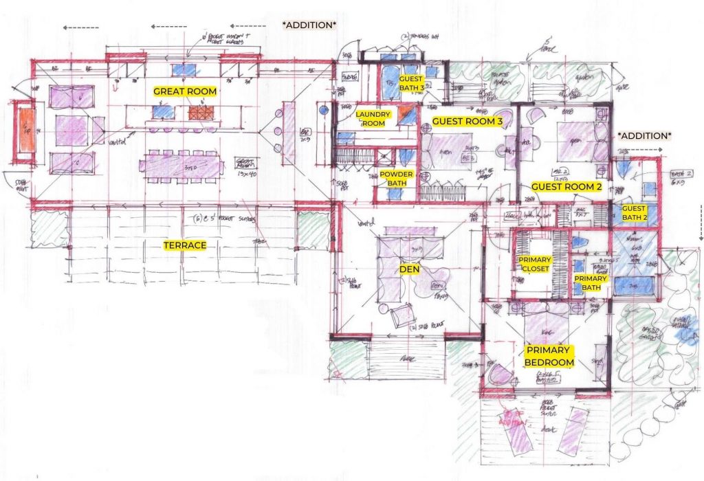
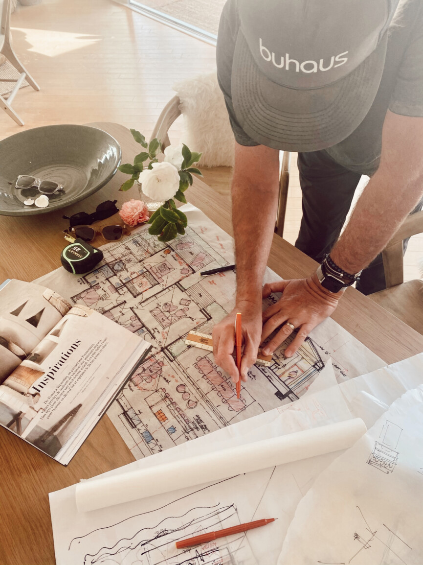
Our architect, Doug Burdge, pretty much nailed the new layout on his first pass. We had thought that the addition would probably be comprised of a primary bedroom suite, however Doug totally reimagined the footprint of the current house to include all the bedrooms/bathrooms, while adding a 1000 square foot great room that would become the home’s focal point. He truly understood our desire to make this house about entertaining and hosting, and created an open floor plan that was really all about gatherings.
For this first pass, Doug experimented with an interesting vision for a modern “hacienda-style” entrance, where once people entered the main gate from the driveway, they could roam around to the front of the house and enter through the huge glass sliding doors. However, for us this plan was missing a few things… namely, a clear front door. We liked the concept, but felt like it ultimately wouldn’t be conducive to everyday life.
Floor plan version 2:

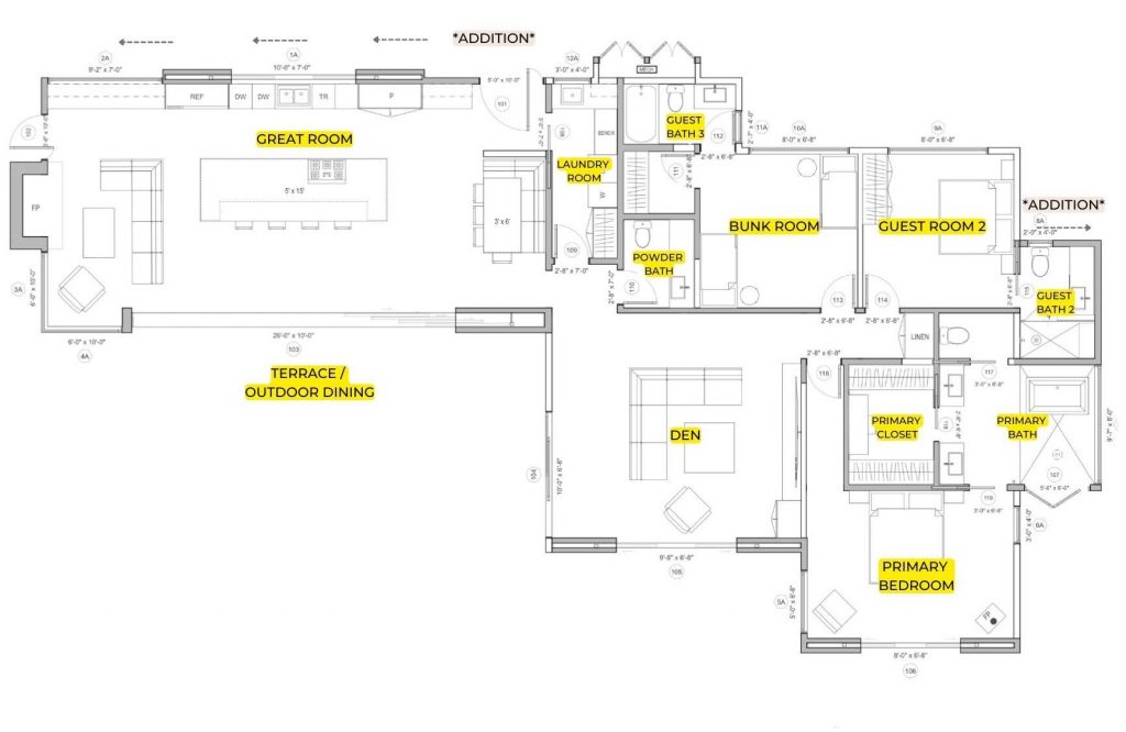
Our second floor plan introduces the new front door, and (surprise!) it’s actually on what is currently the back side of the house. We basically flipped the entrance so that when you walk down the path from the driveway, you enter down a long tree-lined path and enter right into the new Great Room.
One other concern we had from the first set of plans was that our Primary Bathroom was tiny. So, in version 2 we expanded the Primary Bath by stealing the closet from Guest Room 2 (sorry guests!) We’ll add a built-in to that room to serve as the closet. It would have been cool to have an actual closet there, but a small primary bath is just not a great option since I want this one to feel airy and spa-like.
We also turned Guest Room 3 into a bunkroom to make room for lots of kids to sleepover. We added a large floor-to-ceiling corner window in the Great Room to maximize the ocean views from inside the house. And we removed the bar in the Great Room and replaced it with a banquette/breakfast nook.
The one thing this plan was still missing for me was an entryway—I wanted an entrance “moment” when people walk in the front door, and right now they’d be looking at the side of a banquette. Which brings us to…
Beach House Floor Plan version 3:

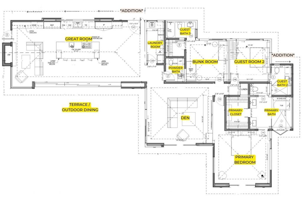
Here are the details of Floor Plan 3 which is close to where we’ve finally ended up…
Square footage:
2500 square feet (includes a 1000 square foot addition)
Room Layout:
The new house will have 3 bedrooms and 4 bathrooms (including the new powder bath), plus a lounge and a great room with open kitchen and living area. The dining room will be outside under a covered trellis (yes—the only dining room will be outside! The beauty of Southern California.)
It feels like we’re adding on so many rooms and usable space, but in actuality, we’re only adding 1000 square feet to the main house. It’s an example of what a difference it makes when a floor plan is designed to be smart and efficient, thanks to the brilliance of our architect, Doug Burdge. He was able to turn the existing footprint of the house into our bedrooms, bathrooms, and lounge. Then we could let the addition stay one big open room that’ll make the entire house feel more expansive, and invite the indoor-outdoor flow that we knew we wanted for this property.
Round 3 changes included:
- Opening up the entryway to make room for a console table and artwork—we did this by removing the banquette and the pocket door to the laundry room.
- Extending the square footage in the Primary Bedroom. We wanted to keep the current footprint of the house as much as possible to save on cost, however we knew that adding a few feet to the Primary Bedroom would be a worthy investment and make that room feel much more open and luxurious.
- Vaulted ceilings throughout—we decided that it would be worth it to go ahead and raise the ceilings in the guest rooms as well. It added on some cost, but for me, high ceilings are a worthy splurge.
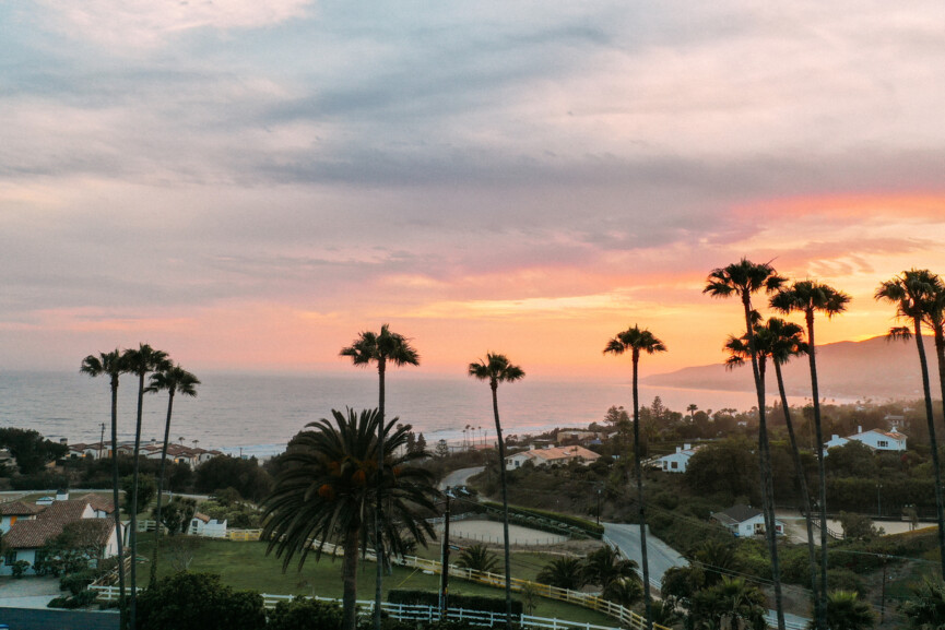
And then there’s the guest house.
We haven’t even talked about the guest house yet! It’s a one-room apartment above the garage, with a weird little kitchenette and fridge that share a space with the bed. The downside is that you have to climb a creepy carpeted staircase from the garage to access it. The upside? It already has gorgeous light, and expansive views of Zuma Beach from every window. We’ll be keeping the current footprint, but getting very creative to turn it into a one-bedroom suite with boutique hotel vibes. The guest house project deserves its own post, so stay tuned to see how we’re doing it.


